Debra Prinzing

Get the Email Newsletter!

Archive for the ‘Playfulness’ Category

“Sustainable Spaces. Beautiful Places”

Friday, September 5th, 2008

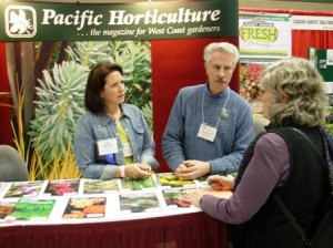
 I’m standing with Richard Turner, editor-in-chief of Pacific Horticulture magazine. We’re volunteering at the 2008 NWFGS in Seattle, visiting with Dawn Chaplin, formerly a fellow board member of Northwest Horticultural Society and a great garden-touring pal (she’s now a Whatcom Co. Hort. Society board member).

The press release just arrived in my in-box, and it announced the 2009 Northwest Flower & Garden Show’s theme. It’s only six months away – and I’m already excited! The theme: SUSTAINABLE SPACES. BEAUTIFUL PLACES. I like it! A lot!

The Northwest Flower & Garden Show, created by my pal, the talented and visionary Duane Kelly, today announced its 2009 theme:

“. . . (the) show will place a major focus on gardening materials and techniques that are good for the environment,” said Duane Kelly, chairman and founder of the annual event, now in its twenty-first year. “Show goers can expect to come away with a number of great ideas that conserve resources such as water and soil while, at the same time, making their gardens more self-sustaining and easier to care for.

“During the past year, organic gardening and vegetable gardening have grown in popularity thanks to the public’s keen interest in doing what’s best for the environment.  The movement has also gained traction with consumers seeking homegrown fruits and vegetables that not only taste better but reduce ever increasing grocery bills.”

READ MORE…

Stamps for the gardener

Thursday, August 21st, 2008

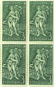
Commemorative “Gardening-Horticulture” stamp, 3-cents, issued in 1958 (from my father’s stamp collection – mint condition)

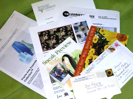
I know we’re all dependent on the Internet for swift correspondence, but I, for one, am still a huge fan of the hand-written letter. It’s not just the pen- or pencil-inscribed words one writes that matter. Think about other non-verbal cues we convey. Beyond the thoughts communicated by careful penmanship, there is also the selection of paper, note card, or greeting card that implies volumes of meaning. Even the color and type of ink sends a full range of sentiments.

I cherish hand-written notes. I have collected shoeboxes-full of them, saved by year, since the 1970s when my dearest and best childhood friend, Lori, and I started writing to one another after my family moved from New England to Portland, Oregon. I have the cherished love letters, the newsy updates from my mother, the thoughtfully-written narratives from another Lori in my life, who lives in Europe (she is known for excellent choice of paper, as well!). And then there’s Paula, who still jots notes with an old-fashioned ink pen (I just received one as a gift, so perhaps I’ll try to do the same). These “snail mail” versions of human communication trump the Internet on any occasion.

READ MORE…

Garden-in-a-pot

Monday, August 4th, 2008

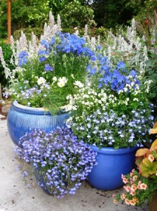
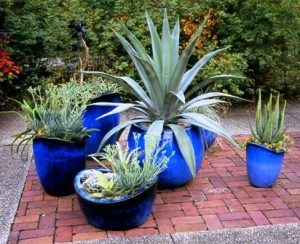
A true-blue grouping (left) in Sunset Magazine’s test gardens; Silvery succulents (right) thrive in ice-blue containers for a satisfying grouping at Longwood Gardens, 2006

Ever since I relocated from Seattle to Los Angeles, nearly 2 years ago now, I have relied more than ever on container gardening. With a confounding, on-again, off-again irrigation system that will cost the equivalent of a year’s grad-school tuition to completely repair, and with rock-hard soil that endured years smothered by the previous owner’s idea of weed control (black plastic sheeting covered with red lava rock “mulch”), I’m desperate to grow plants in spite of unwelcome conditions.

But where? And how to keep them alive when it’s too hot and dry for anything but succulents to look good?

The answer is a container garden. Gardening in a container is like one-stop shopping. Maybe we should call it “one-stop gardening.” Here are some of the best reasons for gardening in pots:

Why grow a container garden?         

  •  Move plants and architectural interest above the ground’s surface:  You’ll enjoy beauty closer to eye level, as in this cool vintage vessel that caught my eye at Chanticleer Gardens in Pennsylvania (2006).


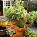
Edible and Accessible: Lettuces and herbs thrive in pots, like this over-sized terracotta “strawberry” pot at right – measuring 48 inches tall, created several years ago by the designers at Emery’s Garden in Lynnwood, Wash.! At left, ornamental peppers and kale in a pot at Longwood Gardens are food for the eyes.


Define a focal point: Signal the entrance to the garden, such as with these two glossy Asian pots that contain lush golden hostas. Mounted on pillars, they announce: “Come this way,” a way that’s made more enjoyable because this portal leads to the gardens of David Lewis and George Little, Bainbridge Island artists.


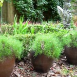
Provide a natural perimeter: Anywhere in the garden, such as at the edge of a deck or patio, pots can act as a verdant “wall” to contain, deter, protect or enclose. I particularly enjoy seeing three identical pots, lined up as a formal barrier – it’s plant-filled architectural interest. Here, at the edge of Peter Norris Home & Garden’s parking lot, these giant iron urns hold gold-streaked phormiums (left). A trio of fern-filled pots defines the edge of a formal planting scheme at Robert Dash’s Madoo Garden (right).


READ MORE…

Dogs and their sheds

Friday, August 1st, 2008

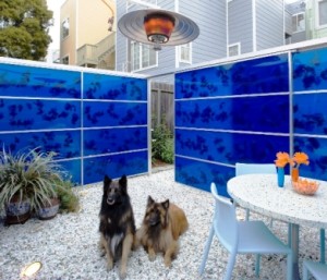
‘Elvis’ and ‘Nico’ are the Pleasure family’s Belgian Tervurens. They’re enjoying the warmth from the overhead heater, as they lounge in their blue pavilion in a San Francisco backyard

Driving behind a Volvo on the Ventura Highway the other morning, a bumper sticker caught my eye: “I love dogs and I vote.”

Not exactly sure what that means, but it started me thinking about the character of a dog owner. And about a funny comment my friend Lin Su made at our Stylish Sheds and Elegant Hideaways book launch party here in Los Angeles.

“I think you had a requirement that everyone included in the book must have a dog in their life!” she maintained. Wow, what a thought. Bill and I didn’t exactly write a canine clause into the scouting notes, but perhaps subconsciously, we were drawn to animal lovers.

There is a sympathetic relationship between people who raise and care for their plants and people who raise and care for their pets. Beloved and cherished, our dogs are often the most patient and forgiving family member in our lives. Our “Zanny” (pictured, left) is certainly the cream of the crop – a rescue Lab, blond and cheerful – found wandering the streets of Yakima, Wash., at six-months of age….brought to an animal shelter in Snoqualmie. My husband Bruce discovered her photo on petfinder.com in 2002 – and she has lived with our family ever since. What a sweet companion and thoroughly accepting of any love she receives, often giving more than we ask of her.

READ MORE…

“Cottage Ornee” for Solitude and Sociability

Thursday, July 24th, 2008

On July 3rd, my friends at Garden Rant invited me to be their guest-blogger. This kind and generous opportunity gave me a platform to share a little essay about my shed odyssey, the fascination I hold for tiny backyard architecture, and the experiences Bill Wright and I had creating “Stylish Sheds and Elegant Hideaways.” I was tickled to see that Amy Stewart titled the piece “In Praise of Sheds.”

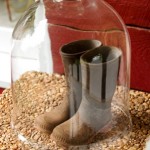
I asked Garden Rant readers to share their thoughts, ideas and inspiration in response to the question: What is your dream shed and how will you use it?  More than 30 clever readers sent in their answers, vying to win a copy of our book, and a set of note cards with our wellies-under-glass photograph (seen at left), taken by Bill while we were on location at Brenda Lyle’s outside Atlanta.

I was touched by reading so many awesome posts – you can go to Garden Rant to read them for yourself. It was a tough call, but I chose as the winner of this small contest a wonderful gardener and writer in rural Massachusetts.

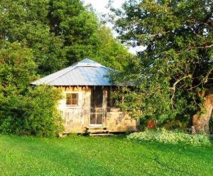
Pat Leuchtman has a blog called Commonweeder. She and her husband created their “Cottage Ornee” (pronounced Cott-aaagh Or-Nay, preferably in a heavy French accent, Pat says), a stylish shed imagined first in their minds and then built by their hands. This little gem of a building resides at their “End of the Road Farm,” in Heath, Massachusetts. I was struck by Pat’s written description of its design and charmed by the narrative of how she and her husband use it. Here is Pat’s post about winning our little contest: “Cottage Ornee is a Winner”

Cottage Ornee  [Pat Leuchtman photos, here and below]

Here are some photographs, provided by Pat. I was so curious about the cottage’s creation and sent Pat several questions. Her comments appear below. I hope you find this little hut as alluring and enticing as I do. I am already scheming about how to get myself up to visit Pat one of these days. In the meantime, I am enjoying reading her delicious words, so make sure to visit Commonweeder.

READ MORE…

It’s all good: Rembering Linda Plato

Monday, July 7th, 2008

I think many of us have experienced that frequent voice whispering in our ear, offering words of wisdom, advice, encouragement and humor — just when we need them. For me, and for many of her beloved friends, that voice belongs to Linda Plato. “It’s all good,” was one of her favorite sayings. Or, her shorthand version of that phrase: “Good times.”

Garden designer, horticulturist, Anglophile, educator, editor, writer and friend, Linda and her bon mots live in our memories and our hearts. Long before cancer took her young life on December 4, 2005 (at the age of 37), Linda’s witticisms and wry look at the world were a source of humor and happiness to me.

She wrote some of her funniest pieces anonymously as the Garden Curmudgeon for “Garden Notes,” the Northwest Horticultural Society’s quarterly newsletter, for which I was editor. Linda later followed me as editor and continued as the GC, often quoting the OGC (the Original Garden Curmudgeon). It took some people years to figure out that she was GC and her dearest friend Greg Graves was the OGC. The columns are collected on the NHS web site.

I’ve been thinking lately that I wanted to write a “Linda’s on my Mind” piece. And over the July 4th weekend, her husband Bruce Forstall sent me a good reason to. Bruce and several family members and friends have sponsored a memorial park bench to commemorate dear Linda. Located in Kirkland, Wash., not too far from Linda’s former design studio, the classy bench will provide respite and peace to many. The logo on the plaque, a container with a triple-ball topiary, is the one Linda designed for her business cards. Her saying,  “It’s All Good,” also appears. (Photos here: courtesy of Bruce Forstall).

READ MORE…

Gaze out and find peace

Tuesday, June 24th, 2008

Taking a ride across Elliott Bay on the West Seattle “Water Taxi”

The boys and I returned to our beloved Seattle for a few days last week. It was all we could do to keep from screaming: “We Love Seattle” to one another.

Is it the people here, the longtime friendships, who make our love for this place feel so much deeper than our present home?

Or is it the appearance of green foliage and needles – everywhere we look – or the moisture in the morning air, the mesmerizing pattern of clouds against the blue-gray sky, the fresh sensation of breathing, smelling, absorbing the weather here in the great Northwest?

The answers aren’t easy to articulate. It’s more of a feeling, a sense of comfort, of familiarity.

So here is a travelogue, of sorts, to share and celebrate our brief visit:

Ben, friend Sean, and Alex pause for a photo in front of Jack’s Fish Spot

Pike Place Market: We enjoyed a tasty lunch at Jack’s Fish Spot — the best cooked-to-order fish’n’chips around, although I ate Jack’s scallops’n’chips, a personal favorite.

This was followed by a stop at Daily Dozen Doughnut Co., another must-have Pike Place treat. I prefer a half-dozen of the minis, dropped into a brown paper lunch bag, sprinkled with cinnamon-sugar and shaken vigorously. Eat while still warm. Even better with a glass of milk.


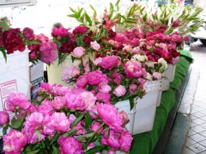
Next, a lustful journey through the stalls – my visit coincided with PEONY SEASON – yeah! Oh, how I miss my peony plants. I actually love these flowers best in their nascent stage, balls of beauty about to burst. The five-for-$10 bunch offered at my local (Southern California) Trader Joe’s is so far removed from the peony plant that I kind of feel like a cheater when I buy it.

READ MORE…

places to “dwell” in the garden (with bamboo overhead)

Saturday, June 14th, 2008

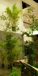
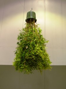
When I toured the Dwell Outdoor section of the trade show at last weekend’s Dwell on Design 08-LA, the first things to catch my eye were some “flying” pots of bamboo. Suspended from the ceiling, resembling broomsticks owned by the Wicked Witch of the West, the potted bamboo plants seemed to be whooshing to and fro, by themselves.

Slightly twisted, this version of a well-behaved, dare I say “garden-variety,” plant display was the brainchild of a few folks at Monrovia. As one of the major sponsors of the Dwell conference, Monrovia was given the task of decorating the vast Dwell Outdoor area, which showcased modern living trends and hot new products.

Monrovia partnered with Sarah Graham, a principal of agps architecture, to create the “Flying Bamboo” theme. “We wanted to design a conceptual landscape for Dwell Outdoor and Monrovia, as a means for visitors to see landscape in a new way,” Graham explained in a Monrovia press release. “As plants, particularly large plants, are usually gravity based, we reversed that normal condition, making it surreal. One cannot help but to notice, to question, and to laugh.”
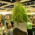
Bamboo foliage nearly tickled the tops of our heads while I chatted with Judy Lynes, Monrovia’s publicist from The Phelps Group, a Santa Monica-based PR agency, and Pamela Wasson, Monrovia’s marketing VP. The women said Monrovia enjoyed creating something that guaranteed a reaction (I guess the only person not excited about the installation was the local Fire Marshall, who had concerns that plants would start dropping from the sky onto conference-goers).

But thanks to secure cables and lots of other precautions, the caper worked! When I walked into the giant shell of a convention hall, the flying plants soared above the displays and visually demanded my attention.
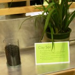
Plenty of lush, healthy Monrovia plants were closer to the ground, too, for easy viewing, including dramatic architectural plants, water-wise and easy-care varieties. By focusing on its selection of 42 custom-blended  soil mixes (using dozen different types of mycorrhiaze, a beneficial fungus), Monrovia educated consumers and landscape professionals about the importance of good soil.

“We work with so many landscape architects and designers, we thought this would be an ideal venue to showcase our plants and soils to those professionals,”  Wasson said.

ARCHITECTURE IN THE GARDEN

Shedista that I am, I was wowed by the many great examples of scaled-down style designed for escaping to the great outdoors. There were some of the wonderfully creative shed-like structures on display below Monrovia’s flying bamboo. I daresay each was a stylish hideaway, deserving of a starring role in the garden:

MODERN CABANA
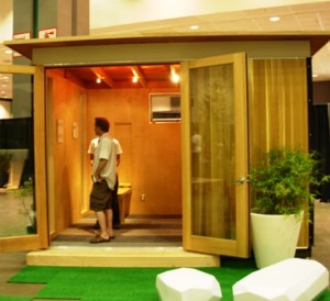
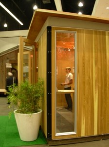
The brochure copy reads like it’s straight out of the pages of Stylish Sheds and Elegant Hideaways, promising: “SPACE TO: Work, Play, Film, Paint, Meditate, Rest, Escape, Research, Read, Create.” Based in San Francisco, Modern Cabana offers pre-fabricated accessory structures made from clear cedar siding (all sorts of design upgrades are available). The clean, modern design comes in 10-by-10, 10-by-12, 10-by-14 and 10-by-16 foot configurations. Multiple units can be connected to create expanded floor plans. “The Cabana can be used as a guest cottage, urban penthouse, desert hideaway, fishing cabin, workshop, sound studio, yoga studio, kids’ playhouse, or exercise room.”

KITHAUS
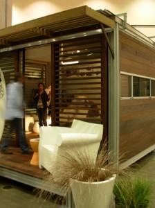
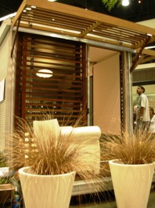
I discovered Kithaus, a cool slat-sided shelter, at the CA-Boom 07 show in Santa Monica and invited the company to be part of our book. But the young shedmaker, which uses a lightweight anodized aluminum frame, Ipe decking and louvers, and a corrugated metal roof to make its nifty, freestanding room, didn’t have a completed and fully installed structure ready in time for our photo schedule. Now, Kithaus has been picked up by Design Within Reach, which is marketing and distributing the prefabricated units. “Wondering where you can use Kithaus? How about anywhere you need a fully insulated, pre-wired comfortable space.”

SHELTER SYSTEMS
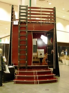
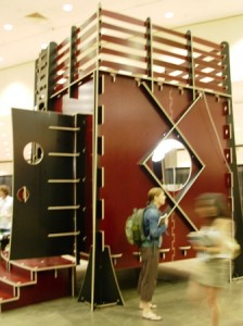
Like a three-dimensional puzzle, the “Comeback Cube” by Culver City, Calif.-based artist-architect Gregg Fleishman, is undeniably part sculpture and part shelter. It is playful and interactive in its design. Yet, it is practical, and I can see it functioning as a contemporary summerhouse. According to press material, the design features: “a full-size single-cube module in 3/4 inch European Birch, measuring 9 ft by 9 ft by 9 ft, with 81 square feet of interior space and an 81 square foot rooftop deck. The single cube is permit exempt, making for a quick and elegant temporary structure, backyard studio, guesthouse, or children’s playroom.”

On his web site, Fleishman speaks further about his design decisions:

“In architecture today, the green movement focuses mostly on the origins of material and use of energy. This work proposes that there is another way to be green in architecture, a way that focuses on process in building going beyond the factory. It is in geometry, with its repeating similar forms, and smaller similar parts that we find the advantages we are looking for. These include greater structural efficiency, manufacturing economies, easier handling, less specialized work force, and lower start up costs. What distinguishes this geometry . . .  (are) the cube and the octagon, more specifically variations of a 3D checkerboard of cubes or ‘rhombicubes.’ When oriented in different ways, these cubes have provided for a veritable bouquet of new and different building types to sprout up using faceted geometrical faces that can provide a new and more natural look and feel to our buildings.”

THE NOMAD YURT
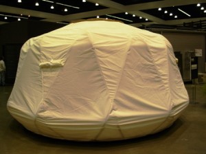
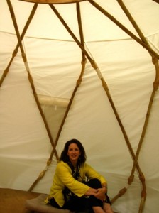
Ecoshack is an LA-based green design studio and manufacturer of architectural products such as the Nomad, a modern take on the traditional Mongolian yurt. I am fascinated by this fabric-cloaked shelter designed for use as a fully-enclosed guest room for 3 to 4, a poolside (or rooftop) lounge that seats 10 to 12, or a spa treatment room. “At night, light the interior to create a magical, private room.”

Designed by Ecoshack founder and CEO Stephanie Smith, The Nomad measures 14-ft. diameter, with an interior height just over 7 ft. Its materials include:

— Solid Core Bamboo, a renewable, flexible, strong and light material 50 times stronger than oak but lighter than steel;

— WeatherMAX FR, an advanced, exterior-grade, anti-flammable fabric that delivers “unsurpassed water repellency, mildew and oil resistance without relying on environmentally unfriendly coating compounds.”

Truly, “a yurt reinvented.”

The wacky world of Jeff Shelton and his sheds

Thursday, June 12th, 2008

The “Geranium Hut,” named so for the cluster of pelargoniums growing at its base. Designed and built by Jeff Shelton

Santa Barbara architect and shed-maker Jeff Shelton appears in my new column for the June issue of 805 Living, a local style magazine based in Westlake Village, California. The column is called ‘In the Garden.’ Not too imaginative, I know. I voted for ‘Deep Roots,’ but I think my editor considered that too esoteric. So like a million other gardening columns, we’re calling ours: ‘In the Garden.’

A blog reader tipped me off about Jeff and his penchant for designing and constructing cool little buildings, sending along a link to the “Huts” section of Jeff’s web site.

When I contacted him to schedule a visit, we had to work around Jeff’s grueling schedule: He was taking time off from his architecture practice between 10 a.m. and noon, four days a week, to teach ultimate frisbee at a middle school. Despite a demanding professional life, Jeff knows how to enjoy the moment. And, of course, this is why he loves creating his little huts.

If it’s possible for someone to be both intense and mellow, Jeff is it. His body language is relaxed, but I can tell his mind is working nonstop. Definitely an out-of-the-box architect, Jeff allows artistry and, dare I say, whimsy, to have a seat at the design table.

“You certainly don’t need skill to build these,” Jeff insisted, describing his structures as something a Dr. Seuss character might erect. While touring me around Oakleigh, his 12-acre family compound in Montecito that dates back to the 1890s (when it was a boarding school for boys), we stepped inside several of the structures, including his wife Karin’s art studio, shown here:
Using whatever was on-hand, working at his leisure during weekends, Jeff fashioned this light-filled room where Karin paints and draws. He appropriated and reassembled old windows and doors, hammered reclaimed fencing to create a cantilevered “porch” for their eldest daughter Elena’s shed, and mounted a mural-painted piece of plywood (originally used for the backdrop of a sixth-grade play) to form one wall of a shed called the Geranium Hut.

In appealing contrast to the luxury world of Santa Barbara and Montecito, Jeff’s little buildings illustrate his Less is Better philosophy:

“People miss out on coziness when their home turns into a status symbol,” Jeff points out. “My job is to try and reduce the size of a project.”

Sometimes, like the forts and tree houses of one’s childhood, the shed “is the answer for the moment,” he says.  

In addition to sharing this illustration of Elena’s Red Shed for use with my column, Jeff gave me a selection of his hand-drawn shed plans. He sketches the dimensions and construction details, makes photocopies, and sells a set of plans for $5. One two-page set of plans, titled “Gardener’s Hut,” includes front, side and back elevations for a cozy, 192-square-foot structure with a tiny loft and a sloped, shed-style roof.

The architect’s design notes appear in the margins, with tips such as “check dumpsters on large construction sites for good stuff,” “design around windows and doors that are available” and “stain wood with watered down latex; 1 gal. will last for years.” An area beneath the shed’s raised foundation is labeled: “place for dog to sleep.”

Often, Jeff helps would-be shed builders to find sources for recycled windows, salvaged wood or other pieces and parts. He is the ultimate scavenger-builder who sees a good use for materials otherwise destined for a landfill. “Save it and use it,” Jeff proclaims.

A note about writing for my “local” style publications, 805 Living magazine. Our monthly magazine has distribution in Ventura and Santa Barbara Counties, so this new gig allows me to explore in my new backyard. I’m meeting great garden designers, architects, plantsmen and women, and I feel like I’ve hit the jackpot.

In addition, editor Lynne Andujar pretty much lets me run with the ideas I find exciting. I am grateful for the freedom she gives and it reminds me of working with a few other trusting and supportive editors in my past, including Melanie Munk at The Herald and Giselle Smith at Seattle Homes & Lifestyles.

When Lynne and I met at a press luncheon last December, we discovered that we have a common past: We both worked for Seventeen Magazine early in our careers. I’m sure she was there more than a decade after I was, but even still, there is a common language for anyone who’s done that gig. Not exactly the stuff of “The Devil Wears Prada,” but kinda.

Stylish Sheds on Martha Stewart Living radio

Sunday, June 8th, 2008

Thanks to a connection made by my Seattle-based PR whiz-friend Cindy Combs, I was invited to be a guest on “Living Today,” the daily afternoon show on Martha Stewart Living Radio. The segment originally aired on April 28th, the day before Stylish Sheds and Elegant Hideaways was published.

I had a delightful 25-minute conversation with gregarious host Mario Bosquez.  We discussed the ideas and inspiration for one of my very favorite subjects: Creating Your Dream Shed.


The “Living Today” team (from left to right): associate producer Lauren Gould, producer Naomi Gabay, host Mario Bosquez, and engineer Chris Hauselt [MSL Radio photo]

The interview was completely enjoyable, enhanced by Mario’s enthusiasm and constant affirmation, which gave the impression that talking about “elegant hideaways” was to him the most exciting topic on earth!

Obtaining an audio copy of the interview was nothing short of a miracle, however. It involved (a), signing up for a free 3-day subscription to Sirius Radio; (b) setting up my crappy little cassette recorder next to the computer so I could tape the show as it streamed live on the net; and (c) racing into the other room to do the interview by phone with Mario.

Once my segment of the show was finished, I returned to my office and rewound the recording of the interview. Not only was it kind of scratchy and there were all sorts of pinging sounds from my computer (probably some kind of AOL affectation that lets you know if a new message has arrived), I also discovered that the tape ran out before the interview was over. I begged my publisher to try and obtain a professional recording from some kind of media monitoring service, but that request went nowhere.

So, finally, thanks to my wonderful collaborator Bill Wright, who figured out how to convert a cassette recording into a digital file (and who, I’m sure, devoted many hours to clean up the poor quality sound captured by my amateurish recording), we have a reasonable facsimile of the interview. Thanks, too, to Bob Meador, aka the web guru, for further enhancing and editing the file, filtering out background noises where possible, and posting the audio to my web site.

Thanks to the support of my friends, I actually have the interview to share, albeit more than a month after it originally aired. Click here to listen: Debra on MSL Radio.