Here are the four gardens we profiled, complete with my original story about each. Take a virtual tour and enjoy a slice of one of the most eclectic spots in Los Angeles.
For all the glossy magazine articles and garden-makeover shows we consume, there’s nothing like a day of garden sight-seeing to inspire the inner-landscaper in all of us.
Featuring nearly 30 properties, today’s legendary Venice Garden & Home Tour is sure to ignite your imagination – and dish up dozens of adaptable ideas for your own yard.
Don’t go empty-handed, though. Bring a camera to capture a cool architectural detail or alluring bloom, a notebook and pencil for jotting down plant names or design resources, and plenty of curiosity. In many of the gardens, owners and designers will be on hand to answer questions and share tips. Consider it affordable design research. Plus, nothing’s more fun than cruising along the canals, walks and side streets of one of L.A.’s most iconic neighborhoods.
We previewed several of the tour’s vintage cottages and sleek cubes (and the gardens, decks and balconies that surround them). Here’s a look at four favorites, including design tips from each.
Accessorize your garden with salvaged signage

A generous and genial host, Orson Bean
Orson Bean, a veteran actor and longtime resident of Venice’s canal district, has a thing for Americana, especially signage “folk art.” “It’s really just pop culture,” he says. “Advertising has always been part show biz.”
Oversized and retro, Bean’s restaurant and retail signs are well suited for the endless scale of blue sky and sunshine overhead. Their very presence in his garden brings out the storyteller in Bean.
There’s the tale of the neon billboard that’s mounted against a ficus-covered fence in the garden he shares with his wife, actress Alley Mills.
“It’s from the ‘Simple Simon’ rhyme, but it was also the logo for Howard Johnson’s restaurants,” Bean points out. “That sign was as identified as the McDonald’s arches.” Rendered in carnival-colored neon tubes, the once-ubiquitous image of a baker, a boy and his dog promised coffee and a slice of pie to drivers along the Jersey Turnpike.

Orson and Alley's vintage Howard Johnson's sign embellishes a corner of their Venice garden
The neon Ho-Jo is one of several pieces Bean has collected as garden art. He likes the way they personalize the shallow-but-wide landscape, which was created by combining three adjacent cottages and their yards over the years, beginning when he spent $113,000 for the first one in the early 1970s.
Another sign promises “Cash for Cars” and it, too lights up at night. Tucked next to a camellia shrub, a third, its faded paint beginning to chip, advertises a sheet metal shop in the hands of a cartoonish man.
There is a down side to having neon tubes so close to the lawn, where Bean’s seven grandchildren often play ball. Fortunately, he has been able to replace or repair occasional damage. “Only the chef’s hat is original,” Bean says.
Infuse the sound of bubbling water in a few square feet

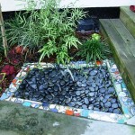
Barbara Balaban's tiny fountain with broken pottery mosaic trim
There’s not a lot of room in her 20-by-20 foot front yard but Barbara Balaban has maximized every square inch. Instead of a space-gobbling fountain, she created a tiny one, wedged between the walkway and the front steps. The 18-inch water feature uses a re-circulating pump bought at a home center. “I filled the top with river rocks and surrounded the fountain with a border of broken pottery,” says the interior designer and contractor. “I just wanted the sound of water here.”
Balaban moved to her canal cottage after fleeing a traditional Sherman Oaks house destroyed by the 1994 earthquake. Her Venice garden incorporates mosaics of broken pottery salvaged from that disaster: the fountain, a freestanding barbecue-cooking counter and a “welcome mat” at the front gate. “I reconstituted my grandmothers’ and mother’s dishes – and it gives me a big smile to see each piece,” Balaban says.

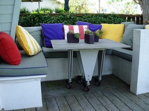
Tiny and efficient, Barbara's U-shaped eating nook seats six
During a home renovation, she retained the original footprint rather than expanding. “I kept the depth of the property the same because I wanted the garden,” she says. Studio City designers Carol Plotkin and Janet Hoskins helped Balaban rethink the miniscule landscape and incorporate a slim border filled with succulents, Mediterranean plants and whimsical art.
There’s a large glass table (on wheels) that accommodates the parties Balaban and her partner, artist Yaacov Aloni frequently throw. But when they want a quiet Sunday morning brunch, the couple lounges in a U-shaped eating nook installed in a corner of the front porch. “It’s like having a little sofa outdoors,” Balaban says. “We can sit here and be a little secluded from passersby.”
Pave the indoor and outdoor spaces with the same flooring material

Lenny Steinberg's tiled, open-air terrace overlooks the Pacific Ocean
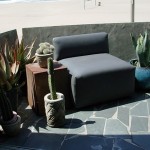
A floor covered in sultry blue-green stone leads your eyes through the soaring, loft-like space, through a 17-foot opening in a retractable glass wall and beyond the outdoor terrace, until they rest on the endless seascape.
“The stones reflect the constant color of the ocean,” say owner Lenny Steinberg of her North Carolina bluestone floor. “Although that seems to change according to the light.”
When Steinberg, a furniture and architectural designer, renovated the former duplex into a single, über-contemporary home on Ocean Front Walk, she wanted to bring the ocean indoors. She inherited a palette of irregular-shaped bluestone after a friend’s patio project fell through.

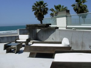
Lenny designed her chaises with distressed wood and modern lines - perfect for the rooftop garden
“It was the perfect solution for my floor, although I ended up calling all over North Carolina to get more of it,” Steinberg says. Even though the material, a hard slate, is usually installed randomly, the designer spent hours choosing the position of each stone to create a subtle pattern. “I like to think of it as a river running out to the sea,” she says.
The sea metaphor (and the bluestone) continues on the floor of the small, angled terrace that Steinberg designed to cantilever beyond the glass wall. The space serves as the intimate outdoor living room, with views of the palm trees, walkway and pier. The dark teal stone has endured intense sun and saltwater beautifully, says its owner. “If it has any nicks, I just take a little steel wool to it,” Steinberg says. “I wish everything else was as durable.”
Practice sustainable design by recycling found objects and allowing the garden to evolve over time (rushing is not allowed here)

Tim Rudnick rings his hanging cymbal-as-doorbell
Stepping through the opening in the ivy-clad fence surrounding Tim and Robin Rudnick’s home and garden, it’s possible to lose all track of time. In fact, it seems as if Tim Rudnick, an architectural designer and artist, has turned back the clock to an earlier Venice. “I like the old, tattered hippy cottage that we lived in and raised our kids – where everyone hung out on the old porch,” he says.
Circa 1913, the summer bungalow originally faced Venice’s Aldebaran Canal (now Market Street). The Rudnicks purchased it in 1984, subsequently modernizing the interior and adding an L-shaped Arts-and-Crafts style addition. The old and new portions of the family compound now embrace an intentionally tangled and untamed landscape, also of Rudnick’s design.
“I had this beautiful photograph of a Buddhist garden in Japan and I imagined our yard by looking at it,” Rudnick says. “I loved the idea that like a Japanese garden, you feel like you’re entering another world when you go through the gate.”

Lush and semi-wild, the Venice garden of Tim and Robin Rudnick
A naturalistic pond, measuring about 25-feet across, occupies the center of the garden. Rudnick used the excavated dirt to build a mounded knoll between the pond and a wraparound deck. He landscaped the water’s edge with heirloom irises once grown by his mother, native Pacific coast irises and ferns.
Several mature trees, planted as seedlings nearly 40 years ago, now tower above the rooftops: a coral tree, an olive, and four eucalyptuses. “The leafy trees give us the feeling of real separation,” he says.
Visitors announce their arrival by striking a mallet on two bronze disks, suspended from the twining branches of the coral tree. Rudnick made one from the base of a salvaged clothing store fixture; the other is a recycled cymbal. He prefers their music to a regular doorbell: “One has a very resonant sound and it goes on for 15 minutes; the other makes a beautiful, contrasting sound.”
