Debra Prinzing

Get the Email Newsletter!

Archive for the ‘Furniture design’ Category

My Mother’s Day gardening project

Sunday, May 9th, 2010

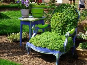
A sedum armchair. Lush and fluffy. Makes you want to sink right in. I love that the lime green arms have been painted to pick up the bright foliage.

Ever since I can remember, I was in love with a 3-piece set of wicker furniture that stood inside the enclosed porch of my grandmother Helen Winslow Ford’s home in Hammond, Indiana. 

After I wrote the above paragraph, I started asking myself “what was it about the wicker porch furniture that tugged at my heart?” Vintage wicker somehow symbolizes all the feelings of comfort, care and love that I always felt at Grandma’s house. Those emotions continued with my own mother and the home she created and kept for her family. And now, maybe I can emulate those traits here in my grownup life, for the husband and sons I care for.

That timeworn wicker – a love seat, arm chair and rocking chair – made its way from Grandma’s home on Florence Street to my mother Anita Ford Prinzing. I first remember seeing the pieces in our Portland, Ore., house (perhaps Mom inherited the furniture after Grandma passed away – I’ll have to ask her).

Mom updated the 1940s seafoam green wicker with a coat of 1970s chocolate brown paint. She replaced the aging seat covers with cushions of a quilted rust-orange-sunflower yellow patchwork print. 

Soon after Bruce and I married in 1984, Mom gave me the rocking chair. I took off the curved “rocker” sections and converted the piece into an armchair. I painted the woven wicker a soft blue-gray. The new cushion was covered in a tiny blue-and-raspberry polished cotton print. I also gathered and piped a cover to hide one of the chewed up arms.    

The shredded weft and warp of the wicker was the fault of mom and her brother’s childhood dog. Consequentially, the chair was always considered a bit junky because you couldn’t sit in it without your sweater sleeve snagging on the bits of wire sticking in every direction.    

Later, my parents shipped me the wicker love seat. I am not sure how I got so lucky because I know my brother Scott and his wife Kris used it for a while. But somehow my teenage “request” to inherit the piece lodged in my mom’s memory and she sent me the brownish wicker love seat in 1997, after she had owned it for more than two decades.

That was the year we lived in a 2-bedroom apartment with a newborn (Alex) and a 5-yr-old (Benjamin) in Seattle’s Madison Park while building our dream house in nearby Seward Park. I remember the enormous box arriving from UPS or some other shipping service. I had to open it in the courtyard outside, because there simply was no space in our apartment to do so.    

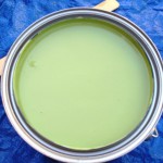
My yummy green paint choice - a perfect garden color!

Recently, after downsizing, my parents arrived to see us in Southern California while en route to their place in Mesa. The “good” wicker armchair (the one the dog didn’t eat!) was wedged into the back seat of their car. Personally delivered by my folks, the chair has joined its love seat companion on our back patio. Both pieces now need a face lift but they are in good shape considering they are at least 70 years old. I’m thinking of painting them glossy black and adding lime green cushions with black piping. Won’t that look modern?!   

Mom told me, “I’m going to give you the nice chair but only if you promise to get rid of the one that’s unraveling.”    

I said, “Okay, I’ll stop using it to entertain garden guests. But is it okay if I find a spot for it as a piece of art in the garden?”    

She couldn’t say no!    

Today I started the makeover of my Grandmother’s wicker chair

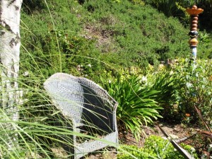
Last fall, I removed the disintegrating cushion and seat, and placed the bottomless chair out in the garden. Yup, it’s in the right place. For months, I’ve wanted to paint it lime green and “plant” the seat and torn-up arm section with sedums and other succulents.   

I have admired planted chairs before. Last summer I saw a peacock blue chair in a garden display at the Ventura Co. Fair. Its seat and back were planted with succulents. Luscious! [see my photo – above]    

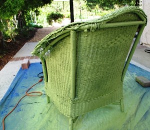
So today, my Mother’s Day gift to myself was to dig out the electric paint sprayer, clean off the chair’s wicker framework, and head to the hardware store for paint. I came home with an outdoor-ready semigloss in a color I can only think to call guacamole green.    

The painting is finished. Doesn’t it look great? Perhaps it needs a second coat after this one dries. I’ll do that tomorrow, before the demands and deadlines of the coming week take over my calendar.    

The new-leaf green, aka “guacamole green” will transform the old wicker

Next: I want to fill the empty seat area with a panel of 1/4-inch mesh sheeting. I have a piece lying around from a planting project a few summers ago. I  used it to anchor some succulents into a path and stop some critters (rabbits? possums?) from digging up the plants each night.    

The mesh will create a supporting base for moss, which will be covered with a shallow layer of potting soil-cactus mix as my planting medium. Into that, I’ll plant a new “cushion” of all sorts of sedums. Voila! My long-awaited planted chair.    

I’ll post photos as I go along. I’m also thinking of using the mesh to contain soil behind the gaps created by Mom’s hungry dog so I can plant a few more succulents there.

I don’t remember much about her family pet other than that the dog’s name was Sue-Sue. According to Mom, my grandfather used to open the front door and call out to the dog: “Oh, Susanna!”    

That’s a silly story, but I remember it made me laugh as a girl.

LA in BLOOM

Thursday, May 6th, 2010

Gregg Fleishman's "Puzzle Prefab Shelter" and Laura Morton's dog shelter with a planted roof were two features of the New California Garden, designed by members of the Association of Professional Landscape Designers/Greater LA Chapter

During the weekend of April 30-May 2, the 127-acre Los Angeles Arboretum & Botanical Garden presented “Living Green: Essentials for the Home Gardener,” an outdoor flower and garden show that was an essential place to welcome the spring growing season.

The LA Garden Show seems to expand in size and style each year, adding exciting and informative speakers on topics ranging from sustainable design (“Green Architecture: Volume and Shape in the Mediterranean Garden,” by Gary Jones) to edible gardening (“Ten Trees in One: Grafting Citrus and Avocados,” with Darren Butler).

There are al fresco-style gardens, planted in or on top of real soil, just like Chelsea and other outdoor garden shows, which I think is a vast improvement over those dark, fluorescent-lit caverns that house indoor displays.

And of course, while the somewhat aggressive male peacocks are strolling and squawking, the two-legged garden show-goers are chatting with designers, snapping pics, waiting in line for lunch (I loved my chicken tacos, served with fresh cilantro), and, of course, doing some plant- and art-related retail therapy!

One of the Arboretum's resident peacocks strolling the greens

I mention shopping because as far as I’ve been able to discern, the marketplace at the LA Garden Show is one of the very best stops for plants, garden art, accessories and other must-have items for the horticulturally-inclined.

 I only wish it lasted longer than 3 days because I didn’t get around to all the plant-sellers, horticultural societies, garden accessory purveyors and other vendors. I learned that efforts by the Arboretum’s volunteer marketplace managers resulted in nearly twice the number of exhibitors this year over last. It was a well-curated lineup of offerings (thankfully, no schlocky stuff).

The festive and enticing Garden Markeplace - where we all engaged in a little horticultural retail therapy

I checked in with a few of my favorite folks including Pacific Horticulture Magazine, Southern California Horticultural Society, Leslie Codina Ceramics and TerraSculpture.

A tiny tabletop landscape by Smallweeds

 A new discovery: Smallweeds, which designs miniature tablescapes and also sells miniature accessories for making your own tabletop and fairy gardens.

I did a lot of browsing and gabbing with old and new friends, a little shopping, and a lot of note-taking while spotting new products, themes and trends. One of my very favorite picks of the weekend is the powder-coated obelisk series, created by Annette Gutierrez and Mary Gray. The women own Pot-ted, an eclectic, must-visit garden shop on Los Feliz in Los Angeles.

Yowzer! Shiny and bold, the powdercoated metal orbs are the hot, new "objet" for your garden.

As experienced and artistic film industry veterans, the women sure know how to create high style on a shoestring. They also know that it’s often easier to design something themselves rather than wait around for the marketplace to catch up with a need or opportunity.

Thus, the colorful objets for the garden, seen at left. Can’t you just imagine how elegant and artful these spherical shapes would look, grouped one, two, or three on a lawn, a gravel patio, or even tucked into a perennial border with stems and petals weaving in and out of the openings?

Annette and Mary aren’t claiming to have invented the ringed orbs (some of the earliest ones were made from leftover steel straps used to hold wine caskets together). But they do love the way the steel shapes take to easily to the powdercoated color. And since aqua and orange are the Pot-ted purveyors’ two favorite garden colors, they started with this palette. You can visit the shop or call to inquire about shipping. There are three sizes and boy do they look awesome: 30-inch ($169); 24-inch ($139) and 18-inch ($98).

READ MORE…

Keeyla Meadows colors her garden world

Sunday, December 20th, 2009

Note: A version of this Q&A appeared earlier this week in “LA At Home,” the Los Angeles Times’ daily home and garden blog.

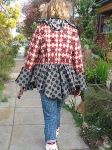
Mary Ann caught one glimpse of the awesome coat and matching socks . . . and said - Hey, that's Keeyla Meadows!

Mary Ann caught one glimpse of the awesome coat and matching socks . . . and said - Hey, that's Keeyla Meadows!

Los Angeles native Keeyla Meadows lives in Berkeley where she makes art and designs gardens. Her cheerful, 50-by-100 foot city lot is a living canvas packed with life-sized female figures and not-so-perfect vessels, hand-built in clay and glazed in a palette of turquoise, apricot and lavender.

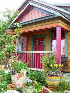
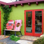
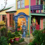
An exuberant color palette that few would dare to use - here's Keeyla's Berkeley bungalow and street-side "sunset" garden

An exuberant color palette that few would dare to use - here's Keeyla's Berkeley bungalow and street-side "sunset" garden

No surface here is left unadorned. Whether it’s her swirly ceramic paving, custom metal benches or sculpted walls, Keeyla artistically places favorite objects and plants with a carefree confidence that few of us can master.

Fans of Keeyla have long admired her award-winning gardens, including a ‘Best in Show’ at the San Francisco Flower & Garden Show a few years back. Her beautiful first book, Making Gardens a Work of Art, was published in 2004 by Sasquatch Books, a Seattle imprint that also published my first book, The Northwest Gardener’s Resource Directory.

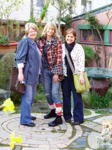
Lorene and me ~ gal pals in Keeyla's garden

Lorene and me ~ gal pals in Keeyla's garden

In 2008, I lucked into an impromptu visit to Keeyla’s personal wonderland when my girlfriend Mary Ann Newcomer boldly followed her into Café Fanny’s in Berkeley, an Alice Waters bistro, and snagged an invite for our group of breakfasting garden writers.

Lorene Edwards Forkner, Mary Ann and I hopped in the car and followed Keeyla to her bungalow, a few blocks away. It is fair to say we were hyperventilating!

“You can take photos, but don’t publish them until my book is out,” Keeyla requested. It was the least we could do, having feasted our eyes on her botanical paint box, imagining how we might try her playful ideas in our own backyards.

9780881929409_CMYKHer new book, Fearless Color Gardens: The creative gardener’s guide to jumping off the color wheel (Timber Press, $27.95), has just been published. Filled with Keeyla’s photography of design projects, as well as her doodles and sketches, it reads like a colorist’s memoir, complete with a muse named Emerald.
Strong on fantasy, it’s also a useful workbook for garden owners who need a nudge toward the more vibrant end of the color spectrum. I recently asked Keeyla about the book.

Q: How do you teach students to feel confident as garden designers?

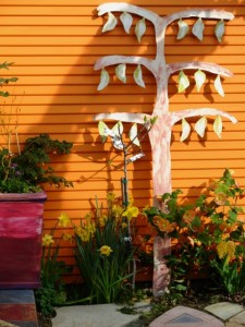
Keeyla's color sensibility is in her DNA as evidenced by the orange side of her house punctuated by a tree-inspird sculpture

Keeyla's color sensibility is in her DNA as evidenced by the orange side of her house punctuated by a tree-inspird sculpture

A: A lot of people have this mantra that says, “I’m not a creative person. I’m not an artist.” Our lives are built around the practicality of what we have to do everyday so many people shut those doors to creativity a long time ago. I suggest you treat garden design like something you do all the time. The physical activity of placing plants in a space can be as easy as folding laundry and putting it away, or setting the table, or baking a cake.

Q. How can I make a landscape project feel less overwhelming?

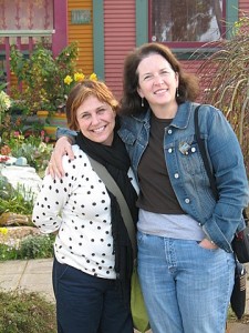
Mary Anne Newcomer, Keeyla Meadows and Lorene Edwards Forkner

Mary Anne Newcomer, Keeyla Meadows and Lorene Edwards Forkner

A. I suggest you divide your space up like a series of photographs or like windows.

Decide what “picture” you’re working with, where it starts and ends. Start with looking out the kitchen window and use plants and art to fill the frame.

Q. Where does your color inspiration come from?

A. A lot of my color sense comes from growing up in Los Angeles and living with its “colorfulness” – the light, tile work and Catalina Island all inspired me. Right now, I’m designing a new garden for the San Francisco Flower & Garden Show in March. It’s a habitat garden and the colors I’m using come from the red-headed garter snake, an endangered snake from the San Mateo coastline. It has a read head with a turquoise and red stripe down the back, so it’s providing my design motif, my imagery and my color combination.

Jump off the conventional Color Wheel and play with Keeyla's Color Triangle

Jump off the conventional Color Wheel and play with Keeyla's Color Triangle

Q. How do you suggest people “jump off” the color wheel?

A. The traditional color wheel makes my head spin. I use a color triangle, which is so stabilizing. I put blue at the top of the pyramid – it represents the sky. The other two points are red and yellow. Between the three primary colors are the secondary colors. On either side of any point is a harmonic chord of color. You’ll never go wrong if you take one of the points – red, yellow or blue – and use one of those chords of color on either side of it.

 Q. How do you balance artwork with the plants in your garden? 

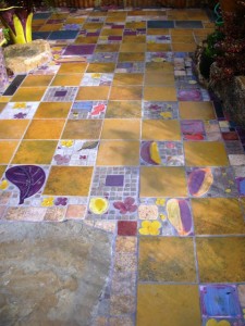
A checkerboard of color in a patio installation

A checkerboard of color in a patio installation

A. Art gives me a constant relationship to plant against, a very stable feature to move through the seasons with.

Art creates so much focus and orients the whole space so one is not always reinventing. It is like a stage setting.

The artwork and hardscape set the stage for your plants to really become the stars.

Here’s a quote from Keeyla’s book that seems apropos:

“In my gardens, color refers to everything – absolutely everything. I don’t just make a bland holder, a neutral vase, for colorful plants. Color includes the rocks, the pavings, and the artwork. It also connects up with the color of the house and the sky above. So it’s really like bringing the camera to your eye. When you take a photo, you are looking at everything in the frame. In creating color gardens we will look at everything that is part of the garden picture. . . “

More photos to share from our visit to Keeyla’s magical garden:

Here’s how her garden influences one textile designer

Thursday, November 12th, 2009
Sina Pearson relies on regular visits to her island garden in Washington state to inspire her teextile designs.

Sina Pearson relies on regular visits to her island garden in Washington state to inspire her teextile designs.

I met Sina Pearson in 2006 when her publicist Susan Harkavy arranged a visit to the textile designer’s aerie (aka studio, atelier, loft) in SoHo.

I was in New York City with Bill Wright to photograph an amazing glass-and-steel West Village “shed” for Stylish Sheds and Elegant Hideaways, but I took a side trip for an hour to meet Sina and see her work.

She grew up in Washington State and studied art and textiles at the University of Washington. Our common Pacific Northwest roots gave us an easy, mutual language, designer-to-writer, as we talked about her interests, influences and passions.

Recently, Garden Design magazine invited me to profile Sina as “One to Watch,” with a short Q-and-A that appears in the November-December 2009 issue. Due to space, a portion of my interview did not make it into the print edition. So here it is in full, along with some photos that Sina shared from her garden in Washington’s Fidalgo Island (Skagit Valley).

Garden Design NovDec001ONE TO WATCH:

Textile designer Sina Pearson may live and work in SoHo but trips outside the city inspire her saturated stripes and vibrant abstracts.

She spends one week each month at a remote island cabin in Washington State, surrounded by a semi-wild garden, just steps away from the 1950s A-frame where she played each summer as a child. Sojourns abroad include idea-gathering places like Scandinavia, France, Mexico and the Caribbean. Collectively, these design “threads” are woven into finished cloth: confident, evocative – and high performance – textiles for residences, hotels, restaurants, offices and outdoor settings.

sina-pearsonThe designer, manufacturer and entrepreneur trained in fine arts and textiles at the University of Washington before earning a MFA in textiles from Cranbrook and studying at the Royal Academy of Arts, Crafts and Design in Stockholm. She launched Sina Pearson Textiles in 1990.

Pearson reinterprets outdoor fabric that looks as if it belongs inside, including terrycloth, chenille and boucle cloth made with Sunbrella® yarns for sunfast, stain-, rain- and mildew resistance. Her newest collection, out next spring, is called Colores de Mexico. Her influence? The orange-striped, hand-woven Mexican curtains that Pearson’s mother hung in the family’s beach cabin. “It has an ethnic, modernist vibe with a serape-like texture,” she says.

 Q. Tell me about your Fidalgo Island garden and how it informs your textiles:

 A. I could not be doing what I’m doing if I didn’t have my garden. It frees my soul and lets me experiment with weaving colors and textures together. The way I work in my garden is very much how I work in textiles. I’ve always maintained that you have to listen to what the fabric wants to be – it’s a wonderfully slow process. Similarly, I have to let my garden design itself. I observe how each plant color works together, how each season is revealed in flower, foliage and blade.  

Q. What influences you as a designer?

A. I can’t separate how I’ve grown up from what I am now. My parents were so visual – my mother was a landscape designer and my father was a photographer. We had Jack Lenor Larson’s textiles in our house. I cannot remember a time when I was not playing with fabric. Family legend recalls me cutting textiles into small pieces and arranging them on the sofa when I was two. At 12, I learned weaving from a Swedish woman and batik design from Ruth Pennington, a very fine metal artist. I created a huge, abstract piece of batik silk with fuchsia pink, bright orange and red colors. We hung it up in the sun and it looked like a stained glass window. Ruth turned to my mom and said: “Sina has a career in textiles.”

Q. How is your Scandinavian heritage reflected in your work?

A. I grew up with Danish modern furniture and I double-majored in Swedish language and literature in college. I also lived and studied in Sweden. When I design, I am looking for “emotion” – the feeling conveyed by yarns, colors and textures in my fabrics. After my last trip to Scandinavia, I created a collection evocative of what my ancestors would have woven to wrap themselves in for warmth: soft, heathery “comfort” fabrics that are hand-crafted, quiet, simple and dignified.

cote d azur_03Q. How have you re-imagined outdoor fabric as something more than utilitarian?

A. When I first started in the contract fabric industry in the late 70s and 1980s, everything was rather plain. That all changed when I went to Unika Vaev as president and design director. We introduced the first tapestry for contract interiors. Herman Miller put our tapestries on its new paneling system and broke open the whole concept of patterned fabrics.

The same thing has happened now that I’m designing outdoor fabric with Sunbrella® yarns. I wanted to invigorate outdoor fabrics with modern designs. I’m a big proponent of mixing cool and warm colors together. I also like to use neutrals – sage, taupe, mid-tone brown – with brighter colors to give a reference to nature.

Q. What is the ideal exterior setting for Sina Pearson’s textiles?

IMG_3265A. A space where the interiors blend with nature as occupants move from indoors through a covered area to the outdoors. I love to see complementary fabrics and colors in all three environments. I don’t design my outdoor fabrics separate from my interiors collection. My outdoor fabrics look and feel just like indoor textiles, yet they are made with high-performance fibers for resistance to sun, mold and mildew.

Q. What is on your drafting table right now?

A. I have little piles of yarn sitting on my desk. I’m playing with brighter palettes to create fabrics with clean, crisp colors of summer. I’m also playing with simple shapes, hand-cutting paper into geometric forms – stripes and flowers. I find it very satisfying. I look like a second-grader, sitting on the floor cutting out bits and pieces.

–Debra Prinzing

Meet a beautiful – and sustainable – landscape

Friday, August 28th, 2009
Mike Mcdonald, a Green Builder and Visionary

Mike Mcdonald, a Green Builder and Visionary

gardendesign004Garden Design magazine asked me to profile one of its “Green Awards” winners for the September-October issue, which is out on newsstands this week.

The story is about a lovely, sustainable landscape designed to complement the cutting-edge, eco-architecture of Margarido House in Oakland.

Margarido House is the creation of builder-owner Mike McDonald of McDonald Construction & Development, and his architect-brother Tim McDonald of Philadelphia-based Plumbob.  The brothers and their multiple collaborators have created a stunning residence that earned the highest (Platinum) rating from the U.S. Green Building Council. It is the first home in Northern California to obtain the LEED-H Platinum Award (Leadership in Energy and Environmental Design).

gardendesign005What makes this garden and its home sustainable?
1. It’s Permeable : The patio, roof and driveway surfaces are designed to capture all of the property’s storm water runoff. The driveway’s decorative design uses recycled and perforated Pavestone concrete tiles. Water percolates into a 4,000-gallon cistern hidden under the driveway and, when needed, circulates through the property for irrigation and flowing through the Zen garden’s piped fountain. “We’ve created a self-contained water loop,” Mike points out.

 2. It’s Durable: Garden designer Lauren Schneider of  Wonderland Garden and Landscape in Oakland, chose a diverse, drought-tolerant plant palette. She worked closely with local growers to specify California native varieties, as well as plants from many Mediterranean regions, including South Africa, Australia and New Zealand, South America and Mexico. She closely observed the garden during its first year to evaluate whether each plant was durable enough to survive Oakland’s dry summer conditions with infrequent water.

 3. It’s Reusable: Recycled concrete is the basis for Margarido House’s über-modern S-curve chaises, tabletops and sleek urns, which contain succulents, bamboo, and New Zealand flax. Created by Bay Area Concreteworks Studio, which also fabricated interior concrete counters, the products satisfy LEED’s “local” and “reusable” criteria. Other outdoor furniture also has recycled content, including Room & Board’s  “Emmet” Adirondack-inspired chairs, by Loll Designs, made with 100 percent recycled high density polyethylene (plastic).

Margarido House, enhanced by a soft, sustainable garden

Margarido House, enhanced by a soft, sustainable garden

One of the key scoring factors in earning this ranking is Lauren’s sustainable landscape design.

Dreamy and naturalistic, the garden is an organic counterpoint to the geometric architecture.

Lauren actually created three distinct gardens – one on the ground; one in the air; and one that climbs an incredible vertical retaining wall and has multiple sections for planting (not to mention a melodic water feature to attract birds).

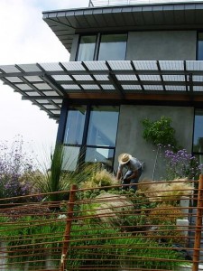
Photographs of the Margarido’s rooftop garden weren’t included in the Garden Design layout, due to space constraints. I wanted to make sure and show some here. The rooftop is pretty stunning, and not just because it has killer views of San Francisco Bay. It is installed on top of a capillary mat and layer of geo-textile material; over this base are “three inches of horticultural pumice as a drainage medium and five inches of lightweight planting mix,” Lauren explains.

Garden designer Lauren Schneider gave me a personal tour of Margarido House's exterior spaces

Garden designer Lauren Schneider gave me a personal tour of Margarido House's exterior spaces

The dramatic design includes sedums and sempervivums, golden barrel cactus, lewisia, Cleveland sage, lavender, deer grass, and Libertia peregrinans, a New Zealand iris relative valued for its bronzy-orange blades.

This garden provides top-down insular qualities that cool or warm the home, depending on the season. Flowers and stems of Cleveland sage, silhouetted against the sky, can even be seen through the skylight that illuminates the master bath. The roof garden invites its viewers to look close and study the interplay of plant colors and forms. In an abstract way, they echo the distant scenery where treetops and buildings form an irregular city skyline.

You can read the full story here. And enjoy this gallery of photos that I shot when visiting this past May. You’ll see details that caught my eye and get a fuller sense of this amazing landscape and home.

Stylish Chicken Coop in Santa Barbara

Sunday, August 16th, 2009
A tiny chicken coop with loads of style

A tiny chicken coop with loads of style

Last week’s visit to Santa Barbara included a stop at “Rooms & Gardens,” a wonderful home furnishings, antiques, accessories and interior design emporium on State Street.

I needed to check out the store’s new backyard chicken coop and garden.

Owners Eric and Jami Voulgaris recently created the sweet coop and romantic garden, where four Buff Orpington hens reside.

When I met Eric a few weeks ago, at the Santa Monica “Rooms & Gardens” store (they own this location with a partner, actress Mary Steenbergen), he told me about the chicken coop project.

The little building measures about 6-by-6 feet in size, with a charming shingled roof, board-and-batten siding, a country-style screen door and shutters. Stained that dreamy grey-blue shade, it looks both elegant and timeless.

A curved cobblestone path leads from the store’s back door out into the postage-stamp-sized garden. Picket fencing contains the four gals in their little yard.

The Voulgaris children named the Buff Orpington chicks, born on Easter morning: “Henny Penny,” “Rosy,” “Cornflake,” and “Scramble.”

The 800-square-foot garden’s renovation came about because it had to be ripped up when the neighboring Apple store was moving in. When that construction came to an end, Eric and Jami saw it as a chance to dress up the space, which really hadn’t changed much since Rooms & Gardens opened 16 years ago.

Happy chickens living in a happy garden

Happy chickens living in a happy garden

Pretty and inviting, a corner garden

Pretty and inviting, a corner garden

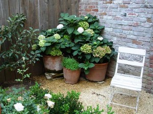
Fully organic, the Martha’s Vineyard-inspired garden is landscaped with espaliered apple trees, Meyer lemon trees, ‘Iceburg’ roses and clumps of lavender. One corner holds a display of potted hydrangeas and an iron chair.

The garden and hens complement the carefree lifestyle settings inside Rooms & Gardens. Eric describes the store’s look and feel as “a fusion of British Colonial, ethnic accents, Chinoiserie and a relaxed coastal theme.”

I love the happy vibe that you feel upon entering. It’s a store where sink-into furniture is paired with uncommon accessories, all of which suggests well-loved and well-lived-in environments.

The garden is open to visitors during store hours. If you want to taste the yummy brown eggs produced here, check with the staff. Eric mentioned that a plan is in the works to supply Tuttini’s, a cafe around the corner, with their daily source of eggs!

Fun at the Ventura County Fair

Tuesday, August 11th, 2009

My lifeblood is comprised of words, sentences, paragraphs, stories. I am definitely NOT a writer of “short” blog posts. But sometimes, I do have to defer to the photographs to tell a story. So today, you will be treated to mostly photos of our afternoon at the Ventura County Fair in Ventura, California. After years fighting the crowds, strollers and sticky run-ins with cotton candy at the King County Fair in Puyallup (Washington), I have to say how nice it is to take in a smaller fair with fewer bells and whistles. With the charming theme, “Homegrown and Pure-Bred,” Ventura’s is the perfectly-sized county fair. Of course, when you go on a Monday afternoon, you’re not going to encounter the weekend crowds. So we did.

What follows are my favorite images of the day. The fair continues through Sunday, August 16th. For details, click here:

RIDES TO THRILL

What a beautiful whirligig. The figures against the blue sky are flying around. The machine's carnival-colored design is beautiful.
What a beautiful whirligig. The figures against the blue sky are flying around. The machine’s carnival-colored design is beautiful.
The giant slide. A ride down the track on a burlap sack couldn't be more fun. My son Alex is nearly prostrate, on the green slide; his friend Philip is racing down the orange one.

The giant slide. A ride down the track on a burlap sack couldn't be more fun. My son Alex is nearly prostrate, on the green slide; his friend Philip is racing down the orange one.

 JUST FOR LOCAVORES

A prizewinning Hubbard squash in the Agricultural Building caught my eye. I'm growing one in the garden, but she won't be this big for a while yet.

A prizewinning Hubbard squash in the Agricultural Building caught my eye. I'm growing one in the garden, but she won't be this big for a while yet.

CRAZY FARM ANIMALS
Turkey racing. Words cannot describe this silly event, but we loved it!

Turkey racing. Words cannot describe this silly event, but we loved it!

More turkeys, including the brown ones.

More turkeys, including the brown ones.

FLOWER POWER
The "Floriculture" displays featured some outdoor gardens. Here's my very favorite: The "Flower Bedroom." I've seen planted beds before, but none as fanciful and well-executed as this one. Note the succulents spilling out of the dresser drawers, too!

The "Floriculture" displays featured some outdoor gardens. Here's my very favorite: The "Flower Bedroom." I've seen planted beds before, but none as fanciful and well-executed as this one. Note the succulents spilling out of the dresser drawers, too!

A sedum armchair. Lush and fluffy. Makes you want to sink right in. I love that the lime green arms have been painted to pick up the bright foliage.

A sedum armchair. Lush and fluffy. Makes you want to sink right in. I love that the lime green arms have been painted to pick up the bright foliage.

BACK TO WORK
 
Today I’m back at the desk, doing interviews for an article for a garden trends story that will run in a future issue of Alaska Airlines magazine. Alex and his friend are back to Junior Lifeguard training. We had a great day at the fair! After all that frivolity, we ended up only eating two roasted corn-on-the-cobs and one powder-sugar-flocked funnel cake between the three of us. Even still, by the time we came home at 8 p.m., both guys had headaches and stomachaches. That’s what going on all those spinning rides will do to you. Me, I’d rather look at produce, pigs, and pretty plants.

How to dress up your patio

Monday, June 22nd, 2009
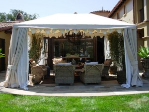
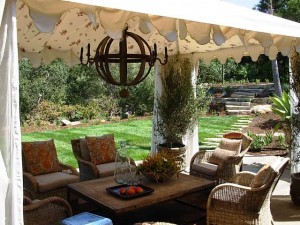
A custom tent with side draperies and scalloped details creates a secluded, breezy patio retreat

A custom tent with side draperies and scalloped details creates a secluded, breezy patio retreat

Interior designer Deborah Campbell knows how to turn an ordinary patio into a place you’ll want to visit often — and perhaps never leave. Use her design ingredients to create a private respite where you can rejuvenate and collect your thoughts.

The Santa Barbara-based principal of Deborah Campbell Interior Design transformed two private patio spaces into outdoor rooms at Casa Robles, the design showcase that benefits CALM (Child Abuse Listening and Mediation, a Santa Barbara nonprofit organization whose mission is to end child abuse).

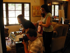
On location: Gary Moss, photographer (kneeling), as he perfects his shot in the family room. His assistant Pam is to his left; 805 Living editor Lynne Andujar is at right

On location: Gary Moss, photographer (kneeling), as he perfects his shot in the family room. His assistant Pam is to his left; 805 Living editor Lynne Andujar is at right

As part of the 805 Living Magazine team that created the CALM Showcase program, I wanted to see the finished project in person before the public tours close this coming Sunday, June 28th (see details below). 805 Living is the presenting sponsor of the event, and editor Lynne Andujar asked me to write a feature story about the home and interiors for our November 2009 issue. This morning I drove to Santa Barbara to see and tour the project. Lynne was there with photographer Gary Moss, shooting the interior and exterior spaces for my story. They captured some gorgeous, evocative shots! Can’t wait to see them in print.

I also met several of the designers involved in creating the new house, including Annette Flower (who created the family room off of the kitchen), Gillian Amery of The Kitchen Company, and Deborah Campbell. The other key persons on the creative team include Christy Martin of Studio Encanto, the primary interior designer; Harrison Design Associates, the architecture firm; Lindsay Adams Construction, the contractor; and Katie O’Reilly Rogers, ASLA, landscape architect (who created the patio’s proportions and selected the beautiful Ashlar-laid stone).  

Create an outdoor room with a Sunbrella fabric tent lined with sheer panels and Morrocan print fabric on ceiling

Create an outdoor room with a Sunbrella fabric tent lined with sheer panels and Morrocan print fabric on ceiling

Deborah Campbell’s design for the living room patio is completely enchanting. In studying and photographing it, I realized that her design, which she calls “Soft Summer Breezes,” offers a perfect recipe for decorating any patio.

Of course, it would be tres bien to turn your own patio into an open-air Kasbah with a custom-made canvas tent lined with sheer fabric and Moroccan toile draped across the ceiling.

But if you can’t do that, try creating an overhead fabric ceiling from yardage, sheets or tablecloths that suit your fancy.

Remember when you were a kid and you clipped two sheets to a clothesline and then pulled them out at the bottom to anchor as the “sides” of your makeshift tent? Ingenuity like that is priceless – we all need to remember our childhood shelter-making ideas and re-purpose them as adults.

Here’s a quote from Deborah:

“I am inspired by the Mediterranean architecture and Santa Barbara’s mild, year-round climate. I wanted to create outdoor rooms to capture that casual lifestyle. My personal style is always loose, relaxed, and eclectic. Nothing is perfectly arranged . . . because I wanted to give a sense of our California casualness.”

DECORATE YOUR PATIO

Try these patio design elements to decorate your outdoor room, straight from Deborah’s drafting table:

rug
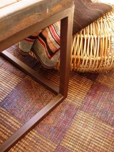
Rugs:  A vintage Moroccan area rug is layered over a jute outdoor rug. The rug is protected from sunlight and rain. If you don’t have a covered area, look for one of the new, cool weatherproof rugs, such as Pier 1 imports’ selections. The Moroccan rug is from Upstairs at Pierre LaFond, Santa Barbara. Also shown here is the rattan “Poof” floor cushion, from Porch in Carpinteria. It echoes texture from the wicker chairs and invites you to perch, curl up your legs, and rest your drink on the coffee table.

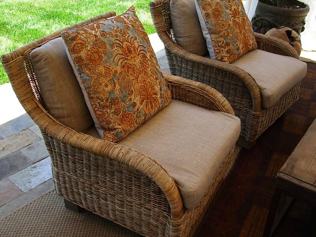
seating-textilesSeating: Deborah selected wicker occasional chairs and piled them high with eclectic textile pillows and basic driftwood-colored linen cushions. The chairs evoke life at the beach, from Porch in Carpinteria.
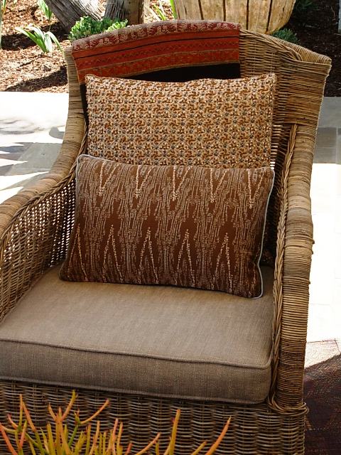
more-textilesTextiles: Pillows galore lend one-of-a-kind interest and beautiful textures. They tell a narrative of an owner who has traveled widely and who loves to pair old with new; worn with polished; rustic with refined. Pillows from Upstairs at Pierre LaFond and Rooms & Gardens, both in Santa Barbara.
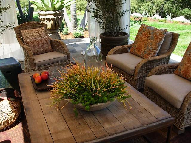
coffeetableTables: Weathered and worn, the plank-topped coffee table is large enough to do double-duty as an al fresco dining table. It is by Brick Maker, available at Porch.
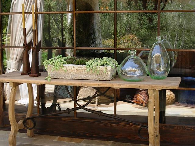
tables

The “Scroll” console table is perfect for displaying objects or setting up a picnic buffet on a cool summer evening.

wine-stave-chandelierLantern: Okay, the over-sized lantern is a gorgeous thing to behold. I love, love, love that Deborah went BIG in scale in selecting this element of her design. It is called a “Wine Stave” chandelier, made from old wine barrels. You can kind of see the influence in the wood rings. I wish I could have photographed it while lit, but if you squint, you’ll get the idea. This lamp-chandelier makes the design sing! It’s from Porch.
objects

objects2

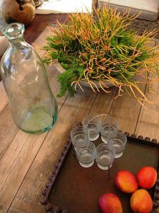
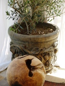
Objects: Decorative orbs (right) are made from burl root and lend another distressed texture to the space. Spanish hand-blown glass bottles look like beach glass (left). All of these items are from Porch.

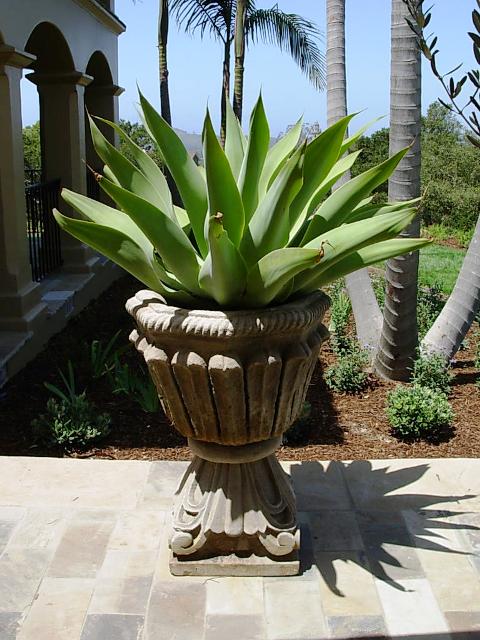
killer-agavePlants: Drama is key. Each plant needs to have presence in the space, almost as sculpture. The mature Agave, potted in a cast concrete urn, is one example. (Above): The cast-concrete bowl, planted with Euphorbia ‘Sticks of Fire’ is another.

MORE DETAILS:

Casa Robles is an exquisite, historic property originally designed by Chester Carjola in 1948. The modest California ranch, situated on a oak-studded hillside with views of the famed Santa Barbara Mission, has been completely transformed and reimagined to capture the essence of a California Spanish Colonial estate. Most of the rooms open onto an interior courtyard, outdoor patios and second floor terraces. Enlarged to 4,500-square-feet, the home is situated on a two-acre garden.

In addition to the generous homeowners, volunteer architects, interior designers, landscape architects, contractors, craftspersons and artists have come together to create, furnish and landscape a beautiful showcase home. It is open to the public through June 28th to benefit CALM. Tickets are $30. Click here for more information.

Deborah Campbell Interior Design: 805-969-9657.

Preview: CA|Boom Design Show 2009

Friday, June 19th, 2009

UPDATE: All four sets of FREE tickets have been claimed, compliments of Charles Trotter, show producer.

caboom001The 6th annual CA Boom Show takes place Friday, June 26th through Sunday, June 28th  in the former Robinsons flagship department store on the corner of Wilshire and Santa Monica Boulevards in Beverly Hills.

I originally learned of CA|Boom when I was still living in Seattle. My friend Ryan Grey Smith, creator of Modern Shed, exhibited at the first CA|Boom Show. He had a great response — from the public and the press – to his simply designed, prefabricated sheds. Little did I know then that I would move to LA in 2006! I attended CA|Boom in 2007 to find an exciting, inspiring and comprehensive introduction to contemporary design from A to Z.

A favorite place for incubating companies and products making their debuts, the show draws both the design trade and design savvy consumer. CA|Boom has grown exponentially in its complexity and hipness, combining everything relating to modern design under one roof. This season’s lineup features domestic and international designers, furniture and home manufacturers and architects.

You can also sign up for shuttle tours to never-before-seen LA architecture, including the Sunset Plaza residence designed by Assembledge+, an LA-based architecture, development and sustainability design firm. (PS, I toured it today and – WOW – what an amazing project. Read on for details . . . ). You can also visit Pierre Koenig’s Case Study House #22, aka The Stahl House, as part of special shuttle tours on Friday and Saturday.

One of the 5 homes on the June 27-28 CA Boom Show's LA architecture tour, designed by Assembledge

One of the 5 homes on the June 27-28 CA Boom Show's LA architecture tour, designed by Assembledge

Today, the press was invited to tour the Sunset Plaza house and meet its designers, Kevin Southerland and David Thompson of Assembledge+. I headed to LA with my friend Jennifer Gilbert Asher, garden designer, artist, and co-creator of TerraSculpture (check her out in the July issue of Garden Design!).

We walked into the house and were assaulted – in a good way – with the breathtaking view of a gorgeous infinity pool that drew our eyes to the LA skyline. We met owner Brad Blumenthal, who graciously opened his home for CA|Boom tours.

I said, “oh, I understand you worked with the design firm Assembledge (which I pronounced with my 11th grade French accent as “aah-sim-BLAAGE”).

Jennifer Gilbert Asher and me in Brad Blumenthal's "Hideaway Lounge"

Jennifer Gilbert Asher and me in Brad Blumenthal's "Hideaway Lounge"

Obviously, that was too funny to Brad, who just started laughing and speaking to me in French.

Duh. I guess the firm’s name is pronounced “a-SEMM-blidj,” with hard vowels, Americanized. 

That was the funniest moment of the day, but it kind of endeared us to Brad (I hope) and to his awesome architects, Kevin and David. The three of them actually gave Jennifer and me a personal, guided tour of the home – upstairs and down.

Owner and actor Brad Blumenthal (center), with his architects Kevin Southerland and David Thompson

Owner and actor Brad Blumenthal (center), with his architects Kevin Southerland and David Thompson

Theirs is an unparalleled design project that defines modern architecture for the 21st century. I’m still marveling at the sleek lines and forms that incorporate rich, organic materials. In true California Living style, the outdoors is invited into every room. The dramatic, 180-degree view is a sight to behold.

We were drawn to the terrace, where the interior terrazzo continues to the pool’s edge, completely extending the notion of “room” to an open-air setting. When viewed at a certain angle, the two lounge chairs, aka “Wave Chaises,” in cast fiberglass (from Float, a Philadelphia design studio), look as if they’re floating on the water’s surface.

charlestrotterI sat down with Charles Trotter (right), founder and producer of CA|Boom, and asked him how things were shaping up for next weekend’s show:

Q. Tell me about this year’s new venue, in the vintage Beverly Hills building that once housed Robinson’s flagship department store:

A. We had an opportunity to reintroduce a building of that style and design from the 1950s. We will feature beautiful Julius Schulman photographs of the building, lent by the Getty. People may forget how stylish the design of this building was in the context of its 1950s architecture.

Q. How big is the show space?

A. It’s abound 30,000-square-feet, which is the same as the Barker Hanger (CA|Boom’s former home at the Santa Monica Airport). But there is more exterior space.

Q. CA|Boom is more than a trade show. It seems like a “happening.” How do you make that work?

A. Many of our exhibitors use the show to debut products. We’ve definitely reinvented the idea of a “trade show.” We’re attracting a new generation of audiences and it’s giving exhibitors an opportunity to influence a design-savvy end user.

Q. You also draw professionals, right?

A. The architects feel this is their show.

Q. Charles, you know I am particularly interested and excited in outdoor living design. What new and innovative design can you tell me about? 

The warm, inviting interior of an IC Green Container House

The warm, inviting interior of an IC Green Container House

A. I.C. Green’s Container Houses are a new pre-fabricated project. Of all the modernist pre-fab we’ve seen, this is hitting the right price point. They will be debuting a 600-square-foot studio, like a  “Granny Flat,” using portions of a shipping container. It’s the most sophisticated durable good that’s been made. You can even put multiple ones together. This has a lot of promise

[Note: This is a description from CA|Boom’s web site: I.C. Green’s Container Houses follow the “principles of modularity with a high degree of flexibility within the system.” The used shipping containers reappropriated as homes provide a frame that is structurally strong, facile to transport and a rectangularity that suits the modern aesthetic of an “open plan” home. Off-site prefabrication/adaptive reuse greatly reduces construction costs and time. Material finishes and energy systems can be used to create additional clean energy performance of the Container Home.]

Architect Kevin Southerland, Assembledge, enjoying his Coolhaus ice cream sandwich

Architect Kevin Southerland, Assembledge, enjoying his Coolhaus ice cream sandwich

We ended our tour and interview with an afternoon snack, a hip Coolhaus ice cream sandwich!

Coolhaus is a modern take on the traditional ice cream truck that is all the Twitter-rage around LA. Oh, P.S., Coolhaus will be selling these mouthwatering archi-treats at CA|Boom next weekend.

High concept ice cream sandwiches are named for modern design icons: Frank Behry, Mintimalism, Oatmeal Cinnamoneo (Jen had this one, but it was melting fast in today’s 80-plus temps), Mies Vanilla Rhoe and IM Peinut Butter (my choice).

Yummy. Sweet.

And stylish!

Sneak a Peek at Summer: Outdoor Accessory Review

Monday, June 8th, 2009
Pier 1 imports in-house stylist, Aimee Beatty in her fav Papasan chair

Pier 1 imports in-house stylist, Aimee Beatty in her fav Papasan chair

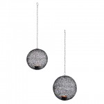
"Crazy Weave" hanging lanterns in 2 sizes, 6-inch high and 7-inch high; ($10-$15)

"Crazy Weave" hanging lanterns in 2 sizes, 6-inch high and 7-inch high; ($10-$15)

Summer’s almost here and since you may not have the budget for a big vacation, why not spend just a little to turn your backyard into a spa-at-home?

Pier 1 imports, my fav post-college source for home decor and furniture, is all grown up. I recently reviewed the retailer’s playful summer collection. I’m especially drawn to their lineup of  creative ideas for decorating outdoor spaces.

To learn more about the colors, patterns and materials that inspired the season, I called Aimee Beatty, Pier 1’s in-house stylist and design maven. She works for the Ft. Worth, Texas-based home furnishings chain to coordinate photo studio vignettes, visual displays and settings for advertisements and catalogues. 

One of the things I noticed about the Summer 2009 collection is that it’s very “interiors-looking.” I wanted to ask Aimee all about it. Here’s part of our conversation:

Q. I have enjoyed many great decorating moments from Pier 1, especially when I was in my budget-conscious, recent grad phase. But now Pier 1’s mix seems more edited and less like a world market. Has this change been conscious?

A. We envision ourselves as having something for everyone. There is an element of our products all working together (mixing-and-matching). Even today, we want shopping at Pier 1 to be a treasure hunt of sorts.

Q. I’m interested in the outdoor furnishings and accessories. What is the palette of the moment?

 A. We’re using punches of lime, yellows, corals and different shades of blue, including turquoise.

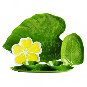
Reusable tropical-themed Melamine serving plates, $2-$19

Reusable tropical-themed Melamine serving plates, $2-$19

 Q. How about materials – what’s new there?

 A. One of the materials I’m most excited about is a plastic rattan.

 Q. It looks like Pier 1’s distinct design themes have an exotic flavor this summer:

 A. I would describe the overall theme as “eclectic” – a look of mixing and matching and layering furniture with different finishes. Themes include:

  • Bohemian:  It’s comfy, eclectic and a little romantic. Our design team has combined patchwork, embroidery and relaxed pieces for a vibe that’s in tune with today even though it might recall a hippy, happy era.
  • Tropical: Oversized floral patterns. Bold color. Natural touches. Easy ideas. This collection is as budget-friendly as it is cheery.
  • Global: This is the look that Pier 1 is known for. We travel the world and pick up treasures along the way.  You’ll see this in festive dinnerware, ceramic vases with an Old World look, carved mirrors – anything with rich, jeweled tones. This season, it’s the mix that makes traditional creations look bold and fresh.
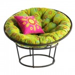
Outdoor Papasan chair, approx. 46-inches in diameter, $99.95 for 2-piece frame; Scatter daisy cushion, $100; 18-inch pillow, $16.95

Outdoor Papasan chair, approx. 46-inches in diameter, $99.95 for 2-piece frame; Scatter daisy cushion, $100; 18-inch pillow, $16.95

Q. Can you share any fun tips on making an outdoor space more personal?

A. People tend to overlook the fact that their outdoor patio can be just as important as their indoor rooms. I suggest you clear the clutter. Don’t use that space for storage! Instead, view the patio (or deck or terrace) as a useful place. No matter how small or big, have fun.

Q. Do you have an example of a favorite deck or patio design?

 A. I like to mix a sitting area with the dining area. You can have a bistro table for two but also incorporate a wicker chair or love seat. Blend the two uses rather than separate them.

 Q. Let’s talk about some of the hot styles and products for al fresco summer settings. What are some of your favorites?

Hot pink with Electric orange, an exotic, 4-by-6 foot outdoor rug, $24.95

Hot pink with Electric orange, an exotic, 4-by-6 foot outdoor rug, $24.95

A. First, the Papasan – for outdoors. I remember when I went off to college and that was the first thing we bought for the dorm room. It’s an iconic Pier 1 piece. This Papasan is great because it can stay outside. It’s bold and bright and has a lot of personality. It’s made out of iron and plastic rattan. The cushions are 100% polyester and water repellent. I love these (once) indoor chairs used outdoors because they offer a new and fun patio feature for you and your guests. Use them to create a cozy, casual environment.

Q. What about the outdoor rugs – they are awesome!

A. Rugs are often the last thing people think about when decorating their patio. These are bold and bright and have a lot of personality. They really warm up a space and make it room-like.

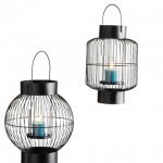
Iron wire cage lanterns 9-3/4-inch high and 10-1/2-inch high ($18 each style)

Iron wire cage lanterns 9-3/4-inch high and 10-1/2-inch high ($18 each style)

Q. And I love all the lanterns — the ones that accommodate votives and the battery-operated options. They would look great hanging from the pergola over my patio or from the trees in my garden.


A. Rather than just using one, you can have groupings of lanterns. Experiment with a little cluster. Or, hang a row of them above a table.

Q. Any final advice for accessorizing our summertime spaces?

A. These trends can be taken and shown by themselves or, for even more fun, mix them all up for an eclectic look that is totally your own.

Thanks, Aimee. I look forward to talking with you again.