Debra Prinzing

Get the Email Newsletter!

Archive for the ‘Furniture design’ Category

Episode 544: Growing Nursery Customers with a Flower Shop and Cutting Garden Program, with Jen Healy of J&B Garden Center in Albany, Oregon

Tuesday, February 8th, 2022

Today, we’re sharing more insight about one of the themes of the 2022 Slow Flowers Floral Insights & Industry Forecast, released last month. 
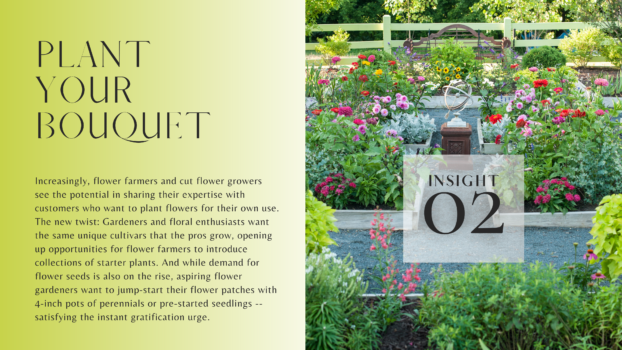
Grow Your Own Bouquet

Our second insight is Plant Your Own Bouquet and today’s guest, Jen Healy, is one of the people who helped me realize this important shift in the marketplace.

When Jen first joined the Slow Flowers Society with her business J&B Garden Center, we jumped on the phone so I could get to know her better. That was very early in 2021 and I learned that J&B is an independent, family-owned retail garden and home decor destination in Albany, located about 70 miles south of Portland near Corvallis. 

Jen and I discussed the important intersection between gardening and cut flower growing, and how she’s integrated the two world through the business she and her husband Brent Pockrus started in 2019. 
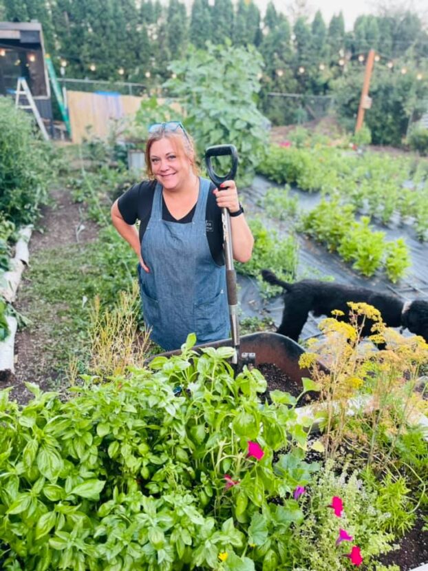
Jen Healy
Jen Healy, the “J” of J&B Garden Center. She’s a retail entrepreneur, nursery owner and proponent of cut flower gardening

Today, we’ll meet Jen, talk about the floral program at J&B — and as a bonus, Jen will share her observations from last month’s Dallas Home & Gift Market. We’ll discuss five key trends that she noticed there — lifestyle and decor themes and concepts you will want to know all about for your floral enterprise.

Click below to download a PDF of our presentation deck with all of Jen’s scouting slides.

Thanks so much for joining us today to meet Jen Healy and learn from a true trendspotter who’s bringing her passion for cut flowers into the retail environment.

Find and follow J&B Garden Center:
On Facebook

On Instagram


NWFGF 2022

As I mentioned in last week’s episode, Slow Flowers is moving into Valentine’s Day by producing five days of floral design workshops for the 2022 Northwest Flower & Garden Festival, which begins today, February 9th and continues through Sunday February 13th.

Be sure to follow our IG stories at slowflowerssociety.com each day, to see our design instructors — all Slow Flowers members. They include Bethany Little of Charles Little & Co., who is teaching romantic wreath design today; Bethany Syphers of Crowley House Farm, who will teach a flower crown workshop on Thursday; Kiara Hancock of K. Hancock Events, who will be teaching a centerpiece workshop on Friday; mom-and-daughter team Kim Gruetter and Tonnelli Gruetter of Salty Acres Farm, who will teach the tiny bouquet workshop on Saturday and Tobey Nelson of Tobey Nelson Events & Design’s botanical jewelry workshop on Sunday.

I’m super excited to get a jump start on spring and the NW Flower & Garden Show is definitely the way to do it here in Seattle. Oh, and I can’t overlook shout-outs to our members and Bloom Imprint authors who are also speaking at the show: Jennifer and Adam O’Neal of PepperHarrow Farm are speaking three times, including about their new book Small Farm, Big Dreams, and competing head-to-head on the Container Wars stage (I’ll try and grab footage of that match up!), and Julie Beeler of Bloom & Dye, who will teach Colors from the Dye Garden.

So what are you waiting for? If you’re in the Seattle area and you want a pair of tickets, I’ll be giving away two sets of tickets to the first two Members who comment in today’s show notes at slowflowerspodcast.com or who send us a DM at slowflowerssociety on IG.


Thank you to our Sponsors

This show is brought to you by Slowflowers.com, the free, online directory to more than 880 florists, shops, and studios who design with local, seasonal and sustainable flowers and to the farms that grow those blooms.  It’s the conscious choice for buying and sending flowers.

Thank you to our lead sponsor, returning for 2022, Farmgirl Flowers. Farmgirl Flowers delivers iconic burlap-wrapped bouquets and lush, abundant arrangements to customers across the U.S., supporting U.S. flower farms by purchasing more than $10 million dollars of U.S.-grown fresh and seasonal flowers and foliage annually. Discover more atfarmgirlflowers.com.

Our next sponsor thanks goes to Store It Cold, creators of the revolutionary CoolBot, which you just heard Carlee mention as a new addition to her studio.  Save $1000s when you build your own walk-in cooler with the CoolBot and an air conditioner.  Don’t have time to build your own?  They also have turnkey units available. Learn more at storeitcold.com   

Our next sponsor thanks goes to Flowerfarm.com, a leading wholesale flower distributor that sources from carefully-selected flower farms to offer high-performing fresh flowers sent directly from the farm straight to you. You can shop by flower and by country of origin at flowerfarm.com — and find flowers and foliage from California, Florida, Oregon and Washington by using the “Origin” selection tool in your search. Learn more at flowerfarm.com.

Our final sponsor thanks goes to Association of Specialty Cut Flower Growers. Formed in 1988, ASCFG was created to educate, unite, and support commercial cut flower growers. It mission is to help growers produce high-quality floral material, and to foster and promote the local availability of that product. Learn more at ascfg.org.


Slow Flowers Podcast Logo with flowers, recorder and mic

Thanks so much for joining us today! The Slow Flowers Podcast is a member-supported endeavor, downloaded more than 813,000 times by listeners like you. Thank you for listening, commenting and sharing – it means so much. As our movement gains more supporters and more passionate participants who believe in the importance of our domestic cut flower industry, the momentum is contagious. I know you feel it, too.

If you’re new to our weekly Show and our long-running Podcast, check out all of our resources at Slow Flowers Society.com and consider making a donation to sustain Slow Flowers’ ongoing advocacy, education and outreach activities. You can find the donate button in the column to the right at debraprinzing.com
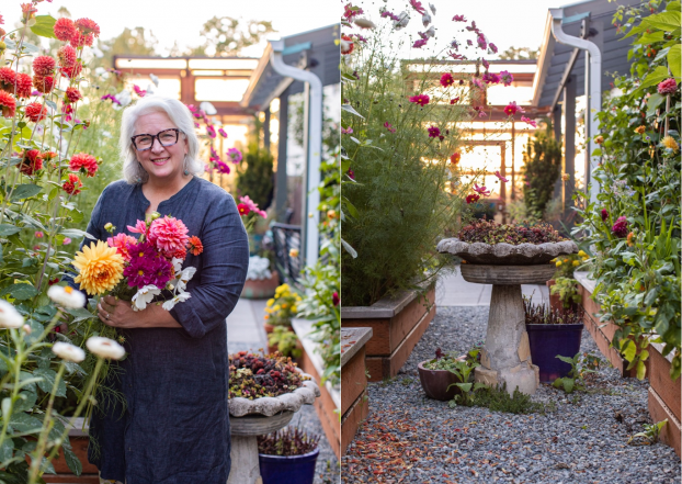

Debra in the Slow Flowers Cutting Garden
Thank you for listening! Sending love, from my cutting garden to you! (c) Missy Palacol Photography

I’m Debra Prinzing, host and producer of the Slow Flowers Show & Podcast. Next week, you’re invited to join me in putting more Slow Flowers on the table, one stem, one vase at a time. The content and opinions expressed here are either mine alone or those of my guests alone, independent of any podcast sponsor or other person, company or organization.

The Slow Flowers Podcast is engineered and edited by Andrew Brenlan. You can learn more about Andrew’s work at soundbodymovement.com

Music Credits:

For We Shall Know Speed;
Turning on the Lights;
Gaena
by Blue Dot Sessions
http://www.sessions.blue

Lovely
by Tryad 
http://tryad.bandcamp.com/album/instrumentals
http://creativecommons.org/licenses/by-sa/3.0/

In The Field
audionautix.com

Week 6 // Slow Flowers Challenge at the Northwest Flower & Garden Show

Wednesday, February 11th, 2015

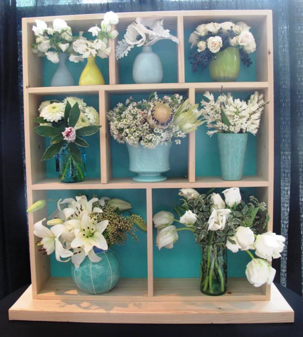
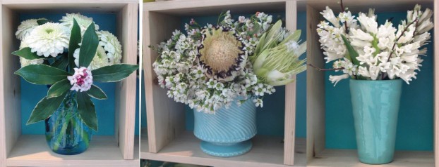
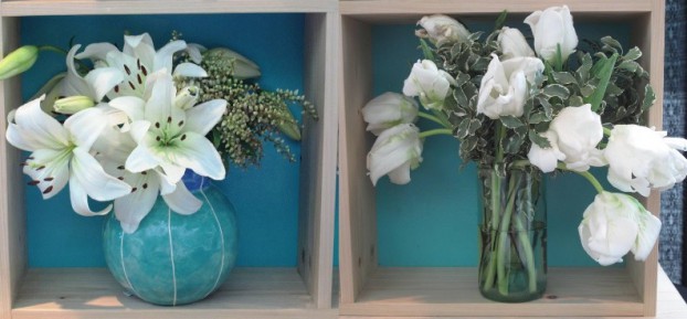
Call it a shadowbox or a curio cabinet, this charming display cupboard was custom made by Andy Chapman of Stumpdust.com.

Call it a shadowbox or a curio cabinet, this charming display cupboard was custom made by Andy Chapman of Stumpdust.com.

This week’s Slow Flowers Challenge features my entry into the Northwest Flower & Garden Show’s floral competition.

The NWFGS opened today and runs through February 15th at the Washington State Convention Center. Follow the links in the sidebar to the right and you’ll find details about “One Bouquet; Three Ways,” design presentations I’m giving on Friday 2/13 and Sunday 2/15. Please join me if you’re in the area! All seminars are free with show admission.

I titled my floral entry “Show Your Love With Local (Flowers),” which is fitting with the show’s theme of “Romance Blossoms.” I knew I wanted to display American-grown flowers in American-made vases, so I’ve spent the past several months thinking about how to best portray that idea. The end result is above.

The idea germinated when I gathered together all the American-made vases I wanted to use, both in my own collection and those I wanted to add. Mostly in the teal-aqua-lime green spectrum, I looked at them and thought: “Each is beautiful on its own, but together they will look like a jumble unless I figure out how to organize them.” And that’s when the idea of a curio cabinet came to mind.

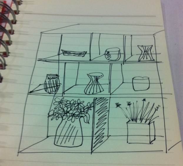
Here’s my original sketch I sent to Andy Chapman of Stumpdust, a talented woodworker and artist who I persuaded to construct what I envisioned in my mind’s eye.

It's pretty amazing that my sketch is pretty close to the final product (discounting my poor perspective drawing skills!)

It’s pretty amazing that my sketch is pretty close to the final product (discounting my poor perspective drawing skills!)

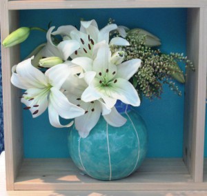
The teal and white "bubble vase" by Kristin Nelson of Vit Ceramics inspired the painted "back" of each nook of thd curio cupboard.

The teal and white “bubble vase” by Kristin Nelson of Vit Ceramics inspired the painted “back” of each nook of the curio cupboard.

We met to figure out the dimensions, making sure the “nooks” would have enough negative space to accommodate my flowers, while being balanced proportionately.

Andy took some measurements and we agreed to a cupboard that was about 24-inches wide by about 30-inches tall, with 6-inch deep shelves. The bottom two spaces are 12-inches square; the center ones are 9-1/2-inches tall x 7 to 9 inches wide; the top row has 6-1/2-inch cubbies by the same width as those on the center row.

I really love how Andy staggered the uprights on the top and center rows to make the spaces more visually interesting.

He used scrap lumber and suggested I purchase a thin board at the home center that I could pre-paint before he attached to the back, like the back of a bookcase. That worked out swell and I chose a high-gloss turquoise hue called ‘Seafarer’ from Lowe’s. I think it looks great in contrast to the natural boards.

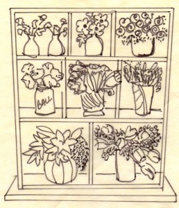
This sketch is a little more  refined!

This sketch is a little more refined!

The paint color makes all the glazes and glass colors pop, and unifies the display. White flowers and just a small amount of foliage keeps everything fresh-looking. Plus, I suspected that there would be a lot of red and pink this week (there is!) and I wanted to show an alternative to the predictable Valentine’s week floral palette.

It all came together beautifully and after I picked up the finished piece from Andy last weekend, I had fun arranging and rearranging the vases for maximum impact.

And thanks to the amazing selection of white flowers from Washington, Oregon and California flower farms, I was able to showcase the diversity of American-grown floral options for Valentine’s Day.

Here is the Slowflowers.com flier I created, a takeaway for showgoers who might be interested in finding their own American-made vases or changing the way they purchase flowers – selecting domestic, local and seasonal options.
SHOW YOUR LOVE WITH LOCAL: AMERICAN-GROWN FLOWERS in AMERICAN-MADE VASES

topRow

Top Row, from Left:

  • Little Shirley vases by Material Good / material-good.com (Seattle) with California sweet peas
  • Aqua bud vase by Heath Ceramics / heathceramics.com (San Francisco) with California anemones and Dusty Miller foliage from my Seattle garden.

  • ‘Imagine’ lime green votive by Glassy Baby / glassybaby.com (Seattle) with California-grown privet berries and cream spray roses (Green Valley Floral)

MiddleRowMiddle Row, from Left:

  • Teal glass Ball Jars (USA made) with California grown ‘Gerrondo’ gerberas and Daphne odora foliage from my Seattle garden.
  • Vintage aqua flower-pot by McCoy Pottery (USA made) with California wax flowers and proteas.
  • Aqua Madagascar bud vase by Bauer Pottery / bauerpottery.com (Los Angeles) with Washington hyacinths and flowering plum branches

bottomRow.jpbBottom Row, from Left:

  • Blue/teal Bubble Vase by Vit Ceramics / vitceramics.com (Seattle) with Asiatic lilies from Oregon Flowers and Pieris japonica from my Seattle garden.
  • Aqua recycled wine bottle vase by Wine Punts / winepunts.com (Colorado) with California variegated pittosporum foliage and parrot tulips from Alm Hill Gardens in Everson, Washington.

Flower Shadowbox designed by Debra Prinzing of Slowflowers.com and Custom fabricated by Andy Chapman of Stumpdust.com.

On location with Jamie Durie for Better Homes & Gardens

Friday, September 2nd, 2011

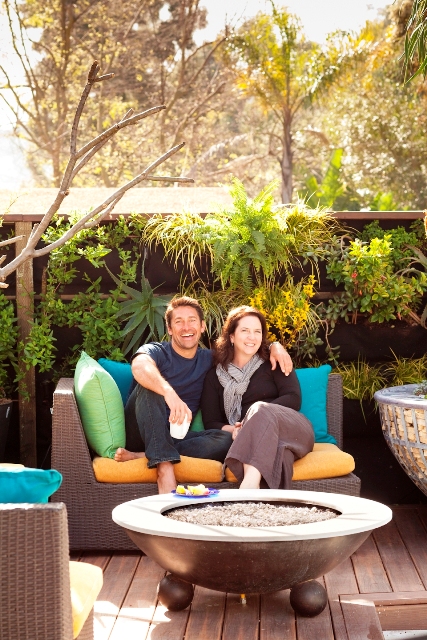
On location in Los Angeles with Jamie Durie - photographed by Edmund Barr

On his popular HGTV show The Outdoor Room with Jamie Durie, stylemaker Jamie Durie uses interior and architectural design tricks to amp up dreary backyards.

By the end of a whirlwind 30-minute episode, you’re energized and inspired. Of course, nimble edits have compressed a couple of days of dirt, sweat and (possibly) tears into a dreamy landscape for the small screen. But still, there’s always a takeaway, a “lesson” that catches the viewer’s imagination. “I could try that,” you say to yourself. “Oh, what a simple way to disguise that ugly wall,” or “That’s brilliant!”

Some of the projects conjured by Jamie and his design team are complicated and require professional assistance to execute. But many others fall into the DIY mode: affordable and requiring only a discerning eye to add polish, such as using color, texture or materials to unify otherwise disparate objects.

That’s one reason why I really wanted to see Jamie’s garden firsthand. When I visited his Los Angeles outdoor design laboratory (aka his humble backyard) last spring I loved what I saw.

My assignment was to interview Jamie and help produce the Better Homes & Gardens “Stylemaker” story that appears in the September issue – out on newsstands right now.

Art director Scott Johnson and I both flew into Los Angeles to work on the story. We were very fortunate to team up with LA photographer Edmund Barr and LA videographer Adam Grossman for the shoot. You can see my article and Edmund’s photos in the September issue; you can watch a fabulous how-to video with Jamie shot by Adam on BH&G’s digital edition. And a special thanks to Edmund for snapping this cozy portrait of Jamie and me, lounging in his outdoor living room. Fun, huh?

Many of Jamie’s best design concepts are ones he previously tried out for clients of Durie Design, his studio in Sydney, Australia, and Los Angeles. Some have been executed on previous episodes of The Outdoor Room, or in the pages of his new book by the same name.

We zeroed in on the ideas that move plants away from the obvious “ground plane” and onto other surfaces, such as living walls, green roofs and in the unexpected niches of garden structures. Jamie’s passion for plants is contagious – and you can see it spill over onto BH&G’s pages. Here’s an excerpt:

Outer Sanctum: HGTV star Jamie Durie uses unexpected designs to turn the barest backyards into green oases. 

“Once you create an outdoor room, you’ll fall in love with your backyard again,” says Jamie Durie, the star of HGTV’s The Outdoor Room.

A popular designer and TV personality in his native Australia as well as North America, Jamie encourages everyone who has a small patch of earth — or even just a patio or deck– to re-imagine their exterior environment as a functional, eco-friendly living space.

Jamie combines a passion for plants, sustainability, and the outdoors into a zeal for landscaping. He grounds his designs in green practices, using local materials, plants that tolerate the region’s climate, and clever techniques to put plants in almost every imaginable nook and cranny. Hanging planters cover his fences and walls, and pergolas support green roofs. Surrounding yourself with nature this way “can improve your health and inspire positive thinking,” says Jamie, who meditates every morning on the patio outside his bedroom.

Check out Jamie's new book for more tips and ideas.

Recently settled in Los Angeles, Jamie used the same advice he offers clients: Increase living space by creating more rooms outdoors rather than indoors. Instead of enlarging his modest 1950s house, he coaxed his once-ordinary backyard to live larger, with outdoor spaces variously designed for cooking, dining, lounging, and chatting. “Your spaces should accommodate your life,” he says. “Not the other way around.”

 “I have a new outlook when I open the doors,” Jamie says. “This house feels bigger than it is, since the lush garden is part of my home.”

The popular HGTV host and landscape designer shares his ideas, techniques and recent projects in Jamie Durie’s The Outdoor Room (Harper Collins, $25.99), a guidebook to creating beautiful exterior spaces.

Jamie Durie’s very personal version of The Outdoor Room

Saturday, May 28th, 2011

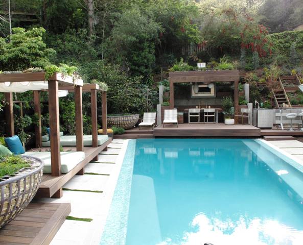
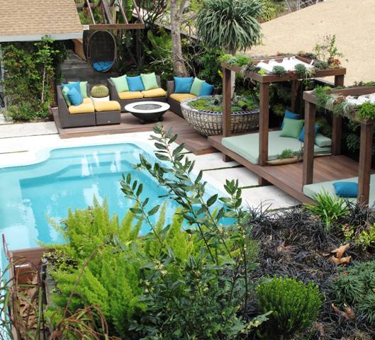
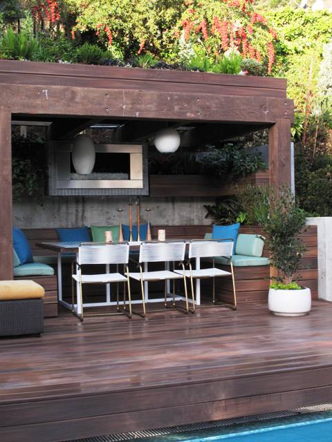
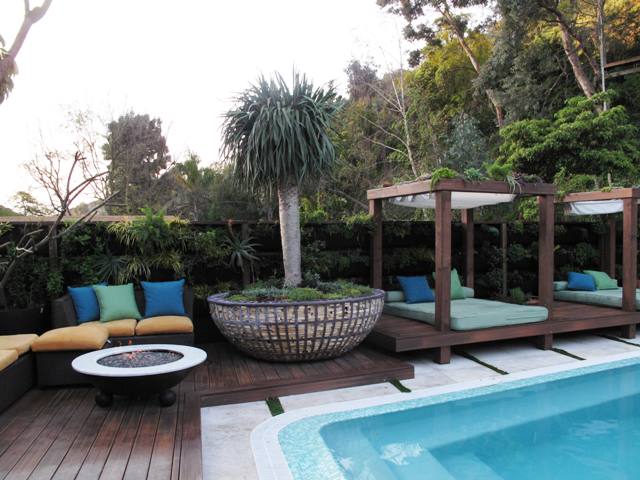
This view takes in the two cabanas on the left and the dining pavilion at the opposite end of the pool

I joined Jamie Durie, of HGTV’s “The Outdoor Room,” for brunch and an interview in LA

I’ve been after celebrity garden designer Jamie Durie for more than a year to let me come and do a story about his personal Los Angeles backyard. I sensed he was stalling because, like many of us who make gardens (or write about them) for a living, our own outdoor environment is the LAST thing to receive our attention!

Turns out, Jamie and his producers of “The Outdoor Room” on HGTV  were cooking up big plans for his hillside property in Los Angeles’s Laurel Canyon.

Jamie reimagined the long-neglected yard, dominated by a vintage 1950s swimming pool, into a gorgeous series of outdoor living spaces. The magical transformation occurred over a three week time, and became the debut episode of The Outdoor Room’s season three, which aired earlier this year (you can see a schedule of re-runs of this episode by following this link).

In late February, I received an out-of-the-blue phone call from Jamie, saying: “The garden is finished – you’re invited to come see it!” Wow – this guy is good to his word.

Here's a bird's-eye view of the transformed outside living space - photographed from Jamie's hillside deck

We had a narrow window of a couple week’s time in which I could get down to LA for a photo shoot and interview, since Jamie was about to fly back to Australia for several weeks to shoot another show there. Whew. That guy lives a marathon life and makes it all look effortless. But we made it work. Here is my profile of Jamie’s project, which appears in today’s print and online editions of The Los Angeles Times.

The Los Angeles Times sent one of its very best photographers, Irfan Khan, to document the beautiful landscape. You can check out his web gallery of gorgeous shots here. I also took lots of reference photos to use while writing the story, and thought I’d post some of my favorites below.

Jamie asked me to include the many great resources he used to pull together this extreme garden makeover. So in case you’re curious, here is that list:

Resources & Materials

Bath: “The Outdoor Room” craftsman Steve Zimpel created the bath using recycled cedar from Durie’s original design.

Decking: Fiberon composite decking

Doors: LaCantina bi-fold doors

Fire: Escea outdoor gas fireplace; Durie Design Fire Pit

Furniture: Walter Lamb for Brown and Jordan reproduction chairs and chaises from Design Within Reach; all-weather wicker sectional, Durie Design.

Kitchen: Fuego modular kitchen.

Plants: Monrovia

Vertical garden system: Woolly Pockets

Pool Makeover: Jamie worked with Aric Entwistle of Los Angeles-based H2o Development Inc. to replace a conventional chlorine system with Spectralight, which uses ultraviolet light to kill pathogens and waterborne bacteria. The renovated pool is solar heated with a system from Suntopia Solar. A new infinity edge was fabricated over the original coping using carbon fiberglass, resin, high-tensile adhesives and several coats of waterproofing. It’s finished with Bisazza glass mosaic tiles.  

Like a raft floating over the garden, the upper deck provides excellent glimpses of the garden below.

Here's a bird's-eye view of the transformed outside living space - photographed from Jamie's hillside deck

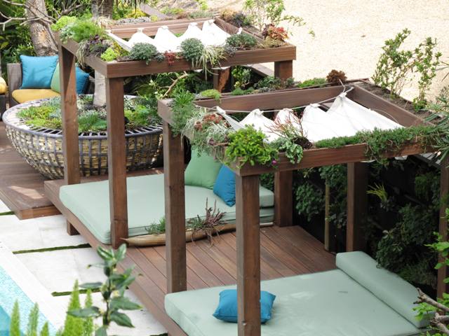
I love this view from above, which shows how the box-beams form planting channels, and how the Roman shades create a canopy roof for the cabanas.

Here's the exterior of two pivoting planted "walls." When opened, they connect Jamie's bedroom to the garden.

A gorgeous detail of the stacked stone contained by one of two 7-foot gabion tree planters that Jamie designed

Here's a nice detail shot from inside the dining pavilion. You can see how the concrete retaining walls hold the hillside back and also form the interior walls where planters are hung and pillow-backs are rested.

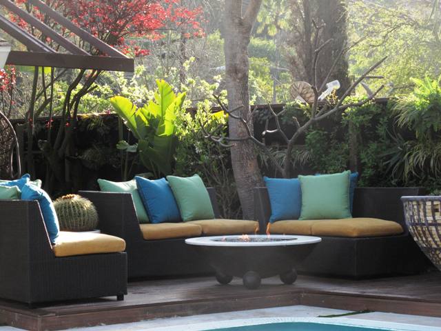
A dreamy morning shot of the outdoor living room, featuring Jamie's own all-weather sectionals and a custom fire pit.

Inside the dining pavilion.

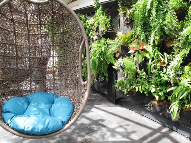
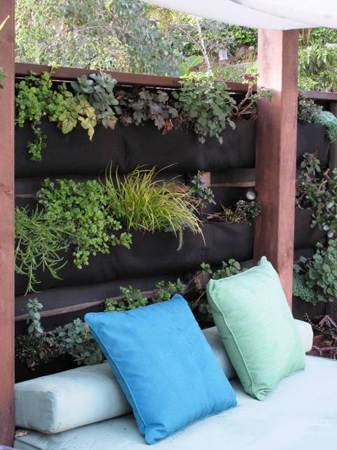
A detail showing how the Woolly Pockets vertical wall system adds foliage and flower texture behind the cabana.

The full-size view of the gabion tree planter - one of two in the garden.

At the end of my interview with Jamie, he talks about how much he enjoys living here. And it’s a perfect way to sum up the feelings I also had being in the highly personal garden environment: 

“Life just seems a whole lot more hectic in Sydney,” Durie says. “You can’t say that about Laurel Canyon. All I ever hear are birds. I’ve got squirrels running along the top of my green wall. An owl moved in once I finished the garden, and we’re starting to be visited by a ton of hummingbirds. I may not have kangaroos and koalas, but it’s kind of fun telling my mates back home that I’ve got coyotes in the canyon.”

Thank you for sharing your garden, Jamie. It was a treat! I hope you slow down long enough to really enjoy it~

LA Times’ Top Home Design Stories of 2010

Wednesday, December 29th, 2010

This just in: the tally of the Los Angeles Times’ HOME section’s most highly viewed stories and galleries of the year. And – wow – 4 of the top 12 are stories that I was fortunate to discover and write for the newspaper.

Here they are – enjoy the inspiration:

Lara and David's Hollywood Regency Living Room - a delicious palette with a retro art, lamps and furnishings.

1. In Beverly Hills, a Hollywood Regency re-do created by TV personality Lara Spencer and her husband David Haffenreffer.

The Daily House in Glendale - an iconic Midcentury house.

2. The historic midcentury Daily House in Glendale, lovingly revived by attorney Chris Burusco.

The exterior of Paul and Cicek Bricault's master suite is planted with succulents - a "green" addition in Venice.

3. The growing green Venice house owned by Paul and Cicek Bricault, complete with succulent walls on the exterior of their master bedroom addition. PS, this story also logged in as one of the paper’s most-read Home & Garden pieces of 2010.

The Chartreuse House - in Venice - a bungalow-turned-modern home.

4. The charming, modern Chartreuse House, also in Venice, designed by Lisa Little of LayerLA and Victoria Yust/Ian McIlvaine of Tierra Sol y Mar. Gardens by Stephanie Bartron of SB Garden Design.

Even though I have relocated to Seattle, I continue to report on home design, interiors and architecture for the Los Angeles Times. I’m looking forward to 2011 – can’t wait to discover the great design the New Year brings.

New Garden Products for 2011 – Part One

Saturday, November 27th, 2010

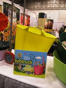
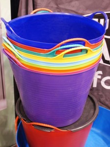
Here is an array of new 2011 Tub Trug colors

Part One of Two Consecutive Blog posts:
I was invited  by the producers of The Independent Garden Center Show, an annual trade show held in Chicago each August, to give two talks about garden and consumer trends. It was easy to say “yes,” because I had heard so much about this massive event. It’s the place to be and be seen for anyone in the gardening industry!

By experiencing the extravaganza first-hand and seeing what all the buzz was about, I got a real workout. With thousands of other attendees, I navigated the aisles and aisles of new garden products, tools, furniture, accessories and even plants. I managed to see it all over the course of three days – and here are my picks for the best new ideas that gardeners will see in 2011. 

You’ll likely discover these goods on the shelves of your local indy garden center, nursery or emporium. Follow the links to the web site for each company (some only sell wholesale, but many have store locator tabs). 

Ethel work glove

I’ve previously endorsed and written about the Ethel Glove so I wanted to stop by the booth of this cool Valencia, Calif.-based company to see what was new. The Ethel Work Glove, with an $8 price tag, is at first glance similar to the everyday rubber-dipped knit glove you’ll see at hardware stores and garden centers. But the Ethel staff explained that this glove is made from a durable knit material with a rubber palm, pads and fingertips formed by painting (rather than dipping) the gloves into a polypropylene finish. 

Ethel also has a new, slim and fashionable, black knit glove made from a bamboo-derived fine knit (protecting the cuff, back of the hands and fingers). The durable palm and pads are coated with a synthetic leather. 

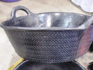
A reimagined rubber tire-turned-trug

Tub trugs come in a rainbow of colors. I own several of these excellent plastic garden carriers with handles. They’re great for hauling anything around the garden and useful for pruning,  dead-heading and weeding projects. 

The designed-in-the-UK and made-in-Spain tubs will soon be available in 10 new colors. There are also a few fun new products, including a color-coordinating push broom ($29.99 retail) and two sizes of trugs made from recycled tires. To me, these look like a riff on the Southern tire planters – they even smell like old Goodyears! Thicker and a little less refined than the sleek, Pantone palette-trugs, the black rubber ones will be available in January for $9.99-$12.99. 

The tub truck - take it with you to the farmer's market!

For those of you who already own a medium or large trug, look for the January release of Tub Truck, a rolling carrier ($37.99). You can pop the bucket onto the frame and take it with you to a plant sale or farmer’s market. The handle has hooks for hanging additional bags. It’s a fun cart to pull behind you and a brilliant solution for gardeners. 

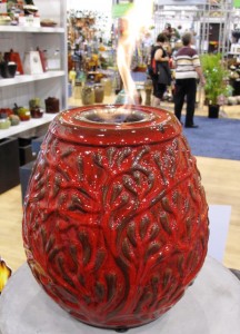
'Serenade' ~ a Napa Firelite, 12 in. tall

“Firelites” or fire bowls are all the rage. As Martyn Fernambucq of Napa Home & Garden puts it: “Fire is such a hot commodity right now.” 

I first noticed this new product category when an editor at Better Homes & Gardens sent me a photo of a small ceramic lantern with a flame (not a wick, mind you, but a 2-inch diameter flame that was flickering 2-3 inches above the round opening in the lantern). That’s when I went online to learn more and discovered that the lanterns are fueled by a long-burning smoke- and odor-free gel.

Like many things that bubble up to one’s consciousness and elbow their way onto one’s radar, it’s not really a surprise that the very next day I went to an al fresco dinner party for a friend where the hosts’ boathouse was illuminated by these flaming lanterns. Clearly they are decorative. The flame can’t  be blown out by a gust of wind (as would be the case with a candle).

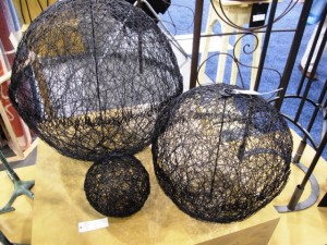
Mesh orbs by Achla Designs

I’m all about orbs, spheres, globes, and balls as sophisticated garden ornamentation. My favorite piece of sculpture features a filigree-style wire mesh ball with a random “scribble” pattern. It was designed by artist Jennifer Gilbert Asher of TerraSculpture and fabricated by Mario Lopez in his Los Angeles metal shop. 

If you like this custom-designed and fabricated look, you might like the black wire orbs that are slightly reminiscent of Jennifer’s designs. I spotted them in Achla Designs booth. Nice design in small (6-inch), medium (12-inch) and large (18-inch) sizes. 

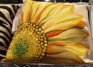
A sunflower pillow - perfect for the patio

Outdoor textiles are more interesting than ever, moving way beyond awning striped polyester choices. 

So of course, the Liora Manne booth lured me in and I was eager to learn more about the gorgeous, patterned pillows made with a felting-like process. 

The Lamontage pillows are made of 100% antimicrobial polyester microfiber for indoor/outdoor use. They measure 20-by-20 inches or 12-by-20 inches with removable, hand-washable covers. The collection includes place mats and outdoor rugs, as well. 

According to the Liora Manne web site, Lamontage is a technique “in which acrylic fibers are intricately structured by hand and then mechanically interlocked by needle-punching to create a nonwoven textile. Lamontage is based on the idea of versatility; breaking the boundaries of traditional textiles and creating a unique textile with unlimited possibilities.” 

READ MORE…

What to do with salvaged shutters

Thursday, November 18th, 2010

Read on to learn what I'm going to do with these amazing shutters!

I recently spent the morning at a cool local flea market in Seattle. I was up early and out the door by 7:15 a.m., ready to get my creative juices going.

My mission: to discover as many castoffs from others that could make their way home with me.

The destination: 2nd Saturdayz, a popular flea market where vendors, dealers and designers come together to do business with salvage-savvy shoppers.

The apt motto: A Saturday Market of Fine Tastes and Curious Treasures.

Once inside the doors of a huge hangar (yes, the flea market is held at a decommissioned Naval base), I met up with Jean and Gillian. But not too much socializing is encouraged at these events. That is, IF you want to get the best deals. First-come, first-serve is the motto. Or: Every woman for herself.

I shouldn’t limit this endeavor to the female salvager because there were many men in attendance at 2nd Saturdayz. But still, you know what I mean. It’s a gal’s paradise.

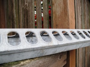
Galvanized chicken feeder. 30 sizeable oval openings. A succulent planter or a flower holder? Or both?

Lately, I’ve been collecting vintage flower frogs, which makes sense since I’m living and breathing floral design. But this time, instead of finding glass and metal frogs, cages and stem-holders to displace the dreaded florist’s Oasis, I picked up a galvanized metal chicken feeder.

Think of a loooong ice-cube tray with oval cutouts. In metal. Very cool. Now that I’m looking at it again, I may just use this nifty piece as a planter for hardy succulents. It’s probably leaky so that’s going to give the drainage I’ll need.

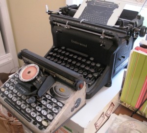
A nearly-pristine child's typewriter complements my grown-up Underwood.

I also picked up a vintage child’s typewriter. It can play nicely with my retro black Underwood typewriter that we bought back in 1985 at the Rotary Club Auction on Bainbridge Island. I think I paid $5 back in the day.

Those old typewriters, truly relics, are now priced at $50 on up. And to think so many of them have been dismantled to make jewelry from the letter keys. I’m guilty of buying one of those alphabet bracelets, too.

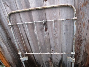
When I walked into one small “booth” with my friend Jean, an awesome Seattle landscape designer, I found myself absent-mindedly stroking the frame and spindles of a cast iron baby crib. The vendor had taken off one of the crib’s side-rails and piled pillows and cushions on the springs and against the three remaining railings.

Here's the end of the baby crib. Next time you see this, I'll be lounging against some cushy pillows, perhaps under a shade tree. This crib will become my garden bench.

What did it recall? Yes, a very fashionable garden daybed or bench. And for $100, I totally lucked out. My friend Gillian, who is a pro at this sort of buying-and-selling of antiques and vintage items at Ravenna Gardens, pulled me aside to share the secret that she’s seen other dealers selling cast iron baby cribs for $600. I don’t have a “garden” in which to place this bench right now, since I’m in a rental house and I’m not yet ready to invest energy on land I don’t own. But . . . I did decide to bring this crib home and store the pieces in the garage until the next garden comes along. Luck-ee me!!!

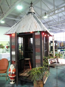
I couldn’t ignore the central element inside the warehouse – a little hamlet of potting sheds. Their perky corrugated metal roofs, topped with finials created from shiny bits and pieces, stood high above the flea market’s landscape.

While gazing at the rustic but stylish potting sheds, I met designer/builder Bob Bowling. Owner of Bob Bowling Rustics of Whidbey Island, this engaging shed artist greeted me and generously shared his story.

Turns out, like some of the talented folks we featured in Stylish Sheds and Elegant Hideaways, Bob makes unique structures using reclaimed and recycled materials. Whimsical and playful, and finished off with salvaged windows, doors and other artifacts, the Rustics sheds are each a delight to see.

Bob's cool garden shed was hard to miss.

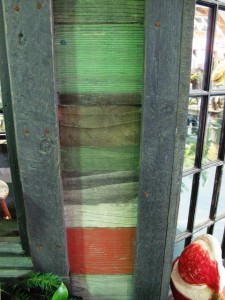
The "stripes" come from variously-stained boards.

The prices are reasonable, too. I should know. For $3200, you can get this “Rasta” shed. It measures about 7-by-7 feet in diameter (plus or minus) and features cool details, like the exterior of alternating stripes of differently-stained boards and the window boxes, door hardware and towering finial.

You could easily spend this much for a pre-fab storage or tool shed on the lot of your local big-box store. Which would add more art and style to your life, while also being quite functional?

All this thrifty flea-market shopping had energized me and made me feel quite artistic.

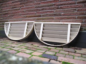
And then I met that shutter duo that called my name. Loudly. They appear to be half-circle crowns or eyebrow tops from a set of plantation shutters.

Wooden, with 2-inch deep slats, these pieces were displayed separately. Once I noticed both of them, I was not going to leave with just one! I don’t think I got a huge bargain, since I paid $28 apiece (but the seller insisted she had just cut the price in half). Whatever. When you spy something so uncommon, you have to act.

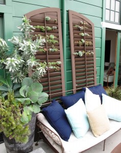
Other than changing the depressing buff-colored paint job to something more lively, what on earth do you suppose I will do with these crescent-shaped pieces?

Hello! You two are pretty darned cute. That Baylor Chapman is uber-talented!

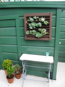
Here's another small shutter-turned-wall garden, compliments of Baylor Chapman.

For inspiration, I hearkened swiftly to my visit to Baylor Chapman, a talented San Francisco floral and garden designer I recently profiled for A Fresh Bouquet. After my friends Susan and Rebecca took me to meet Baylor at her floral studio, the three of us accompanied her to her loft apartment in SF’s Mission District.

And there on the outside roof deck, were some pretty amazing succulent gardens – PLANTED IN SHUTTERS!!!

Naturally, I am going to draw from this incredibly clever idea and put those twin shutters to very good use with a vertical planting of hardy succulents. It may take until next spring, but stay tuned. And if you have any suggestions on what color I should use to upgrade the crappy paint color, please chime in.

The trick, according to Baylor, is to secure a layer of landscaping cloth like a little pocket or envelope behind each shutter opening. Then you can add potting soil and plant your sedums, succulents or whatever else seems fitting. You know, I really do love that chocolate brown finish on the shutters. Doesn’t it nicely offset the silver, gray, blue and green foliage of the succulents?

Well, all in day’s work. More to come as I execute these big plans.

My home design interview with actor Jonathan Togo of “CSI: Miami”

Sunday, October 3rd, 2010

 BEHIND THE SCENES WITH JON TOGO

Actor Jon Togo (center), with designer Lory Johansson and me

If you’re a fan of the “CSI” television franchise, you probably know this handsome young actor I’m standing with in the photo at left. He’s Jonathan Togo, aka investigator Ryan Wolfe of “CSI: Miami.” 

The show enters its 9th season with tonight’s premiere (10 p.m. on CBS). In anticipation of the show, I’ve posted my recent interview with Jon and his interior designer Lory Johansson.

Lory, an inventive and gifted designer whose firm is called Just Joh, introduced me to Jon’s 1958 Midcentury modern “guy pad” in the Hollywood Hills earlier this year. I love that Jon describes her as “the best design Sherpa” because it’s true. She has a gift for helping each client express his or her unique personality through furniture, art, and the home.

The Los Angeles Times photographed the interiors in July, the day of this photo, which Lory’s husband Mats Johansson took with my camera. My interview with Jon and Lory (and featuring a fun commentary by Jon’s mother, Sheila Togo) appeared in the Sept. 18 issue of the HOME section. You can read the story and see a gallery of photos here.

Behind the scenes with Garden Design

Wednesday, June 23rd, 2010

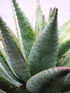
A pretty stunning aloe-as-sculpture in one of Joseph Marek's gardens.

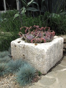
Scott Shrader turned an ancient millstone into a succulent planter

Garden Scouting: It sounds so luxurious, doesn’t it?

Spending four days scouting some of the most beautiful and unique residential landscapes in and around Los Angeles! 

I do it all the time – visit and tour gardens that might just make it onto the pages of the magazines and newspapers to which I contribute. And yet, achieving the “get” is not always that luxurious. It’s fun and rewarding. But also hard work. 

Successful garden scouting requires lots of telephone calls to set up appointments. It means I have to lean on my personal connections to cajole invitations from reclusive garden owners or rock star designers. And it demands that I put way too many miles on my Volvo odometer. A lot! (Thank goodness for NPR.) 

Most of all, this job means being extremely open to everything I see, while also keeping out a discerning eye for that magical glimpse of a perfect story. 

It’s alot like being on a treasure hunt when you don’t know the ending, but I wouldn’t have it any other way! 

Jenny Andrews, executive editor for Garden Design, one of the magazines for which I am contributing editor, was in Los Angeles a few weeks ago for a four-day scouting marathon. As she put it, it felt like we were college roommates for four days . . . probably because Jenny ended up staying with me for most of the time. She got to experience the craziness of the Prinzing-Brooks household with kids, dog, schedules, and more. And, we put 700 miles on my car in four days. We were both exhausted by the end. 

READ MORE…

My sedum-planted wicker chair

Sunday, May 23rd, 2010

Take a seat. A succulent seat, that is.

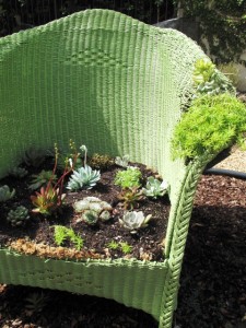
Voila! My sedum-planted wicker chair as garden art

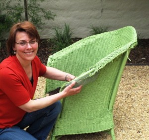
If you’ve ever admired the charm and whimsy of a planted chair, you’re not alone. I’ve always liked plants combined as a design element with furniture. When my mom passed along Grandma’s 1940s wicker porch set, I knew that the slightly unraveled rocking chair was destined for a new role in my garden. So two weekends ago, on Mother’s Day, I started creating a sedum seat for the cherished rocker.

After giving Grandma’s wicker chair a fresh coat of herbal green paint, I was ready to turn the family hand-me-down into an ornamental garden feature. Here’s Part Two of my Mother’s Day gardening project, which illustrates how to prepare and plant the chair. 

Step One

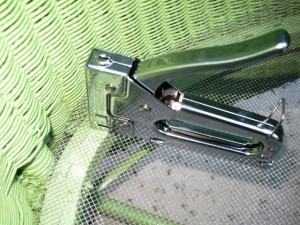
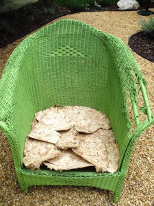
Step One: Using a sheet of 1/4-inch wire mesh and a pair of wire clippers, I cut out a seat-sized section to fit into the chair’s base. A staple gun came in handy to secure the mesh to the piece of wood bracing.

Step Two: I layered sections of dry Angel Moss over the mesh. A highly-absorbent variety of sphagnum moss, Angel moss is a nifty product that I discovered last month while teaching four container and hanging basket design classes for Gardening How-To magazine. The moss hails from the bogs of New Zealand and, because of the way it is farmed and harvested, is considered a renewable resource. You can purchase pre-formed liners to fit into wire hanging baskets or flat sheets to use for projects such as mine.

Step Two

As dry as a piece of brittle cardboard, Angel moss changes its character dramatically when exposed to water. It’s a fabulous medium for baskets, window boxes and the mesh seat of my wicker chair because the moss proves itself to be an excellent material for holding soil and plants. It doesn’t dry out as quickly as the kind of coco-fibre or woodland moss we’re used to here in North America.

Step Three: On top of the Angel moss I spread approximately 3 inches of my planting medium. I’ve learned that the best environment for growing succulents (especially in containers) is to mix equal parts organic potting soil with cactus mix. Erin Taylor, owner of Botanik, a great garden emporium in Summerland (near Santa Barbara) taught me this recipe soon after I moved to Southern California. One look at her shop’s awesome succulent containers and I knew she was speaking from experience.

Step Four: My friend Jean Zaputil, who I call my garden muse for the 25 years of design, horticulture and landscaping knowledge she’s shared with me, was visiting from Seattle last weekend (along with our mutual friend Jan Hendrickson).

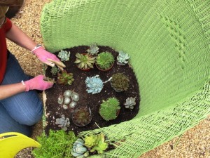
We had a little free time on Sunday morning so Jean offered to do the planting layout for my chair. She worked with about 14-16 small succulent plants of varying colors (ranging from silvery-white to lime green to red-burgundy).

Step Four

Before planting the “seat,” we tackled the tricky gap in one of the chair’s rolled arms.

Plants in the "arm"

A total negative from my mother’s point of view (the shredded wicker arm reminded her that a childhood dog had gnawed on the arm and practically ruined it for comfortable use), I decided to use the gaping void as a spot for more succulents.

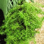
Jean fashioned a shallow tray with the 1/4-inch wire mesh sheeting. We fit it under the arm and wired it into place. Just as with the seat, we inserted some pieces of Angel moss and poured in some soil. The chewed-away openings now hold three succulents, including the very pretty Sedum rupestre ‘Angelina’. Its chartreuse-color and fluffy form will drape over the arm and soon obscure the mesh tray.

Jean Zaputil, as always, my garden muse

Jean arranged the sedums, sempervivums and other succulents to create the planted seat.

Even though the root space appears shallow, these plants will do just fine. They are ideally suited for my project – able to withstand extended periods of drought.  A quick “shower” every week or so will give the plants enough moisture to take root in the soil/Angel moss and begin to spread, eventually filling in the seat.

And pretty soon, I’ll have a lush, succulent “cushion” for my grandmother’s wicker chair.

Now I’m looking at a modern wicker chair – a Pier One version with leg bent from too many teenagers leaning back in it while playing X-box games – and thinking about giving that chaise a new life in the garden. It’s currently natural colored, but maybe a coat of paint and a new planting theme will give it the necessary style to move outside.

Wonder what plants belong in that chair? Maybe I’ll paint it peacock blue and do an all-white flowering scheme! Stay tuned.