Debra Prinzing

Get the Email Newsletter!

Author Archive

Erin Benzakein’s seasonal and sustainable flowers

Saturday, March 21st, 2009
Read "The West at its Best," pages 20-21

Read "The West at its Best," pages 20-21

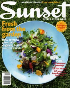
The April 2009 issue of Sunset magazine features my friend Erin Benzakein of floret flowers. Erin is a young organic flower farmer and talented floral designer who values seasonal ingredients for her bouquets and uses sustainable practices to raise a wide array of flowers, blooming shrubs and attractive foliage.

I met Erin in the spring of 2006 through her father David Perry, a gifted photographer (that was the first day I met Dave, too, when we teamed up on a garden scouting excursion after being introduced by a mutual colleague). That meeting, at Waverly Jaegel’s antique rose-filled garden in Skagit Valley (Washington State), was the beginning of two inspiring and invigorating friendships for me.

The three of us talked about our mutual passion for locally-grown blooms. Erin and I discovered our love of floral design that’s “in the moment,” depending on what’s in bloom in one’s own garden, or what you can find at the farmer’s market, from a friend’s flowering shrubs, or even foraged in the wild. That’s the essence of seasonal and sustainable floral design. It begins with the farmer who raises those blooms with care for the land and agricultural workers alike.

Over time, Erin, David and I realized we all hold a dream of some day creating a book about this topic. We hope it will be filled with stories that I write, photographs that David captures through his lens, and – of course – flowers that Erin grows and arranges. Whether it happens and in what form, time will tell. In the meantime, we are beginning to document the best stories of growers and designers with organic values. You can see some pretty exciting photographs on A Photographer’s Garden Blog, David’s visually alluring online journal.

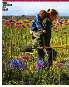
David and I shared Erin’s story with our editors at Sunset who agree that she has an unique and compelling passion and philosophy – one worthy of a feature in the magazine. The piece appearing in Sunset’s April issue, out now on newsstands, is spread across two pages with David’s evocative photo of Erin, carrying her son Jasper on her back, as she walks through rows of giant alliums. My Q-and-A with Erin has been reduced to just a few lines, but you can read my full interview with her here: 
Erin and Jasper, mother-and-son organic farmers

Erin and Jasper, mother-and-son organic farmers

The Western pioneer: Budding ambition

Erin Benzakein has turned her two Washington acres into a sustainable flower farm

By Debra Prinzing | Photography by David Perry

Erin Benzakein became captivated with fresh-from-the-border flowers while working on a Seattle estate’s garden crew. “I never before thought you could go into your yard and cut so many flowers. They looked like the Dutch paintings – perennials, berries, vines, floppy roses – all spilling out of a huge vase.”

Inspired, Benzakein planted two rows of sweet peas to create a fragrant “tunnel” (“I wanted to walk down it, just for the experience,” she confides). Suddenly, the 29-year-old mother-of-two became a flower farmer. “It was a done deal. All the vegetables got ripped out and were replaced with flowers.”  Since 2007, with her husband Chris Benzakein and their “bunch runners” (9-year-old daughter Elora and 6-year-old son Jasper), Benzakein has operated Floret, a 2-acre certified organic flower farm in Mt. Vernon, about 90 minutes north of Seattle.

Why are sustainable flowers important?

Eighty percent of the cut flowers we buy in the U.S. are imported from countries that do not have worker safety or pesticide regulations. I don’t think we should sacrifice the health of our earth, or that of the farmers, their children and animals, just to have a bunch of pretty blooms on our kitchen tables. If you buy your flowers locally – at a farmer’s market, from a roadside stand, or a grocery store that sources bouquets from local growers – they’re probably sustainably grown. You’ll help eliminate the use of jet fuel that flies flowers to America, keep money in your local economy and enjoy healthier and fresher blooms.

READ MORE…

Home Wizards Radio, gotta love it!

Friday, March 20th, 2009

Cindy Dole is LA’s home improvement and design go-to gal on the AM dial. You can hear her “Home Wizards” show each Saturday morning for a full hour on KRLA 870-AM. Cindy chooses all of her music openers and transitions – each number is whimsical and creative. The morning I appeared, she opened the show with the Crosby, Stills, Nash & Young song “Our house is a very, very, very fine house . . . .” – A perfect segue into a conversation about home, haven, design and interiors.

I appeared on the March 14, 2009 edition of "Home Wizards" radio in LA

I appeared on the March 14, 2009 edition of "Home Wizards" radio in LA

Cindy invited me to be a guest on last Saturday’s show to talk all about my favorite subject: personal backyard escapes (aka SHEDS).  We’d been waiting several weeks to do the program, mainly because at this time of year I have too many Saturday lectures or trips. What a treat to finally arrive at her studio in Glendale early last week and meet Cindy in person. She is vivacious and knowledgeable, serving as both executive producer and host of her long-running show.

We found an instant rapport, along with my fellow studio guest, a Los Angeles floral and garden designer George Woods. George and his partner and wife Evonne Woods own The Woods Exquisite Flowers in Culver City.

When Cindy introduced my segment, she promised that we’d talk about “Man Caves” and “Gal Palaces.” I’ve heard lots about the man-cave movement, both here in the U.S. and also in the U.K. But I really love the gal-palace correlary. Looking forward to using those distinctions in my upcoming talks – it’s often not too hard to tell the difference between the styles.

If you want to listen to the interview, Cindy has it posted on her web site in two parts, about 15 minutes total. Enjoy and let me know what you think! Part One and Part Two.

When I saw George Woods’ beautiful floral arrangement that he and Evonne brought to the studio, I knew they were kindred spirits – people who appreciate flowers in season and who are far from traditional in their design approach.

Cindy Dole with George and Evonne Woods - and their gorgeous arrangement of spring blooms

Cindy Dole with George and Evonne Woods - and their gorgeous arrangement of spring blooms

Displayed in a low, square glass vase, combining a palette of greens and vibrant oranges, reds, and purples, George’s design drew from a wonderful mix of flowers and foliage. 

His fresh, new “happy” spring green came mostly from a surprise ingredient: ephemeral Maidenhair Ferns; plus, Algerian variegated ivy, pale green viburnums and hydrangea blooms. Parrot tulips, ranunculus, roses, anemones and some pretty awesome dark purple and fuchsia-colored sweet peas comprised the brighter hues. So breathtaking. Plus, all the stems of these cut flowers and foliage were hidden in a woven “nest” of just-sprouting willow that George used to line the vase.

A lucky listener won the arrangement, but I certainly lusted after it, too. I can’t wait to see what else George has designed (he promised to take me to a certain garden on a Malibu hillside very soon!).

Breaking News: Buyers step up for San Francisco Flower & Garden Show

Thursday, March 19th, 2009

Duane Kelly, owner of the popular Northwest Flower & Garden Show and the San Francisco Flower & Garden Show, dropped a big surprise gift into our laps last night at the SF Flower Show’s garden media reception in San Mateo, Calif.

While making remarks about the show’s history he announced that a deal was reached on Tuesday, March 17th with an investor group that will purchase the San Francisco Flower & Garden Show.

That means the show will go on! At least here in Northern California.

The 2010 San Francisco Flower & Garden Show will be staged by the new owners, a group of horticultural enthusiasts who recently joined forces to acquire and continue the wonderful spring event.  SF Garden Show LLC will be led by a new steering committee comprised of well-known landscape gardeners and growers including Davis Dalbok of Living Green, Mike Boss of Rock & Rose Landscapes, Robin Stockwell of Succulent Gardens, and led by Chairman Tim O’Shea of Greenworks Design.

The new team wants to ensure that the show will celebrate its 25th anniversary next year.

Congratulations to Duane Kelly and his awesome team of garden creators – the magical people who bring springtime to our gray, wet, cold days. Their legacy will continue in an exciting new way!

More details to follow. I filmed videotaped the announcement and remarks made by two of the new owners but I won’t be able to post my video clip until this weekend.

A POD in the Garden (POD=Personal Outdoor Dwelling)

Saturday, March 14th, 2009
San Francisco's hottest garden and plant emporium, Flora Grubb

San Francisco's hottest garden and plant emporium, Flora Grubb

A great gathering of Shed-Fanatics joined me at Flora's

A great gathering of Shed-Fanatics joined me at Flora's

After my exhausting trip to the wintry Philadelphia Flower Show, I returned to LA for a quick overnight to recharge my batteries with my family.

Then, last Thursday, I returned to Burbank to fly north to Oakland.

My friends at the Garden Conservancy invited me to share my fascination with sheds and hideaways at an evening benefit lecture.

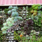
Hosted by horticultural celebrity Flora Grubb at her eponymous urban emporium, the after-hours event included cocktails and hors d’oeuvres among Flora’s awesome collection of palms, succulents, Mediterranean and drought-tolerant plants – and more.

Flora and Debra, smiling in this great garden setting

Flora and Debra, smiling in this great garden setting

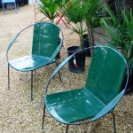
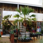
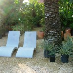
She curates this environment with an eye for design, style and presentation. Furniture selections, displayed among plant groupings really “pop” – from avant-garde concrete chaises to retro-salvaged circle lawn chairs (see below for specifics).

The playfulness with which Flora and her staff have created this plant-centric lifestyle just puts a smile on my face. I’ve heard and read about this cool SF destination nursery for a few years and am thrilled to have been given a great excuse to travel and speak there.

Thanks for the experience begins with my friend Margo Sheffner, who is Flora Grubb’s book buyer extraordinaire. Margo, who is also the business manager for the Pacific Horticultural Foundation (a nonprofit of which I am board member), was an early fan and supporter of Stylish Sheds and Elegant Hideaways. She brought it to Flora Grubb’s and continues to update me about how Flora’s customers “get” the notion of backyard sanctuary, habitat and haven. And that translates into book sales (which is so reassuring in this non-print phase we’re in). Yeah! It makes me happy to see our book in this cool environment.

Here’s a little gallery of Flora Grubb’s Garden. You will love every image:

Credit for my lecture title, “A POD in the Garden,” goes to Garden Conservancy west coast program manager and all-around horticultural go-to gal, Betsy Flack. She came up with the idea of using the acronym P-O-D (as a personal-outdoor-dwelling). I love it! This is my new buzzword. Stylish Sheds includes a chapter about Loretta Fisher’s “Mod Pod” in Austin, so Betsy’s title is apropos. Betsy and her assistant Maria Martinez (along with several Garden Conservancy staff, friends and volunteers) put on a lovely evening. I felt welcomed among so many kindred spirits.

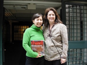
The following morning, I stopped by Dwell's editorial offices to say hello to Miyoko

The following morning, I stopped by Dwell's editorial offices to say hello to Miyoko

Before I started my talk, Betsy invited Miyoko Ohtake, associate editor at Dwell magazine, to share a few words. Miyoko is a talented young architect-journalist who joined Dwell last summer after impressive gigs at Wired and Business Week.

She contacted me in August to ask if I could serve as Dwell’s guest expert for a review of prefabricated sheds (February 2009 issue). It was great to finally meet her in person and to also have the audience meet Miyoko and hear her enthusiasm for modern outdoor design. Dwell supported the event and Miyoko blogged about my talk in advance of the evening.

Then, Flora invited her architect-friend Seth Boor, AIA, of SF’s Boor Bridges Architecture, to comment on the city’s zoning issues relating to shed construction.

It was a stroke of brilliance to include Seth on the program. He and Flora (and her partner Kevin Smith) recently collaborated on a very cool planted-wall installation at a hip, new Napa Valley hotel called Bardessono. The project was recently documented by Stephen Orr in the New York Times. So we were in excellent company (oh, and how cool is this? Stephen was in the audience – what a sweet guy to come hear my talk).

Among other remarks, Seth touched on the permit and installation parameters for anyone wanting to add a backyard shed in San Francisco:

  • No permit is required if you build an outdoor structure under 100 square feet in size and no taller than 8 feet high.
  • The configurations can vary. For example, the structure can be 10-by-10 feet or 8-by-12 feet in size.
  • As for height, as Seth pointed out, “Eight-feet-tall is a little short” but you can work with it.
  • Working without a permit “frees you up to do anything within that size,” he says
  • Also, if the structure isn’t permitted, the typical setback rules do not apply. However, there is the “good neighbor” rule and Seth recommended that shed-builders think about how a 100-sf structure will appear to a neighboring property.

Debra’s note: Creative shed-owners are already aware of this issue. I’ve seen shedistas carefully paint, embellish and artfully adorn the side of their structure that faces a neighbor’s lot. Good shed policy!

Botanical fantasy? Or Shoe Fetish?

Monday, March 9th, 2009
Shoes for a flower fairy with twigs, moss and petals

Shoes for a flower fairy with twigs, moss and petals

I spent a few days last week at the spectacular Philadelphia Flower Show. It was my second time traveling to this Grand Dame of indoor flower shows to give a garden talk. When I first presented there in 2006, I was blown away by the over-the-top displays and ambitious floral designs. This year’s theme, “Bella Italia,” inspired show designers to highlight Italian- and Mediterranean-themed gardens.

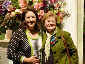
Debra (left) and Mary-Kate Mackey (right). We posed in front of a lavish rose-filled urn at the entrance to the Philadelphia Flower Show.

Debra (left) and Mary-Kate Mackey (right). We posed in front of a lavish rose-filled urn at the entrance to the Philadelphia Flower Show.

With my roommate, Mary-Kate Mackey, I managed to squeeze in lots of adventures in my 36 hours on Pennsylvania soil (I spent more time trying to fly there and back than I was actually on the ground, due to a doozy of an East Coast snow storm that stranded me in Dallas overnight and then marooned me for five hours in Milwaukee). Unfortunately, I missed seeing all of my fellow Garden Writer members because I was sitting in the Milwaukee Airport at the exact time the regional meeting took place. Oh well.

But – finally – when down to my last option of continuing eastward or returning home to LA, I grabbed a seat on the only flight to Philly that day. I arrived late last Monday and met up with Mary-Kate, who was in town to teach a one-day writing class for Garden Writers, and to see the show.

After my lecture on Tuesday afternoon, we strolled out to the show. With M-K as my tour guide (all-knowing, she had been there for several days, including hours spent behind-the-scenes during show set-up). We meandered through “Bella Italia” – kind of like taking a cross-country floral tour – all in a single day.

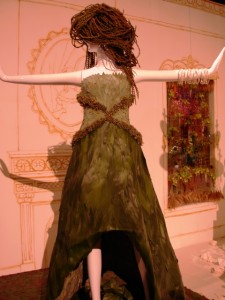
With gardens devoted to Italy’s major tourist regions, there was lots to admire. But the most surprising and artistic of them all celebrated Milan. Milan is the fashion capital of Italy. The American Institute of Floral Designers (AFID) created a floral fashion show of sorts. Spectacular stuff!

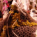
Foliage as soft as velvet creates the bodice of this nature-inspired creation

Foliage as soft as velvet creates the bodice of this nature-inspired creation

Against a stark white backdrop of mannequins and props, the designers displyaed imaginative shoes, handbags, hats, jewelry and garments . . . made out of petals, leaves, pods, buds, stems, needles and more. In every hue and texture of flower and foliage. Oh, so beautiful. M-K likened the technique of layering and gluing individual petals and plant parts (to create fields of color) to a small-scale version of Pasadena Rose Bowl Parade’s float production. It is a good explanation of the way these inventive designers rendered fashion “in bloom.”

Bows, buds and pods adorn this pair of stylish heels

Bows, buds and pods adorn this pair of stylish heels

More inspiring than the dresses, though, was the footwear. People were standing three- and four-bodies deep to gaze at and try to capture photographs of these dainty delicacies for the toes.

What is it about shoes? We asked each other this question as we, too, tried to get close and peer at the high heels, strappy sandals, little ballet flats, avant-garde boots, and more.

Are shoes magical, like Cinderella’s glass slippers? Or do they just seduce us with those sensual shapes? I know from experience that a gorgeous pair of shoes (comfortable ones would be nice, too) gives many women a feeling of power and confidence.

A whimsical pair of boots (made from chicken wire and moss), spotted in Holland in 2005

A whimsical pair of boots (made from chicken wire and moss), spotted in Holland in 2005

Shoes in the garden never fail to charm and delight. Think of those people who love to plant hen-and-chicks in old work boots.

A steel "spring" adorns the toe of this shoe-planter

A steel "spring" adorns the toe of this shoe-planter

I love my wacky garden shoes, also known as “Steel Heels.” I discovered them when I lectured at the Boise Flower Show in 2006.

Cut from steel and welded with fanciful heels and swirly toes, these artful shoes were made by Micki Shampang-Voorhies and her husband Gary Voorhies. I love that these perfect Size 8’s are weathered over time to reveal a rusty patina.

These shoes make me smile every time I see them in the garden.

The artists, whose Blue River, Oregon, studio is called Custom Copper & Iron, turn everyday scrap metal and rusted tools into fashionista-worthy shoes.

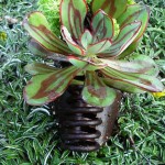
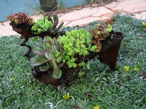
Castoff springs, drill bits, bolts and even a handle of a garden faucet create the heels of each artistic stiletto. Tuck a few sedums into the toe or heel and I’ve started my own shoe wardrobe in the garden:

"Steel Heels," planted with succulents

"Steel Heels," planted with succulents

 Enjoy this garden gallery of shoes and other fashions for your visual delight:

The New Terrarium: Small world, Big influence

Saturday, March 7th, 2009
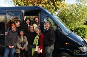
Our Holland gang, with Tovah front and center (she is the short, grinning gal with a huge camera around her neck). Clockwise, from left: Kathy Renwald, Bianca Helderman, Anne Nieland, Debra Prinzing, Walter Reeves, Mary Robson, Nellie Neal and Tovah Martin

Our Holland gang, with Tovah front and center (she is the short, grinning gal with a huge camera around her neck). Clockwise, from left: Kathy Renwald, Bianca Helderman, Anne Nieland, Debra Prinzing, Walter Reeves, Mary Robson, Nellie Neal and Tovah Martin

I met Tovah Martin in 2005 when we both participated in a media tour to Holland during spring bulb season. Since I had for years enjoyed and admired Tovah’s garden writing in the original Victoria magazine, you can only imagine how exciting it was to actually meet her.

I think we were both surprised at how quickly our little group of seven (including our wonderful guide Bianca Helderman from the Netherlands Board of Tourism & Conventions) bonded as accidental fellow travelers. I have vivid memories of Tovah wearing her knee-high rubber boots to tramp around the bulb fields at Hortus Bulborum  (I actually envied her pragmatism: I mean, who else would pack a pair of waterproof gardening boots to bring on a trip to Europe!?)

Tovah gave me a very important gift that week. I still remember sitting across from each other at an ancient trestle table. We ate lunch and swapped stories about book publishing. Known and loved around the globe for her beautiful Tasha Tudor’s Garden and Tasha Tudor’s Heirloom Crafts and many other books, Tovah graciously shared her advice and guidance as I struggled with how to develop my “garden shed” book (it was just an idea back then). Her suggestions about photography really influenced my decision to partner with Bill Wright on Stylish Sheds and Elegant Hideaways, rather than working with a variety of photographers in every market. She gave me a lot of clarity and I cherish her advice.

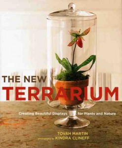
newterrariumcover001So now, I’m the lucky recipient of newest Tovah Martin book, by all counts, her 13th title. The New Terrarium: Creating Beautiful Displays for Plants and Nature, was published on March 3rd by Clarkson Potter/Publishers. [Full disclosure: Clarkson Potter also published our book – we love everything they produce!]
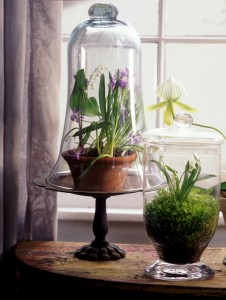
Captured on film by photographer Kindra Clineff, The New Terrarium is a magical tome filled with small, planted scenes, landscapes, still-life’s and collections under glass.

Tovah brings a perfect combination of talent to this dreamy book. She is a gifted storyteller, both visually and with words (Tovah art-directs and produces many of her magazine articles for Country Gardens and other publications); she has a long history as an expert with indoor and greenhouse plants from her past career at Logee’s Greenhouses; and she is a visionary who understands how to get others excited about her passion.

The idea of creating a book about gardening under glass (on a small scale) struck a chord with this avid plants woman. Here is an excerpt of my recent conversation with Tovah:

Q. How did The New Terrarium come about?

A. Kindra and I started working on magazine projects together, and when Clarkson Potter came to me with this idea, I thought of Kindra. She is a cross between a garden photographer and an interior photographer.

This ode to spring under glass includes white wood hyacinth (right) and lily-of-the-valley with glory-of-the-snow (left). Kindra Clineff photograph

This ode to spring under glass includes white wood hyacinth (right) and lily-of-the-valley with glory-of-the-snow (left). Kindra Clineff photograph

Q. What enchants you about gardens under glass?

A. Way back when I was at Logee’s, I originally lived in the upstairs of the house that overlooked all the greenhouses. Why I find (terrariums) so quaint, and why I can really get into them, is that I’ve never lost that feeling of loving things encased in glass. I loved looking down on the glass greenhouses. I even used to produce little booklets on how to plant terrariums for people who wanted to make or sell them.

Q. Terrariums are a tradition that dates back more than a century. What makes this technique, this idea, suddenly “new”?

A. I can’t think of a modern terrarium book. What I’m hoping is that people in office buildings, people with no access to gardening for a major part of their day, will think of this as a low-maintenance way to bring nature into their lives.

Q. You really believe that plants can be transformative?

A. I kept calling up Kindra and saying, “This is really big. We’re going to change the world.” I saw that this whole mode of gardening has the potential to rescue people from terminal office life.

Q. Tell me about the glass containers you used to create your projects. There is such an incredible variety – many surprised me.

A. Almost anything can be used. You can just start looking at glass this new way.

[Debra’s note: The New Terrarium is packed with inspiring ideas of the types of containers suitable for planting – from traditional cloches, Wardian cases and lantern cloches to more contemporary vessels, including recycled aquariums, hurricane lanterns, vases and repurposed glass domes used to cover cakes or cheese platters.]

“]A Wardian case with a deep base simplifies planting directly in the case. Kindra Clineff photograph]

A Wardian case with a deep base simplifies planting directly in the case. Kindra Clineff photograph

Q. What do you hope to teach gardeners and non-gardeners about growing plants under glass?

A. It’s an easy way for people to enjoy plants. Basically you don’t need to water very often. You don’t even need to fertilize.

[Debra’s note: Tovah has included a comprehensive plant encyclopedia that recommends a surprising array of plants for glass gardens, including: orchids, ferns, heucheras, begonias, mosses, African violets, bromeliads, ivies, ornamental grasses and more.]

Q. I love the photos! How did you and Kindra produce the shots?

A. This book was the challenge of the century because everything reflects in glass. We now understand why no one’s done this book before. Kindra had to surround herself in a black piece of velvet (so she wouldn’t be reflected in the shot). We kept joking that we should do the author and photographer’s portraits reflected in glass.

Q. Did you photograph at your Connecticut farmhouse?

A. We shot at four different houses, one of them being mine. I have a converted barn with big, huge windows and a little cobbler shop from 1790. A greenhouse connects these two buildings. We used the windows of these houses (for a backdrop). But most terrariums should be displayed away from the sun or windows.

Q. Tovah, how do you describe your writing philosophy?

A. This has been a lifelong mission for me: To write for (publications) that aren’t necessarily reaching gardening audiences in order to expand the whole realm.

Thank you! What a great conversation and a spectacular book.

Happy birthday to me

Saturday, February 28th, 2009
Celebrating my first birthday, February 28, 1960, with my mother, Anita

Celebrating my first birthday, February 28, 1960, with my mother, Anita

It pains me to admit it, but I was born 50 years ago today.

But one of my hip, young friends told me she thought I was 41, so I totally love her for that.

The hardest thing about turning 50 is that my mother can’t quite believe she has a 50-year-old child.

My mother is the youngest person I know. She is an artist and a writer and she has more curiosity about life than I will ever have. She also has patience, kindness, empathy and incredible courage.

I think today is more about celebrating Anita Louise Ford Prinzing than anything else. Thank you, Mom. You are the best. (Thank you, Dad, too. You are also the best!)

My husband has turned the five-year birthday mark into an art form. When I turned 40, our boys were 2 and 7. Bruce surprised me by flying my mother to Seattle to take care of them so we could go to Palm Springs for the weekend.

When I turned 45, he flew me on Business Class to London and arranged for me to spend 5 days visiting the Chelsea Flower Show and other awesome gardens (including Wisley, Great Dixter, and Sissinghurst). A magical, unforgettable trip. The pressure was on for turning 50.

But I decided to take matters into my own hands to plan my 50th b-day and also Bruce’s and my 25th wedding anniversary (which is in August). So I booked two weeks at Villa Maddalena, a magical and ancient villa that our friend Marcia has renovated. It is situated in a small Tuscan village called Montisi. At the end of October, I will get to spend one week there with many of my girlfriends. And then, the following week, Bruce and my sons will come for a family vacation – to celebrate our 25th anniversary.

When I invited my girlfriends to make the trip, I wrote something a little carefree (careless?).

Live large, people. The economy is in the toilet; the publishing world is spiraling into a ghost of its former self. Oh well. What’s left to do but eat pasta and drink Chianti?  

This kind of cavalier attitude might be what gets us through the current malaise of life. Many of us are in a waiting pattern. . . waiting for life to get back on track, waiting for things in Washington to sort themselves out, waiting for a job, waiting for the housing market to rebound. We have to find the joy, the surprise, the spontaneity. Birthdays allow us to do just that. We have one day every year to be self-indulgent and frivolous. Oh, but there’s one problem. I have two story deadlines today. UGH.

Even so. . . it will be a day of laughter, family, friends, and celebration – as I think about that Tuscany trip in October.

A Malibu garden party worth writing about

Thursday, February 26th, 2009

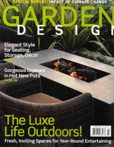
gardendesign0309001Designers Scott Shrader and Julie Millgan are friends who teamed up to produce a fantastic garden party for GARDEN DESIGN Magazine’s March 2009 issue (on newsstands now). I am the fortunate scribe who was asked to tell the story of their “Sunset Soiree” (which is what I titled the 10-page article). A great shot of Scott Shrader’s custom fire table appears on the cover of the magazine.
Here’s the background: Scott designed the outdoor living spaces of a modified A-frame midcentury beach house owned by Rea Laccone and Paul Perla, a style-savvy couple who run the casual fashion line called Vince USA.

When the project was completed, Rea and Paul suggested that Scott invite a few friends and clients to “show off” the project and celebrate. He took them up on it and recruited Julie Milligan, herself a fave Garden Design landscape designer, to produce and co-host the party.

Garden Design sent along Jack Coyier, a great photographer (this is my third article illustrated by Jack’s photographs – his images also accompany a piece Metropolitan Home’s March issue and last September’s Garden Design cover story about Ron Radziner’s garden in Venice). Through his lens, Coyier captures the playful, carefree nature of the space, the event, the people and the food — with gorgeous shots.

Scott Shrader and Julie Milligan - on location in Malibu

Scott Shrader and Julie Milligan - on location in Malibu

Even though this is an outdoor entertaining piece, the story naturally centers around its designed environment and the oceanside setting. Buy the magazine in order to really feast your eyes on the photos. Or read it here, on my web site: Sunset Soiree.

For the student of landscape design, this project offers several important take-aways. This is not a plant-centric space, so some hort-heads may scoff that Garden Design actually describes it as a “garden.”

But by designing with stone, textiles, elements like fire and water – and plants – Scott has created a magnetic reason for his clients to spend time outdoors.

And isn’t that the point, the mission of everyone in the garden-making world? To advocate for the role of exterior design and put it on par (or even elevate it!) with architecture and interior design? Scott has hit a home run with this project.

A stucco half-wall encloses the U-shaped banquette that Scott Shrader designed for his Malibu clients

A stucco half-wall encloses the U-shaped banquette that Scott Shrader designed for his Malibu clients

Even though you’d think it would be awesome to live by the beach (who wouldn’t?), there are some pretty harsh conditions here to challenge a homeowner and designer alike. The extremes range from intense sunlight and heat to intense wind and chilly temperatures. So the design thoughtfully accommodates the elements and helps protects those who spend time in the outdoor spaces.

To begin with, the home’s entry area (the non-ocean side) was really just a jumble of grass and an aging deck. Scott reconfigured these “negative” volumes to form a spacious outdoor living room. It doubles as the entry courtyard, enclosed on four sides. Two sides are created by the “L” of the home; new walls form the other two sides (one wall has a rustic wood entry gate; the other is the backdrop to a linear pool of water level with the “floor” of the space). The courtyard is by no means dark because sunlight flows through the beach house. Glass walls on the home’s west and east sides give the home a see-through quality.

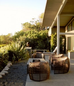
On the western side of Rea and Paul’s house is a serene sunset-viewing terrace. When the winds die down, the couple adjourns to this partially-covered outdoor room. Sinking into comfy armchairs, they can prop their feet up on the versatile basalt table-bench-firepit and watch the orange-red orb disappear beyond the Pacific’s horizon. A lone palm tree – part of the borrowed scenery – adds a bit of perspective to the scene.

The new basalt patio faces the ocean; new furnishings from Janus et Cie are placed around a cool basalt fire feature.

The new basalt patio faces the ocean; new furnishings from Janus et Cie are placed around a cool basalt fire feature.

Here are some of Scott’s the smart design ideas:

  • Palette: Inspired by the fashion colors in the Vince clothing line, Scott worked with a range of gray hues (this means a monochromatic use of pewter-colored basalt, aluminum planter boxes and smoke-gray cushion/pillow fabric choices). Shrader translated Vince’s spectrum of warm-toned neutrals – ranging from dove-gray to dark gunmetal – into a tranquil and unified garden environment.  “If you look at the Vince clothing line, you see warm grays. I wanted to use that palette and keep things minimal and clean to reflect Rea and Paul’s  life,” he says.
  • Function: This is not just a pretty space to observe from an indoor vantage point. The courtyard has multiple functions, with a U-shaped chaise providing incredibly generous seating (what do I mean by the term “generous”? I can easily imagine several intimate clusters of two or three friends in intense conversation OR 20 hipsters for pre-dinner drinks). But what I like most, as I said in the article, is that Scott created a cozy, curl-up-your-feet kind of space. When there are gusts of wind at the shore, this space is protected; blocked mostly by the home’s architecture.
  • More Function comes by way of the 6-by-6 foot coffee-table cum buffet-counter. It is the most utilitarian element of this setting. Hidden castor wheels enable its movement, rolling in-and-out of the “U” seating area. Custom designed by Scott Shrader and fabricated of weathered teak (very beachy), the chunk of wood is earthy and durable. Piled with beverages and hors d’oeuvres during the photo shoot, it earned its weight in gold.
  • Even More Function is revealed in the basalt-wrapped fire feature, pictured on Garden Design’s cover. The heat source doubles as a cocktail table and bench. Its flames are mesmerizing; you can get even closer to the warmth by perching on the ledge. “This part of the garden is fairly limited in size, so I wanted to give it a warm element and make it a generous gathering space,” Scott says.

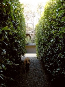
Cliipped Carolina laurel cherry hedges form a transitional corridor between the two gardens

Clipped Carolina laurel cherry hedges form a transitional corridor between the two gardens

Where plants are used in this landscape, they serve as architectural and sculptural purposes. The opening shot of the magazine spread depicts one of Scott’s guests as she walks through a hallway of green (which creates a maze-like journey from entry courtyard to oceanside terrace). The hedge-walls are formed by clipped Carolina laurel cherry (Prunus caroliniana). Simple and dramatic. So much more exciting than a few stepping stones that could serve a similar, but ordinary purpose.

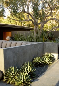
Just inside the front gate is another beautiful and functional feature – a basalt counter that acts as a foyer table. On it, Scott placed a potted bonsai of boxwood. It has just as much presence as if he put a small ornament or sculpted object instead. Phormiums and agaves also lend sculptural form; they are mulched with Japanese black river rock, which looks sleek, modern, and works with the overall slate-gray palette.

Finally, there are two private miniature gardens outside the guest bedrooms. Scott treated these spaces as still-lifes; he called them “planted beach” scenes. Grasses and phormiums emerge from a salt-and-pepper mixed gravel carpet. A stone bench, planted with a moss “seat” is quiet and meditative in feeling. I can understand the sense of calm that settles over Rea and Paul when they escape here after an intense week in the city. This is another world altogether.

I ended the article with this paragraph:

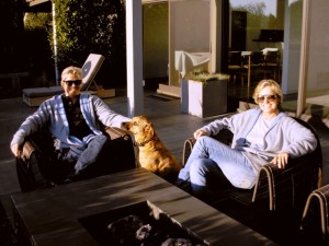
To Rea and Paul, the Malibu getaway is one of the only places they can relax and unwind. Rea loves the “boundary-less environment” that encourages her to easily move from indoor spaces to the open-air ones. “Sometimes we quietly sneak out here by ourselves,” Rea says. Yet she’s happy to welcome friends, even during sweater weather. “How lucky am I? “Paul and I are both from New England, so we couldn’t be more excited to live near the ocean and where we need our sweaters.”

So, you can tell that I loved this garden and I certainly loved writing about it!

Stylish Sheds and Elegant Hideaways at the Northwest Flower & Garden Show

Monday, February 23rd, 2009
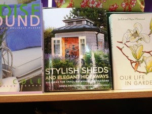
Stylish Sheds, a featured book at University Bookstore's display

Stylish Sheds, a featured book at University Bookstore's display

I’ve just returned from spending three days at the fabulous-but-possibly-final Northwest Flower & Garden Show in Seattle where I saw many, many gardening friends, hung out with my Hortus Posse pals and enjoyed a week of Seattle Sunshine (Seriously, folks. It was raining in Burbank when we flew outta here on Feb. 16th and sunny when we landed in Seattle!).

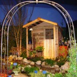
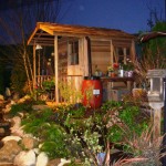
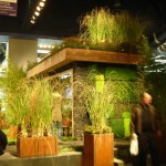
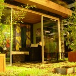
Of course, I was preaching the message of Stylish Sheds, and I’m happy to say, my “Shedar” (that’s like Radar, but it’s my own version of being alert to shed-spotting all around me) zoomed in on several fantastic garden structures, sheds, arbors, pavilions, shelters and enclosures.

It seemed as if every display garden at the show featured a fanciful structure in the garden. That goes to show you how important it is to design with not just plants, but architecture in mind.

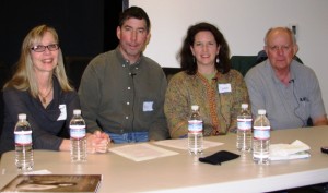
Bill Wright, my collaborator on Stylish Sheds, and I kicked off the week with a Tuesday lecture for his peers in the Seattle chapter of American Society of Media Photographers. We participated in “The Odyssey of a Book,” a panel with two other book-savvy photographers, Dick Busher, of Cosgrove Editions, and Rosanne Olson, creator of a beautiful new book called “this is who I am — our beauty in all shapes and sizes”. The audience included fellow photographers, some of whom are also members of Garden Writers Association (David Perry, Mark Turner), friends Marcia Gamble Hadley and writer Robyn Cannon, as well as my former cohort from Seattle Post-Intelligencer days, Steve Shelton (what a treat to see him in the audience!). While we writers were definitely in the minority in the crowded room at Seattle Central Community College’s photography studio, it was a great experience talking books with kindred spirits.

Rosanne Olson, Bill Wright, Debra Prinzing and Dick Busher

Rosanne Olson, Bill Wright, Debra Prinzing and Dick Busher

On Wednesday, I took a tour through the Flower Show and snapped a bevy of shots to document the veritable bevy of sheds and shed-like structures featured in the show (see below). I was particularly gratified to see two Modern Shed structures by the talented Ryan Grey Smith and his team. Ryan adapted his awesome prefabricated shed architecture for two display gardens, including Michael Hancock’s “Serene Scapes” garden and Tony Fajarillo’s “Collaborating with Nature” garden.

Bill and Debra at their book signing

Bill and Debra at their book signing

On Thursday, I was back on my soapbox, speaking about backyard architecture in “Your Personal Escape,” my lecture illustrated by many of Bill’s awesome photos from our book. Bill joined me for a booksigning afterwards and we’re pleased to say that University Bookstore sold out of copies of Stylish Sheds. Hopefully, they’ll order MORE books next time!

The week went by way too quickly, but upon reflection, it was a perfect moment in time; a perfect experience to savor for months to come.  I’ll close by sharing some of my favorite structures: A Gallery of Garden Architecture from the 2009 Northwest Flower & Garden Show’s designers.

Shed Spotting in Pasadena

Saturday, February 14th, 2009
The gate leads to a Shed Surprise

The gate leads to a Shed Surprise

If you’ve been following Shed Style for any period of time, by now, you know that I use the term “SHED” quite broadly to describe “a shelter in the garden.”

And so, here are two very different, but equally enticing, glimpses of garden shed architecture that I had the good fortune to tour earlier this week. The occasion: a preview of the Feb. 28th study tour that Betsy Flack of Garden Conservancy has designed to accompany the Feb. 27th seminar: Gardens that Re-Make Themselves.

The seminar will examine the restoration of historic gardens to reflect the original architecture and period, as well as sustainable design practices that today’s garden makers can use to ensure their landscapes endure for future generations. Several really incredible established gardens, mostly in Pasadena, will be open to seminar participants who take the study tour.

The garden structures I visited are relatively new, but they were designed – in the spirit and character of the property’s origins – to fit into older landscapes .

M's Garden House

M's Garden House

“M’s” Garden House stands at the back of a long, narrow garden in an historic Pasadena neighborhood.

The 1926 residence, a one-story Mediterranean-style bungalow, is situated near the front of the 50-by-195 foot lot. Because her house is closer to the sidewalk, the parcel behind the house is very park-like. She has preserved and enhanced the original hard-scape and bones of this Italian-inspired garden. It is truly amazing to see the setting and realize it is 83 years old.

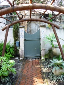
At the far end of the garden path stands a scallop-topped swinging gate. According to the owner, the gate originally led to an old tool shed for garden storage.

But she had other plans for this underutilized space and asked her architect to design a garden structure in keeping with the garden’s vintage.

Hugh Maguire, an architect who does work in Pasadena and Palm Springs, designed the 11-by-13 foot structure in1995. “I had seen an old English train station ‘storefront’ at a salvage place in Pasadena,” Maguire told me when I contacted him by phone. “It had the words ‘Waiting Room’ on it”

An urn, in the garden court

An urn, in the garden court

He thinks the fanciful storefront dates to the 19th century.

Maguire discovered it years ago at Across the Street from Alice, a Mission Street salvage dealer and has had his eye on it ever since.

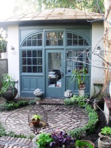
M’s request for a garden structure presented the perfect opportunity to use the beautiful architectural element with mullioned windows, an arched transom and detailed mill-work panels. Maguire spent around $1,200 for the salvaged facade. “Can you image what it would cost to have something like this custom made?” he asked me. No, I can’t. And that’s why I love it when designers and builders utilize materials from the past. Salvaged architectural fragments are a high art form when it comes to shed-making.

In order to build this pleasing space, a “collapsed shed” was removed. However, architect and client salvaged doors from the old structure and recycled them as cupboard doors on interior bookcases. In between the bookcases is a perfect-circle porthole window. It echoes the perfect-circle recycled brick “carpet” that now serves as the garden foyer to the little house.

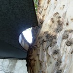
a cut-away in the roof to wrap around the tree trunk

a cut-away in the roof to wrap around the tree trunk

On top of the new stucco building, Maguire added a standing seam metal roof. In one corner of the four-sided roof that caps the garden house, they had to make a cut-out – to accommodate a stately eucalyptus tree that M did not want disturbed by the construction. That’s showing serious concern for her garden and the plants she inherited!

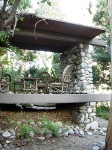
Redwood and river rock form a rustic gazebo

Redwood and river rock form a rustic gazebo

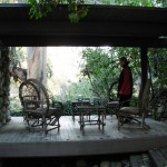
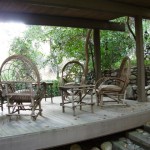
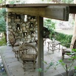
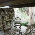
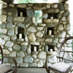
The second shelter-shed I visited is from a different architectural era altogether. It was designed by architects Conrad Buff and Donald Hensman in 1993. Carol Soucek King, its intuitive and creative owner, calls the structure a “gazebo.” It is far from a wimpy, ultra-feminine Victorian gazebo. This is a rustic, natural edifice that is situated at the upper edge of a creek.

Using local Arroyo Seco river rock for the foundation and side wall (notice the wonderful niches that allow for pedestal candles – imagine how meditative this space will feel at twilight!) and leaving the structure covered, but open-sided, the design is a study in native, organic architecture.

According to Carol, when the gazebo’s construction was completed, the builder, stone mason and architect gathered with the Kings for a Bento box lunch “to bless it.”

“We all sat here and were very conscious that this would be a sacred place,” she told me.

In a magnificent book about Buff and Hensman’s architectural careers, the structure is described as a “lineal redwood gazebo” . . . “conceived as a refuge.”

A refuge indeed. No one could wish for a better way to experience sanctuary, solace, spiritual respite and beauty.

Here are a few more images: