Debra Prinzing

Get the Email Newsletter!

Author Archive

In my own backyard: California’s Channel Islands

Sunday, May 24th, 2009
A view down the rocky coast of Santa Cruz Island

A view down the rocky coast of Santa Cruz Island

This won’t be a long post because it has been a long day. But I have some images to share from today’s field trip to Santa Cruz Island, which is part of a string of eight small islands forming the Channel Islands off the California coast (between Santa Barbara and Long Beach). Perhaps the most famous is the glamorous Catalina Island. But since I wanted to see nature and take a break from the freeways and noise, the remoteness of Santa Cruz was appealing.

My companion Paula Panich has ventured to Santa Cruz twice before by herself. She suggested a day trip over the holiday weekend and we both arranged to be away from our families for a good part of the day. It started by booking our passage through a commercial boating company called Island Packers. We each spent $48 for the round-trip journey. The boat left the Oxnard Harbor at 9 a.m. We boarded and sat up on the top deck, along with other pleasure-seekers, cameras and small video recorders around their necks. No one was disappointed by the 90-minute crossing, thanks to a playful performance from dolphins, including several that seemed to want to “surf” in the boat’s wake.

With my friend Paula, on the trail

With my friend Paula, on the trail

Paula had prepped me for this trip, helping dictate a list of what I should bring: 2 bottles of water; 2 bottles of Gatorade; a fanny pack and a backpack; nuts and dried fruit; a hat and sunscreen; polar fleece and a rain jacket; hiking shoes. I added my fav hiking food – hard cheddar cheese and salami, along with crackers.

The thing is, Santa Cruz is one of four northern islands that make up the Channel Islands National Park. The only amenities on this rocky, isolated destination are a few port-a-potties and potable water. You can plan ahead to camp or kayak here but everything you bring in . . . you must pack out.

We got off the boat at 10:30 a.m. and checked our watches: Four Hours. Before hiking, we wandered through the historic displays that covered Santa Cruz’s background dating to the first indication of human life there 2,000 years ago. Those humans were probably the ancestors of our local Chumash Indian tribe. European settlers had their moment in time here, too, unfortunately. This island was home to sheep, cattle and pig ranching over the years. Paula and I kept asking ourselves: Who would transport livestock to this island to “farm” when there was still a ton of good, undeveloped property on the mainland a century ago? Ridiculous.

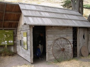
The restored black smith shed

The restored black smith shed

A relic of undetermined provenance

A relic of undetermined provenance

But, of course, we were tickled to see the remains of a few “sheds.”

There you go. Sheds are everywhere.

The natural beauty of Santa Cruz, though, made everything man made look uninspired. The terrain blew our minds. I kept saying: “It’s otherworldly.” Finally, Paula said it reminded her of Iceland, an otherworldly place she visited last October. When we hiked up to a bluff overlooking the Pacific Ocean to the southwest and the Santa Barbara Channel to the northeast, I was struck by how varied the geography is here.

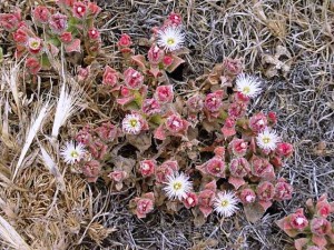
This blooming pinkish succulent carpeted the earth

This blooming pinkish succulent carpeted the earth

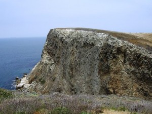
On land, it’s desolate, dry and hilly (the livestock ate most of the native vegetation, but there are efforts to reintroduce native plant species). On the perimeter, it’s rugged, weather beaten and dramatic, where the sheer face of the island exposes itself to the sea.

Here’s a paragraph from the National Parks brochure we picked up:

Santa Cruz Island: Here are pristine beaches, rugged mountains, lonely canyons, grass-covered hills, and some animals and plants that you have never seen before. This paradise is Santa Cruz Island, a miniature of what southern California looked like more than 100 years ago. The largest island in the national park, with 61,972 acres, Santa Cruz is 22 miles long and from two to six miles wide. A central valley splits the island along the Santa Cruz Island fault, with volcanic rock on the north and older sedimentary rock on the south. Today, the Nature Conservancy and National Park Service preserve and protect the island.

Rocky outcroppings, perhaps formed in an earlier millenia

Rocky outcroppings, perhaps formed in an earlier millennia

We spent most of our time just staring at the rock formations and speculating about what force of nature had shaped them in which millennium. The trails were narrow, single-file style, and perilously close to the edge of cliffs and bluffs. But we felt more exhilarated than frightened.

Our clock wound down to 2:30 p.m. and we had to make our way back to the pier to re-board the return boat. This morning, I worried about what on earth we would do to fill 4 hours on an island, one with no tree cover, few places to sit but on the ground, and lonely views of water and rock all around us. But breathtaking scenery, good conversation with a close friend, a zip-lock bag filled with nuts and dried fruit, a few cheese-and-salami bites and – wow – time flies.

I can’t wait to schedule a return visit. Just think, only 30 minutes away from home is the boat that will bring me back to the wild place called Santa Cruz.

A tale of a Wicked Plant (aka “The Case of the Poisonous Monkshood”)

Saturday, May 23rd, 2009

In preparing for a phone interview with prolific, bestselling author Amy Stewart to discuss her new book, Wicked Plants: The Weed that Killed Lincoln’s Mother & Other Botanical Atrocities, I came across a dog-eared manila folder in my office file drawer. Its label read “Emery’s Garden Monkshood.”

”]Autumn Monkshood - beautiful and poisonous [photo from Valleybrook Gardens Ltd.]And immediately, I recalled my own brush with a “Wicked Plant.” Before sharing my Q&A with Amy, I will indulge in the tale of Autumn Monkshood, aka Aconitum carmichaelii ‘Arendsii’.

In the late 1990s, I worked for a wonderful specialty nursery in Lynnwood, Washington, called Emery’s Garden. I had recently left business writing and a nonprofit communications gig to embark on my “garden writer” journey. Lucky for me, the people at Emery’s took me in and our relationship there flourished. I wrote and edited “The Weedy Reader,” our quarterly newsletter. I planned and produced our educational program and special events. I basically learned the horticulture business, thanks to Emery Rhodes, Marlis Korber and Amy Tullis.

After I left Emery’s in 2000 (that’s when I joined the team of The Herald’s “Home & Garden” section in nearby Everett), I stayed in close touch with my Emery’s pals. One day, in April 2001, I received a panicked phone call from Marlis, the nursery’s general manager.

Turns out, a customer purchasing perennials pointed out some odd tags on the 6-inch containers of Monkshood (Aconitum). The tag read: “All parts of this plant are tasty in soup.” The shopper had filled one of Emery’s carts with her two toddlers and three pots of the mislabeled (and wicked) perennial. “I thought this stuff was poisonous,” she said to our sales associate. “But this label says it’s edible.”

aconitum-story2aconitum010Needless to say, a check in Sunset Western Garden Book revealed the exact opposite to be true. Under “Aconitum,” Sunset warns: “All parts are poisonous if ingested.”

What resulted was a mini-international scandal and media frenzy. The common Monkshood, which is a beautiful, tall violet-blue ingredient in the cottage border, is NOT a tasty ingredient for soup or stews. Instead, it’s lethal.

The ensuing drama played out as you might expect. I got to play the role of Crisis-PR consultant while Emery’s pulled all the mislabeled plants, contacted the grower (a Canadian nursery), and soon discovered that the label mishap had been a stupid prank pulled by one of the grower’s employees! Within 48 hours, we were visited by the FDA; the Canadian authorities got involved; the plant recall went out over the wires; television, radio and print outlets picked up on the story and came to report on the scare.

In the end, it was a bit of a wake up call for Emery’s (and possibly other local nurseries) about the importance of using proper signage and labeling of toxic ornamental and landscaping plants. But I wonder, did anything really change? It certainly elevated consciousness at one nursery, at least for one season.

wicked012Now, however, with the advent of Wicked Plants, the evils of ingesting the flowers, stems or leaves of Aconitum are coming back to haunt me. The perennial is, in fact, the very first entry of Amy Stewart’s charming and horrifying new effort, published earlier this month. Amy writes:

In 1856 a dinner party in the Scottish village of Dingwall came to a horrible end. A servant had been sent outside to dig up horseradish, but instead he uprooted aconinte, also called monkshood. The cook, failing to recognize that she had been handed the wrong ingredient, grated it into a sauce for the roast and promptly killed two priests who were guests at the dinner. Other guests were sickened but survived.

Her scary narrative explains where the perennial grows and what to look out for (gardeners should wear gloves anytime they go near aconitum, Amy advises). The page is labeled “Deadly.”

Wicked Plants, is a compendium of horrifying stories and historical facts of the botanical world. If you have any question as to the deadly, illegal, intoxicating, dangerous, destructive, painful and offensive traits of the trees, shrubs, perennials and herbs growing on our planet, you’ll want to peruse this powerful little volume.

Between the pages of Amy’s 5-3/4 x 7-1/4 inch, 235-page book, which is bound in the same sickly green worn on the face of the witch Elphaba in the musical “Wicked,” are tales of death, destruction, war and more. I recently had a chance to chat by phone with Amy, and here is part of our conversation:

READ MORE…

Another amazing reason I’m starting to groove on Southern California

Monday, May 18th, 2009


For those of you who have known me for a l-o-n-g time, or even for ones who only occasionally stumble upon Shedstyle.com, it may be evident that I am torn between desperately missing Seattle, my home for most of the past 30 years, and embracing life in Southern California, where I’ve been living nearly 3 years now.

I’m learning that there is incredible beauty here in SoCal, especially if one gets off of the freeways and out into the raw, rugged nature. The same attributes that make me love the Pacific Northwest – the mountains, the ocean, the amazing plant life – are some of the ones that have made me begin to appreciate, value and (possibly) love my new home.

Yesterday was no exception. I slogged through 70 miles of freeway traffic on a mid-Sunday (which took 1 hour and 45 minutes, thank goodness for Prairie Home Companion or it would have been a lot worse!) to a place high above the ocean called Rancho Palos Verdes. When it comes to offering endless views of the Pacific shoreline, coastal beaches and blue ocean, it’s as breathtakingly gorgeous of a place as the more popular Malibu. Except, it seemed to me yesterday, with way less traffic and commercial development.

I met up with architect Ron Radziner of Marmol-Radziner, a Venice, Calif.-based architectural firm (which also has landscape architecture, interior design, furniture design and prefabricated design in its portfolio) to tour one of his projects. The property is called Altamira Ranch and the American Society of Landscape Architects recognized it with a residential design honor award in 2008.  My interview with Ron about the project will appear in a future issue of Landscape Architecture magazine. Suffice it to say that the approximately three sweeping acres of California native plants, surrounding a contemporary residence (also designed by Marmol-Radziner) is a study in excellent design. It is lesson that Bud Merrill, my former garden design instructor, would have so loved. He preached the gospel of “environmentally responsive design” – and I tell you, this project – home and landscape – makes huge strides in that practice of only “lightly touching” the earth.  Stay tuned for the full story.

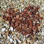
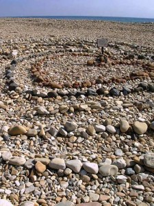
The alluring labyrinth patterns are visible from high above the beach

The alluring labyrinth patterns are visible from high above the beach

The stone design, made by unknown hands

The stone design, made by unknown hands

After Ron and I finished the interview, Julie, the owners’ personal assistant, offered to walk the property with me.

She is a wealth of knowledge about native plants and how they perform in a residential setting – especially this tricky coastal site that is exposed to high winds, intense sun, frequent blankets of fog, and saltwater.

We paused at the edge of the bluff and looked down at the beach, which was probably 200 feet below us.

Julie pointed out the stone labyrinths that beachcombers have placed on the shore and she told me where to park so I could walk down to see them (she also suggested where I could grab some lunch; ironically, it was at the grill where golfers eat when they’re finished playing the greens at the Trump International Golf Club).

I hiked down to the beach and made my way across the uneven, rocky surface. It isn’t one of those “take off your shoes and stroll barefoot” kind of beaches. My shoes kept filling up with pebbles, but I couldn’t imagine going bare. The wind was brisk, which you’ll notice in the poor sound of the two short movies I shot. How else do you show the experience of a labyrinth without a moving picture?

At the Beach with Deb:

httpv://www.youtube.com/watch?v=BKYt9OW2iQE

Walking the Heart-shaped Labyrinth:

httpv://www.youtube.com/watch?v=HSxQm4iv_GA

Here’s my takeaway from yesterday’s unexpected hour on the beach: I was given yet another gift of California’s natural beauty. It was a vivid reminder that I am here for a reason. I am still discovering the reason(s), but isn’t having a chance to drink in this beach, collect a few of these stones and witness the creative way artistic humans have responded to them reason enough?

Country Gardens: A Lavender Life

Friday, May 15th, 2009
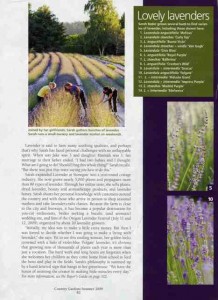
Look inside for Debra's feature about Oregon lavender farmer Sarah Bader

Look inside for Debra's feature about Oregon lavender farmer Sarah Bader

I’m sending a huge *virtual* bouquet of aromatic lavender to the lovely and wise Oregon grower Sarah Bader. Sarah is the subject of a story I wrote for the Summer 2009 issue of COUNTRY GARDENS magazine — out on newsstands now.

Another big bouquet goes to James Baggett, the awesome editor at Country Gardens who asked me to interview Sarah and write the piece. He has an uncanny knack for finding just the right story subjects for moi. And Sarah was a perfectly wonderful plantswoman to profile.

She is the purveyor of Lavender at Stonegate in West Linn, a village about 20 minutes outside Portland. As you’re planning summertime excursions, think about a thoroughly enjoyable detour to Stonegate. Sarah, her children, small staff, neighbors and friends – not to mention lavender enthusiasts from around the country – celebrate the season with several fun events, plant sales and u-pick opportunities. Just think, an aromatic escape that feeds your eyes, fills your head, and and nurtures your spirit. One step onto this farm and you’ll be cramming your hatchback full of dozens of lavender varieties. [UPDATE: Lavender at Stonegate’s “opening day” for the summer season is May 22nd. The Summer Lavender Festival weekend is set for July 11-12. You can check the web site for other events and open hours.]

Just to give you a whiff of Sarah’s lavender life, I want to share the opening lines of my story, “Purple Haze.” Laurie Black photographed the story. I’ve had the chance to collaborate with Laurie on a past article and I do love her work! Here it is:

countrygardenslavender002She lives and breathes all things lavender. When gentlewoman-farmer Sarah Bader isn’t working side by side with a few employees to propagate lavender cuttings and harvest armloads of the aromatic herb, she’s walking along hazy purple rows to evaluate her best-performing lavender cultivars. She gardens with lavender, cooks with lavender, perfumes her home with lavender, and is even writing a book about lavender.

Sarah calls her West Linn, Oregon, farm Lavender at Stonegate. About 20 minutes from Portland, the venture takes its name from a hand-carved stone pillar near the entry of her 5-acre parcel. Sarah began growing lavender as a hobby – a way to make her agricultural property productive after its original hazelnut orchard suffered from blight. Inspired by a visit in 2002 to the Sequim (Washington) Lavender Festival, Sarah started with 380 Lavandula sp. plants. She laughs at her beginner’s ambition: “I wanted to try growing 10 to 15 kinds of lavender. I jokingly called that first effort ‘my learning curve field’ because I couldn’t plant in straight rows.”

countrygardenslavender005I called Sarah this morning to see how she thought the final story and photography turned out. She was so pleased.

Pleased, too, that Country Gardens readers from all around the country, coast to coast, have already begun to contact Lavender at Stonegate with inquiries about special events this summer, about buying and growing lavender – and to tell Sarah what an inspiration she is to them.

That’s exactly how I feel every time I talk with Sarah. She is an inspiration.

The final lines of my story capture this woman’s strength, passion and engaging spirit:

Sarah’s philosophy is summed up by a hand-lettered sign that hangs in her greenhouse: “We have the honor of assisting the creator in making little miracles every day.”

Amen.


Growing Your Own Vegetables with Lorene Edwards Forkner

Tuesday, May 12th, 2009
Lorene, visiting a waterwise garden in San Diego, 2007

Lorene, visiting a waterwise garden in San Diego, 2007

I am so proud of my gal-pal Lorene Edwards Forkner and her latest book, Growing Your Own Vegetables (Sasquatch Books, 2009, $17.95).

An inspiring and essential compendium of vegetables and herbs to grow in your own backyard, GYOV is the first in Sasquatch’s series of single-topic references inspired by the late Carla Emery’s The Encyclopedia of Country Living.

If you came of age in the 1970s, you’ll remember this huge Yellow Pages-like tome. More than 600,000 copies have (and continue to be) sold over the years, even though Carla passed away in 2005.

growingyourownvegetables001It’s a good thing that Lorene was a back-to-the-earth gal long before modern-day foodies who are just discovering the joys and benefits of tending to their own edible plants.

She writes confidently and lovingly about all the great veggie and herb crops that have grown in her potager over the years. In GYOV‘s 180 pages, Lorene’s lively, conversational tone makes the idea of planting and tending one’s own food sources sound easy and achievable. There’s no right or wrong here, just an enthusiasm that says, “Come on, you can do it, just try!”

Lorene hints at an early obsession with urban farming in her introduction to GYOV, in which she thanks her parents “who allowed me to dig up our backyard, plant corn, and walk away.”

That curious opening prompted me to request the “back story” when Lorene and I spoke by telephone last week. Here’s her true confession:

“It was the mid 1970s, I think I was in junior high school. One day, I tore up about one-third of our backyard and planted it with corn. Then I lost interest and walked away. Oh my goodness, it turned into the biggest mess! I was in so much trouble because what I created was everything that ran against my father’s neat-and-tidy instincts. It was total chaos. And that was truly my first garden.”

Lorene and me, visiting the famed Lotusland in Santa Barbara (2007)

Lorene and me, visiting the famed Lotusland in Santa Barbara (2007)

Not much later Lorene went to college and married her high school sweetheart James (that’s where I met up with them in the late 70s-early 80s in Seattle). 

After a successful career in art, garden design and nursery ownership, Lorene joined the writing profession in earnest several years ago. One day last spring, Lorene met with Gary Luke, Sasquatch’s editorial director. He showed up carrying the latest edition of ECL (which was about to celebrate its 35th anniversary of the first printing).

That’s when Lorene proclaimed: “I know this book. I bought it in college. I knew who Carla was and what she was about.”

With one Sasquatch title under her belt, the hilarious and irreverent Hortus Miscellaneous, Lorene agreed to tackle editing and rewriting the first two single-subject adaptations of ECL.

She’s an amazing writer, but this project called for more than good composition skills. It required a dose of literary anthropology and journalistic archaeology to dissect the 900-page, 3.5 pound title (yes, she weighed ECL’s 10th edition to verify this fact) and turn out a very readable, user-friendly Veggie Manual.

READ MORE…

An artisan shed

Thursday, May 7th, 2009
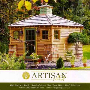
A collection of custom outbuildings to suit your lifestyle

A collection of custom outbuildings to suit your lifestyle

I only check my P.O. Box once every week or two, usually to find a lone press kit or alumni association mailing. Rarely does any personally-written correspondence show up.

Then a few weeks ago there was an envelope. The return address read “ARTISAN SHEDS.” Well, that certainly warranted opening! I opened it up to find a four-page, lovely hand-written letter from Lynn Weber.

Lynn is the owner and architectural designer of Artisan Sheds (the company’s tagline is alluring: “A collection of custom outbuildings to suit your lifestyle.“) She designs the small outdoor dwellings; her husband, Michael Weber builds them.

Artisan Sheds and Lynn’s personal story get filed under my ever-growing category: “The ones that got away.”

They are on my list of great shedistas who have come to me, each with an unique point of view, a personal narrative as to what inspired them to create a P-O-D (personal outdoor dwelling) and, of course, a fabulous little structure that I wish with all my heart that we would have discovered in time to include in Stylish Sheds and Elegant Hideaways! Several days after reading her charming note, I called Lynn. We enjoyed a friendly chat, swapping ideas and stories over the line, three time zones away from one another.

Since she and her sheds are in North Collins, N.Y. (about 30 minutes south of Buffalo), I won’t be able to personally visit the Weber family’s garden showroom – yet. But I can share their story here with you. Lynn gave me permission to use excerpts from her letter. The photographs are courtesy of Artisan Sheds.

Hello Debra,

Late last summer, while browsing the web, I came upon your Shedstyle web site. I ended up reading about and purchasing your book, “Stylish Sheds and Elegant Hideaways.” I couldn’t believe what I was seeing. Here was someone writing about something that had been an interest of mine for so long and who clearly had the same philosophy as I – the importance of an aesthetically pleasing building that one could call a place of their own; a place to escape to. Since my childhood, I’ve had a fascination with little outbuildings. . . Your book . . . convinces me, more than ever, how important in our hectic times a place to retreat to is.

In the winter, the artful potting shed is your landscape's only architectural focal point

In the winter, the artful potting shed is your landscape's only architectural focal point

Lynn continued by sharing her story. Originally, she planned on converting the second level of her barn-style garage into an art studio-home office-gathering place. Then she saw a few magazine articles featuring re-purposed potting sheds and something took hold in her imagination:

“. . . my thinking shifted from renovating the barn to the idea of designing and building a smaller, separate structure.”

Soon, Lynn was entertaining the notion of starting a cottage industry to create, build and share her shed designs with others.  “With my education and background as an artist and designer, and my husband’s craftsmanship in building, I knew we could turn out some incredible things,” she wrote.

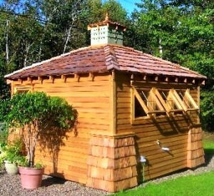
Lynn and Michael Weber created a finely-crafted shed using traditional homebuilding materials and methods

Lynn and Michael Weber created a finely-crafted shed using traditional homebuilding materials and methods

Lynn and Michael spent an entire summer on the first prototype of a potting shed, a 12-by-12 foot structure . “We moved it to a spot near the roadside and put up a sign: ARTISAN SHEDS. We had a great response from the public,” Lynn continued. “People honked their horns and shouted out compliments and gave us ‘thumbs up’ as they drove by. Apparently, they had been watching our construction progress all summer and were just as excited to see us finish as we were.”

Like many of the very special havens we profiled in Stylish Sheds and Elegant Hideaways, the ones designed by Artisan Sheds provide small-scale backyard shelter. But they also nurture one’s spirit, inspire the inner artist, and encourage the dreamer in all.

Lynne wrote this text for her brochure – it strikes a chord in my heart: “Experience the charm of a guest cottage complete with a platform bed, storage drawers and bookshelves; or a lakeside house for boating equipment that doubles as a beautiful summer bunkhouse. Perhaps an artist’s or writer’s studio with upright storage for canvases, a sink for brushes, or a desk area for your office equipment, comfortable chairs and a built in coffee bar. The choices are almost endless.”

READ MORE…

Spring Garden Books for Mother’s Day gift-giving

Monday, May 4th, 2009

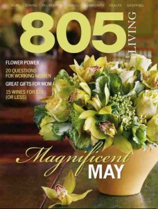
805-may-09001My “In the Garden” column for 805 Living’s May issue is all about great gardening books to give Mom (or keep for your own shelves).

Grow your garden library: Just like plants, you can never have too many books that inspire and intrigue

By Debra Prinzing

I was on the East Coast recently to lecture at the Philadelphia Flower Show. While sharing gossip and a glass of chardonnay with my NYC-based literary agent, Sarah Jane Freymann, conversation turned to the sorry state of book publishing.

“When I give a gift,” she proclaimed in her always-alluring British accent, “I only buy books.” Her singular gesture of thoughtfully choosing, buying and giving a book (rather than an impersonal gift card) might be an important element of the reading person’s economic stimulus package.

In early March, I visited Philadelphia and met up with book-lover and awesome agent, Sarah Jane Freymann

In early March, I visited Philadelphia and met up with book-lover and awesome agent, Sarah Jane Freymann

Books, especially when they are hand-picked for the reader, convey as much about the giver as the recipient.

For my birthday, my writing mentor, Paula Panich, recently gave me American Writers at Home, by J.D. McClatchy, a fitting tome for a journalist who covers architecture, interiors and the garden – all aspects of the home. When Britt Olson, my best friend from high school, recently wed, she spent hours at the book store, choosing just the right hard-bound volume for each of her attendants. For me, she selected Barbara Kingsolver’s lovely memoir of a year growing her own food, Animal, Vegetable, Miracle, which fed my spirit and mind alike.

If you’re like me, you can “read” a person by observing the titles that fill her bookcase. So here’s a peek at what’s on my bedside table (a new crop of gardening books). Whether for Mother’s Day, a friend’s birthday, or just for your own pleasure, give the gift of a book. As the author of five books, I thank you.

A Rose by Any Name

By Douglas Brenner and Stephen Scanniello [Algonquin Books of Chapel Hill, 2009, 320 pp., $19.95]
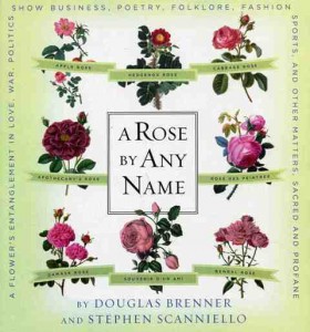
805-may-09002I met Stephen Scanniello, president of the Heritage Rose Foundation, in a Chicago radio studio several years ago. We enjoyed our banter with the host of a garden show, but the conversation continued well after the gig was over. His favorite subject? Roses. Scanniello lives, breathes, and designs gardens with roses. Not those scentless, thornless pageant variety roses, but ones with  storied pasts and interesting pedigrees. He teamed up with co-author Douglas Brenner, a former Martha Stewart Living garden editor, to document the origins, history, and lore of more than 1,200 rose names.

Their enchanting narrative follows the trials and tribulations of this beloved flower through the centuries to modern time. The rose has been entangled in love, war, politics, show business, fashion, sports and even automobiles (yes, the ruby-red ‘Chrysler Imperial’ rose was bred in the 1950s, right here in California).

A Rose by Any Name features all sorts of facts and anecdotes about the world’s most popular flower. There is even a chapter devoted to celebrity-named roses, including ‘Barbra Streisand’, a glamorous purple-blushed lavender rose that the star selected from a field of potential candidates. Even we nobodies can have a personalized flower. “As with vanity license plates, anybody can have his or her name officially conferred upon a rose,” the authors write. “All it takes is a phone call and a big check.”

Designer Plant Combinations

By Scott Calhoun [Storey Publishing, 2008, 240 pp., $18.95]

805-may-09003I’m a sucker for artful color combos,and I can often be found playing with paint-chip samples at the hardware store or mixing and matching blooming plants at the nursery. But here’s a guide that color-dreams for me. Designer Plant Combinations features inspiring techniques the pros use to pair color, texture, scale and form in the garden.

Tucson-based garden designer and book author Scott Calhoun is easy to envy for his writing and photography talents. Except that since he’s so likeable and engaging, I end up hungrily waiting for the next installment of his thoughts and images that appear in book form. And this vibrant guide doesn’t disappoint. Calhoun crisscrossed the country visiting the best residential and public landscapes to study and photograph stunning plant vignettes. Each of the 105 design schemes include six plants or less, which will inspire both designers and non-designers in their garden-making efforts. Detailed plant lists and photographs show you how to replicate the ideas in your own garden.

The book’s oh-so-alluring imagery is more than just eye candy, though. Calhoun explains why these perennials, ornamental grasses, annuals, ground covers, woody plants and dramatic accent plants are hardworking ingredients of successful garden design (look for useful designer tips, such as “when using one color, use different textures”).

A consummate plantsman, Calhoun is convinced that non-plant elements are crowding his beloved specimens out of the landscape. He writes, ” . . . good plant combinations are a little like the stanzas of a poem. That is, like the stanza, they are not trying to be a whole garden but a self-contained little part of one.” Whether bold or subdued, the groupings you’ll find here will give your garden personality and elevate it to something more than ordinary.

The New Terrarium

By Tovah Martin (photography by Kindra Clineff) [Clarkson Potter/Publishers, 2009, 176 pp., $25.00]
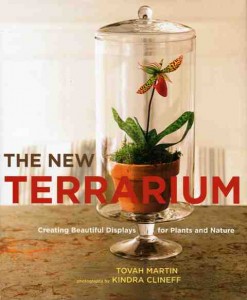
newterrariumcover001Devoted subscribers of the original Victoria magazine know the work of garden writer Tovah Martin. In her stories, Tovah brings a sense of wonderment to each of her subjects, be they gardens, gardeners or the plants they love.

Likewise, her latest project, The New Terrarium, is a magical tome filled with small, planted scenes, diminutive landscapes, twee still-lifes and dwarf collections – all under glass. This dreamy book is captured on film by photographer Kindra Clineff.

The New Terrarium pays homage to the conservatory gardens of the Victorian era, as they were the first to perfect the art of gardening under glass. According to Martin, in today’s go-go, hard-to-find-time to garden world, the terrarium may be the best way to bring something from nature into your life. “A terrarium is any transparent confine that allows you to nurture the elements of the green world,” Martin writes. “[It] is truly a small world . . . a mini-environment that provides an atmosphere of elevated humidity for all the botanical contents it embraces.”

This idea is appealing – and relatively simple to do yourself. Martin presents an array of cool glass containers suitable for planting: Traditional cloches, “Wardian” cases (miniature glass greenhouses), hurricane lamps, recycled aquariums, vases and repurposed glass domes typically used to cover cakes or cheese platters. What to grow under these unique vessels? Martin provides a comprehensive plant encyclopedia, including orchids, ferns, heucheras, begonias, mosses, African violets, bromeliads, ivies, ornamental grasses, and more.

This writer’s enthusiasm for gardening under glass inspired me to buy a small potted fern and contain it under a cloche (also called a bell jar). Living in its charming covered world, the fern, I think, will be happy. And I know I will be, too.

Home Outside: Creating the Landscape You Love

By Julie Moir Messervy [The Taunton Press, 2009, 240 pp., $30]
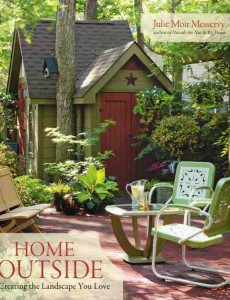
805-may-09005Julie Moir Messervy is an amazing landscape designer, author and teacher who teamed up with the likes of Yo-Yo Ma to create the Toronto Music Garden, and with architect Sarah Susanka to co-write Outside the Not So Big House.

In her new book, Messervy asks, “Why do we spend the bulk of our resources on the inside of our house, while settling for so little on the outside?” In response, she walks readers through the process of turning any property into the “home outside” they’ve always dreamed of. If, like her, you believe that the nurturing nest, the place called home, begins at the edge of your property and encompasses everything within its boundaries (the porch, the patio, the lawn where your children play – even the pathways, edges and corners), then Messervy’s book is the ideal reference to inform and inspire your design decisions. If you haven’t thought of the landscape in this way, her design approach is the perfect starting point. It will equip you with both basics and intricacies necessary to create a personal outdoor space that feeds the eyes and the spirit.

Bursting with instructive illustrations and before-and-after photographs of do-it-yourself gardens, Home Outside helps you see a property the way a landscape designer views it. Messervy breaks down the design process into manageable pieces. Take her “Designer’s Personality Test” and learn more about your style of garden-making. After completing the quiz, I discovered that I’m more expressive (versus reserved) and more relaxed (instead of orderly).

Our Life in Gardens

By Joe Eck and Wayne Winterrowd [Farrar Straus Giroux, 2009, 322 pp., $30]
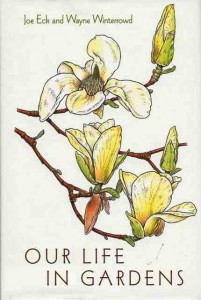
805-may-09004My aforementioned agent, Sarah Jane, has a saying about what makes a good cookbook. “It must transcend the recipes,” she posits. In other words, we can now find recipes anywhere – in magazines, on the web, in grandmother’s dog-eared “Joy of Cooking.” But what makes a great cookbook resonate is the way it touches our universal relationship with food.

Similarly, Joe Eck and Wayne Winterrowd, Vermont-based garden designers and authors, transcend the typical gardening book in Our Life in Gardens. Their collection of nearly 50 essays (arranged logically from Agapanthus to Xanthorrhoea quadrangulata) is so engaging, so gratifying to read, that you truly forget it came from the section of a bookstore otherwise filled with “how-to” titles. There is a lot to learn from these celebrated designers, but I think the lesson is more about observing and cherishing everyday life in the garden than about how to grow delicious peas.

For example, in “Pea Season,” a chapter illustrated with one of Bobbi Angell’s charming plant drawings, Eck and Winterrowd philosophize on the rewards a gardener receives outside of the vegetable plot. The chapter opens with these lines: “No one can say that a gardening life is rich in leisured holidays, but a gardener’s rewards are festivals, big and small, though we make little distinction there, for they are all wonderful. There are other activities in which effort and labor are so certainly followed by achievement and celebration, and anyone who takes an active hand in shaping life must know equal causes for joy. We know only our life, which is largely one of gardening.”

Written with passion and honesty, this book is a keeper. Buy two copies. One to delight in yourself and the other to share with someone who needs to be lured outdoors.


The Venice Garden Tour Vibe

Saturday, May 2nd, 2009

venice001

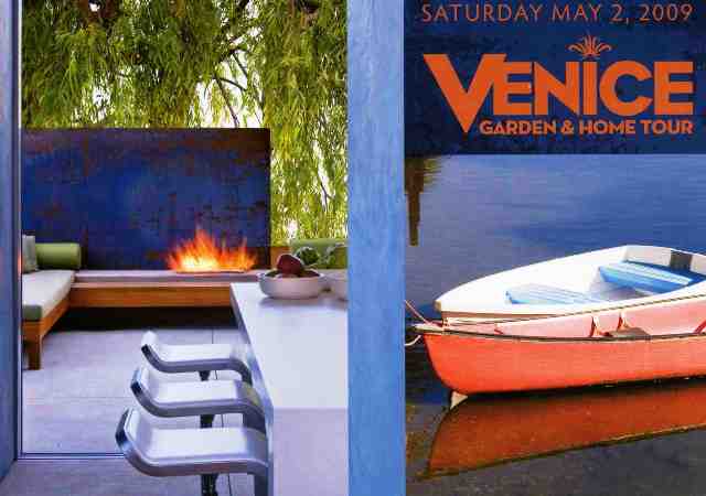
Today – May 2nd – is the 16th annual Venice Garden and Home Tour, which is a hip, happenin’ kind of tour serving up no fewer than 30 properties. For $70-per-ticket, that averages about $2.50 per garden, so when you look at it that way, it’s well priced. Plus, who can argue with the deserving beneficiaries? Children! The tour raises funds for the Neighborhood Youth Association of Venice, which operates Las Doradas Children’s Center, a licensed childcare facility that serves working families.

Along with tour producer Barbara Baumann and co-chair Adri Butler, I previewed several of the properties a few weeks ago and wrote about four of them for today’s Los Angeles Times.  Due to s-p-a-c-e limitations (surprise!), there is only room for one mini-feature in the print edition. You have to go to the online gallery to get a peek at how the staff photographers captured the three other gardens.

Here are the four gardens we profiled, complete with my original story about each. Take a virtual tour and enjoy a slice of one of the most eclectic spots in Los Angeles.

Get the Venice vibe and borrow these easy design ideas for your interior and exterior spaces

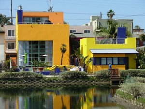
A colorful compound on one of Venice's unusual canal streets

A colorful compound on one of Venice's unusual canal streets

By Debra Prinzing

For all the glossy magazine articles and garden-makeover shows we consume, there’s nothing like a day of garden sight-seeing to inspire the inner-landscaper in all of us.

Featuring nearly 30 properties, today’s legendary Venice Garden & Home Tour is sure to ignite your imagination – and dish up dozens of adaptable ideas for your own yard.

Don’t go empty-handed, though. Bring a camera to capture a cool architectural detail or alluring bloom, a notebook and pencil for jotting down plant names or design resources, and plenty of curiosity. In many of the gardens, owners and designers will be on hand to answer questions and share tips. Consider it affordable design research. Plus, nothing’s more fun than cruising along the canals, walks and side streets of one of L.A.’s most iconic neighborhoods.

We previewed several of the tour’s vintage cottages and sleek cubes (and the gardens, decks and balconies that surround them). Here’s a look at four favorites, including design tips from each.

 Accessorize your garden with salvaged signage

A generous and genial host, Orson Bean

A generous and genial host, Orson Bean

Orson Bean, a veteran actor and longtime resident of Venice’s canal district, has a thing for Americana, especially signage “folk art.” “It’s really just pop culture,” he says. “Advertising has always been part show biz.”

Oversized and retro, Bean’s restaurant and retail signs are well suited for the endless scale of blue sky and sunshine overhead. Their very presence in his garden brings out the storyteller in Bean.

There’s the tale of the neon billboard that’s mounted against a ficus-covered fence in the garden he shares with his wife, actress Alley Mills.

“It’s from the ‘Simple Simon’ rhyme, but it was also the logo for Howard Johnson’s restaurants,” Bean points out. “That sign was as identified as the McDonald’s arches.” Rendered in carnival-colored neon tubes, the once-ubiquitous image of a baker, a boy and his dog promised coffee and a slice of pie to drivers along the Jersey Turnpike.

Orson and Alley's vintage Howard Johnson's sign embellishes a corner of their Venice garden

Orson and Alley's vintage Howard Johnson's sign embellishes a corner of their Venice garden

The neon Ho-Jo is one of several pieces Bean has collected as garden art. He likes the way they personalize the shallow-but-wide landscape, which was created by combining three adjacent cottages and their yards over the years, beginning when he spent $113,000 for the first one in the early 1970s.

Another sign promises “Cash for Cars” and it, too lights up at night. Tucked next to a camellia shrub, a third, its faded paint beginning to chip, advertises a sheet metal shop in the hands of a cartoonish man.

There is a down side to having neon tubes so close to the lawn, where Bean’s seven grandchildren often play ball. Fortunately, he has been able to replace or repair occasional damage. “Only the chef’s hat is original,” Bean says.

Infuse the sound of bubbling water in a few square feet

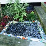
Barbara Balaban's tiny fountain with broken pottery mosaic trim

Barbara Balaban's tiny fountain with broken pottery mosaic trim

There’s not a lot of room in her 20-by-20 foot front yard but Barbara Balaban has maximized every square inch. Instead of a space-gobbling fountain, she created a tiny one, wedged between the walkway and the front steps. The 18-inch water feature uses a re-circulating pump bought at a home center. “I filled the top with river rocks and surrounded the fountain with a border of broken pottery,” says the interior designer and contractor. “I just wanted the sound of water here.”

Balaban moved to her canal cottage after fleeing a traditional Sherman Oaks house destroyed by the 1994 earthquake. Her Venice garden incorporates mosaics of broken pottery salvaged from that disaster: the fountain, a freestanding barbecue-cooking counter and a “welcome mat” at the front gate. “I reconstituted my grandmothers’ and mother’s dishes – and it gives me a big smile to see each piece,” Balaban says.

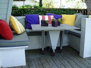
Tiny and efficient, Barbara's U-shaped eating nook seats six

Tiny and efficient, Barbara's U-shaped eating nook seats six

During a home renovation, she retained the original footprint rather than expanding. “I kept the depth of the property the same because I wanted the garden,” she says. Studio City designers Carol Plotkin and Janet Hoskins helped Balaban rethink the miniscule landscape and incorporate a slim border filled with succulents, Mediterranean plants and whimsical art.

There’s a large glass table (on wheels) that accommodates the parties Balaban and her partner, artist Yaacov Aloni frequently throw. But when they want a quiet Sunday morning brunch, the couple lounges in a U-shaped eating nook installed in a corner of the front porch. “It’s like having a little sofa outdoors,” Balaban says. “We can sit here and be a little secluded from passersby.”

Pave the indoor and outdoor spaces with the same flooring material

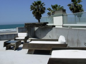
Lenny Steinberg's tiled, open-air terrace overlooks the Pacific Ocean

Lenny Steinberg's tiled, open-air terrace overlooks the Pacific Ocean

A floor covered in sultry blue-green stone leads your eyes through the soaring, loft-like space, through a 17-foot opening in a retractable glass wall and beyond the outdoor terrace, until they rest on the endless seascape.

“The stones reflect the constant color of the ocean,” say owner Lenny Steinberg of her North Carolina bluestone floor. “Although that seems to change according to the light.”

When Steinberg, a furniture and architectural designer, renovated the former duplex into a single, über-contemporary home on Ocean Front Walk, she wanted to bring the ocean indoors. She inherited a palette of irregular-shaped bluestone after a friend’s patio project fell through.

Lenny designed her chaises with distressed wood and modern lines - perfect for the rooftop garden

Lenny designed her chaises with distressed wood and modern lines - perfect for the rooftop garden

“It was the perfect solution for my floor, although I ended up calling all over North Carolina to get more of it,” Steinberg says. Even though the material, a hard slate, is usually installed randomly, the designer spent hours choosing the position of each stone to create a subtle pattern. “I like to think of it as a river running out to the sea,” she says.

The sea metaphor (and the bluestone) continues on the floor of the small, angled terrace that Steinberg designed to cantilever beyond the glass wall. The space serves as the intimate outdoor living room, with views of the palm trees, walkway and pier. The dark teal stone has endured intense sun and saltwater beautifully, says its owner. “If it has any nicks, I just take a little steel wool to it,” Steinberg says. “I wish everything else was as durable.”

 Practice sustainable design by recycling found objects and allowing the garden to evolve over time (rushing is not allowed here)

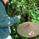
Tim Rudnick rings his hanging cymbal-as-doorbell

Tim Rudnick rings his hanging cymbal-as-doorbell

Stepping through the opening in the ivy-clad fence surrounding Tim and Robin Rudnick’s home and garden, it’s possible to lose all track of time. In fact, it seems as if Tim Rudnick, an architectural designer and artist, has turned back the clock to an earlier Venice. “I like the old, tattered hippy cottage that we lived in and raised our kids – where everyone hung out on the old porch,” he says.

Circa 1913, the summer bungalow originally faced Venice’s Aldebaran Canal (now Market Street). The Rudnicks purchased it in 1984, subsequently modernizing the interior and adding an L-shaped Arts-and-Crafts style addition. The old and new portions of the family compound now embrace an intentionally tangled and untamed landscape, also of Rudnick’s design.

“I had this beautiful photograph of a Buddhist garden in Japan and I imagined our yard by looking at it,” Rudnick says. “I loved the idea that like a Japanese garden, you feel like you’re entering another world when you go through the gate.”

Lush and semi-wild, the Venice garden of Tim and Robin Rudnick

Lush and semi-wild, the Venice garden of Tim and Robin Rudnick

A naturalistic pond, measuring about 25-feet across, occupies the center of the garden. Rudnick used the excavated dirt to build a mounded knoll between the pond and a wraparound deck. He landscaped the water’s edge with heirloom irises once grown by his mother, native Pacific coast irises and ferns.

Several mature trees, planted as seedlings nearly 40 years ago, now tower above the rooftops: a coral tree, an olive, and four eucalyptuses. “The leafy trees give us the feeling of real separation,” he says.

Visitors announce their arrival by striking a mallet on two bronze disks, suspended from the twining branches of the coral tree. Rudnick made one from the base of a salvaged clothing store fixture; the other is a recycled cymbal. He prefers their music to a regular doorbell: “One has a very resonant sound and it goes on for 15 minutes; the other makes a beautiful, contrasting sound.”


Los Angeles Garden Show Highlights

Friday, May 1st, 2009
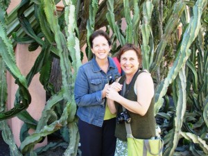
Garden celebrity Shirley Bovshow and I posed on a bench in Nick Williams's garden

Garden celebrity Shirley Bovshow and I posed on a bench in Nick Williams's garden

The theme of this year’s LA Garden Show, “A Festival of Flavors,” is timely and delectable. The show is produced by the Los Angeles County Arboretum and Botanical Garden in Arcadia (just east of Pasadena), a 127-acre destination with a diverse plant collection, inspiring display gardens and natural habitat-inspired landscapes. The three-day flower show runs through Sunday, May 3rd. The event’s honorary chairs are Clara and Jacob Maarse of the famous Pasadena rose nursery and florist, and Rosalind Creasy, garden writer and pioneer in edible landscaping.

Edible gardening expert Rosalind Creasy

Edible gardening expert Rosalind Creasy

Most of the flower shows I’ve participated in have been indoor shows, so when I arrived last night to attend the preview gala, I was reminded of how alluring an open-air flower show can be. There’s nothing like the sky overhead, the sounds of screeching peacocks that wander the Arboretum grounds, the fragrances and textures of plants from every continent — and the conviviality of friendships — to put me in a perfect festive mood.

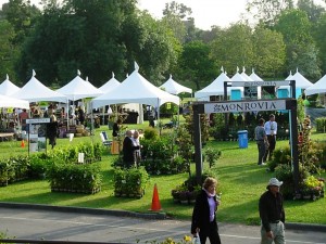
Upon entering the Arboretum, we first stopped off at the “marketplace” of plant vendors, garden artists and purveyors of cool stuff, which occupies the lower lawn adjacent to Baldwin Lake. The collection of white tents, topped with jaunty flags, put a smile on my face. I felt as if I was in Europe rather than Los Angeles. The two hours allotted to previewing the sales area was barely enough – but no worry, because I’ll be back there on Sunday to do some more damage to the checkbook (That’s after my 11 a.m. “Garden Chat” ).

Plant vendors, garden artists and more

Plant vendors, garden artists and more

As I strolled along the grassy pathways between each tent, poked my head inside several to check out the offerings, and chatted with fellow party-goers, I said to myself: These are my people!

I was surrounded by kindred spirits who love gardens, plants, ornamentation, vintage finds, and more.

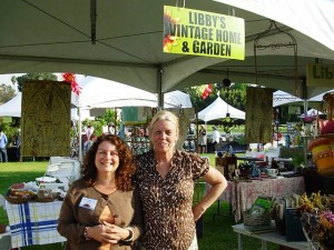
Vintage gals, Libby and Nancie

Vintage gals, Libby and Nancie

A couple of highlights included visiting with Libby Simon of Libby’s Vintage Home & Garden and her friend Nancie Piser, fellow collectors of salvage, old linens, elderly gardening books, retro dishes and glassware, anything tin, rusted or galvanized, and more!

Oh, and Libby also specializes in unusual cactuses – I came home with a nifty specimen (Euphorbia handiensis) that I quickly re-potted in a turquoise-glazed pot for my garden.

My friend Paula Panich and I had a few acquisitive moments, inspired by all the unique finds these two women featured in their tent. I came home with an old garden spray-nozzle and some awesome vintage books, including an almost-mint 1932 edition of The Fragrant Path: A book about sweet scented flowers and leaves, By Louise Beebe Wilder (perfect for a friend’s upcoming birthday). Here’s what Miss Beebe Wilder writes in her opening lines:

A garden full of sweet odours is a garden full of charm, a most precious kind of charm not to be implanted by mere skill in horticulture or power of purse, and which is beyond explaining. It is born of sensitive and very personal preferences yet its appeal is almost universal.

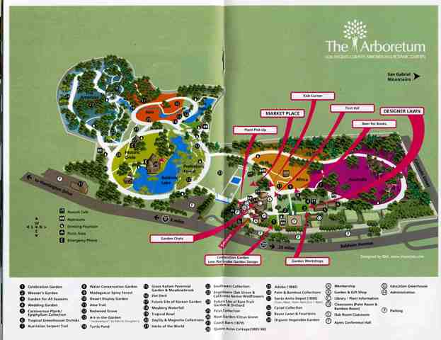
Here is a map of The Arboretum and the Garden Show features:

lagardenshowmap001

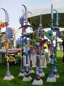
Leslie Codina's art: A joyful explosion of color and form

Leslie Codina's art: A joyful explosion of color and form

Playful, fanciful, nature-inspired sculpture

Playful, fanciful, nature-inspired sculpture

Inspired, my eyes drifted over to the next tent over, which was filled with lively ceramic spires pleasing to the visual senses. Leslie Codina, a local Los Angeles area artist, creates whimsical stacked towers of color, pattern and form. The 5- to 7-foot-tall sculptural creations are formed first in Leslie’s imagination as she “interprets the shapes and colors of nature into her garden sculpture.”

Leslie renders individual elements in clay, then shapes, curves, twists, carves and rolls the medium into fantastical armitures, balls, finials and wing-like shapes.

Firing and glazing steps follow, featuring a mix-and-match palette of lime, plum, apricot, red, orange, blue, aqua and lavender.

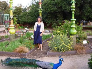
Artist and sculptor Leslie Codina, with peacock strolling by

Artist and sculptor Leslie Codina, with peacock strolling by

I first learned of Leslie from photographer pal Gene Sasse, who has done much of the photography that appears on her web site. He urged me to seek Leslie out – and boy am I glad I finally did.

Leslie has just donated a grouping of four 8- to 12-foot tall sculptures as a permanent installation at the Arboretum. The collection appears in the “Garden for All Seasons” display, which represents each phase of the year.

After shopping and browsing, several of us moved to the “Designer Lawn” area of the Arboretum, where the cocktail reception was underway.

The displays, created by talented area landscape firms and individuals, brings together the idea of “edible” and “ornamental” worlds co-existing in the garden. Here are a few of the innovative ideas showcased:

“Punctuation in the Garden: A Gallery of Edible Container Gardens,” created by the local members of the Association of Professional Landscape Designers (APLD):

I’ve admired and been privileged to write about the design work of several APLD members, both in the Washington State chapter and now in the California chapter. The group of a dozen folks who created eye-catching edible focal points has come up with some pretty fun interpretations of an “edible container.”

READ MORE…

Finally, CB2 comes to Los Angeles!

Wednesday, April 29th, 2009

Outdoor-Live-Decorate-Eat-Work-Sleep-Splash

CB2's first Los Angeles outlet opens on April 30th

CB2's first Los Angeles outlet opens on April 30th

I remember all those years when I lived in Seattle and eagerly anticipated my occasional trips to Chicago, New York and Boston – because that’s where I could finally shop at Crate & Barrel. It was always a challenge to see how many throw pillows, dessert plates and flatware I could cram into my suitcase when time came to fly home.

For me and countless other Seattleites, those retail pilgrimages to Crate & Barrel’s Midwest and East Coast outposts whetted our appetites for the time when the innovative home furnishings-and-accessories merchant finally came to Seattle about five years ago.

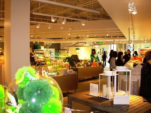
Inside the new CB2 store, opening in LA on April 30th

Inside the new CB2 store, opening in LA on April 30th

You could say the same scenario is playing out here – again – as fans of Crate & Barrel’s younger, modern-focused sister store, CB2, have been keen for a real, brick-and-mortar version to arrive on the West Coast (catalog and online shopping is cool – but nothing beats touching, feeling, sitting in and sizing up the actual product).

By the way, the first CB2 store in Los Angeles isn’t just brick-and-mortar construction. The smart, modern and affordable retail environment conforms to LEED requirements by incorporating eco-friendly bamboo floors, low VOC-paints and the re-use of existing materials.

Situated on the corner of Sunset and Laurel in Hollywood, the store’s façade is ornamented with gun-metal gray grates. Its large windows display CB2’s iconic vignettes. This is CB2’s third West Coast store – in the past six months, San Francisco and Berkeley addresses have also opened (and there are also two original stores in Chicago and one in NYC’s SOHO neighborhood).

There are definitely echoes of Crate & Barrel’s aesthetic at CB2. Althought, with its own streamlined, uncomplicated and playful vibe, CB2 targets apartment, loft and home dwellers with a modern attitude.

According to a 2008 article in the Chicago Tribune, CB2 is Crate & Barrel’s “less expensive furniture concept aimed at younger shoppers who frequent Target and Ikea.” I kept asking myself why that Tribune statement bugged me. I finally realized that it’s because CB2’s shopping environment is way more sophisticated than the two stores to which it’s compared. CB2 is everything about design, but in a specialty store setting rather than a big-box one. Unlike Target and Ikea (which are great, don’t get me wrong), you don’t have that anxious, gotta-grab-what-I-need-and-get-outta-here feeling at CB2. You want to stay. And chill out.

I predict a huge success for CB2 in LA, starting tomorrow morning, when its 8, 500-square-foot outlet opens on Sunset Strip. I visited CB2 to see and shop there during this morning’s press preview.

I'm sharing a seat on CB2's "resort" sectional with brand director Marta-Maria Calle

I'm sharing a seat on CB2's "resort" sectional with brand director Marta-Maria Calle

Greeted by Marta-Maria Calle, CB2’s brand director, I enjoyed the chance to sit down with her for a quick interview. Hey, I really like this woman, not only because she was wearing the same chambray-blue linen Eileen Fisher tunic that I wore for the taping of “Peace by Design.”

Marta-Maria shared the background of CB2’s genesis – from a seed of a modern design idea to a full-fledged retail destination – and she graciously answered some of my questions: 

When did CB2 first emerge as a Crate & Barrel concept?

The first store opened in Chicago in 2000. Gordon Segal (C&B’s co-founder and Chairman) and Barbara Turf (longtime Crate & Barrel president, appointed CEO last year) wanted to test the brand’s modern attitude. They asked a few Crate & Barrel buyers to buy for CB2. I was one of them.  Now, we’re a company of 16 people and we are moving away from the “mother ship” to our own office location in six weeks. [Marta-Maria told me that after about five years of juggling buying duties for both retail concepts, she persuaded Barbara to spin off CB2 as a separate retail venture with its own, fully-dedicated creative staff.]

Why has it taken 10 years for CB2 to begin expanding more aggressively?

The signs say it all

The signs say it all

We don’t do anything until we’re ready. We wanted to give this brand a reason to be. It’s all about value. Our emphasis is “Simply Modern and Simply Affordable.”

What is your retail philosophy?

We believe we’ll build the CB2 brand one customer at a time. We are one-hundred percent customer-service powered.

Tell me how you develop your product selection:

We work with designers and manufacturers to create CB2 products. Ninety percent of our products are exclusive to CB2. We want to allow people to bring their ideas to us (rather than only developing products internally). We always ask: how much would our customer pay for this? If we can’t meet that price, we won’t carry the product. Also, our design priority is to balance mass-produced with the “hand touch” aspect of design.

READ MORE…