Debra Prinzing

Get the Email Newsletter!

Author Archive

How to dress up your patio

Monday, June 22nd, 2009
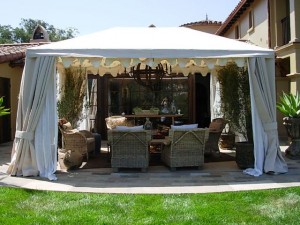
A custom tent with side draperies and scalloped details creates a secluded, breezy patio retreat

A custom tent with side draperies and scalloped details creates a secluded, breezy patio retreat

Interior designer Deborah Campbell knows how to turn an ordinary patio into a place you’ll want to visit often — and perhaps never leave. Use her design ingredients to create a private respite where you can rejuvenate and collect your thoughts.

The Santa Barbara-based principal of Deborah Campbell Interior Design transformed two private patio spaces into outdoor rooms at Casa Robles, the design showcase that benefits CALM (Child Abuse Listening and Mediation, a Santa Barbara nonprofit organization whose mission is to end child abuse).
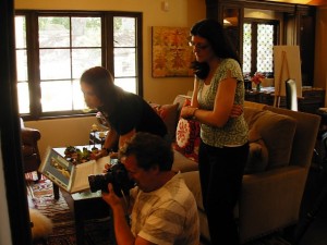
On location: Gary Moss, photographer (kneeling), as he perfects his shot in the family room. His assistant Pam is to his left; 805 Living editor Lynne Andujar is at right

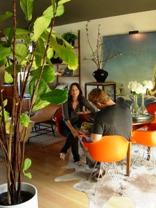
On location: Gary Moss, photographer (kneeling), as he perfects his shot in the family room. His assistant Pam is to his left; 805 Living editor Lynne Andujar is at right

As part of the 805 Living Magazine team that created the CALM Showcase program, I wanted to see the finished project in person before the public tours close this coming Sunday, June 28th (see details below). 805 Living is the presenting sponsor of the event, and editor Lynne Andujar asked me to write a feature story about the home and interiors for our November 2009 issue. This morning I drove to Santa Barbara to see and tour the project. Lynne was there with photographer Gary Moss, shooting the interior and exterior spaces for my story. They captured some gorgeous, evocative shots! Can’t wait to see them in print.

I also met several of the designers involved in creating the new house, including Annette Flower (who created the family room off of the kitchen), Gillian Amery of The Kitchen Company, and Deborah Campbell. The other key persons on the creative team include Christy Martin of Studio Encanto, the primary interior designer; Harrison Design Associates, the architecture firm; Lindsay Adams Construction, the contractor; and Katie O’Reilly Rogers, ASLA, landscape architect (who created the patio’s proportions and selected the beautiful Ashlar-laid stone).  
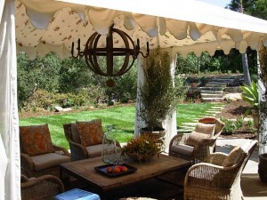
Create an outdoor room with a Sunbrella fabric tent lined with sheer panels and Morrocan print fabric on ceiling

Create an outdoor room with a Sunbrella fabric tent lined with sheer panels and Morrocan print fabric on ceiling

Deborah Campbell’s design for the living room patio is completely enchanting. In studying and photographing it, I realized that her design, which she calls “Soft Summer Breezes,” offers a perfect recipe for decorating any patio.

Of course, it would be tres bien to turn your own patio into an open-air Kasbah with a custom-made canvas tent lined with sheer fabric and Moroccan toile draped across the ceiling.

But if you can’t do that, try creating an overhead fabric ceiling from yardage, sheets or tablecloths that suit your fancy.

Remember when you were a kid and you clipped two sheets to a clothesline and then pulled them out at the bottom to anchor as the “sides” of your makeshift tent? Ingenuity like that is priceless – we all need to remember our childhood shelter-making ideas and re-purpose them as adults.

Here’s a quote from Deborah:

“I am inspired by the Mediterranean architecture and Santa Barbara’s mild, year-round climate. I wanted to create outdoor rooms to capture that casual lifestyle. My personal style is always loose, relaxed, and eclectic. Nothing is perfectly arranged . . . because I wanted to give a sense of our California casualness.”

DECORATE YOUR PATIO

Try these patio design elements to decorate your outdoor room, straight from Deborah’s drafting table:
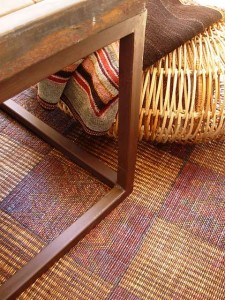
rug
Rugs:  A vintage Moroccan area rug is layered over a jute outdoor rug. The rug is protected from sunlight and rain. If you don’t have a covered area, look for one of the new, cool weatherproof rugs, such as Pier 1 imports’ selections. The Moroccan rug is from Upstairs at Pierre LaFond, Santa Barbara. Also shown here is the rattan “Poof” floor cushion, from Porch in Carpinteria. It echoes texture from the wicker chairs and invites you to perch, curl up your legs, and rest your drink on the coffee table.

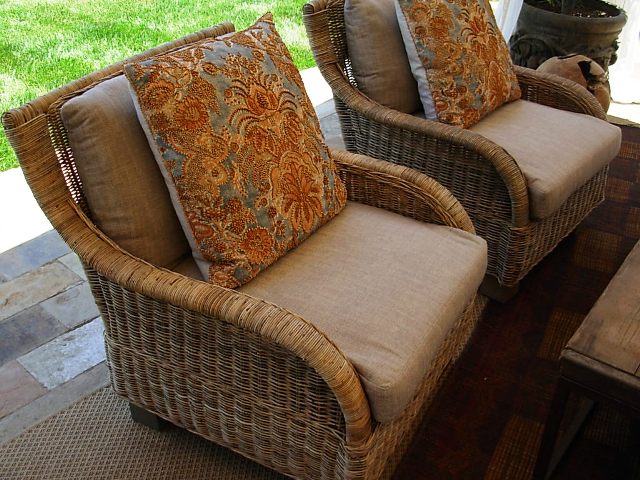
seating-textilesSeating: Deborah selected wicker occasional chairs and piled them high with eclectic textile pillows and basic driftwood-colored linen cushions. The chairs evoke life at the beach, from Porch in Carpinteria.
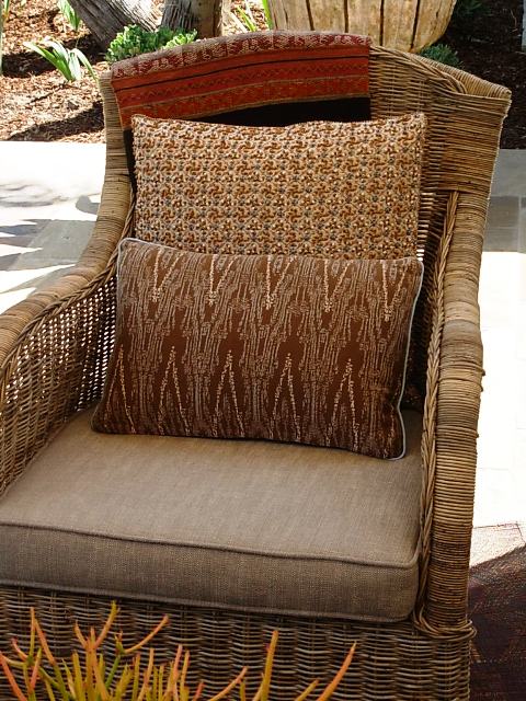
more-textilesTextiles: Pillows galore lend one-of-a-kind interest and beautiful textures. They tell a narrative of an owner who has traveled widely and who loves to pair old with new; worn with polished; rustic with refined. Pillows from Upstairs at Pierre LaFond and Rooms & Gardens, both in Santa Barbara.
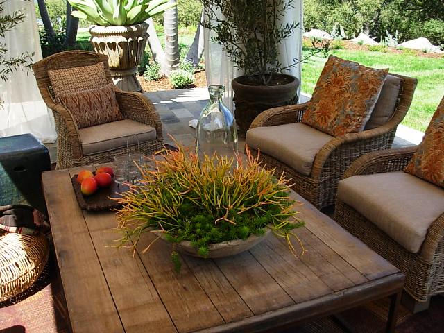
coffeetableTables: Weathered and worn, the plank-topped coffee table is large enough to do double-duty as an al fresco dining table. It is by Brick Maker, available at Porch.
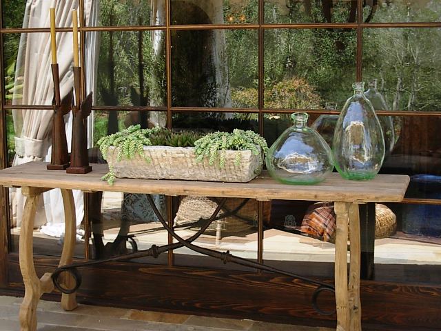
tables

The “Scroll” console table is perfect for displaying objects or setting up a picnic buffet on a cool summer evening.

wine-stave-chandelierLantern: Okay, the over-sized lantern is a gorgeous thing to behold. I love, love, love that Deborah went BIG in scale in selecting this element of her design. It is called a “Wine Stave” chandelier, made from old wine barrels. You can kind of see the influence in the wood rings. I wish I could have photographed it while lit, but if you squint, you’ll get the idea. This lamp-chandelier makes the design sing! It’s from Porch.
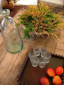
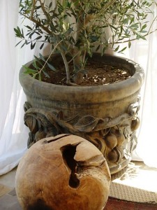
objects

objects2

Objects: Decorative orbs (right) are made from burl root and lend another distressed texture to the space. Spanish hand-blown glass bottles look like beach glass (left). All of these items are from Porch.
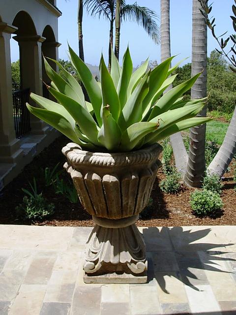
killer-agavePlants: Drama is key. Each plant needs to have presence in the space, almost as sculpture. The mature Agave, potted in a cast concrete urn, is one example. (Above): The cast-concrete bowl, planted with Euphorbia ‘Sticks of Fire’ is another.

MORE DETAILS:

Casa Robles is an exquisite, historic property originally designed by Chester Carjola in 1948. The modest California ranch, situated on a oak-studded hillside with views of the famed Santa Barbara Mission, has been completely transformed and reimagined to capture the essence of a California Spanish Colonial estate. Most of the rooms open onto an interior courtyard, outdoor patios and second floor terraces. Enlarged to 4,500-square-feet, the home is situated on a two-acre garden.

In addition to the generous homeowners, volunteer architects, interior designers, landscape architects, contractors, craftspersons and artists have come together to create, furnish and landscape a beautiful showcase home. It is open to the public through June 28th to benefit CALM. Tickets are $30. Click here for more information.

Deborah Campbell Interior Design: 805-969-9657.

Growing Vegetables Organically: an old technique for new gardeners

Saturday, June 20th, 2009
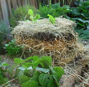
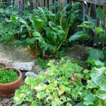
The layered, above ground, "no-dig," organic vegetable bed

The layered, above ground, "no-dig," organic vegetable bed

Here’s a sneak peek at a story that I’ll be reporting for an upcoming issue of Organic Gardening magazine.

I stopped by Pat Marfisi’s house in the Hollywood Hills last evening to tour his unusual “no-dig” veggie patch and to say hello to Pat and my colleague Jack Coyier, who’s photographing Pat’s prolific garden for my piece.

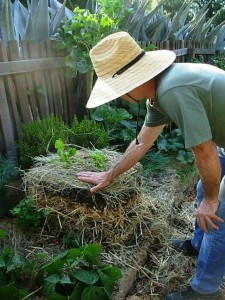
I arrived around 5:30 p.m. The late afternoon light was beautiful and warm. Pat’s dog “VaBene” (Italian for “it’s going well”) came down the street to greet me, followed by his owner: A grinning face under a broad-brimmed straw hat; strong gardener’s arms, emerging from a soft green T-shirt; functional jeans and black sneakers. He was in his element with vegetables, soil, and a harmonic convergence of pollinating native bees darting around to their heart’s content.


With apologies to Jack, who with his camera was preoccupied with artistic portraits of young squashes and pole beans, I launched into “interview mode” with Pat. Every word that emerged from his mouth was inspiring – practically prophetic. This was just a meet-and-greet visit. It wasn’t supposed to be an interview. I grabbed my notebook and pen and started scribbling furiously to capture our conversation. 


His face hidden under a brim, Pat demonstrates the layering method

His face hidden under a brim, Pat demonstrates the layering method

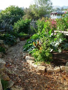
A central pathway cuts through the narrow garden with no-dig beds lining each side

A central pathway cuts through the narrow garden with no-dig beds lining each side

Pat was profiled last summer in an article by Lisa Boone for the Los Angeles Times Home section. Willi Galloway, west coast editor for Organic Gardening, saw the piece and tracked Pat down to learn more about his unusual method of layering newspapers, alfalfa, straw and compost – with a bit of blood meal and bone meal stirred in – to grow edibles above ground. He plants straight into this towering medium, which is a good alternative to tilling up poor soil or back-breaking “double-dig” methods. As I was trying to understand the process, I jotted this explanation down on the page: He creates rich soil while at the same time grows food in it.  


When Willi asked me to interview Pat and write the article for Organic Gardening, I was thrilled! I remember reading Lisa’s piece when it came out and learning that this practice of sandwiching organic materials (some also call this the “lasagna” technique) was decades old. Pat picked it up during an early retirement trip to Australia and New Zealand, where he volunteered on organic farms. He’s refined the scheme in his own LA garden and now teaches it to schools and community groups. He’s a modern day vegetable gardening Pied Piper.

kalesquashetcAs I’ve mentioned here before, some people learn by reading or doing, but I tend to learn by writing about something. I fall in love with each tree or flower I find myself writing about. I become fascinated with a style, a material, a project as I craft the narrative piece that will be published and read by others. 

I suspect it will be the same when I learn more about Pat’s process of growing food with abundance – in a very small area with few resources, natural or physical. I can’t wait to actually write this story (after returning to spend more time with Pat), and to see how it turns out in print with Jack’s photos.


Until then, the photos you see here are some of my snapshots to illustrate what Pat’s up to in his few hundred square feet of level land on an otherwise very steep 1/5th-acre urban lot.

Preview: CA|Boom Design Show 2009

Friday, June 19th, 2009

UPDATE: All four sets of FREE tickets have been claimed, compliments of Charles Trotter, show producer.

caboom001The 6th annual CA Boom Show takes place Friday, June 26th through Sunday, June 28th  in the former Robinsons flagship department store on the corner of Wilshire and Santa Monica Boulevards in Beverly Hills.

I originally learned of CA|Boom when I was still living in Seattle. My friend Ryan Grey Smith, creator of Modern Shed, exhibited at the first CA|Boom Show. He had a great response — from the public and the press – to his simply designed, prefabricated sheds. Little did I know then that I would move to LA in 2006! I attended CA|Boom in 2007 to find an exciting, inspiring and comprehensive introduction to contemporary design from A to Z.

A favorite place for incubating companies and products making their debuts, the show draws both the design trade and design savvy consumer. CA|Boom has grown exponentially in its complexity and hipness, combining everything relating to modern design under one roof. This season’s lineup features domestic and international designers, furniture and home manufacturers and architects.

You can also sign up for shuttle tours to never-before-seen LA architecture, including the Sunset Plaza residence designed by Assembledge+, an LA-based architecture, development and sustainability design firm. (PS, I toured it today and – WOW – what an amazing project. Read on for details . . . ). You can also visit Pierre Koenig’s Case Study House #22, aka The Stahl House, as part of special shuttle tours on Friday and Saturday.

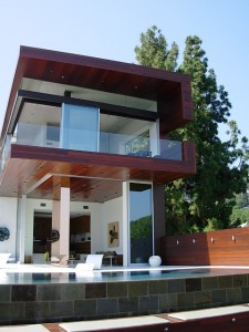
One of the 5 homes on the June 27-28 CA Boom Show's LA architecture tour, designed by Assembledge

One of the 5 homes on the June 27-28 CA Boom Show's LA architecture tour, designed by Assembledge

Today, the press was invited to tour the Sunset Plaza house and meet its designers, Kevin Southerland and David Thompson of Assembledge+. I headed to LA with my friend Jennifer Gilbert Asher, garden designer, artist, and co-creator of TerraSculpture (check her out in the July issue of Garden Design!).

We walked into the house and were assaulted – in a good way – with the breathtaking view of a gorgeous infinity pool that drew our eyes to the LA skyline. We met owner Brad Blumenthal, who graciously opened his home for CA|Boom tours.

I said, “oh, I understand you worked with the design firm Assembledge (which I pronounced with my 11th grade French accent as “aah-sim-BLAAGE”).

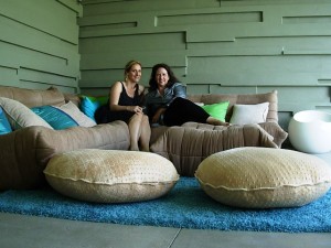
Jennifer Gilbert Asher and me in Brad Blumenthal's "Hideaway Lounge"

Jennifer Gilbert Asher and me in Brad Blumenthal's "Hideaway Lounge"

Obviously, that was too funny to Brad, who just started laughing and speaking to me in French.

Duh. I guess the firm’s name is pronounced “a-SEMM-blidj,” with hard vowels, Americanized. 

That was the funniest moment of the day, but it kind of endeared us to Brad (I hope) and to his awesome architects, Kevin and David. The three of them actually gave Jennifer and me a personal, guided tour of the home – upstairs and down.

Owner and actor Brad Blumenthal (center), with his architects Kevin Southerland and David Thompson

Owner and actor Brad Blumenthal (center), with his architects Kevin Southerland and David Thompson

Theirs is an unparalleled design project that defines modern architecture for the 21st century. I’m still marveling at the sleek lines and forms that incorporate rich, organic materials. In true California Living style, the outdoors is invited into every room. The dramatic, 180-degree view is a sight to behold.

We were drawn to the terrace, where the interior terrazzo continues to the pool’s edge, completely extending the notion of “room” to an open-air setting. When viewed at a certain angle, the two lounge chairs, aka “Wave Chaises,” in cast fiberglass (from Float, a Philadelphia design studio), look as if they’re floating on the water’s surface.

charlestrotterI sat down with Charles Trotter (right), founder and producer of CA|Boom, and asked him how things were shaping up for next weekend’s show:
Q. Tell me about this year’s new venue, in the vintage Beverly Hills building that once housed Robinson’s flagship department store:

A. We had an opportunity to reintroduce a building of that style and design from the 1950s. We will feature beautiful Julius Schulman photographs of the building, lent by the Getty. People may forget how stylish the design of this building was in the context of its 1950s architecture.

Q. How big is the show space?

A. It’s abound 30,000-square-feet, which is the same as the Barker Hanger (CA|Boom’s former home at the Santa Monica Airport). But there is more exterior space.

Q. CA|Boom is more than a trade show. It seems like a “happening.” How do you make that work?

A. Many of our exhibitors use the show to debut products. We’ve definitely reinvented the idea of a “trade show.” We’re attracting a new generation of audiences and it’s giving exhibitors an opportunity to influence a design-savvy end user.

Q. You also draw professionals, right?

A. The architects feel this is their show.

Q. Charles, you know I am particularly interested and excited in outdoor living design. What new and innovative design can you tell me about? 

The warm, inviting interior of an IC Green Container House

The warm, inviting interior of an IC Green Container House

A. I.C. Green’s Container Houses are a new pre-fabricated project. Of all the modernist pre-fab we’ve seen, this is hitting the right price point. They will be debuting a 600-square-foot studio, like a  “Granny Flat,” using portions of a shipping container. It’s the most sophisticated durable good that’s been made. You can even put multiple ones together. This has a lot of promise

[Note: This is a description from CA|Boom’s web site: I.C. Green’s Container Houses follow the “principles of modularity with a high degree of flexibility within the system.” The used shipping containers reappropriated as homes provide a frame that is structurally strong, facile to transport and a rectangularity that suits the modern aesthetic of an “open plan” home. Off-site prefabrication/adaptive reuse greatly reduces construction costs and time. Material finishes and energy systems can be used to create additional clean energy performance of the Container Home.]

Architect Kevin Southerland, Assembledge, enjoying his Coolhaus ice cream sandwich

Architect Kevin Southerland, Assembledge, enjoying his Coolhaus ice cream sandwich

We ended our tour and interview with an afternoon snack, a hip Coolhaus ice cream sandwich!

Coolhaus is a modern take on the traditional ice cream truck that is all the Twitter-rage around LA. Oh, P.S., Coolhaus will be selling these mouthwatering archi-treats at CA|Boom next weekend.

High concept ice cream sandwiches are named for modern design icons: Frank Behry, Mintimalism, Oatmeal Cinnamoneo (Jen had this one, but it was melting fast in today’s 80-plus temps), Mies Vanilla Rhoe and IM Peinut Butter (my choice).

Yummy. Sweet.

And stylish!

More Stylish Sheds: Old House Interiors story + review

Saturday, June 13th, 2009

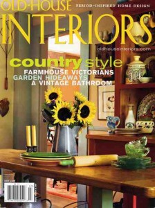
STYLISH SHEDS AND ELEGANT HIDEAWAYS: “A charming, happy, very pretty book full of ideas for building, furnishing, and enjoying your backyard shed or writing den.” — Old House Interiors review, July 2009.

ohijuly09001My Stylish Shed partner, the very talented Bill Wright, is a frequent contributor to Old House Interiors magazine. His photographs of luscious historic interiors and architecture are always a treat for the eyes. So when we learned recently that editor Patricia Poore planned to feature Stylish Sheds and Elegant Hideaways in the magazine’s July 2009 issue, Bill and I were thrilled.
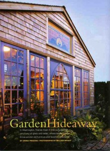
Patty decided to excerpt a chapter from Stylish Sheds, one about Michelle and Rob Wyles’s dreamy garden shed in Eastern Washington.

We called our chapter “Sun Catcher,” which aptly describes the shed’s design that utilizes ample antique windows to draw sunlight into the 20-by-20 foot cedar-shingle-clad structure. OHI titled the chapter “Garden Hideaway” and I’ve included the edited story here, along with Bill’s images:

ohijuly09002

GARDEN HIDEAWAY: In Washington, friends meet in this sun-catching sanctuary of glass and cedar, where tended plants thrive amidst old furniture and favorite collections.

By Debra Prinzing | Photographs by William Wright

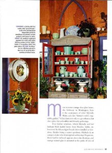
More summer cottage than glass house, this hideaway in Washington State is the centerpiece of what Michelle Wyles calls her “farmer’s wife’s vegetable garden.” It functions not only as a greenhouse, but also a place for collectibles and friendly gatherings.

Two Gothic windows, which Michelle and her husband Rob hauled home from Hayden, Idaho, are bracketed by fifteen-light French doors installed as windows. Besides being a master gardener, Michelle is an antiques dealer who’d stockpiled architectural fragments. More Gothic millwork appears above a doorway, and vintage stained glass is mounted at the peaks of two of the building’s four gables.

ohijuly09003Her design process was anything but logical, Michelle admits. “You can be unrealistic and impractical when you’re making a garden building,” she says.
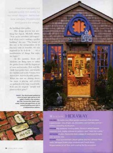
“The beauty of this one is the juxtaposition of its fanciness with its humility. It’s not supposed to be la-di-da . . . it’s a manifestation of things that make me happy.”

In the summer, doors and windows are flung open to infuse the garden house with the fragrance of roses and lavender.

Rob and Michelle host parties here, and benefits for charities such as the Yakima Area Arboretum, their local public garden.

When the stars are shining above, the music is playing, and revelers are gathered at the large round table, Rob says it’s magical: “people and plants in their glory!”

Mission: Hideaway

ohijuly09004Challenge: To build a sun-filled garden sanctuary that emulates a greenhouse – lots of light, air, circulation, and humidity control – without mimicking its structure.

Program [Must-haves]: Big windows, running water, floors of native Cascade mountain rock, display shelves for pottery – and “room for a party.”

Inspiration: A plain, Nantucket-style cottage of weathered shingles with lavender trim.

Design features: Four symmetrically placed gables and four window-filled walls. Salvaged Gothic-style windows and French doors. Hinged panels for air flow, and a ceiling fan for circulation.

The story ends with this sidebar, featuring three other of our favorite Stylish Sheds:

“A room of one’s own” doesn’t have to be in the house. Backyard structures sometimes bear no resemblance to the cobwebby garden sheds of suburbs past; today people are using them as studios, writing rooms, playhouses, dining pavilions – hideaways of all sorts. Look for lace curtains and window boxes, and cedar shingles instead of corrugated walls. Even toolsheds, of course, can be artistic.

Rooftop Crop: Edible Gardens Overhead

Thursday, June 11th, 2009
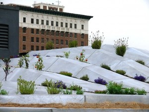
A sculptural vegetable garden grows on a downtown Los Angeles rooftop

A sculptural vegetable garden grows on a downtown Los Angeles rooftop

I wrote about Los Angeles’s gardens-in-the-sky in 2007, so when my chef-photographer friend Rico Mandel told me about a rooftop vegetable and herb garden that fellow chef Jonathan McDowell had been cultivating, I was excited to learn more. And to see it!

We grabbed a Starbucks and hopped on the freeway a few days ago to drive to downtown Los Angeles. On the way, I told Rico about an article I had just read in the January 2009 issue of Growing for Market, a journal for local food and flower producers. It was written by Marc Boucher-Colbert, a Portland sustainable farmer who created Rocket Restaurant’s rooftop garden with table-high steel planting troughs and 39 lightweight “kiddie” wading pools.

“Kiddie pools – how do you like that?” I asked Rico. “That’s cheap, lightweight and clever, isn’t it?” He silently chuckled to himself. Later, I understood why. Because what Jonathan had to show us was as far from a plastic wading pool as you could get.

bluevelvetBlue Velvet restaurant occupies the ground floor of a 10-story, 1960s-looking (but new) apartment building – all horizontal lines and clean facade. Jonathan met us in the parking lot and took us up the elevator to the top floor; we climbed a flight of stairs and emerged onto the roof.

Rico hinted about the totally unusual, sculptural design that contains Blue Velvet’s edible crop, but there was no way I could have envisioned the fluid, galvanized metal, Frank Gehryesque installation in front of me. What the . . . ?

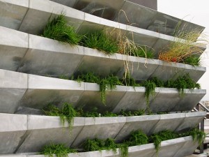
"Gutters" hold trailing rosemary in a vertical wall system.

"Gutters" hold trailing rosemary in a vertical wall system.

Turns out, this creation was fabricated on site to mold up and across a bleacher-like frame that hides HVAC units and other commercial rooftop paraphernalia.

It begins as a 10-foot vertical installation of long, horizontal channels – stacked almost like a wall of roof gutters. Many of the sections are planted with trailing rosemary. We marveled at the metal material. Even though Rico and I visited on a dreary, cool day in June, there’s no denying Southern California’s heat and sun effect. “Oh, well, this wall is north-facing, so at least it’s away from the most intense heat,” I commented.

“Wait until you see the rest of the roof,” Jonathan promised.

We walked a few yards across the roof, following that vertical wall of herbs, and I noticed how this “metal farm” took on kinetic qualities, wrapping over and around the “stuff” on the roof (and in the process, facing due south!).

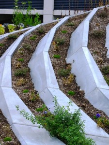
Fluid, shaped metal planting channels hold veggies and herbs

Fluid, shaped metal planting channels hold veggies and herbs

plantedroof3To get an idea of how this scheme looks in person, take a sheet of paper from your printer and fold it back and forth every 1/2-inch or so. This is how we made paper “fans” when we were kids. Open up the paper slightly so there are V-shaped pleats. Now, imagine translating that texture to sheet metal. The V-shapes create long planting channels, about 4- to 8-inches at the deepest point. Sections of the metal, welded together every 18-20 inches or so, take form, twisting, bending and turning as a beautiful sculpture.
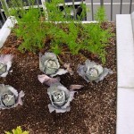
veggiesBut for all practicality, in responding to this design as a gardener, I have to admit that a million questions flooded my mind. How can tender herbs, greens and vegetables handle this sun-baked, roots-against-metal, rooftop condition, especially in July and August when it is ugly-hot? Moreover, where was the irrigation?


Jonathan, who just completed a four-year stint at Blue Velvet (two years as sous-chef and two years as head chef), looked at me and shrugged. Although he wasn’t involved in the design of the “garden,” Jonathan was tasked with figuring out how to grow plants in it. That has meant filling those pockets and grooves with soil and planting veggies in an artful way. There’s no denying this is an evocative design. “It pleases the eye,” Chef Jonathan acknowledges. “It has attracted a lot of attention.”

But – duh. Every square inch of this garden has to be hand-watered.

“In L.A.’s restaurant gardens, freshness is grown to order,” a May 20th Los Angeles Times Food article, Betty Hallock featured Blue Velvet’s rooftop garden, quoting its designer, architect Alexis Rochas: “The point was to experiment with how to turn infertile ground into a fertile one,” he said.

Chef Jonathan McDowell and Chef-photographer Rico Mandel

Chef Jonathan McDowell and Chef-photographer Rico Mandel

That’s an admirable goal. But the experiment has revealed that plants here don’t thrive against metal, and the absence of drip irrigation – that could direct moisture straight to root zones – is a negative. I’m worried that those hand-watering duties will likely be neglected when the guys in the kitchen get super busy!

Metromix Los Angeles recently featured “rooftop gardens” in a trend report by Krista Simmons. She included Blue Velvet’s in-the-sky garden, calling it “a sweeping silver flatbed . . . strikingly similar to the Walt Disney Concert Hall.” Simmons points out that the garden doesn’t generate enough to sustain the restaurant, but adds: “. . . McDowell does use the produce for tasting menus, amuse bouches and specialty holiday events.”

I applaud the rooftop restaurant garden. It’s a great vehicle to bring the “seasonal, sustainable and local” concept from garden to plate. To succeed, however, Blue Velvet needs a retrofit. Maybe getting an irrigation specialist up to that rooftop will help. Ask a professional market farmer or gardener to consult on how to better grow and sustain these poor little plants – they looked pretty stressed out! After all, part of the sustainable equation is to work with nature and create a supportive growing environment so that plants are productive and bountiful.

More reading: INHABIT, a design blog

Sneak a Peek at Summer: Outdoor Accessory Review

Monday, June 8th, 2009
Pier 1 imports in-house stylist, Aimee Beatty in her fav Papasan chair

Pier 1 imports in-house stylist, Aimee Beatty in her fav Papasan chair

"Crazy Weave" hanging lanterns in 2 sizes, 6-inch high and 7-inch high; ($10-$15)

"Crazy Weave" hanging lanterns in 2 sizes, 6-inch high and 7-inch high; ($10-$15)

Summer’s almost here and since you may not have the budget for a big vacation, why not spend just a little to turn your backyard into a spa-at-home?

Pier 1 imports, my fav post-college source for home decor and furniture, is all grown up. I recently reviewed the retailer’s playful summer collection. I’m especially drawn to their lineup of  creative ideas for decorating outdoor spaces.

To learn more about the colors, patterns and materials that inspired the season, I called Aimee Beatty, Pier 1’s in-house stylist and design maven. She works for the Ft. Worth, Texas-based home furnishings chain to coordinate photo studio vignettes, visual displays and settings for advertisements and catalogues. 

One of the things I noticed about the Summer 2009 collection is that it’s very “interiors-looking.” I wanted to ask Aimee all about it. Here’s part of our conversation:

Q. I have enjoyed many great decorating moments from Pier 1, especially when I was in my budget-conscious, recent grad phase. But now Pier 1’s mix seems more edited and less like a world market. Has this change been conscious?

A. We envision ourselves as having something for everyone. There is an element of our products all working together (mixing-and-matching). Even today, we want shopping at Pier 1 to be a treasure hunt of sorts.

Q. I’m interested in the outdoor furnishings and accessories. What is the palette of the moment?

 A. We’re using punches of lime, yellows, corals and different shades of blue, including turquoise.

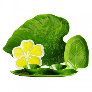
Reusable tropical-themed Melamine serving plates, $2-$19

Reusable tropical-themed Melamine serving plates, $2-$19

 Q. How about materials – what’s new there?

 A. One of the materials I’m most excited about is a plastic rattan.

 Q. It looks like Pier 1’s distinct design themes have an exotic flavor this summer:

 A. I would describe the overall theme as “eclectic” – a look of mixing and matching and layering furniture with different finishes. Themes include:

  • Bohemian:  It’s comfy, eclectic and a little romantic. Our design team has combined patchwork, embroidery and relaxed pieces for a vibe that’s in tune with today even though it might recall a hippy, happy era.
  • Tropical: Oversized floral patterns. Bold color. Natural touches. Easy ideas. This collection is as budget-friendly as it is cheery.
  • Global: This is the look that Pier 1 is known for. We travel the world and pick up treasures along the way.  You’ll see this in festive dinnerware, ceramic vases with an Old World look, carved mirrors – anything with rich, jeweled tones. This season, it’s the mix that makes traditional creations look bold and fresh.
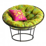
Outdoor Papasan chair, approx. 46-inches in diameter, $99.95 for 2-piece frame; Scatter daisy cushion, $100; 18-inch pillow, $16.95

Outdoor Papasan chair, approx. 46-inches in diameter, $99.95 for 2-piece frame; Scatter daisy cushion, $100; 18-inch pillow, $16.95

Q. Can you share any fun tips on making an outdoor space more personal?

A. People tend to overlook the fact that their outdoor patio can be just as important as their indoor rooms. I suggest you clear the clutter. Don’t use that space for storage! Instead, view the patio (or deck or terrace) as a useful place. No matter how small or big, have fun.

Q. Do you have an example of a favorite deck or patio design?

 A. I like to mix a sitting area with the dining area. You can have a bistro table for two but also incorporate a wicker chair or love seat. Blend the two uses rather than separate them.

 Q. Let’s talk about some of the hot styles and products for al fresco summer settings. What are some of your favorites?

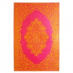
Hot pink with Electric orange, an exotic, 4-by-6 foot outdoor rug, $24.95

Hot pink with Electric orange, an exotic, 4-by-6 foot outdoor rug, $24.95

A. First, the Papasan – for outdoors. I remember when I went off to college and that was the first thing we bought for the dorm room. It’s an iconic Pier 1 piece. This Papasan is great because it can stay outside. It’s bold and bright and has a lot of personality. It’s made out of iron and plastic rattan. The cushions are 100% polyester and water repellent. I love these (once) indoor chairs used outdoors because they offer a new and fun patio feature for you and your guests. Use them to create a cozy, casual environment.

Q. What about the outdoor rugs – they are awesome!

A. Rugs are often the last thing people think about when decorating their patio. These are bold and bright and have a lot of personality. They really warm up a space and make it room-like.

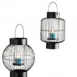
Iron wire cage lanterns 9-3/4-inch high and 10-1/2-inch high ($18 each style)

Iron wire cage lanterns 9-3/4-inch high and 10-1/2-inch high ($18 each style)

Q. And I love all the lanterns — the ones that accommodate votives and the battery-operated options. They would look great hanging from the pergola over my patio or from the trees in my garden.


A. Rather than just using one, you can have groupings of lanterns. Experiment with a little cluster. Or, hang a row of them above a table.

Q. Any final advice for accessorizing our summertime spaces?

A. These trends can be taken and shown by themselves or, for even more fun, mix them all up for an eclectic look that is totally your own.

Thanks, Aimee. I look forward to talking with you again.

Now That We’ve Ripped Out The Grass . . .

Saturday, June 6th, 2009
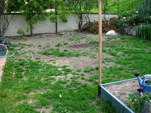
We turned off the irrigation and tried to "choke" out the grass. This technique is fairly effective...until winter rains arrive!

We turned off the irrigation and tried to "choke" out the grass. This technique is fairly effective...until winter rains arrive!

The traditional lawn-centric backyard is changing – for the better.

After a brutal buffalo grass removal process (that stuff refuses to die!), we’ve begun the transition to create my “dream” garden.

Gone are a dozen pygmy date palms and two gangly buddleia shrubs that never looked happy, even when they were blooming. Gone is 800 square feet of grass. Now we’re ready to install a low-water, Mediterranean and California native landscape in several border areas, planting beds and center “islands.”

In place of the turf, we’re spreading California Gold gravel. The material is about 3/8ths inch in size and has a mid-tone sandy gold color.

In the Pacific Northwest, if you were going to do a gravel garden, you’d use “quarter-minus crushed gravel,” but it would be from basalt; thus, it would be grey. Grey works under grey skies. Gold works under sunny skies.

Here’s how it arrived, yesterday:

httpv://www.youtube.com/watch?v=j9UroPHg0U0

The thing I like about the California Gold (or any crushed rock medium) is that rain and moisture percolate through to the ground rather than running off into the storm water system. Plus, you can plant right into it, thereby softening the hard look of too much stone. It’s compact-able; thus, it’s not uncomfortable to walk on. I’m not sure how my dog, Zanny, is going to enjoy it, but luckily, we’ve left a few places around the side of the house for her to do her business.

I’ll keep posting more photos as we continue the journey!

Online Flower Buying, Do’s and Don’ts

Thursday, June 4th, 2009
hydrangeas and roses - straight from my garden in 2006

hydrangeas and roses - straight from my garden in 2006

Here’s what you need to know when ordering flowers online or over the telephone.

Earlier today, I joined Jennifer Litwin, host of “The Shop Cop,” a national consumer advocacy program that airs live every Thursday at 10 a.m. Pacific on Voice America Radio.

We discussed ways that consumers can make the most of their long-distance flower purchases, including my tips on avoiding ripoffs, poor-quality product and bad service.

Here’s a link to the 15-minute segment.

Some of the recommendations I shared with Jennifer’s listeners include:

Check local rants and raves on Yelp, the consumer review site (search “flower shops” by city). Find a certified floral designer in your city or in the city where you wish to send flowers at the American Institute of Floral Designers.

Everyone wants a “green” planted wall

Tuesday, June 2nd, 2009
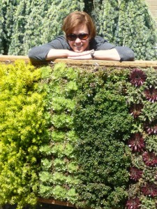
Carina Langstraat's delicious planted wall

Carina Langstraat's delicious planted wall

Green walls are the hot, new, must-have landscape design element. The Europeans were the first to figure out how to engineer large-scale planted walls, inspiring some innovative American designers to follow with their own twist. From my research, most are here on the West Coast, natch.

My friend Flora Grubb in San Francisco has received quite a bit of press for her avant-garde planted wall tapestries that incorporate everything from succulents to air plants (Tillandsias). 

And recently, the Los Angeles Times featured green wall designs using edibles (by Go Green Gardeners’ Anne Phillips) and California native plants + succulents embedded with LED lighting (by L.A. artist Michel Horvat).

HOW DID THIS TREND GET STARTED?

Garden writers have been describing “vertical elements” in the landscape for years. Traditionally, this idea involved arbors, trellises, fences and other structures upon which vines and climbing plants are trained. An explosion of interest in “green” planted roofs – including here in Los Angeles – followed. Pamela Berstler and Marliee Kuhlmann, two cool LA designers, create planted succulent “sky-scapes” for their clients’ garden roofs. I’ve seen, touched, and admired their work – and I can tell you, a lush, foliage-strewn roof is a lot more snazzy (and eco-smart) than tile, composite or tar!

But privately, some designers have confided to me their concern about liability issues involved in engineering green roofs. Even when I wrote on this topic for the Los Angeles Times in 2007, the experts I quoted cautioned that roof structures should be designed with load-bearing supports to manage soil/planting medium, handling moisture, and just the sheer weight of plants.

So, it’s only natural that the planted wall is the next installment of “plants-as-architecture” – a trend that seems more achievable than a green roof. I love seeing how designers are “going vertical” with a planted foliage palette.

THE WALL AS A PLANTING CANVAS

One of my favorite designers, Seattle-based Carina Langstraat (who runs Langstraat-Wood Landscape Architecture & Design with her landscape architect partner Erik Wood), has recently engineered a 4-foot by 5-foot green wall prototype at her Ballard studio. She shared with me photos and tips on how she created the system. It’s exciting to think about the possibilities, whether you’re willing to play around with this concept on your own or if you want to hire a professional.

READ MORE…

A visit to Design-on-a-Dime’s Kristan Cunningham

Friday, May 29th, 2009
A peek at Scott and Kristan's $1000 kitchen renovation

A peek at Scott and Kristan's $1000 kitchen renovation

Kristan Cunningham and her boyfriend Scott Jarrell hang out in their hip living room

For the full story about DIY star Kristan Cunningham’s clever re-do of her Venice canal district rental, read my profile in Saturday’s Los Angeles Times’ HOME section.

Kristan and her longtime boyfriend Scott Jarrell transformed a frumpy 1980s “faux French Chateau” into a cozy, lighthearted setting filled with a mix of DIY projects, vintage accessories and furnishings from big-box retailers. They use savvy and common-sense ideas to conjure a very livable – and affordable – design.