Debra Prinzing

Get the Email Newsletter!

Author Archive

New scenes of my lawn-free backyard

Wednesday, September 2nd, 2009
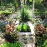
My killer backlit shot of the central path

My killer backlit shot of the central path

We now have a backyard that is grass-free. The space has undergone a huge transformation since earlier this summer when a crew removed the last patches of dying turf. With irrigation repaired and new planting beds+borders outlined and populated, we received a delivery of California Gold crushed gravel to carpet the walking areas. I’ve since decided on the very best way to describe this color of gravel. To me, it will forever be called “Golden Lab.” When our dog Zanny lays on the gravel in the warm Cali sunshine, we notice that her fur blends beautifully – practically the same color.

Our 25th anniversary was last week, and Bruce surprised me with a brand new digital camera, a Canon PowerShot G10. This is a “big girl” camera. No point-and-shoot idiot stuff for me anymore. OK, basically, I have no idea how to do anything BUT point and shoot, but I hope to learn.

The partner-in-crime in this Canon choice is none other than Bill Wright. Bill and I have worked together for years and together created Stylish Sheds and Elegant Hideaways. He knows his stuff. I’m sure he rolled his eyes (privately) about my wimpy camera shenanigans while we were on location together. Lucky for me, Bill advised Bruce on this camera purchase. Oh, and one sweet note. Bruce gave me a 35mm manual camera for a wedding gift on August 24, 1984. It was a beautiful Pentax. I used it for years, but eventually, it broke (OK, it “was dropped,” which is my passive way of saying I broke it) and couldn’t be repaired. That he remembered the wedding gift 25 years ago and wanted to do a reprise was both thoughtful and romantic.  I’m going to get major mileage out of this Canon. That is, when I learn all of its bells and whistles.

Until then, here is my maiden voyage. Photos of the “new” backyard:

Meet a beautiful – and sustainable – landscape

Friday, August 28th, 2009
Mike Mcdonald, a Green Builder and Visionary

Mike Mcdonald, a Green Builder and Visionary

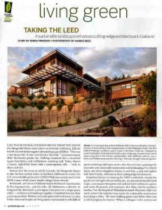
gardendesign004Garden Design magazine asked me to profile one of its “Green Awards” winners for the September-October issue, which is out on newsstands this week.

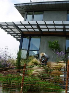
The story is about a lovely, sustainable landscape designed to complement the cutting-edge, eco-architecture of Margarido House in Oakland.

Margarido House is the creation of builder-owner Mike McDonald of McDonald Construction & Development, and his architect-brother Tim McDonald of Philadelphia-based Plumbob.  The brothers and their multiple collaborators have created a stunning residence that earned the highest (Platinum) rating from the U.S. Green Building Council. It is the first home in Northern California to obtain the LEED-H Platinum Award (Leadership in Energy and Environmental Design).

gardendesign005What makes this garden and its home sustainable?

1. It’s Permeable : The patio, roof and driveway surfaces are designed to capture all of the property’s storm water runoff. The driveway’s decorative design uses recycled and perforated Pavestone concrete tiles. Water percolates into a 4,000-gallon cistern hidden under the driveway and, when needed, circulates through the property for irrigation and flowing through the Zen garden’s piped fountain. “We’ve created a self-contained water loop,” Mike points out.

 2. It’s Durable: Garden designer Lauren Schneider of  Wonderland Garden and Landscape in Oakland, chose a diverse, drought-tolerant plant palette. She worked closely with local growers to specify California native varieties, as well as plants from many Mediterranean regions, including South Africa, Australia and New Zealand, South America and Mexico. She closely observed the garden during its first year to evaluate whether each plant was durable enough to survive Oakland’s dry summer conditions with infrequent water.

 3. It’s Reusable: Recycled concrete is the basis for Margarido House’s über-modern S-curve chaises, tabletops and sleek urns, which contain succulents, bamboo, and New Zealand flax. Created by Bay Area Concreteworks Studio, which also fabricated interior concrete counters, the products satisfy LEED’s “local” and “reusable” criteria. Other outdoor furniture also has recycled content, including Room & Board’s  “Emmet” Adirondack-inspired chairs, by Loll Designs, made with 100 percent recycled high density polyethylene (plastic).

Margarido House, enhanced by a soft, sustainable garden

Margarido House, enhanced by a soft, sustainable garden

One of the key scoring factors in earning this ranking is Lauren’s sustainable landscape design.

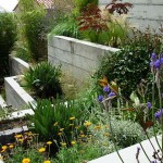
Dreamy and naturalistic, the garden is an organic counterpoint to the geometric architecture.

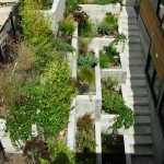
Lauren actually created three distinct gardens – one on the ground; one in the air; and one that climbs an incredible vertical retaining wall and has multiple sections for planting (not to mention a melodic water feature to attract birds).

Photographs of the Margarido’s rooftop garden weren’t included in the Garden Design layout, due to space constraints. I wanted to make sure and show some here. The rooftop is pretty stunning, and not just because it has killer views of San Francisco Bay. It is installed on top of a capillary mat and layer of geo-textile material; over this base are “three inches of horticultural pumice as a drainage medium and five inches of lightweight planting mix,” Lauren explains.

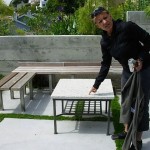
Garden designer Lauren Schneider gave me a personal tour of Margarido House's exterior spaces

Garden designer Lauren Schneider gave me a personal tour of Margarido House's exterior spaces

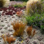
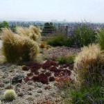
The dramatic design includes sedums and sempervivums, golden barrel cactus, lewisia, Cleveland sage, lavender, deer grass, and Libertia peregrinans, a New Zealand iris relative valued for its bronzy-orange blades.

This garden provides top-down insular qualities that cool or warm the home, depending on the season. Flowers and stems of Cleveland sage, silhouetted against the sky, can even be seen through the skylight that illuminates the master bath. The roof garden invites its viewers to look close and study the interplay of plant colors and forms. In an abstract way, they echo the distant scenery where treetops and buildings form an irregular city skyline.

You can read the full story here. And enjoy this gallery of photos that I shot when visiting this past May. You’ll see details that caught my eye and get a fuller sense of this amazing landscape and home.

A Gazebo in the Garden

Sunday, August 23rd, 2009
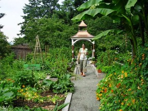
Kathy Fries, framed by her new gazebo

Kathy Fries, framed by her new gazebo

Most gazebos are a little twee for my liking. If you think of a traditional white latticework structure, the kind that looks as if a gust of wind or a swiftly-kicked soccer ball might knock it over, you probably don’t love gazebos either.

Ever since I started scouting great garden architecture for Stylish Sheds and Elegant Hideaways several years ago, I have changed my tune.

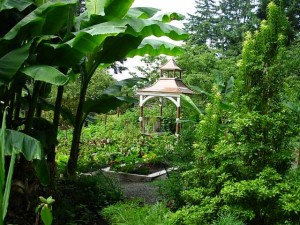
Case in point: When I was in Seattle earlier this summer, my friend Kathy Fries invited me to see her new copper-roofed gazebo. Situated in the heart of Kathy’s prolific vegetable garden, the structure was built by John Akers. I’ve written about Kathy and John’s collaboration before, both in this blog and in the pages of Stylish Sheds. He is a salvage-artist-carpenter who knows how to take Kathy’s grand ideas and construct them into fanciful garden buildings.

It's a lovely addition that enhances the vegetable garden

It's a lovely addition that enhances the vegetable garden

What I love about Kathy’s new gazebo is that it is both beautiful and functional (not to mention sturdy!). In it, you can gain shelter from rain or sunshine; you can pause while picking raspberries and sit on one of two facing interior benches. You can “gaze out” over the garden, looking through openings on either end or the side walls.

The gazebo’s charming rooftop joins several other turrets, cupolas and domes that populate the skyline of Kathy’s garden. Plus, it gives the vegetable garden a new point of view. When John erected the gazebo, it allowed Kathy to realign some of her paths and planting beds on a main axis. It’s beautiful and I know everyone who sees it will start dreaming about a new sort of garden gazebo.

And did you know that Gazebo is believed to come from the Latin for “Gaze About”? I’ve added definitions from several sources to my Shed Glossary, here.

If you have a Gazebo you want to share, please send me the photo and I’ll post it in the future. Here are a few more photos from Kathy’s garden:

The Oregonian book review

Tuesday, August 18th, 2009
Today’s Oregonian newspaper features an online 3-Star “Excellent” review of Stylish Sheds and Elegant Hideaways by staff garden writer Kym Pokorny. I love how she started out the review:

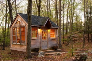
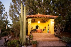
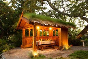
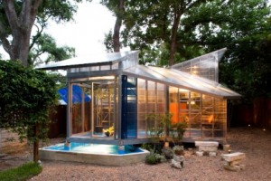
It’s tempting to describe all 28 sheds in Debra Prinzing’s “Stylish Sheds and Elegant Hideaways,” but that would take the fun out of discovery. Here’s a tease: A tiny, rustic cabin in the woods; an astonishing, asymmetrical, steel-framed structure over a pool; a grass-roofed, Norwegian stabbur; a stucco-and-tile pavilion surrounded by desert plantings. OK, that’s enough.

For those of you who read Kym’s Q&A interview with me and then moseyed over here, I thought I’d share the photos of each of the stylish structures she highlighted in her tease. These photographs reveal the incredible talent of my collaborator William Wright.

Enjoy!

A Tiny, Rustic Cabin in the Woods


Separate from the main residence but as comfortable as a little cottage, the 14-by-14 foot writing shed is nestled in the Connecticut woods

Separate from the main residence but as comfortable as a little cottage, the 14-by-14 foot writing shed is nestled in the Connecticut woods


 A Stucco-and-Tile Pavilion Surrounded by Desert Plantings

The grand pavilion sets the stage for entertaining in a gorgeous cactus-and-succulent landscape outside San Diego


Grass-Roofed, Norwegian Stabbur

The 9-by-12 foot redwood dining pavilion was inspired by traditional Norwegian farm buildings, called stabburs. Complete with a sod roof, it's a magical destination for outdoor gatherings
The 9-by-12 foot redwood dining pavilion was inspired by traditional Norwegian farm buildings, called stabburs. Complete with a sod roof, it’s a magical destination for outdoor gatherings


An Astonishing, Asymmetrical, Steel-Framed Structure Over a Pool

Made from ordinary greenhouse material, the 430-square-foot shed is a winter greenhouse for potted tropical plants. But during summers in Austin, Texas, it's a play pavilion
Made from ordinary greenhouse material, the 430-square-foot shed is a winter greenhouse for potted tropical plants. But during summers in Austin, Texas, it’s a play pavilion

 I hope you find inspiration from these incredibly diverse garden destinations!

Stylish Chicken Coop in Santa Barbara

Sunday, August 16th, 2009
A tiny chicken coop with loads of style

A tiny chicken coop with loads of style

Last week’s visit to Santa Barbara included a stop at “Rooms & Gardens,” a wonderful home furnishings, antiques, accessories and interior design emporium on State Street.

I needed to check out the store’s new backyard chicken coop and garden.

Owners Eric and Jami Voulgaris recently created the sweet coop and romantic garden, where four Buff Orpington hens reside.

When I met Eric a few weeks ago, at the Santa Monica “Rooms & Gardens” store (they own this location with a partner, actress Mary Steenbergen), he told me about the chicken coop project.

The little building measures about 6-by-6 feet in size, with a charming shingled roof, board-and-batten siding, a country-style screen door and shutters. Stained that dreamy grey-blue shade, it looks both elegant and timeless.

A curved cobblestone path leads from the store’s back door out into the postage-stamp-sized garden. Picket fencing contains the four gals in their little yard.

The Voulgaris children named the Buff Orpington chicks, born on Easter morning: “Henny Penny,” “Rosy,” “Cornflake,” and “Scramble.”

The 800-square-foot garden’s renovation came about because it had to be ripped up when the neighboring Apple store was moving in. When that construction came to an end, Eric and Jami saw it as a chance to dress up the space, which really hadn’t changed much since Rooms & Gardens opened 16 years ago.

Happy chickens living in a happy garden

Happy chickens living in a happy garden

Pretty and inviting, a corner garden

Pretty and inviting, a corner garden

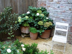
Fully organic, the Martha’s Vineyard-inspired garden is landscaped with espaliered apple trees, Meyer lemon trees, ‘Iceburg’ roses and clumps of lavender. One corner holds a display of potted hydrangeas and an iron chair.

The garden and hens complement the carefree lifestyle settings inside Rooms & Gardens. Eric describes the store’s look and feel as “a fusion of British Colonial, ethnic accents, Chinoiserie and a relaxed coastal theme.”

I love the happy vibe that you feel upon entering. It’s a store where sink-into furniture is paired with uncommon accessories, all of which suggests well-loved and well-lived-in environments.

The garden is open to visitors during store hours. If you want to taste the yummy brown eggs produced here, check with the staff. Eric mentioned that a plan is in the works to supply Tuttini’s, a cafe around the corner, with their daily source of eggs!

Shed Stuff

Wednesday, August 12th, 2009

In my past life as a garden writer in Seattle, I had several opportunities to interview landscape architect Alan Burke of Classic Nursery & Landscape Co. in Redmond (outside Seattle). I profiled Alan as one of the “Hot 40 Landscape Designers You Need to Know,” for Northwest Home + Garden Magazine in 2005.

Now we’re just Facebook Friends (since I’m here in Southern California; he’s still in the PNW; and I don’t get to see what he’s up to).

But today, out of the blue, I received this little communique from him on FB:

Today at 4:29pm
So I am having a meeting with a client, we’re talking about an outbuilding. She is thinking of many ideas for the shed, a greenhouse, a writer’s studio, a music room, a conservatory…. As we’re talking I am thinking: “I have to refer her to Deb’s book.” She says: “I saw some great ideas somewhere wait, I…”
I say: “You need to get a copy of Shed Style,” and she almost screams, “That’s it! That’s where I got the idea!”

…It’s a great book to show clients to get the ideas flowing….Great job!

Thanks for the shout-out, Alan. I needed that good news today!
Promise you’ll send me photos of the “outbuilding” you design for your client, okay? I’ll be sure to post them here!
Fondly,
Debra

Fun at the Ventura County Fair

Tuesday, August 11th, 2009

My lifeblood is comprised of words, sentences, paragraphs, stories. I am definitely NOT a writer of “short” blog posts. But sometimes, I do have to defer to the photographs to tell a story. So today, you will be treated to mostly photos of our afternoon at the Ventura County Fair in Ventura, California. After years fighting the crowds, strollers and sticky run-ins with cotton candy at the King County Fair in Puyallup (Washington), I have to say how nice it is to take in a smaller fair with fewer bells and whistles. With the charming theme, “Homegrown and Pure-Bred,” Ventura’s is the perfectly-sized county fair. Of course, when you go on a Monday afternoon, you’re not going to encounter the weekend crowds. So we did.

What follows are my favorite images of the day. The fair continues through Sunday, August 16th. For details, click here:

RIDES TO THRILL

What a beautiful whirligig. The figures against the blue sky are flying around. The machine's carnival-colored design is beautiful.
What a beautiful whirligig. The figures against the blue sky are flying around. The machine’s carnival-colored design is beautiful.
The giant slide. A ride down the track on a burlap sack couldn't be more fun. My son Alex is nearly prostrate, on the green slide; his friend Philip is racing down the orange one.

The giant slide. A ride down the track on a burlap sack couldn't be more fun. My son Alex is nearly prostrate, on the green slide; his friend Philip is racing down the orange one.

 JUST FOR LOCAVORES

A prizewinning Hubbard squash in the Agricultural Building caught my eye. I'm growing one in the garden, but she won't be this big for a while yet.

A prizewinning Hubbard squash in the Agricultural Building caught my eye. I'm growing one in the garden, but she won't be this big for a while yet.

CRAZY FARM ANIMALS
Turkey racing. Words cannot describe this silly event, but we loved it!

Turkey racing. Words cannot describe this silly event, but we loved it!

More turkeys, including the brown ones.

More turkeys, including the brown ones.

FLOWER POWER
The "Floriculture" displays featured some outdoor gardens. Here's my very favorite: The "Flower Bedroom." I've seen planted beds before, but none as fanciful and well-executed as this one. Note the succulents spilling out of the dresser drawers, too!

The "Floriculture" displays featured some outdoor gardens. Here's my very favorite: The "Flower Bedroom." I've seen planted beds before, but none as fanciful and well-executed as this one. Note the succulents spilling out of the dresser drawers, too!

A sedum armchair. Lush and fluffy. Makes you want to sink right in. I love that the lime green arms have been painted to pick up the bright foliage.

A sedum armchair. Lush and fluffy. Makes you want to sink right in. I love that the lime green arms have been painted to pick up the bright foliage.

BACK TO WORK
 
Today I’m back at the desk, doing interviews for an article for a garden trends story that will run in a future issue of Alaska Airlines magazine. Alex and his friend are back to Junior Lifeguard training. We had a great day at the fair! After all that frivolity, we ended up only eating two roasted corn-on-the-cobs and one powder-sugar-flocked funnel cake between the three of us. Even still, by the time we came home at 8 p.m., both guys had headaches and stomachaches. That’s what going on all those spinning rides will do to you. Me, I’d rather look at produce, pigs, and pretty plants.

Hurrah for Julie and Julia

Saturday, August 8th, 2009

51ezORAwNJL__SL500_AA240_Two years ago, I read Julie Powell’s wonderful debut memoir, “Julie & Julia.” Her story of spending 365 days cooking every recipe in Julia Child’s “Mastering the Art of French Cooking” was electrifying and compelling.

I couldn’t decide what was more inspiring – Julie Powell’s innocent ambition and subsequent bravado or the between-the-lines story of the power of blogging as a voice for authors.

Either way, I ended up buying 5 copies of Powell’s book for my favorite writer girlfriends. I told them: You must read this book. It will open up your eyes to the potential of blogging.

At the time, I had just bit the bullet and decided to really try serial blogging. My best intentions prior to the fall of 2007 hadn’t gotten me very far. I originally “started” this blog in March 2007, when I foolishly thought Shedstyle.com would be a book-in-progress blog while Bill Wright and I created “Stylish Sheds and Elegant Hideaways.”  Constant travel, photo shoots, intense deadlines and a generally crazy schedule conspired to keep that from occurring (I think I wrote 2 posts between March and October 2007).

In September 2007, I moderated a “Garden Blogging” panel at the annual Garden Writers Association symposium with blogger-friends Kathy Purdy, Mary Ann Newcomer and David Perry (you will find each of them and their blogs the LINKS section of my home page).  I felt like a fraud. Sure, I created the panel and served as its moderator. But I was a pretender “talking” about blogging, not actually doing it.

I came home from Oklahoma City and, wholly inspired, I just started writing. I am eternally grateful to Mary Ann, David and Kathy for their honest and heartfelt support as fellow bloggers.

Like many tough things, repetition and frequency make it easier to learn new skills and habits. In less than 2 years I have written nearly 200 posts and met many awesome fellow bloggers, readers, friends.

Back to Julie and Julia.

That book really did change my life, thanks to the courageous Julie Powell and the inimitable Julia Child. I came home tonight from watching the movie “Julie & Julia” equally inspired.

As director and screenwriter, Norah Ephron is amazing. What a talent. Her screenplay is delightful. Her cast – Meryl Streep and Amy Adams – are delicious. Totally delicious in their roles as Julia Child and Julie Powell.

A woman seated near me (friend of a friend) told me a great story after the movie. As you may know, Julia Child lived in Santa Barbara in her retirement. The woman remembered working as a waitress in Santa Barbara in 1989. She waited on Julia and her husband Paul, who by then was in a wheelchair.

“Julia ordered a grilled-cheese sandwich and a banana for lunch,” this former waitress recalled. Hmm. I love hearing that our culinary icon, Julia Child, liked basic comfort food. It puts a smile on my face.

Not sure where this post is going, except to say that the writer in me LOVED the book and the film. I felt like I was watching all of our stories, our efforts, our hopes and dreams, up there on the screen. When the film portrayed Julia Child’s manuscript finally getting published after 8 years of work, I felt so victorious for her. When Julia Powell was interviewed for a story in the New York Times food section, I felt the excitement at hearing her answering machine buzz (well, that hasn’t exactly happened to me, but I can kind of relate).

Anyway, if you’re into food you should see “Julie & Julia.” If you’re a writer, you’ll definitely want to.

This post is dedicated to Nan, Paula, Mary Ann and Lorene, my friends who received copies of Julie & Julie from me in 2007.

LA Field Trip: Hollywood opulence gets a facelift

Saturday, August 8th, 2009
A 1926 pool built by William Randolph Hearst now has a new community pool house. The modern columns emulate original ornate ones

A 1926 pool built by William Randolph Hearst now has a new community pool house. The modern columns emulate original ornate ones

My friend Cristi Walden invited me to join her on an excursion earlier this week, one that introduced me to a chapter of Hollywood’s glamorous history. Cristi, a native Californian, is plugged into the architectural-decorative arts world around here. But she’s not just into the luxury, high-end stuff. She’s been known to cruise around LA after dark on tours of vintage neon signs with her pal Eric Evavold, who also accompanied her on our field trip.

The visit gave me a great excuse to spend a morning with Cristi and to learn something new about my own backyard. We met up at the new Annenberg Community Beach House at Santa Monica State Beach, which opened in late April at 415 Pacific Coast Hwy.

Located on Santa Monica’s “Gold Coast,” this is the site where publishing tycoon William Randolph Hearst built a $7 million mansion for his starlet-girlfriend Marion Davies. A very informative docent shared the fascinating story. Hearst, who had been married since 1902, became smitten with Marion Davies when she was a teenager performing in the Ziegfeld Follies. He waited until she was 20 and then began to court her (he was 54). Hearst even built a film studio in Manhattan as a vehicle to turn Davies into a classical actress. He never divorced his wife, Millicent, but remained with Davies, who was his companion for over 30 years. She was in 48 movies during Hollywood’s Golden Age.

The Marion Davies Guesthouse has an impressive scale, even for a so-called smaller residence

The Marion Davies Guesthouse has an impressive scale, even for a so-called smaller residence

Hearst visited friend Louis B. Mayer at his “Gold Coast” mansion and in 1926 decided to build his own beachfront estate. Photographs portray the 110-room Hearst mansion as an edifice that looked more like Monticello than anything you’d expect to see on the Pacific Ocean. The five-acre estate also encompassed an ornate marble-edged swimming pool, several guest houses and gardens. Famed architect Julia Morgan, who designed many homes for Hearst (including San Simeon) designed the interiors and also the guest house, which is now restored.

The parties they threw were legendary, including huge theme galas and costume balls whose guests included Charlie Chaplin, Greta Garbo and Louise Brooks. The power couple resided here until 1942, when they retreated to another of Hearst’s estates during WWII.

In the late 1940’s, the property was sold, becoming Oceanhouse, a hotel owned by Joseph Drown who eventually demolished the large mansion but preserved an original guest house and pool as well as cabanas and a locker building. Subsequently it was sold to the State of California and leased for thirty years to the popular Sand and Sea Club until the City of Santa Monica assumed responsibility for the site in 1989. After a brief period as a seasonal public beach facility, it was severely damaged during the 1994 Northridge Earthquake.
 

RESTORED TO ITS FORMER GLORY, IN PART
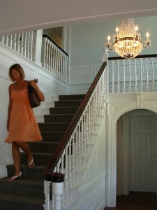
Recently restored to its former elegance, here's the foyer
Recently restored to its former elegance, here's the foyer

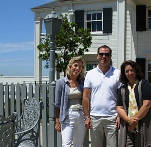
Cristi, Eric and Debra, in front of the Marion Davies Guesthouse

Cristi, Eric and Debra, in front of the Marion Davies Guesthouse

According to Cristi, for years Marion’s pool and guesthouse were closed off from public view, hidden and neglected behind a fence. Even though the property was smack in the middle of a city beach, it wasn’t maintained. Cristi recalls that friends (other California tile enthusiasts like her) snuck onto the property about 10 years ago just to photograph vintage pool tile-work that they feared would be destroyed.

In 2005, philanthropist Wallis Annenberg donated a boatload of money – $27 million – to save the property. I feel a special affinity for the Annenbergs, having once met her father, publishing tycoon Walter Annenberg, when I worked for Triangle Communications. Annenberg owned three magazine titles: TV Guide, the Daily Racing Form, and Seventeen Magazine, where I worked from 1980-1982. Once several of us flew on Annenberg’s private jet from NYC to LA to work at a Seventeen Magazine Tennis Tournament at Mission Viejo. Can you imagine me, a 22-year-old junior editor, getting to do that!? I still have the Triangle Corp. deck of playing cards as a memento from that trip.

Designed by Frederick Fisher and Partners, Architects, a new community pool house has 16 sleek “columns” across its facade, a symbolic echo of the 16 ornate columns that used to stand in that exact spot when the mansion faced a pool filled with frolicking Hollywood stars. Isn’t that totally amazing?

Fanciful original tile exists at the bottom of the famous swimming pool

Fanciful original tile exists at the bottom of the famous swimming pool

The refreshing and colorful new property also include a children’s play and splash area; beach volleyball and beach tennis courts; a beach cafe and new pool house. The historic Marion Davies Guesthouse has been restored and landscaped. It is available for rental events, but you can also take a guided tour like we did. I’m still not sure how this gracious residence avoided the wrecking ball; “she” must have many, many secrets in her walls!

The tile-lover in Cristi was super excited to see the beautiful and intact tile designs in three original bathrooms (one docent told us the tile had been painted over in white, requiring careful restoration to strip it away). Other noteworthy details include several original lights and chandeliers, as well as intricate crown molding and fretwork detailing. See those details below.

And for just $10, you can go swim in the pool where Hollywood’s beautiful people once bathed, or sun yourself on a chaise next to its black-and-white marble border. Only in L.A.

Here are some more images to enjoy:
Landscape Architecture magazine reviews Stylish Sheds

Friday, August 7th, 2009

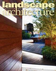
landscapearchitecture002Wow – a nice, little review popped up in the July issue of Landscape Architecture magazine’s “noteworthy” column.

Stylish Sheds and Elegant Hideaways: Big Ideas for Small Backyard Destinations, By Debra Prinzing

Don’t expect the sheds displayed in beautiful, full-color photos in this book to house a lawn mower and a jumble of rusty tools. Geared toward an upscale lay audience, this book is intended to inspire affluent home owners to rethink what a “shed” can be: Tea rooms, writing nooks, playhouses, and fanciful creations that defy simple descriptions fill the pages.

It’s nice to be noticed. But of course, we know that stylish sheds do not have to be “upscale” or “affluent.”

As long as they are designed with heart and soul, they will bring comfort, cheer and satisfaction to their occupants.

Even still, maybe the review will inspire more landscape architects to incorporate diminutive sheds and shelters into their clients’ gardens!