Debra Prinzing

Get the Email Newsletter!

Author Archive

Keeyla Meadows colors her garden world

Sunday, December 20th, 2009

Note: A version of this Q&A appeared earlier this week in “LA At Home,” the Los Angeles Times’ daily home and garden blog.

Mary Ann caught one glimpse of the awesome coat and matching socks . . . and said - Hey, that's Keeyla Meadows!

Mary Ann caught one glimpse of the awesome coat and matching socks . . . and said - Hey, that's Keeyla Meadows!

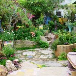
Los Angeles native Keeyla Meadows lives in Berkeley where she makes art and designs gardens. Her cheerful, 50-by-100 foot city lot is a living canvas packed with life-sized female figures and not-so-perfect vessels, hand-built in clay and glazed in a palette of turquoise, apricot and lavender.
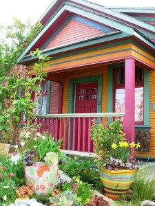
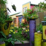
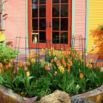
An exuberant color palette that few would dare to use - here's Keeyla's Berkeley bungalow and street-side "sunset" garden

An exuberant color palette that few would dare to use - here's Keeyla's Berkeley bungalow and street-side "sunset" garden

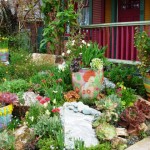
No surface here is left unadorned. Whether it’s her swirly ceramic paving, custom metal benches or sculpted walls, Keeyla artistically places favorite objects and plants with a carefree confidence that few of us can master.

Fans of Keeyla have long admired her award-winning gardens, including a ‘Best in Show’ at the San Francisco Flower & Garden Show a few years back. Her beautiful first book, Making Gardens a Work of Art, was published in 2004 by Sasquatch Books, a Seattle imprint that also published my first book, The Northwest Gardener’s Resource Directory.
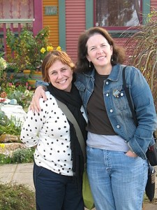
Lorene and me ~ gal pals in Keeyla's garden

Lorene and me ~ gal pals in Keeyla's garden

In 2008, I lucked into an impromptu visit to Keeyla’s personal wonderland when my girlfriend Mary Ann Newcomer boldly followed her into Café Fanny’s in Berkeley, an Alice Waters bistro, and snagged an invite for our group of breakfasting garden writers.

Lorene Edwards Forkner, Mary Ann and I hopped in the car and followed Keeyla to her bungalow, a few blocks away. It is fair to say we were hyperventilating!

“You can take photos, but don’t publish them until my book is out,” Keeyla requested. It was the least we could do, having feasted our eyes on her botanical paint box, imagining how we might try her playful ideas in our own backyards.

9780881929409_CMYKHer new book, Fearless Color Gardens: The creative gardener’s guide to jumping off the color wheel (Timber Press, $27.95), has just been published. Filled with Keeyla’s photography of design projects, as well as her doodles and sketches, it reads like a colorist’s memoir, complete with a muse named Emerald.

Strong on fantasy, it’s also a useful workbook for garden owners who need a nudge toward the more vibrant end of the color spectrum. I recently asked Keeyla about the book.

Q: How do you teach students to feel confident as garden designers?
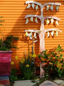
Keeyla's color sensibility is in her DNA as evidenced by the orange side of her house punctuated by a tree-inspird sculpture

Keeyla's color sensibility is in her DNA as evidenced by the orange side of her house punctuated by a tree-inspird sculpture

A: A lot of people have this mantra that says, “I’m not a creative person. I’m not an artist.” Our lives are built around the practicality of what we have to do everyday so many people shut those doors to creativity a long time ago. I suggest you treat garden design like something you do all the time. The physical activity of placing plants in a space can be as easy as folding laundry and putting it away, or setting the table, or baking a cake.

Q. How can I make a landscape project feel less overwhelming?
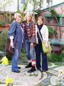
Mary Anne Newcomer, Keeyla Meadows and Lorene Edwards Forkner

Mary Anne Newcomer, Keeyla Meadows and Lorene Edwards Forkner

A. I suggest you divide your space up like a series of photographs or like windows.

Decide what “picture” you’re working with, where it starts and ends. Start with looking out the kitchen window and use plants and art to fill the frame.

Q. Where does your color inspiration come from?

A. A lot of my color sense comes from growing up in Los Angeles and living with its “colorfulness” – the light, tile work and Catalina Island all inspired me. Right now, I’m designing a new garden for the San Francisco Flower & Garden Show in March. It’s a habitat garden and the colors I’m using come from the red-headed garter snake, an endangered snake from the San Mateo coastline. It has a read head with a turquoise and red stripe down the back, so it’s providing my design motif, my imagery and my color combination.

Jump off the conventional Color Wheel and play with Keeyla's Color Triangle

Jump off the conventional Color Wheel and play with Keeyla's Color Triangle

Q. How do you suggest people “jump off” the color wheel?

A. The traditional color wheel makes my head spin. I use a color triangle, which is so stabilizing. I put blue at the top of the pyramid – it represents the sky. The other two points are red and yellow. Between the three primary colors are the secondary colors. On either side of any point is a harmonic chord of color. You’ll never go wrong if you take one of the points – red, yellow or blue – and use one of those chords of color on either side of it.

 Q. How do you balance artwork with the plants in your garden? 
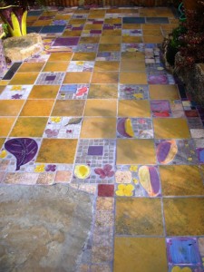
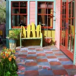
A checkerboard of color in a patio installation

A checkerboard of color in a patio installation

A. Art gives me a constant relationship to plant against, a very stable feature to move through the seasons with.

Art creates so much focus and orients the whole space so one is not always reinventing. It is like a stage setting.

The artwork and hardscape set the stage for your plants to really become the stars.

Here’s a quote from Keeyla’s book that seems apropos:

“In my gardens, color refers to everything – absolutely everything. I don’t just make a bland holder, a neutral vase, for colorful plants. Color includes the rocks, the pavings, and the artwork. It also connects up with the color of the house and the sky above. So it’s really like bringing the camera to your eye. When you take a photo, you are looking at everything in the frame. In creating color gardens we will look at everything that is part of the garden picture. . . “

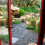
More photos to share from our visit to Keeyla’s magical garden:

Better Homes & Gardens and me

Thursday, December 17th, 2009
Don't you love this giant red trowel, called "Plantois"?

Don't you love this giant red trowel, called "Plantois"?

On Nov. 30th, I took one of the only direct flights from LAX to Des Moines, Iowa (on Allegiant Air), arriving in the Midwest around 8 p.m.

Susan picked me up at the airport and whisked me off to her cozy home where we sipped wine and reminisced about being in Tuscany together only four weeks earlier.

We indulged in sentimental memories, of course. The week in Italy – in a village called Montisi – was life-affirming, especially because it was to celebrate my big Five-Oh.

Susan on a sunny Tuscan afternoon at La Foce

Susan on a sunny Tuscan afternoon at La Foce


The 10 women who joined me, including Susan, are some of my dearest friends. I would do anything to recapture that week we had together. We’d all love to return as quickly as possible!

The Italy week was an amazing “new beginning” for Susan as she dreamed about her next venture, a culinary destination she plans to open in rural Iowa. Stay tuned for news on “Applehurst Farm,” the project Susan is developing as I write this.

Doug Jimerson and Eric Liskey, BH&G's garden guys

Doug Jimerson and Eric Liskey, BH&G's garden guys

On Tuesday morning, Susan dropped me off at the world headquarters for Meredith Corporation, publisher of Better Homes & Gardens and a million other home, garden, food and lifestyle titles.

I was to spend the day as guest of Doug Jimerson, group editor of all Meredith’s “outdoor” content (books, mags, online) and Eric Liskey, deputy garden editor of Better Homes & Gardens magazine.

It was hard to be businesslike when I kept running into the friends I’ve made and worked with over the years:

They included James Baggett, editor of Country Gardens; Nick Crow, art director of Country Gardens; Jane Austin McKeon, editor of Nature’s Garden magazine and her art director Jarrett Einck; Denny Schrock, a talented editor and past fellow Garden Writers Association board member; Justin Hancock, BHGBH&G web garden editor;  and David Speer, editorial manager. Hugs and high-fives ensued. These are people I would rather be friends with than spend my time hustling for assignments.
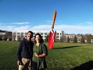
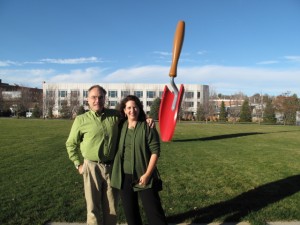
Doug and Eric and I brainstormed about possible ways I can get more involved in BH&G’s editorial pages. Then we met up with Gayle Goodson Butler, editor-in-chief of the mothership!

Wow – what a great experience. Gayle, Doug, Eric and I had a delicious lunch during which we tossed around story ideas and discussed outdoor living trends. It looks like I will join the BH&G family as a contributing editor for gardening and outdoor content in 2010. I couldn’t be more excited!!!

I'm posing with BH&G garden editor Eric Liskey

I'm posing with BH&G garden editor Eric Liskey


I also posed with Doug Jimerson, Meredith's Group Editor for Garden & Outdoor Living

I also posed with Doug Jimerson, Meredith's Group Editor for Garden & Outdoor Living


After lunch, we took a tour of the Meredith “campus,” which includes an incredible, larger-than-life sculpture of a trowel called “PLANTOIS.” The pop-art style of this sculpture reminded me of the 19-foot eraser at the Olympic Sculpture Park in Seattle, called “Typewriter Eraser, Scale X.”  Turns out, BH&G’s trowel was also designed by Claes Oldenborg .

A site plan of BH&G's gorgeous test garden

A site plan of BH&G's gorgeous test garden

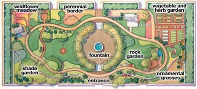
Doug and Eric also showed me Better Homes & Gardens’  Test Garden, a beautiful walled oasis in the heart of the corporate campus. Here’s a plan of the garden (right) and a company description of how it is used:

It is an outdoor studio for our photographers, a venue for corporate entertaining, and a meeting and lunch spot for employees. While inner-city, the garden is landscaped in the style of someone’s backyard. Or, actually, several someones’ backyard. Because anywhere you take a look in our garden, if you turn ever so slightly, you will have a whole new vista. Because anywhere you take a look in our garden, if you turn ever so slightly, you will have a whole new vista. And so will our cameras, as we set about photographing how-to sequences and plant portraits, and documenting the performance of new plants. In all, there are 22 distinct areas in the Test Garden.

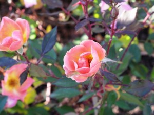
Yes, a rose was still in bloom on Dec. 1st

Yes, a rose was still in bloom on Dec. 1st

Mind you, this was on Dec. 1st in Des Moines, USDA Zone 5 or something like that. But several roses were still in bloom and the garden looked almost ready for its dormant winter phase, with lots of fresh mulch spread around, grasses and perennials cut back and everything tidy.

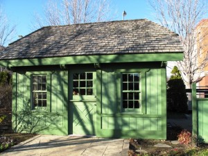
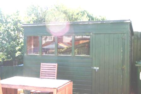
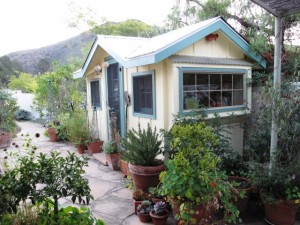
I was particularly drawn to the green shed, of course. I found out from David Speer that the plans for this potting shed are a free benefit of joining BH&G’s new Garden Club.

I do love this green potting shed with gabled roofline

I do love this green potting shed with gabled roofline


For $9.95, you get the shed plans and other cool resources. Check out how to sign up here.  

If you find yourself in Des Moines, you can schedule a tour with garden manager Sandra Gerdes on Fridays from noon to 2 p.m., May through October. The garden is located at 1716 Locust Street, Des Moines, IA 50312. The phone number is 515-284-3994.

Here are more pics of the beautiful Test Garden:

By the way, the original test garden is on Doug Jimerson’s farm outside Des Moines. I got to visit that evening and join him and Karen Weir Jimerson, his writer-wife, for a delicious dinner.

Okay, doesn’t it make you feel better to know that the guy who heads up all of Meredith’s garden/outdoor living content is basically a gentleman farmer? In addition to their lovely farm and century-old farmhouse, Doug and Karen tend to six dogs, at least six cats (I lost count), a flock of sheep, a huge family of chickens and roosters, donkeys and horses. Before dinner, Doug gave me a tour of the Jimerson Farm in the waning daylight. I thought about how much I could love living on a farm in Iowa. Never mind. I’m just going to visit Susan and Jerry when Applehurst Farm gets up and running.

As for BH&G, my first contributions won’t appear until May 2010, but you can be assured that lots of creative storytelling will occur between now and then.

I’m excited – and grateful – for this cool opportunity!

Let’s see what 2010 brings!!!

A Post Script. I flew home from Des Moines on Dec. 2nd. While I was there, the weather was beautiful, with brilliant blue skies, sunshine and balmy (for Iowa) low 50-degree temperatures. One week later. . . yes, only one week later, my friends were buried in 16 inches of snowfall that practically shut down Des Moines. I heard that something like only 17 out of 60 flights were allowed to depart from the Des Moines Airport.

Whew. I totally lucked out. Thank you to the weather gods!

Rolling Greens nursery and garden emporium comes to Hollywood

Wednesday, December 16th, 2009
Gourmet food, exotic tea blends and a library of design books fill the new Rolling Greens in Hollywood

Gourmet food, exotic tea blends and a library of design books fill the new Rolling Greens in Hollywood

rolling greensLast Thursday, a vintage tire shop in the heart of Hollywood was the setting for a festive pre-opening bash thrown by Rolling Greens, its new tenant.

Designers, landscapers and horticulture fans gathered to sip, graze, explore (and shop!) at the hottest new garden emporium in Los Angeles. My editors at Garden Design magazine asked me to attend and check out the happenin’s.

Rolling Greens’ second location is the brainchild of owner Greg Salmeri and his colleague and creative director Angela Hicks. The original store in L.A.’s Culver City is a distinctive nursery, home and garden destination, formerly only for the trade, that opened to the public in 2004.

Tire dealer-turned-garden emporium, in a historic, weathered building that's full of character

Tire dealer-turned-garden emporium, in a historic, weathered building that's full of character

For his new outlet, Salmeri snagged the lease on Town Tire Company, a weathered brick building that has been a Hollywood landmark at the corner of Beverly Blvd. and Gardner Ave. Built in 1930, the iconic structure was originally a food market and then in 1963 became a tire store.

“I’ve had my eye on the Town Tire Co. building for years and dreamed of opening Rolling Greens in this incredible space,” Salmeri says. “In this new location, we’ve expanded our offerings into home categories beyond what we offer at our Culver City location.”

Greg Salmeri

Greg Salmeri

Salmeri and Hicks turned the tire shop’s unpolished attributes into appealing design elements for Rolling Greens. There are big metal garage doors that roll up to connect the indoor spaces with the fresh-air ones. The original concrete floor has been cleaned up and the exposed brick walls sandblasted. Once covered over, several huge glass doorways topped with half-circle transom windows have been exposed to invite sunshine into the 1,000-square-foot bed and bath department. The cash-wrap counters are clad in 19th century pressed-tin ceiling tiles. The “color greenhouse” is a glass-and-steel dividing wall that encloses an area for indoor plants, including orchids and ferns. Panes of amethyst and bottle green glass replaced broken sections, creating a vintage greenhouse backdrop at the center of the store.

READ MORE…

A visit to Sharon Lovejoy’s garden shed

Wednesday, November 25th, 2009
Sharon Lovejoy and me

Sharon Lovejoy and me

In the middle of last week, when I really didn’t have the time to do it, I drove northbound, to central California, where I spent 24 hours with talented writer-illustrator-naturalist Sharon Lovejoy and her smart and kind husband Jeff Prostovich. I met Sharon a little over two years ago when Nan Sterman and I drove to the San Francisco Flower & Garden Show with our friend Joan Bolton of Santa Barbara Garden Design. It was our Garden Writer Caravan and Road Trip. First, Nan took the train/bus from San Diego to my neck of the woods (Ventura Co.); then, the next morning, we drove to Santa Barbara to pick up Joan. Another 90 minutes north of Joan, up Hwy. 101, and we arrived to visit Sharon and Jeff. They fed us, feted us, and hopped in their car to follow the caravan.

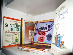
A collection of Sharon's charming and inspiring books

A collection of Sharon's charming and inspiring books

Sharon is a total rock star in the Garden Writing Galaxy and I was so excited to have a chance to spend time with her and Jeff.

She has had a huge following ever since she started writing “Heart’s Ease,” a monthly naturalist’s column for the former Country Living Gardener magazine. Sharon’s blog is fun and highly personal – it’s read by friends and fans around the globe.

Her illustrated books about gardening, gardening with children, gardening for wildlife, gardening with food — oh, there are so many and they are like little love letters — have sold hundreds of thousands of copies over the years. In our world, that is unparalleled, I tell you.

61rTYy4K-jL__SL500_AA240_If, like me, you love the way Sharon involves children and their grownups with the natural world, be on the lookout for her next book – out in January 2010! It’s called Toad Cottages & Shooting Stars (and it features her sweet artist-granddaughter, Sara, on the cover).
Sharon and Jeff and I had a magical 24 hours in which we basically talked, ate, drank, cooked, went to see the Lone Pine Arboretum and the plant nursery at Cal Poly San Luis Obispo, admired nature, and compared notes about our industry (?) and the “new media” platforms we’re all learning to navigate.

We had to force ourselves to go to bed last Tuesday night . . . the fire was burning in the fireplace and we had so much to say to one another. But we drifted off to sleep and rose on Wednesday morning in time for me to join Sharon at her writers’ group, during which yet another sparkling facet of this talented writer was revealed to me (hint: she is writing a wonderful young adult novel and I can’t wait for it to be completed AND published!).

A sweet retreat in the heart of Sharon's garden

A sweet retreat in the heart of Sharon's garden

It was nice to do something very spontaneous (and very nice that my own husband Bruce held down the fort at home so I could take the trip). I’ve been anxious to see Sharon’s new garden shed.

I had a sneaking suspicion I would be able to persuade Sharon to let me interview her on camera, so I asked – and lucky for you – she said yes. (And there was Jeff, the smart marketer, egging us on and actually directing us at one point.)

We made this totally rough-and-rugged video with my little Flip camera and gave the footage to Shirley Bovshow of Garden World Report. Shirley cleaned it up and used a portion of my tour with Sharon on today’s show. You can watch it here, along with contributions from Ken Druse and Ellen Zachos, two of my favorite garden writer-designers on the east coast.

Sharon promised me a personal tour, and here it is:

httpv://www.youtube.com/watch?v=cv4OT8NukZ8

This entire experience reminded me of why I love what I do and the people with whom I share this journey.

Since this is Thanksgiving week, I’m thinking about gratitude:

1. I’m thankful that Nan introduced me to Sharon. Nan’s heart is big enough to share her blessings with her friends. I love that about Nan. It’s not the first time she’s opened a door for me, and I hope I can reciprocate.

2. I’m thankful that Sharon and Jeff have adopted me as a friend, and for their generous gift of time, ideas, support, encouragement, shelter (hey, I didn’t mention getting to sleep in the cozy loft at the top of a spiral staircase in Sharon’s art studio!!!) and food (oh, time around the table in their farmhouse kitchen was delicious – in more ways than one).

3. I’m thankful that there are so many kindred spirits in the gardening world, especially for innovators like Shirley Bovshow who just make things happen in new ways, pioneering the path that we all wish to follow (but when we don’t have a road map….she’s bound to!)

4. I’m thankful for my long-suffering spouse and partner, Bruce. He always encourages me to take these trips and excursions, even though it usually means more work for him. I can’t wait for the time when he’ll be freer to join me (and vice-versa).

That’s it for now.

A tree obsession, or should I say a two-tree obsession?

Friday, November 20th, 2009
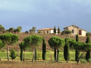
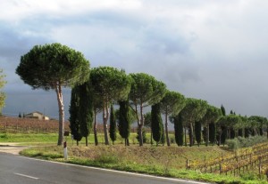
Italian cypresses are so companionable with Italian stone pines

Italian cypresses are so companionable with Italian stone pines

I did a lot of driving in Tuscany. More than I would have liked, just ask my girlfriends. Lots of to-ing and fro-ing between our remote villa and the train station in Chiusi about 45 minutes away. But there was one scene on the road between Trequanda and Sinalunga that caught my breath every time I drove past it and made the driving worth while.

Someone planted two lovely rows of trees on either side of a long driveway that ran perpendicular into the strada. And as I approached it, the classic, Renaissance-inspired pattern emerged, filling my line of vision with its elegance and storybook perfection.

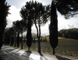
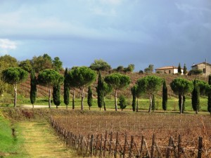
When backlit, the tree shapes are even more distinctive

When backlit, the tree shapes are even more distinctive

Silhouetted against the Tuscan sky, or back-lit by the sun, stood the contrasting shapes of tall, slender Italian cypress trees (Cupressus sempervirens) and upward-sweeping, umbrella-like forms of Italian stone pines (Pinus pinea).  The iconic forms alternate up one side of the drive and back down the other, ensuring a perfect display of two quintessentially Italian trees.

Thanks to the genius plantsman or woman who decided that these two trees – one, a spire; the other, a classic ovoid — should be grown together.

If ever I have enough land and live in the right climate, I’m going to replicate this gorgeous, satisfying, perfectly ordered pattern of trees. For now, I will share more photos. I stopped one morning and snapped oh-so-many views.

Another view of my favorite tree scene

Another view of my favorite tree scene

Beautiful and orderly, an intentional planting scheme

Beautiful and orderly, an intentional planting scheme

Each time that I approached the pine-and-cypress-edged drive, a smile covered my face

Each time that I approached the pine-and-cypress-edged drive, a smile covered my face


P.S., this is the pine tree from which those delicious pine nuts come from.

Shed-of-the-Year . . . you can enter!

Tuesday, November 17th, 2009
Uncle Wilco, as he is depicted on his web site, We *Heart* Sheds (well, this was a holiday version from 2007)

Uncle Wilco, as he is depicted on his web site, We *Heart* Sheds (well, this was a holiday version from 2007)

Here’s some background about SHED OF THE YEAR and its creator Uncle Wilco, a cyber friend who lives in the UK in South Wales, and is the creator of We (Heart) Sheds and several other projects.  I was thrilled to discover that I was not alone on this quest for finding and documenting awesome backyard structures, that many kindred spirits existed on this globe to share my journey. Here is the original story I wrote about Uncle Wilco nearly two years ago. A memorable quote about his Shed of the Year contest:

. . . the British have a love affair with the shed, so really it’s just snowballed. I was lucky to do a few radio interviews. I got the impression they thought I was a nutter . . . ! But at least people realise that I have a passion for sheds, so that’s all that matters.

Imagine my surprise when Wilco asked me to join his illustrious team of judges to represent as the International Judge for the 2010 Shed of the Year competition! The event culminates with an announcement in early July, during National Shed Week, and I’m eager to participate. I’m hoping to get over to the UK to join the others, but at the very least, I will do my part on this end. I encourage any of my readers to submit photos and enter. That is all it takes!

Thought I’d kick things off by telling you a little more about the competition. In the words of Mr. Wilco himself:

Q. You started Shed of the Year in 2007, right? So you’ve had 3 winners!
What has surprised you most about the scope and diversity of sheds
around the globe?

Tony's Roman Temple took honors in the 2007 Shed of the Year contest

Tony's Roman Temple took honors in the 2007 Shed of the Year contest

A. I have run readersheds since 2001  and thought it was time I should celebrate all these great sheds. So I started Shed of the Year. The last three winners have been very different: 1) A Roman Temple,  2) A Pub Shed, and 3) a Cabin. I look forward to shed of the year 2010 — it could be a workshop or studio or even a hut. That’s the thing — we don’t know until the public have voted and the judges have made their decisions for Shed Week 2010.

Q. Who does Sheds better, the UK shed aficionados or the North American ones?

A. Well, I am biased. UK sheds Rock- or should I say UK Sheddies rock. But you US sheddies have a different view on sheds. The UK history with sheds as mainly a man thing is very long and it’s the sheddies that make readersheds.co.uk

Q. Can you please describe “wossname” and how I can explain it to US readers?

A. I am not great with words , so I tend to fill in things I can’t think about with “wossname.” So it’s a term in the UK, like a thing or a “wotsit,” when you can’t think of the real word!

Here's where Uncle Wilco hangs out and enjoys his home brew

Here's where Uncle Wilco hangs out and enjoys his home brew

Q. If you had to spend your final days inside your own shed, what three essential items would you need to bring with you?

A. That’s very difficult. I would say family and friends and  my dog, but as for items it would have to be some home brew (beer).

Q. What kind of swag can I expect for being a Shed of the Year judge?

A. What, the glory of being a judge in the World’s most favourite Shed competition is not enough?

Q. How many entries have you had from North American shed owners (in past years)?

A. Well, it’s not just North American sheds. It’s International, too. We love sheddies from the Americas, Canada, Europe and Australia and New Zealand. You can view all the international sheds entries (199 of them to join the 1200 UK ones) here.

Q. What else do you want my readers to know?

A. That we are welcoming entries to Shed of the Year 2010 now and would love to have some more  Stylish Sheds added. All I ask is that the sheddies add a few good images — including external/internal shots. The more images the better, so the public can get a  good look.

Thanks so much Uncle Wilco – I will do my best to pump up the entries from the International contingent. See you soon.

Creating and capturing movement in the landscape

Monday, November 16th, 2009

AGnucov1AA version of this piece originally appeared in my 2005 book, The Abundant Garden (Cool Springs Press), photographed by Barbara J. Denk, a gifted Bainbridge Island-based photographer. 
I recently updated the text as an article that appears in the current Southern California Horticultural Society newsletter.

RHYTHM AND MOTION

In landscape design, you can create a visual flow through the garden with the dynamic element of rhythm.

As a beat is to music, as choreographed steps are to a dance, rhythm animates a garden. Even if the wind doesn’t blow, your garden can look and feel infused with energy.

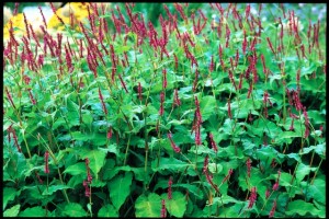
Raspberry-red spikes of aptly named Persicaria amplexicaulis 'Firetail' erupt in this singular performance of color and form. (Barbara J. Denk photograph)

Raspberry-red spikes of aptly named Persicaria amplexicaulis 'Firetail' erupt in this singular performance of color and form. (Barbara J. Denk photograph)

MOTION:  We experience a physical sensation when something rustles or sways in the garden. We pause to appreciate movements, subtle or dramatic – flowing water, rippling leaves, a billowing banner, or clanging chimes – because they signal life’s evanescent qualities. Such movements resonate as the garden responds to the earth’s vital elements.

By the very act of creating a garden, we embrace the external forces of nature, most of which are out of our control. In addition to rays of sunlight and rain showers, the kinetic presence of wind and breeze in our landscapes is important to channel – as movement – in a planting scheme.

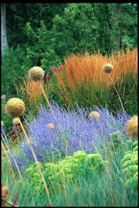
The ball-shaped seed heads of Allium 'Globemaster' are showcased against a rhythmic display of Calamagrostis x acutiflora 'Karl Foerster', velvety Russian sage (Perovskia atriplicifolia) and Sedum 'Autumn Joy' (Barbara J. Denk photograph)

The ball-shaped seed heads of Allium 'Globemaster' are showcased against a rhythmic display of Calamagrostis x acutiflora 'Karl Foerster', velvety Russian sage (Perovskia atriplicifolia) and Sedum 'Autumn Joy' (Barbara J. Denk photograph)

It’s rewarding to see how climatic changes affect the garden, something we can’t help but notice, whether there are extreme gusts or light flurries flowing through branches and stems. When we intentionally design the garden to capture these movements, we infuse an otherwise commonplace landscape with vitality.

The choices of plants that can catch the airflow, gently dance, or furiously shake are endless. Perennials with tall, slender stems ripple like the fringe on a canopy (think of a vibrant stand of daylilies or a swath of lavender).

Fluffy inflorescences of maiden grass undulate above its finely-textured blades – and the overall effect is a seductive rhythm. The leaves of a California pepper tree shimmer like sequins on an evening gown. Agapanthus seedpods rattle and whisper as autumn arrives. The natural symphony energizes any landscape.

RHYTHM:  Beyond individual plants, the visual suggestion of animation or motion can also be incorporated into the overall template of a garden. The repetition of organic forms, the course of a sinuous path, or the sensual outlines of beds and borders suggest movement. Alternating shapes – the gradual widening or narrowing of a space, the regular spacing of trees – do as well.

Calm white and intense blue join for a duet of gentle movement. A border of creamy white Lysimachia clethroides relates well with a stand of blue-flowering Caryopteris x clandonensis.

Calm white and intense blue join for a duet of gentle movement. A border of creamy white Lysimachia clethroides relates well with a stand of blue-flowering Caryopteris x clandonensis (Barbara J. Denk photograph)

When the tiny stones in a Zen garden are raked into concentric circles, movement appears. When a “stream” of large, smooth, river rocks fills a gully or trench, the sense of running water is implied. The sequence of stepping stones spaced through a cushioned ground cover of fragrant thyme invigorates the scene and helps direct the viewer’s eye through the garden. The scene is emotionally alive and visually pleasing.

Movement in a garden is essential. It’s the organic rhythm, the fluid characteristic that every garden needs in order to come to life for those who enjoy it.

Here are some tips for “animating” your garden:

  • Develop a repertoire of plants:
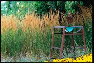
A glass bowl - a modern birdbath - is showcased against a coppery stand of Karl Foerster grass - an exquisite choice for "motion" in the garden (Barbara J. Denk photograph)

A glass bowl - a modern birdbath - is showcased against a coppery stand of Karl Foerster grass - an exquisite choice for "motion" in the garden (Barbara J. Denk photograph)

Base your plant selection on the scale of your house and the natural setting around it. Once you’ve selected the primary plants – those that provide structure and have multiseason interest, such as ornamental grasses – you can choose a second wave of plants to “star” in specific seasons.

  • Create a basic framework for design:

Choose a template and follow it consistently throughout the garden. One method is to mirror dominant lines of your house, such as repeating key architectural shapes in the landscape. Use these as a guide for shaping pathways and planting beds. For example, a home’s arched windows and doorways might be echoed in the contour of a border or patio. Alternately, you can borrow a framework for design from nature, such as the irregular rhythm of distant hills. 

  • Consider the vertical dimension:
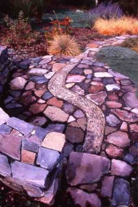
Hardscape, such as this fabulous pebble "river" running through a flagstone patio, can animate and energize the landscape. This was designed and installed by my Yakima friends Linda Knutson and Ron Sell (Debra Prinzing photograph)

Hardscape, such as this fabulous pebble "river" running through a flagstone patio, can animate and energize the landscape. This was designed and installed by my Yakima friends Linda Knutson and Ron Sell (Debra Prinzing photograph)

Backlighting is magical, even in my own backyard. I love the morning sun as it illuminates and highlights the various blades, stems and leaves (Debra Prinzing photo).

Backlighting is magical, even in my own backyard. I love the morning sun as it illuminates and highlights the various blades, stems and leaves (Debra Prinzing photo).

Select plants that bring height, energy, and motion into the garden, and vary their placement for impact.

Even if surrounded by buildings on every side, your garden will respond to daily and seasonal climate changes. Watch how breezes move through the garden, and capture that energy by placing fluid plants where currents flow. Notice where the sun rises and sets in relation to your landscape, and choose trees, shrubs, grasses, and other perennials that will reflect the morning light or absorb sunset’s glow. Red and purple foliage turns flame-like when backlit. As the sun’s rays shine through fringed tassels of fountain grass or pampas grass, the garden will shimmer in response.

Gray concrete goes “green”

Saturday, November 14th, 2009

Here’s a story that ran in the Los Angeles Times last month. It’s about a few of Stephanie Bartron’s projects to remake her clients’ ugly concrete patios into more attractive – and sustainable – backyard features. The best part of the story is learning how easy it is to turn this technique into a DIY project of your own. The LA Times also features an awesome in this photo gallery. Read on . . .

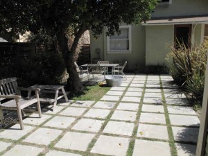
The basketball-court like patio has been repurposed by scoring and slicing 4-inch bands to create a grid pattern

The basketball-court like patio has been repurposed by scoring and slicing 4-inch bands to create a grid pattern

If landscape designer Stephanie Bartron has her way, California’s sea of patio concrete is going to start shrinking.

When the Los Angeles landscape designer eyed her clients’ slab behind a 1940s Atwater Village bungalow, she knew the concrete had to go. New hardscape and plants would have done the trick, sure, but digging out all that paving was costly and, the the waste would just end up in the landfill.

So, Bartron took a different approach. She hired a professional industrial saw operator to slice up the 20-by-20 foot patio into a grid of 18-inch squares.

The result is a new focal point for the garden, resembling evenly-spaced pavers divided by 4-inch bands of grass. When it rains, the storm water percolates into the ground rather than streaming down the driveway and into the street. Little material was thrown away. But the biggest effect was aesthetic. The repurposed patio no longer resembles a basketball court, nor does it dominate the tiny lot.

A power saw with a diamond blade slices up a sea of concrete

A power saw with a diamond blade slices up a sea of concrete

“By cutting it up, I changed the scale of the concrete from a big slab into an attractive backyard feature,” the designer says.

While his two children play nearby, owner Caleb Dewart, a television producer, likes to lounge beneath the mature orange tree that Bartron saved.

“We’re really happy we didn’t have to tear this up and start over,” he says of the patio. “And we like using what we have rather than being wasteful.”

Bartron’s approach solves myriad design challenges, and the designer has artfully sliced up several ugly patios and driveways for clients. Environmentally conscious homeowners like reducing the waste associated with redesigning a landscape. Budget-conscious clients like getting a lot of bang for their buck.

The once-ugly carport slab is reinterpreted as a lovely courtyard and seating area designed by Stephanie Bartron

The once-ugly carport slab is reinterpreted as a lovely courtyard and seating area designed by Stephanie Bartron

According to Kenny Grimm, sales manager for Oxnard-based Independent Concrete Cutting Inc., this kind of project requires an experienced operator to cut concrete with a diamond blade, 37-horsepower saw. Cost: $140 per hour, plus travel charges.

“We’re seeing more people re-use their existing material because recycling your paving is an affordable alternative to hauling it away,” he says. “You can get a lot of cutting done for around $1,000.”

For yoga instructor Lucy Bivins and cinematographer Eric Schmidt, Bartron recycled front-yard concrete into useful elements, including garden benches and a prominent water feature.

The couple inherited a gray slab when they purchased a Mt. Washington house designed by architect Barbara Bestor. The concrete had been installed by a previous owner as part of a carport, Bivins says. “It was very bleak and unattractive,” she says. “A real eyesore.”

At Bestor’s suggestion, she and Schmidt contacted Bartron for design help.

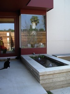
Narrow bands of concrete now form the edges of a modern koi pond and fountain

Narrow bands of concrete now form the edges of a modern koi pond and fountain

“We asked for shade trees, an outdoor gas fireplace and some type of fountain,” Schmidt says. “Stephanie turned the unused space into our outdoor living room, which in just a few years has been filled by a canopy of shade trees. It’s a favorite place to sit with our newborn son, Hugo, listen to the fountain and watch the trees move in the wind. It calms him down every night before bedtime.”

Used to working with old, cracked paving, Bartron was fascinated with the newer concrete. Four-inches thick and embedded with rebar, it covered 400 square feet between the street and her clients’ front door.

Coming up with a savvy design that created little waste was “like solving a big jigsaw puzzle,” the designer says. “This material was in great shape, but we wanted to turn one giant slab into many smaller elements for a bold and inviting garden space.”

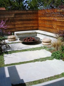
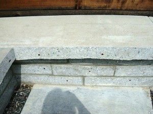
Bartron chose a rectilinear motif to echo the architecture’s lines, slicing the patio into 1-1/2-by-4-foot sections. She layered the cut-out concrete in the form of an L-shaped seating area, the bench backed by a new, horizontal-plank fence. Narrower slices of concrete stacked four levels high form the edges of a contemporary fountain and koi pond. Cross sections reveal aggregate-like detailing when sanded smooth.

You can see the interesting texture in the cross-sections of cut concrete

You can see the interesting texture in the cross-sections of cut concrete

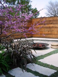
Bartron left some of the concrete in place but carved away planting strips to accommodate low-growing, drought-tolerant dymondia, a silver groundcover. She also removed enough patio to create two large beds for Eastern redbud trees (Cercis canadensis), carex and fescue grasses, and New Zealand flax. Evenly-spaced concrete bands serve as a walkway from the front door and adjacent bubbling fountain to the L-shaped seating, which has a gas-piped steel fire bowl designed by New York artist Elena Colombo .

“It’s a very sexy entertaining space,” Bivins says. “Whenever we have people over, we end up around the fire bowl. There can be 10 of us here and it still feels intimate.”

She praises Bartron for coming up with a money-saving design that also enhances the architecture.

“It was very crafty of her,” she says. “She took our lemon and made lemonade.”

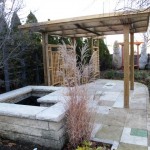
Cutting up the patio

Another view of the lush transformation of this garden

Another view of the lush transformation of this garden

Want to slice up your patio? Landscape designer Stephanie Bartron says it’s not for the faint of heart. It’s possible to make small cuts using a power hand saw with a diamond blade, but you should take safety precautions such as wearing safety goggles and heavy gloves. Large-scale projects, such as the ones shown here, are best left to professional contractors.

Draw a map of your patio and think about where you want to place furniture. Table and chair legs need to be placed on an even surface, not in the spaces between concrete.

Dig along your patio to determine the concrete’s depth and the edge type (uniform or jagged). Newer concrete may be even, but old patios tend to be rough-edged. The type of edge may determine if or how the cut pieces may be repurposed.

While marking your pattern with chalk, note of any cracks, chips or score lines. If possible, tweak your design to eliminate these blemishes.

If the concrete is prone to cracking, Bartron suggests cutting it so the remaining pads are standard paver sizes (18- or 20-inch squares). “That way you can pull out a cracked section and install a replacement paver,” she says.

A gentle plea for an excellent cup of tea

Friday, November 13th, 2009

Author’s note. You know those “contributor pages” that many magazines include at the front of their books? I recently received a request from one of my 805 Living editors to write about “the little things that make life grand” to be included in the November issue’s “Behind the Scenes” section.

I wrote the following tea-drinker’s manifesto (about 500 words) before I re-read Anthony’s email in which he asked for only 50 words! Yikes! Anyway, he used one entire sentence and the rest would have been filed away or deleted had I not decided to go public here, with my personal confession. I don’t think I’m alone, either. While staying our our villa in Italy a few weeks ago, I woke up every morning with a chubby packet — a bag of Peet’s English Breakfast tea — slid under the door of my room (thanks, Paula!). Someone was looking out for me.

iStock_000009079416SmallI am a tea drinker.

In the world of double-tall lattes and cappuccinos, I realize I am a minority.

So I am grateful for a decent, HOT mug of English Breakfast tea (or two). Honestly, I wake up each morning excited to start my day. But mostly I wake up excited to fill the electric kettle with water and hit the “on” button so I can brew a pot of tea, pour myself a mug and add a splash of milk (not half-and-half or cream). I always drink from my French Apilco porcelain mugs from Williams Sonoma.

I’ve taken to carrying around spare tea bags with me, just in case. Places like Starbucks stock Tazo’s “Awake” and the Tully’s at the Burbank Airport has canisters of “British Breakfast.” I love these teas, too.

Unfortunately, though, at least one time out of 10, these coffee joints are “out” of my tea. You would never, ever find these places running out of coffee. That would be unthinkable. At least I can order a Grande cup of piping hot water and make my own on the fly.

The problem with restaurants and hotels (as well as airplanes) is that you often have to beg for real milk. I’ll take it any way you have it – whole, two percent or non-fat (I especially love steamed milk, which doesn’t cool down my tea). Just please give me milk instead of cream or half-and-half. I am one-quarter English, and I always tell the waitress that the English people use milk with their tea.

And don’t get me started about the stupid carafes of hot water you get at conferences. I’m talking about the vessels previously used to dispense the dreaded coffee beverage. As a result, the entire pot of hot water is infused with that bad coffee flavor. It really shouldn’t be difficult to segregate your carafes so a few are dedicated to only hot water for tea drinkers.

I realize this little meditation on the merits of a good cup of tea sounds more like a rant than a rave. So I will end on a positive, thankful note.

I could not function with out my delicious, satisfying mug of morning tea. It really is the fuel that runs my engine. I love that there are places in the world where tea is grown, processed and packaged for export to the U.S. I love that a few retailers still exist where I can purchase excellent, loose tea in bulk. And I love the moment of calm that drinking tea gives me in the midst of my chaotic, deadline-driven life.

To many more sips!

P.S., A great tea resource is the Teacup in Seattle. You can go online and order loose tea (Malty Assam is my favorite), OR if you are ever visiting Seattle, be sure to go in person for their very excellent tea latte. My friend Jean introduced me to this beverage more than a decade ago. It is a big secret how they make it, but Jean’s theory is that the brewers make a “shot” of a very dense, strong Indian tea and then infuse steamed milk, just like the coffee lattes are made. It is heavenly.

Here’s how her garden influences one textile designer

Thursday, November 12th, 2009
Sina Pearson relies on regular visits to her island garden in Washington state to inspire her teextile designs.

Sina Pearson relies on regular visits to her island garden in Washington state to inspire her teextile designs.

I met Sina Pearson in 2006 when her publicist Susan Harkavy arranged a visit to the textile designer’s aerie (aka studio, atelier, loft) in SoHo.

I was in New York City with Bill Wright to photograph an amazing glass-and-steel West Village “shed” for Stylish Sheds and Elegant Hideaways, but I took a side trip for an hour to meet Sina and see her work.

She grew up in Washington State and studied art and textiles at the University of Washington. Our common Pacific Northwest roots gave us an easy, mutual language, designer-to-writer, as we talked about her interests, influences and passions.

Recently, Garden Design magazine invited me to profile Sina as “One to Watch,” with a short Q-and-A that appears in the November-December 2009 issue. Due to space, a portion of my interview did not make it into the print edition. So here it is in full, along with some photos that Sina shared from her garden in Washington’s Fidalgo Island (Skagit Valley).

Garden Design NovDec001ONE TO WATCH:

Textile designer Sina Pearson may live and work in SoHo but trips outside the city inspire her saturated stripes and vibrant abstracts.

She spends one week each month at a remote island cabin in Washington State, surrounded by a semi-wild garden, just steps away from the 1950s A-frame where she played each summer as a child. Sojourns abroad include idea-gathering places like Scandinavia, France, Mexico and the Caribbean. Collectively, these design “threads” are woven into finished cloth: confident, evocative – and high performance – textiles for residences, hotels, restaurants, offices and outdoor settings.

sina-pearsonThe designer, manufacturer and entrepreneur trained in fine arts and textiles at the University of Washington before earning a MFA in textiles from Cranbrook and studying at the Royal Academy of Arts, Crafts and Design in Stockholm. She launched Sina Pearson Textiles in 1990.

Pearson reinterprets outdoor fabric that looks as if it belongs inside, including terrycloth, chenille and boucle cloth made with Sunbrella® yarns for sunfast, stain-, rain- and mildew resistance. Her newest collection, out next spring, is called Colores de Mexico. Her influence? The orange-striped, hand-woven Mexican curtains that Pearson’s mother hung in the family’s beach cabin. “It has an ethnic, modernist vibe with a serape-like texture,” she says.

 Q. Tell me about your Fidalgo Island garden and how it informs your textiles:

 A. I could not be doing what I’m doing if I didn’t have my garden. It frees my soul and lets me experiment with weaving colors and textures together. The way I work in my garden is very much how I work in textiles. I’ve always maintained that you have to listen to what the fabric wants to be – it’s a wonderfully slow process. Similarly, I have to let my garden design itself. I observe how each plant color works together, how each season is revealed in flower, foliage and blade.  

Q. What influences you as a designer?

A. I can’t separate how I’ve grown up from what I am now. My parents were so visual – my mother was a landscape designer and my father was a photographer. We had Jack Lenor Larson’s textiles in our house. I cannot remember a time when I was not playing with fabric. Family legend recalls me cutting textiles into small pieces and arranging them on the sofa when I was two. At 12, I learned weaving from a Swedish woman and batik design from Ruth Pennington, a very fine metal artist. I created a huge, abstract piece of batik silk with fuchsia pink, bright orange and red colors. We hung it up in the sun and it looked like a stained glass window. Ruth turned to my mom and said: “Sina has a career in textiles.”

Q. How is your Scandinavian heritage reflected in your work?

A. I grew up with Danish modern furniture and I double-majored in Swedish language and literature in college. I also lived and studied in Sweden. When I design, I am looking for “emotion” – the feeling conveyed by yarns, colors and textures in my fabrics. After my last trip to Scandinavia, I created a collection evocative of what my ancestors would have woven to wrap themselves in for warmth: soft, heathery “comfort” fabrics that are hand-crafted, quiet, simple and dignified.

cote d azur_03Q. How have you re-imagined outdoor fabric as something more than utilitarian?

A. When I first started in the contract fabric industry in the late 70s and 1980s, everything was rather plain. That all changed when I went to Unika Vaev as president and design director. We introduced the first tapestry for contract interiors. Herman Miller put our tapestries on its new paneling system and broke open the whole concept of patterned fabrics.

The same thing has happened now that I’m designing outdoor fabric with Sunbrella® yarns. I wanted to invigorate outdoor fabrics with modern designs. I’m a big proponent of mixing cool and warm colors together. I also like to use neutrals – sage, taupe, mid-tone brown – with brighter colors to give a reference to nature.

Q. What is the ideal exterior setting for Sina Pearson’s textiles?

IMG_3265A. A space where the interiors blend with nature as occupants move from indoors through a covered area to the outdoors. I love to see complementary fabrics and colors in all three environments. I don’t design my outdoor fabrics separate from my interiors collection. My outdoor fabrics look and feel just like indoor textiles, yet they are made with high-performance fibers for resistance to sun, mold and mildew.

Q. What is on your drafting table right now?

A. I have little piles of yarn sitting on my desk. I’m playing with brighter palettes to create fabrics with clean, crisp colors of summer. I’m also playing with simple shapes, hand-cutting paper into geometric forms – stripes and flowers. I find it very satisfying. I look like a second-grader, sitting on the floor cutting out bits and pieces.

–Debra Prinzing