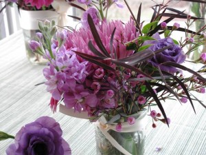
A spring bouquet in a Mason Jar inspires . . .
The other day, while talking with my friend Lorene (one of the most creative people I have known since we were college classmates together), I described some of the cool design ideas I’ve spotted in the past few weeks. My own enthusiasm for all this visual stimulation made me realize my “list” could be a blog post here.
After seeing these ideas in Seattle, Los Angeles and New York, my own idea-bank has been rekindled. Witnessing the talent of others doesn’t ever make me envious. No, it makes me want to up my own game and push myself further to do something wonderfully better as a writer, a gardener, a designer.
The type of inspiration I’ve seen lately has been truly exquisite. Great design is great design, whether in the garden, the home, or the restaurant. When you see it, you know it!
There may be no other response than to gaze in awe and say – WOW. But if your muse can be stirred or awakened by these ideas, by all means, use them as a starting point for your own artistic expression. I hope you enjoy where all this beauty takes you!
A TEENAGER WINS

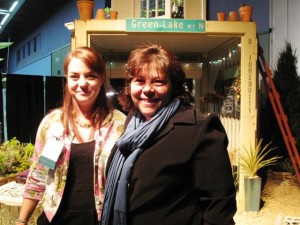
17-year-old garden designer Courtney Goetz won a Gold Medal at the Northwest Flower & Garden Show. Her mom, designer and writer Sue Goetz, is one of her influences.
At last month’s Northwest Flower & Garden Show, one of my most favorite annual events, I was invited by Julie Chai of Sunset Magazine to help “judge” the Sunset Outdoor Living Award.
We were smitten by a small but extremely innovative garden called “Paradise (to be) Regained . . . borrowing Thoreau,” which we honored with the Sunset award.
The critera recognizes a garden that exemplifies “fresh, useful and achievable ideas.” In this instance, the designer was 17-year-old Courtney Goetz.
Courtney, the daughter of garden designer and writer Sue Goetz, grew up in the garden-making business. In 2005, when she was 11, Courtney helped mom Sue design a display garden named “A Child of the Garden Grows . . . .” for this same show. Now, she has made a garden herself – and guess what? In addition to the Sunset Award, the show judges honored Courtney with a Gold Medal.

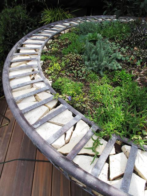
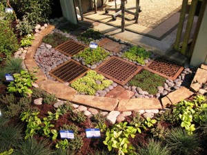
This half-circle garden floor treatment by Courtney Goetz shows how to pair salvaged metal grates with colorful groundcovers to create a "welcome mat" at the entry to a garden shelter.
As her Senior Thesis Project for Gig Harbor High School, Courtney wanted her design to be all about “recycling, re-purposing, and ‘re-characterizing’ used materials for use in the garden,” she says. “My goal and intent for this garden is to have green ideas for everyone to instill in their lives. I want the message to get out that not everyone can buy solar panels or hybrid cars, but anyone can and will make a difference by using a little bit less and utilizing what we already have.”
One of the many wonderful – and really clever — details of Courtney’s display garden was the checkerboard “floor” treatment, combining recycled metal grates with ground covers and rocks.
We loved this idea as a modern twist on a “welcome mat.” Courtney selected varieties of sedum and sempervivums in gold and dark green, as well as smooth rocks and the metal grates. It all adds up to a really gorgeous detail in the garden.
Look for exciting things to come from this young talent. We can’t wait to see more!
ROUGH AND SMOOTH TEXTURES

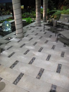
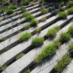
Openings between each paver makes room for a permeable detail of smoth stones.

Design detail
Another wonderful “floor” treatment appeared in a garden called “Wrinkle in Time,” designed by Karen Stefonick of Karen Stefonick Design. Her garden won the Best in Show Award, also called the “Founder’s Cup.”
Since I was able to tour it up close during the judging, I realized how truly creative Karen is when it comes to working with landscaping materials. She devised a patio using two simple ingredients: Concrete Pavers and Tumbled Stone.
Look closely at this pattern created by the slightly offset 1-by-2 foot concrete pavers. By staggering their placement and filling a 2-inch gap at either end of each paver with small rocks, Karen has accomplished two things.
First, she uses the texture of stone to contrast with the smooth concrete, which results in an attractive pattern. Second, this treatment turns a patio into a permeable surface for collecting rainwater into the ground rather than allowing it to stream down to the curb and disappear. Very cool!
BIRTHDAY BOUQUET

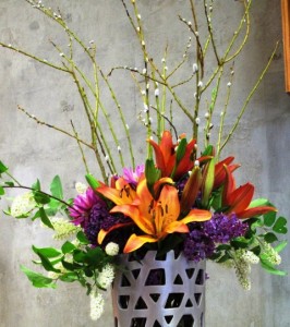
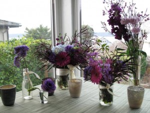
What a gorgeous grouping of flowers and vases!
During all the Flower Show activity, including giving three talks in two days, I almost forgot to celebrate my birthday. But thankfully, my friends and family didn’t forget.

Flower detail
One of the best surprises was the delivery of flowers from a local West Seattle shop called Fleurt Studio.
The gift-giver was my sister-in-law Sandra B. Henriquez. Her touching gesture of sending flowers was made more amazing because instead of resorting to the generic, 1-800 route, Sandi did her homework to find a local flower shop that offers unique, one-of-a-kind gift bouquets. She called (long-distance from Washington, DC) and spoke with Samantha, the owner, and discussed exactly what would be included in the delivery.
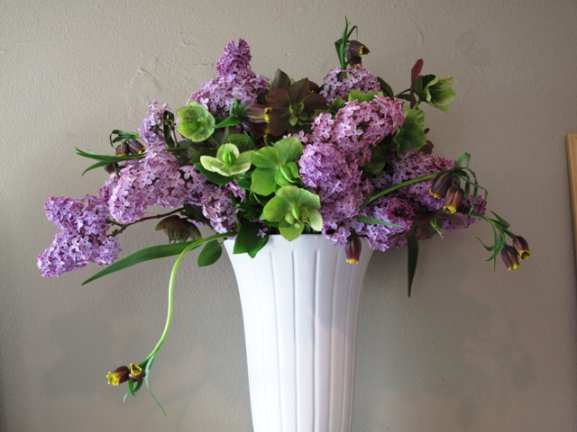
And here’s what arrived: A “floralscape,” an eclectic grouping of five differently-sized vases holding mostly purple and plum ingredients. I loved the whimsical inclusion of two canning jars, a bud vase, a vintage bottle and a miniature glass cup. Together, they created a floral display that no single bunch could equal. Magical, huh?
LOS ANGELES VIBE

Stunning!
After February’s Flower Show madness, March welcomed a trip to Los Angeles, my former home town. Living there for the past four years was an amazing adventure, especially when it comes to learning about design with new eyes. The city, and in fact all of Southern California, was for me a big design graduate school – with lessons in architecture, industrial design, sculpture and history.
While living in LA, I spent a lot of time scouting homes and gardens for the Los Angeles Times HOME section, as well as visiting retail sources for plants, furniture, gardening accents and more.
Rolling Greens Nursery in Hollywood is one of my favorite haunts. It was the site of our Garden Design magazine Hollywood Issue party last April – one of those exciting moments when I said to myself: I can’t believe I’m living here and doing this type of work I love!

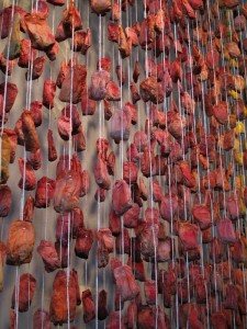
Teabags, thousands of them!
When I returned to LA last week to work on a photo shoot for Better Homes & Gardens, I took our art director Scott Johnson to visit Rolling Greens. I wanted him to see several of the area’s cool nurseries. We stocked up on some plants for the next day’s shoot, and poked around buying ourselves tiny agaves to bring home to our colder climes (Seattle for me; Des Moines, Iowa, for Scott – yes, I know. It’s really futile, but we try).
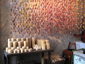
But the wow-factor occurred when I walked into the large space where cookbooks and culinary/gourmet products are typically sold. There along the far wall hung a new installation that I can only describe as a Tea Bag Curtain. One of the staffers told me that the artful treatment had just been hung by Rolling Greens creative director Angela Hicks and her crew.
Hundreds (maybe thousands!) of hand-dyed tea bags, attached to long strings create a beautiful semitransparent cascade, suspended from rods attached at the ceiling. I can only imagine how much time and care was taken to create this rosy-melon masterpiece.
Organic and delicate, this “curtain” is so charming. I am eager to figure out how to replicate it somehow. Simple ingredients paired with masterful execution . . . it adds up to something truly remarkable. This Tea Bag Curtain isn’t “selling product,” but who cares? It goes miles at saying to Rolling Greens customers: we care about design and we’re a place where you can be inspired.
ON TO NEW YORK CITY

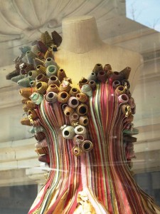
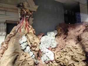
Anthropologie's lavish zipper gown - look close and see how it was made with straight pins!

Here's how the crushed paper skirt emerges from the tight, pastel-colored bodice....
Only days after spending 48 hours in Los Angeles, I flew to New York City. I’ve previously written about visiting the awesome High Line Park, but here’s another visual treat, shown purely for its beauty and innovation.
I turned the corner on my way to the Chelsea Market, a huge warehouse-turned-hipster food mall, and there on the corner was a gorgeous Anthropologie window display.
Some super-creative designer turned a dressmaker’s form, yards of zippers, straight pins and crushed butcher paper into a fanciful ball gown. The way the separated zippers form the bodice so the gold and silver metallic zipper teeth sparkle in the light . . . dazzling. But at the top of each zipper, the “end” has been spiraled into a little rosette.
Just take a look and feast your eyes on the charming way a few simple ingredients become Cinderella’s new gown!
Now, go out and do something uninhibited and artistic today. I dare you! I’m going to try it myself.


