Debra Prinzing

Get the Email Newsletter!

Author Archive

Catching up: a mother’s mantra

Friday, April 18th, 2008

Where has the time disappeared to? What have I done to fill my days since last posting on March 20th?

Ignoring the chance to write here is like ignoring my running schedule because of “work” demands. Oh, the work will always be here, but the creativity (and exercise), now that’s something I shouldn’t neglect. Even though the promotion and travel schedule for Stylish Sheds is looming, I have been telling myself not to let another day go by without posting here.

Yet, I find I’m always “catching up” and apologizing for it. Replying to emails of friends’ and professional colleagues with the opening line: “I’m sorry I’ve been out of touch; I’m playing catch-up on 100 unanswered emails,” or “I’m catching up on housework, or the bills, or the gardening, because I just finished a killer deadline.” It’s sort of the everyday currency of my life. I borrow from time and then I have to pay it back. Choices, choices. I choose to accept assignments that interest, intrigue or challenge my curiosity. Then I choose to neglect everything else that’s non-essential in order to report and write the article. Then I choose to set keyboard and telephone aside so I can “catch up” on grocery shopping, garden-tending and family-time.

Catching up, I think: What have I been up to? Here’s a brief recap, for as far back as my memory serves (about one month, these days):

alex, deb, ben, death valley march 08

Day One, Death Valley

In late March, we spent several days in Death Valley for spring break. Let’s just say Mom had more fun than her two sons, who tired of all the driving, hiking, heat, intense sun, and more. Yet, being with dear friends Sara and Malcolm (a gifted tour guide) made it all the more worthwhile. As I tell my boys, “We need to meet our surroundings, up close and personal. As we learn more about California’s geography, geology and history, we feel more like Californians.” Yikes! That’s why we went to Death Valley.

 Artist’s Palette

God’s creation overpowers the frail human efforts of emulating the colorful rock formations at Artist’s Palette, Death Valley

sunrise

Sunrise over Zabriskie Point. Worth getting out of bed early to experience. Truly breathtaking and awe-inspiring

While en route, however, we couldn’t resist stopping for photo-ops in a little blink-of-a-town called “Pearsonville.” It is known as the hubcap capital of the world. Seriously. Here are the photos to prove it.

pearsonvillehubcap detailhubcap fence

These roadside attractions gave us a glimpse of California’s quirky nature. And hey, now you know how to turn a wayward hubcap or two into a gleaming expression of kitschy garden art! 

Justin HancockIn early April, on April 1st to be exact, I spent no fewer than 14 hours and 205 miles behind the wheel of my ol’ Subaru, ushering Justin Hancock around LA to see local gardens. Justin is the “Garden Doctor” for Better Homes & Gardens’ web site, bhg.com. You can read him here. He is truly one of those “next generation gardeners” that everyone in the green industry is striving to attract. Yet, Justin is miles ahead of most of us, a true plantsman who takes seriously his craft as an editor, educator and communicator. We actually filled our time, our hours on the freeway between stops, gabbing away about plants, gardening and all sorts of ideas about new media. Look for big things coming from this guy.

justin and shirley

BH&G’s Justin Hancock, touring Shirley Bovshow’s lovely garden

justin with marilee

Justin and Marilee Kuhlmann, touring her project in Santa Monica. They are seen here, intently discussing a plant combination

Other than these outings, I’ve been spending lots of time interviewing great gardeners, designers, architects and artists, and thinking of ways to promote the heck out of Stylish Sheds and Elegant Hideaways. The book will FINALLY be published on April 29th. To hear my recent radio interview with Fran Halpern, host of “Beyond Words” on KCLU (Ventura/Santa Barbara county’s NPR station), follow this link.

Breathing Room: Welcome to spring

Thursday, March 20th, 2008

March 20th is a magical day for me – the Spring Equinox and the day of my son Alexander’s birth. Today he turns eleven! Like me, he is a Pices, arriving at the last possible moment of this sign.

alex-in-a-flowerpot

My friend Scott Eklund, now a photographer for the Seattle Post-Intelligencer, took this “flower baby” portrait of Alex in the fall of 1997 when we were shooting a holiday brochure at Emery’s Garden

I take pleasure in the fact that my first child was born on the Summer Soltice and my second child was born on the day when spring arrives (today!). It feels symbolic and life-affirming in so many ways, especially for a mother whose creative expression occurs in and around the garden. My sons, so special and yet very different from one another, are growing up. Oh, for a time-lapsed movie of their young journey to date. In my memory, my mind’s eye, I can actually see them growing: their legs and arms lengthening; their shoulders broadening. In the stories my husband and I retell one another, we roll back the tape and hit the pause button to watch it over and over again. Remember when….?

************************************************

A little piece I wrote for the Los Angeles Times appears today under the banner: Breathing Room.

If you read my “willow” post in January, you’ll know why I so enjoyed composing a short essay about environmental artist Patrick Doughterty’s new Los Angeles County Arboretum & Botanical Garden installation. Called “Catawampus,” the willow sculpture opened on February 24th.

Here is my essay in its entirety. The Times had to cut it for space, which is fine. I like it both ways. Read the published version by clicking here: Branching In.

Catawampus

Willow wisdom

Standing in a distant field, looking like child’s building blocks tossed here by giant hands, the assemblage of woven-willow cubes and rectangles conveys kinetic energy.

Aptly named ‘Catawampus’ by creator Patrick Dougherty, it is slightly askew, beckoning me to draw near.

Taller than a house, the installation is situated away from the main path at the Los Angeles County Arboretum & Botanic Garden. I approach, noticing how sunlight slips between open spaces formed by the warp and weft of twigs. The tactile quality of each thread-like branch appeals to me: the in-and-out, the over-and-under. I run my hand along the twisted surface, marveling at the density of four-inch-thick walls. My fingers stroke pussy willow-like tips, velvet against the rough twig bark. The structure looks spontaneously woven, as if beavers gathered the arboretum’s fallen branches after a windstorm and built themselves a fanciful dam.

Like a sophisticated student of art, I try to mentally deconstruct the organic sculpture. Is it a modernist bird’s nest? Is it a commentary on the fragile balance between nature and architecture? Or is pure folly, meant only to delight the eye?

magnolia seen through willow-framed window The tilted branch-blocks rest on ottoman-like cushions of willow. I enter and move from one interconnected space to the next. Peering out of the window openings, I glimpse a maple tree, its new green leaves about to unfurl. Through another portal in the gray-and-brown twig wall I see an early-blooming magnolia. A “skylight” at the top brightens the dark interior with spring’s pure blue sky.

It’s easy to be lured into Dougherty’s rooms, made from saplings grown by the Willow Farm in Pescadaro. Even though the primitive chambers are penetrated by air, light and sound, they feel safe and separate. Time stands still, at least for a few moments.

Solid-looking, yet impermanent. In the end, it is simply a series of large forms, fashioned from ordinary willow otherwise destined for the compost heap. But it gives me quiet comfort.

Catawampus by Patrick Dougherty runs through 2009 at the Los Angeles County Arboretum, 301 North Baldwin Ave., Arcadia, (626) 821-3222 or www.arboretum.org.

Flower show report, chapter 1

Wednesday, March 19th, 2008

I traveled last month to Seattle’s fabulous Northwest Flower & Garden Show, spending a week in my beloved former city absorbing the magical effect of rare February sunshine filtered through a dewy atmosphere. Here is a field report of some of my favorite gardens at the show:

garden getaway

Stained chocolate brown, a sleek, 10-by-15 foot “slat house” provides a sense of shelter while allowing views into and out of the room-like space.

blue urn

The cool-blue palette appears in large-scale urns.

glazed blue pot

Silver and blue-grey foliage defines a monochromatic design by Tami Ott-Ostberg

I enjoyed serving as a judge for Seattle Homes & Lifestyles’ “First in Home and Design 2008” award, an honor given to the best example of residential garden design. I evaluated more than 25 display gardens with publisher Jill Mogen, editor Giselle Smith, art director Shawn Williams, and assistant editor Lindsey Rowe. Unanimously, we selected “Garden Getaway,” created by Tami Ott-Ostberg of Garden Dreams Design, and Ian Wilson of Outdoor Living Environments. With a fashion-forward aqua-and-brown palette, the two interpreted an interior design aesthetic for the landscape.

sommarstugasommarstuga2sommarstuga3

My shed obsession was satisfied when I viewed “Sommarstuga: Summer Living, Simply and Sustainably,” a fantastic take on a Swedish summer cottage (see above), designed by Janine Anderson and Terry LeLievre for the Washington State Nursery & Landscape Association. How fitting that Sunset magazine selected this garden for its award. Here’s what the designers had to say: “Similar to the Northwest, Sweden has short summers and long summer days. Swedes often spend their summers in simple, airy cottages . . . . Though such a retreat might sit on an island in the Stockholm archipelago, it could just as easily straddle rocks on a Northwest promontory. . . .wherever it sits, a Sommarstuga is an icon of summer living.”

rooftop veggies

rooftop veggies 2

corn and sunflowers rooted in the roof of an arbor

chicken coop

edibles planted in the roof of the chicken coop

I was thrilled to learn that judges for Pacific Horticulture, the awesome journal for Western gardeners, gave the nod to “A Backyard Farm: Urban Agriculture in the Northwest.” Designed by Colin McCrate and Brad Halm of Seattle Urban Farm Co., the garden featured a vegetable patch, mini orchard and chicken coop, an illustration of how a Seattle resident might bring the concept of urban agriculture to their own backyard. The open kitchen situated next to the garden emphasizes the connection of the landscape to the dinner table. The inclusion of traditionally rural elements (chickens, corn stalks, sunflowers and more) in an urban setting shows how a small but functional garden space can also be beautiful. 

Garden 2 Table

edible parterre

Robyn Cannon’s edible parterre, created with Lucca Statuary

 NW style by Ravenna Gardens

Ravenna Gardens’ Northwest-style courtyard

wendy welch

Wendy Welch’s urban terrace

Kudos to Northwest Horticultural Society and its members, volunteers and president Nita-Jo Rountree for pulling off an inspiring educational display called “Eat Your Vegetables: Garden 2 Table.” Each of three designers showed how edibles can be beautiful elements of residential garden design. I loved it!

A greener view of the world

Monday, March 17th, 2008

While volunteering in my son’s fifth-grade class last Friday, I overheard the teacher remind students to WEAR GREEN on Monday! “But what if we don’t have any green clothing?” worried one boy.

WHAT??! No green in his closet? Yikes. That is unthinkable.

In celebration of St. Patrick’s Day, since I am one-quarter Irish thanks to Daniel Joseph Ford, Jr., my maternal grandfather, I promise to wear green. Thought I’d share this photo of downtown Chicago where they dye the river green on St. Paddy’s day. I was there in 2005 to speak at the Chicago Flower & Garden Show and thought this was quite outrageous!

green river

Gardeners celebrate March 17th in many ways. In Seattle, it is the day when we planted peas, the edible and ornamental varieties. My sweet peas are already blooming, so here in LA, I’ll sow more of the countless seeds amassed for the cut flower garden. I planted some a week ago and yesterday I discovered the first sunflower and amaranthus seed-leaves sprouting. Yeah!

Living large in 50 words or less

Friday, March 14th, 2008

I thought my big foray into the glossy, over-sized, luxury magazine market here in LA would be exciting. Instead, it kind of left me underwhelmed.

The assignment, by way of a referral from an editor friend whose work I really admire and who handed me off to write for his design deputy, was to report and write three 150-word pieces for Angeleno magazine’s “Living Large” section in its March 08 issue. Measuring 10-by-12 inches, the 300-page issue arrived in my mailbox today. Wow, Ryan Philippe is on the cover looking broodingly handsome.

Angeleno magazine

Quickly, I flipped through the first two hundred or so pages, past full-page ads featuring the beautiful people wearing clothing by Armani, Banana Republic, Dolce & Gabbana and Chanel. Where was my big story?

FINALLY. I found the six-page article, chock-full of mini-stories (and I mean mini – you really could call them “sentence stories”) about everything big in architecture, furnishings, interiors, oh, and even plants. Yes, my dazzling prose was boiled down to a caption-length block of text. Only two of the three items I wrote made the “cut,” so to speak. They really don’t resemble anything I composed.

Living Large, the story

if you look veeeerry closely, you can see my byline, circled above

But the good news is that I can publish my original pieces here, thanks to the freedom of blogging. I think you’ll like reading them. One is about super-sized cactuses and succulents; the next one is about how to grow an instant-gratification hedge; and the final one – my favorite – is about Berylwood Tree Farm, a magical nursery owned by Rolla Wilhite, a man who has been growing trees for 40 years. This is the one short story that Angeleno cut. And you know, I’m actually relieved, because Mr. Wilhite is a visionary – and he deserves a HUGE story of his own in a publication that will give him his due. And I intend to write it myself.

Read on for a revealing comparison between how the stories began and how they ended up in print:

STORY ONE (the original):

Looking Sharp: Emulate Lotusland’s exotic century plants and tree-sized aloes or recreate Huntington Botanical Garden’s otherworldly desert displays for your own enjoyment. Stunning as a piece of living sculpture, a prickly tower calls for special care in transporting and planting, says cactus-grower Molly Thongthiraj of California Cactus Center in Pasadena.

“It usually involves some kind of big equipment like a forklift or a crane,” she deadpans. “We sold a saguaro cactus that had to be delivered by helicopter.”

The scale and size of estate gardens call for big impact, which you can achieve with a pair of 4-by-4-foot variegated century plants (Agave americana ‘Variegata’) displayed in large urns. With cream-and-blue-green streaked blades forming a perfectly symmetrical (but wicked-to-the-touch) rosette, you can expect to spend $300 to $600 per plant.

Wish for something even rarer? Thongthiraj suggests a South African giant tree aloe (Aloe bainesii), with a price tag of $30,000 (12-foot) to $60,000 (20-foot). Location: 216 South Rosemead Blvd., Pasadena, CA; 626-795-2788 or www.cactuscenter.com.

How STORY ONE looks in print:

tiny story on big cactuses

STORY TWO (the original):

Fortress mentality: When Suzanne Rheinstein, interior designer and owner of Hollyhock, the West Hollywood design and antique store, wanted to double the size of her Hancock Park backyard for her daughter’s wedding, she removed a wood fence and ripped out an old eugenia hedge in order to “borrow” her neighbor’s yard for the event (that’s a nice neighbor!).

“When (the wedding) was over, we knew we had to put a hedge back, but I didn’t want to use eugenia again,” Rheinstein explains. “Instead, I found espaliered podocarpus trees that were eight feet high and wide, with wonderful dark green foliage.”

If you plant it in a straight line, just about anything – from tree ferns and ficus to holly and bamboo – can be considered a hedge. People want hedges for privacy, enclosure, and to screen objectionable views. Euphemistically called a “living fence,” there’s something kinder about erecting a green hedge rather than a solid wall between you and the neighbors.

“A green hedge benefits the environment more than a block wall,” notes Los Alamitos-based landscape architect Graham Stanley. (It’s also more economical: hedging costs about $20-per-linear-foot versus $100-per-linear-foot for a constructed wall, Stanley estimates.)

Evergreen shrubs with dark-green leaves make for the best hedges. “They set off the garden as a backdrop to the lime and bronze foliage of other plants,” Stanley says. Good choices: Waxleaf privet (Ligustrum japonica ‘Texanum’, 8-10 ft.); myrtle (Myrtus communis ‘Compacta’, 8 ft.); and fern pine (Podocarpus gracilior, 20-40 ft.). Stanley’s current favorite is Japanese blueberry tree (Elaeocarpus decipiens, to 10-15 ft.), “a nice hedging plant with dark green leaves.”

Source: Valley Crest Tree Co., 818-223-8500 or www.vctree.com (to the trade).

How STORY TWO looks in print:

hedging “story”

STORY THREE (the original piece which was dropped from Angeleno’s roundup of all things big):

Trees are the answer:There’s nothing like a 20-foot-tall (or larger) shade tree to give the impression of largess. Use one as a focal point or group several trees to form a bosque or grove – and your landscape will feel instantly established. For mega-specimens, landscape architects and designers here and beyond call Rolla Wilhite, tree purveyor extraordinaire and owner of Somis-based Berylwood Tree Farm.

Rolla Wilhite

A UCLA-trained landscape architect and horticultural pioneer who 40 years ago began planting saplings at his 25-acre nursery, Wilhite supplied trees for the Bellagio, Getty Center, Getty Villa and the Smithsonian. While he won’t reveal his most-famous clients, Wilhite slyly hints at the marquee names who have shopped among his verdant rows of stately redwoods, graceful magnolias and tufted blue atlas cedars trained into espaliered forms (Hint: just last month he helped a certain pregnant Oscar-winner choose mature live oaks for “one of her houses.”)

Known as the Rodeo Drive of trees, Berylwood is open only to architects and contractors. Wholesale trees have three- to five-figure price tags. You can’t access an online list of his 8,000 trees (Wilhite keeps that inventory in his head), but staff will email photos of specific varieties upon request.

Then there’s the waiting: After you select a mature, field-grown tree, it may take six months to two years for it to be pruned, dug and boxed for delivery so as to avoid transplant shock. “These trees are my children,” Wilhite confides.

Berylwood Tree FarmSource: Berylwood Tree Farm, 805-485-7601 or btfnurs@aol.com (to the trade).

It’s back to the world of full-length stories for me. I think my Hollywood journalism days are over.

Musings on “home”

Saturday, March 1st, 2008

“To be happy at home is the ultimate result of all ambition, the end to which all enterprise and labour tends.”

Samuel Johnson, 1750

homeI’ve been meditating on the notion of home this week, trying to figure out if it’s possible to possess more than one.

And I don’t mean having a second home in the mountains or at a lake (that vacation cabin of our fantasies), but what this question really gets to is whether my heart can be at peace when it lives in two places even though I’m only physically in one of them.

It’s funny how frequently the word “home” appears in our lives. And how many different synonyms we use to describe it (nest, shelter, cocoon, cave, abode, roost, maison, house, castle, my place…..).

Last night, my son’s high school choir staged an ambitious “Singing Waiter Dinner,” during which some very talented teenagers sang — and served dinner to — parents and friends, while also raising funds to pay for their spring performance trip to Boston. The theme of “home” appeared in at least a half-dozen of the numbers: ballads, show tunes, hot songs that teenagers are listening to right now, and even an original song written and performed by one of my son’s fellow choir members. Home is on our minds, whatever our age.

So while in Seattle for the Northwest Flower & Garden Show last week, the notion of home occupied my thoughts. My heart is invested in that city, the city of my college years, our early (pre-children) married life, my many professional iterations, my multiple newspaper, magazine and book projects, the home Bruce and I made for ourselves, with our fabulous architect and builder friends, and the garden I planted and cared for, and loved. This, I thought, was “home.” The place I left 18 months ago for S. California, which was decidedly “not home.”

I remember my first return trip in February 2007, when I flew to Seattle for the flower show and spent five days pretty much on the verge of tears. I stood up on the podium to lecture and was so overwhelmed at the sight of friends and their dear faces in the audience – people who I considered my community – that my eyes welled up and I had to pull myself together in order to give that talk. It was a tough trip because I’d only been away for six months and I felt as if I had been exiled to an alien land.

This time, the story was different. I guess that extra 12 months of familiarizing myself with a new landscape – literally and figuratively – started changing my idea of “home.” During a completely self-indulgent week in Seattle when I left my family behind in order to have long, uninterrupted adult conversation, hug and laugh with friends, inhale the fragrances of wet earth and feast my eyes on plants I can no longer grow, I finally realized that I was kind of just a visitor. Life continues, but it changes. And you know, that’s okay. And for the most part, even though we miss one another, my friends would rather know that we’re happy, adjusting, getting connected and making a good life here in LA. They don’t really want to hear that we’re miserable, lonely, and lost in this land.

And the good news is that we’re not lost. I’m surprised every day about the experience of living here. I never could have imagined feeling “at home” in a new city and state. But it’s happening, thanks to kindred spirits who have adopted me and taken me on plant-and-garden lovers’ field trips, and shared their passion for this place with me. Sandy, a talented designer who I met through a mutual Seattle friend, laughed at me recently, saying: “You’re like a tourist – you get excited about everything new!” I guess I can thank my insatiable curiosity for helping deepen my affection for my new surroundings.

After returning on an early morning Seattle-to-Burbank flight last Saturday, I wrote this email note to a friend: “Being in Seattle last week was the first time I realized that it is no longer my home, but a beloved place that I cherish in my heart. Home is now in Southern California, and after a week of playing in Seattle, I was ready to get back here.”

pocketful of beach glassYesterday, after playing catch with my dog at the ocean and filling my pockets with bits and pieces of seashells, smooth glass and pottery that dotted the sand, after touring a favorite display garden where the hot orange South African aloes were in bloom, and enjoying brilliant conversation over lunch with Paula, another writer exiled in L.A. (from Boston), I realized what a gift it is to be given a “new home,” even one that I didn’t realize I wanted.

aloes in bloom

Stylish Sheds – a sneak peek!

Tuesday, February 26th, 2008

Zanny started barking when the FedEx truck arrived at the curb around 11 a.m. today. Little did I know she was announcing the delivery of my advanced copy of Stylish Sheds and Elegant Hideaways!

Stylish Sheds cover

I opened the padded envelope from Clarkson Potter so quickly that I got a paper cut, but no bother…it was worth the pain because I knew what was inside. What an exciting feeling to hold this volume in my hands, to feel the slick, glossy jacket wrapped around a hardback book bound in two shades of sage green, to flip the pages (c-a-r-e-f-u-l-l-y at the top, right corner, Robyn) and then see Bill Wright’s gorgeous photographs return me to the many magical destinations we’ve visited in the past few years. 

half title page

How odd, to read the words I wrote with such intensity (and almost always while on a crazy deadline) as they looked up at me in a friendly, familiar way. What a gift to have been able to explore this notion of a separate, backyard destination, and take the journey with so many wonderful shed owners to discover their stories.

There are some very special people to acknowledge, and I’ll be thanking them again and again. First of all, my collaborator and creative partner, Bill Wright, photographer extraordinaire. We had a fun and compatible adventure documenting nearly 40 locations, 28 of which appear in the final book. You don’t really know a person’s true character until you have to work side-by-side with him at 4:30 a.m. (after going to sleep at midnight the night before), schlep photography equipment together, and realize he is letting you be bossy when he really does know what he’s doing! No words can fully explain my gratitude, Bill. We got through Stylish Sheds with only a few “I’m about to kill you” moments — moments that we thankfully laugh about now.

Doris Cooper, our visionary and big-picture editor, believed in this idea. I am grateful that she was willing to trust her gut, trust our creativity and support us as we pursued this dream. I’m ready for the next big thing and hope I can repeat the experience with her at the helm. Marysarah Quinn, the incredibly gifted designer and art director, took a pile of photos and pages of text and conjured up a jewel of a book that really sparkles. All I can say is “wow,” Marysarah. You gave us your best and it feels great to hold the finished evidence in my hands. Finally, a big bouquet of thanks goes to Sarah Jane Freymann, the agent who “gets it,” who represents us so well, and who inspires me, makes me laugh, and gives me hope.

All these accolades will be repeated in two months when our official on-sale date arrives, April 29th. But my birthday is this week, and I’m tickled for the early B-day present.  

intro pages

Thought I’d post a few photographs of the real thing, and share some lines from the introduction, entitled: “Escape to your own backyard.”

. . . The human need for a separate place appears in literature, speaking to the ideal of ‘sanctuary’ in our personal lives. In his book The Poetics of Space, the French philosopher Gaston Bachelard wrote, ‘The recollection of moments of confined, simple, shut-in space are experiences of heartwarming space, of a space that does not seek to become extended, but would like above all still to be possessed . . . [it] is at once small and large, warm and cool, always comforting.’

Bachelard’s thoughts on shelter resonate with me, as do the words of architect Ann Cline, who calls her backyard shed a ‘hut.’ In her book of essays, A Hut of One’s Own, Cline describes a journey taken by many of us (if only in our dreams): ‘Nowadays, the woman – or man – who wishes to experience the poetry of life . . . might be similarly advised to have a hut of her – or his – own. Here, isolated from the wasteland and its new world saviors, a person might gain perspective on life and the forces that threaten to smother it. Only in a hut of one’s own can a person follow his or her own desires – a rigorous discipline . . . . Here, a person may find one’s very own self, the source of humanity’s song.’

This is all lofty stuff, isn’t it? Well, there’s more. After quoting the academic and professional people who inspire me, I needed something solid, rooted to the earth. I turned to carpenter-philosopher, John Akers. A profoundly wise craftsman, John designed and constructed several sheds that appear in our book’s pages, including four structures for Kathy and Ed Fries and one for Edgar Lee. Here’s what John has to say, quoted in the introduction:

“I’ve seen so many situations where people have slowed down because of adding a shed to their property. They experience something intangible when entering their sheds. Maybe it transports them to a simpler time.”

What this carpenter-philosopher has to say makes a lot of sense. The modern shed may be a purely practical solution that expands the square footage of one’s living space, or it may be a simple sanctuary in the garden. But either way, it is a gift. John sums up his observations with a laugh: “I guess you could say my motto is ‘build a shed and change your life.'”

Amen, brother.

back cover

An ancient shed

Sunday, February 24th, 2008

thatched roof and ball finialAs long ago as the Tong Dynasty (616 to 906), Chinese scholars and poets sought refuge in small, distant places – such as a pavilion – to write, observe nature, and seek understanding.  Powerful and universal is the desire to separate from everyday life for quiet, spiritual, and artistic pursuits.  I was reminded of this notion, one that bridges cultures and centuries, when taking a pre-tour of Liu Fan Yuan, or the “Garden of Flowing Fragrance,” at the Huntington Library, Art Collections, and Botanical Gardens, in San Marino, Calif., near Pasadena.

On a crisp, sunny January morning, June Li, Chinese Garden curator, and Lisa Blackburn, Huntington’s communications coordinator, escorted me behind the construction barriers to stroll this magnificent new garden, which opens to the public this weekend.

With an initial phase that includes a 1.5-acre lake, a complex of pavilions, a tea house and tea shop, and five stone bridges, the $18.3 million project has been a decade in the making. It covers about 3.5 acres of a planned 12-acre site.

Amidst architectural majesty of carved stone and wood, handmade roof-tiles, and a dynamic entry wall that undulates like an ancient river, appears the most arresting visual sight: Di Lu Ting, or, the “Pavilion for Washing Away Thoughts.” Other features of this garden are pristine and elegant, but the pavilion is humble by comparison.

thatched roof pavilion

The Pavilion for Washing Away Thoughts

This rustic thatched structure, situated a distance from grand pavilions, soaring moon bridges and pebble-patterned courtyards, appears at the edge of a rushing stream in a canyon-like setting. Constructed with traditional post-and-beam craftsmanship, the round, open-air shelter orients its occupant’s eyes upstream, past mature winter-flowering camellias, toward the heart of the Chinese Garden.

A couplet is inscribed in Chinese characters on two wood columns:

“Flowing water can purify the mind; Fragrant mountains are good for quiet contemplation.”

(by Shi Tingquan, also known as Richard Strassberg, professor of Chinese at UCLA)

June Li told me that the 21th century Chinese landscape designers who worked with the Huntington included the thatched-roof pavilion as a symbolic reference to Chinese literary traditions. Ancient poetry and essays, she says, “talk about scholars wanting to retreat to a thatched cottage or pavilion by a stream.”

ceilingside viewIt is pleasing to see this peaceful, soul-nurturing place at the wilder edges of the Chinese garden. Just viewing it reminds me that my interest in the architecture and design of sheds and hideaways is nothing new. Centuries ago, on another continent far from here, others sought solitude to pursue art and beauty. 

In an article I wrote about the garden for the San Diego Union-Tribune, I ended the piece with this paragraph:

For anyone living in the fast-paced, twenty-first century Western world, time spent in this “living painting” is to be savored. When you visit, perhaps you’ll recall the story Li shares about Tao Yuan Ming, a fourth-century Chinese poet whose favorite flower was the chrysanthemum: “As we all do sometimes, he was frustrated with a life of compromises. So he retired to his garden, which for him was more of a form a protest to uphold his moral principals, rather than just giving up. He desired the ideal of living a simple life.”

Shedquarters: a basic sense of shelter

Thursday, February 7th, 2008

The Shed“The Shed” is a bimonthly online magazine published by my British shed friend, Alex Johnson. Alex’s Shedworking site is updated daily with news and features about the work-at-home (but in a backyard shed) phenomenon. The site receives more than one thousand hits a day!

This past December, I ran a Q&A with Alex about his popular blog and I learned about his related venture, “The Shed.” In its third year, this mini-magazine has more than 1,500 readers around the world. You can email him at alex.johnson@empathymedia.co.uk to receive a free subscription.

Alex invited Bill Wright and me to be guest contributors to the February 08 issue of “The Shed.” We submitted a piece about one of our favorite shed-makers, Ryan Grey Smith of Seattle-based Modern Shed. Alex’s space was limited, so he had to cut the story it considerably. But just for fun, I want to include the story here in its entirety (below). Bill’s photos illustrate a wonderful backyard escape owned by Irv and Shira Cramer in Berkeley.

Leaf green shed - Berkeley, CA

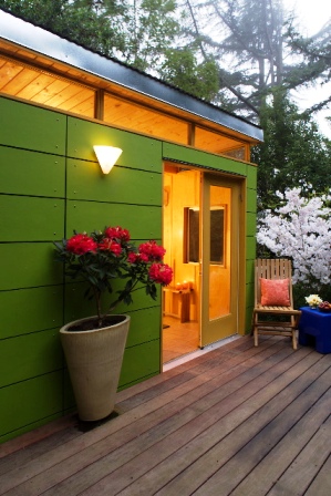
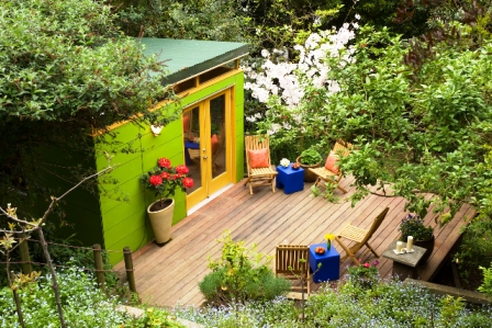
Hillside hideaway: Irv and Shira Cramer originally installed a simple backyard structure to give their teenage children a place to escape. Instead, they appropriated the serene, garden getaway for themselves. [William Wright photo]

Shedquarters: An architect’s own tool shed gets dressed up for his clients’ backyards 

Measuring 8-by-6 feet with a starting price tag of around $6,000, Ryan Grey Smith’s Modern Shed is one of the most affordable additions one can make to a house. Except it’s not attached. Smith, a University of Southern California-trained architect who logged years working in the corporate environment, returned to his native

Washington State in 1997. His move was prompted by a chance meeting with the international glass artist Dale Chihuly, another Washington son.

“I ran into him at a lecture and four months later, I was working for Chihuly Studio, running the architecture department,” Smith marvels.

He managed countless Chihuly installations, including “In the Light of Jerusalem” and the “Bridge of Glass” in Tacoma. The job entailed complex layers of project management, lighting design, engineering, site coordination and more.

Designing and installing large-scale installations of Chihuly’s glass sculptures was exciting for the young architect. But after six years, he was ready to work for himself.  In 2003, Smith launched his own architectural firm, Grey Design Studio, continuing the business name that his grandfather Larry Grey, a graphic designer and illustrator, started in the late 1920s. “I wanted to have that family connection in my studio,” says Smith. Much like his mentor Chihuly, Smith blends art and design with a strong entrepreneurial streak. “I started working on local architectural projects, but that expanded to designing furniture and lighting. When I couldn’t find something, I decided to make it myself.”

This problem-solving approach inspired the original shed that Smith created for himself in 2000. He and his wife Ahna Holder, an artist who also trained in architecture, live in an urban Seattle neighborhood. “We don’t have a garage, a basement or an attic and we were struggling with what to do with tools and the lawnmower,”  he says. “We considered something (mass-produced), but those sheds never did much for me. Instead, we wanted something that matched our modern aesthetic.”

exterior detailSmith designed a 10-by-12 foot box-style structure with a slanted galvanized metal roof, pitched at a 7-degree angle. It had a vinyl tile floor, a single door and an open-air transom around the top. “Originally, I didn’t want any windows, but I gave it a transom opening to allow in light and air for circulation,” he explains. The exterior was finished with 12-inch bands of Hardy board, a concrete-based material that can be painted, attached with exposed fasteners.

Constructed over a few weekends with a limited budget, the shed was “durable, inexpensive and easy-to-build,” Smith says. He set it up in the backyard on deck-style concrete pier footings and filled it with rakes, shovels, paint cans, power tools, the lawnmower, an artificial Christmas tree and the yard waste bin.

window detailA client noticed Smith’s cool shed asked him to upgrade the storage design for a backyard studio. “He worked at home and this offered a great solution,” Smith says. “It solved a space problem for him immediately and he didn’t have to do an addition, which would have been three-times the cost.” It wasn’t hard to convert the tool shed into an office design with the addition of glass in the transom opening, two 30-inch-square crank-windows, and insulated maple plywood walls.

Since then, thanks to interest from editors of design publications and customers who have seen Modern Shed displays at shows like CA Boom, a West coast contemporary art show, the firm has grown from a side venture to a major endeavor, one that Smith juggles with his architecture and product design work. The studio turns out three to four sheds each month, shipping a “kit” containing all the pieces (wall panels, floor, roof, siding, windows, door and assembly instructions) by truck to customers all around the country.

modern shed interiorMost clients begin with Modern Shed’s standard design and add custom features, such as French doors, second windows, insulation and paint color. Styles range from children’s play structures and potting sheds to studios and even potential dwelling units (starting at 475 square feet for around $40,000, these are often purchased for vacation property or rental units).

Smith thinks the inherent flexibility of these little buildings has fueled their popularity with artists, writers, musicians, software designers and owners of home-based businesses. “It’s expensive to add onto a house, but these sheds are an easy idea for people to grab onto.”

Functionality aside, Smith acknowledges the emotional attachment people have to a separate backyard structure. “Everyone has a need, whether it’s for a workshop or a getaway. People always connect to the basic sense of shelter, just like when you’re a little kid and you have a playhouse.” 

Resources: Modern Shed, (206) 524-1188
Web:
www.modern-shed.com
 

view from above 

Reached by descending 25 steps to a garden far below their Berkeley home, the Cramers enjoy this separate and soulful place for music, reading, and conversation [William Wright photo]


Rain is good

Monday, January 28th, 2008

snowfall in Ventura County Jan 2008

Snowfall frosts the mountaintop, seen from our neighborhood, January 2008

Southern California has received more than seven inches of rain since the start of the New Year. Apparently, this means our area has been blessed with more precipitation in one month of 2008 than we had in all of 2007!

There is something quite delightful about rain when it arrives. Of course, since this happens ALL THE TIME during Seattle winters, we were once desensitized to the cleansing, refreshing spirit of raindrops, sprinkles, showers, softly-falling mists…whatever you want to call it. Now, though, after living here in SoCal nearly 18 months, we do our little “happy dance” when it rains.

Capturing rain is a top priority for cities in the LA area. That’s because the dense network of urban freeways, streets, sidewalks and patios has created an impermeable surface that repels rainfall, washing it down driveways, curbs, and gutters and dumping it into the street drains. On the way, the water picks up pollutants — motor oil, auto fuel, antifreeze — any number of toxins that cling to the concrete and asphalt. So the relatively clean water falling from the sky becomes a chemical cocktail that eventually pours into drainage systems and dumps into the Pacific Ocean.

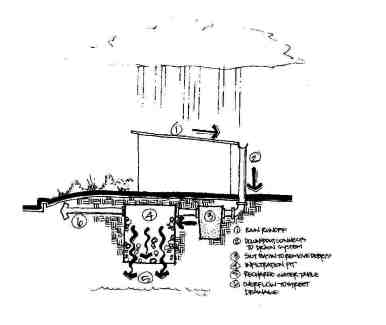
Several municipalities have established incentives to help homeowners (and their landscape designers) to capture and retain water falling on their property. One creative solution is to sink an infiltration system into the yard. As precipitation gushes along rooftops, into gutters and downspouts, and across the driveway, it is directed to this underground vessel that holds hundreds of gallons of water. Then the H20 slowly filters into the ground, replenishing the water-table instead of spilling into the street.

infiltration system

A cross-section of an underground infiltration system, designed by Gaudet Design Group

I took a crash course in Rain Management 101 a few weeks ago when the Los Angeles Times asked me to write a story about creative ways to capture excess rainwater.  I met Peter Jensen of Gaudet Design Group in Santa Monica, a landscape designer who specializes in sustainable solutions. Here is a link to the January 17th article called: “Imagine: Rain, Rain, Stored Away.”

Peter makes something completely functional look very appealing. Here is some of his work:

Echeveria “Afterglow”

Echeveria “Afterglow”

gravel garden

A Santa Monica front yard: In a space once occupied by thirsty turf, an attractive palette of drought-tolerant plants captures rainwater

agaves in gravel garden

On top of the “hidden” in-ground infiltration system, the river-rock is interspersed with Agave americana ‘Varietgata’ and ‘Icee Blue’ spreading juniper (Juniperus horizontalis ‘Icee Blue’)


Dymondia between steps

Between “pads” of poured concrete steps, clumps of fescue and dymondia (Dymondia margaretae) encourage rainwater to seep into the ground

Dymondia cushioning broken concrete walk

Dymondia margaretae cushions the spaces between pieces of broken concrete


Santa Monica drycreek garden with infiltration

To passers-by, it looks like a dry creek-bed; but this river-rock entry garden is installed above an in-ground infiltration system

Broken concrete rebuilt as permeable driveway

Once a two-car driveway that shed rainwater into city streets, this re-designed drive uses a patchwork of ground-covers and broken concrete to allow rainwater to slowly seep into the ground.