Debra Prinzing

Get the Email Newsletter!

Author Archive

In Praise of the Modern Shed

Monday, September 15th, 2008

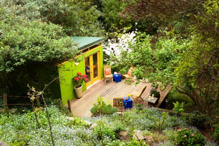
Irv and Shira Cramer created a backyard destination in an otherwise unused section of their hillside property. They bought and personalized a prefabricated shed-studio from Seattle-based Modern Shed.

[All photographs by William Wright]

There’s a huge media spotlight on prefabricated sheds these days, and much of it is shining on Ryan Grey Smith and Modern Shed of Seattle. While I would prefer to have a bit of those bright rays focus on Shed Style and our book, Stylish Sheds and Elegant Hideaways, I can’t help but be pleased to have media outlets participate in the conversation we began. As more stories rave about Modern Shed’s innovative and affordable design solutions for people in search of stylish space, I think everyone in the shed world will benefit. “The Shed,” an online magazine published by Alex Johnson in the UK, ran my story about Ryan earlier this year, called “Shedquarters.”

One of Ryan’s projects is featured in our book, a chapter called “Rec Room” that profiles a young Los Angeles artist and designer named Lin Su (seen at left, in front of her Modern Shed). But originally, a second Modern Shed structure was also slated for Stylish Sheds. It’s the sad reality that books have space limitations. Ours did, and in the end, that meant we had to cut seven chapters out of the final version of Stylish Sheds. It was P-A-I-N-F-U-L to say the least!


So many sheds, so few pages. Now it’s time to share one of those “lost” chapters. It includes the story and photographs of a bright green structure perched on a Berkeley hillside. Designed and built by Modern Shed, the haven is owned and used by a warm, artistic and fascinating couple named Irv and Shira Cramer.

Here’s their story, illustrated by a gallery of Bill Wright’s wonderful photographs:

Hillside Hideaway

A couple descends twenty-five steps to a garden far below their home to enjoy this separate and soulful place for music, books, and conversation. 

Irv Cramer doesn’t take the gift of sanctuary lightly. While some might consider the 13-by-14 foot shed installed at the foot of their garden to be a modest, humble structure, to Irv and his wife Shira, it is an oasis, for both body and mind.

READ MORE…

What’s filling my in-box

Saturday, September 6th, 2008

Like many freelance journalists, I receive a lot of “goodies” in the mail. I love it when garden, design, and plant books arrive for me to review. And of course, I appreciate “plant booty” — those boxes sent by growers who want me to trial their new introductions (although it’s uncanny: the boxes of tiny annuals, perennials and the like inevitably arrive on the hottest day of the week when I’m away from home, making it very hard to quickly rehydrate and revive the contents once I return!).

Press kits abound (although many are now sent electronically), and since I belong to countless horticultural societies, I also receive colorful monthly newsletters. Hand-written notes from friends are highly valued, as are checks from publishers (yeah!).

Today, as I was trying to organize the piles in my office, I pulled out a few of the items in my In-Box that caught my attention. Here’s a list:

Personal notes come first:

My friend and former co-author Mary Robson, a faithful letter-writer, jotter of quick notes, and all-around dear friend, dropped me a note with a nice little story: “. . . an incident you will appreciate,” (she wrote). “I stayed over at a friend’s home, in their garden-shed turned guest house. And what should be on the bedside table – of course, your book. She bought it to show guests! Warm thoughts, Mary.” [Oh, I love it. . . Stylish Sheds as bedside table reading! Thanks for the imagery, Mary]

With a SUNFLOWER STAMP, no less, Julie Schoenfeld, she of my auction-planning days, sent me a lovely hand-written note on letterpress stationary from Snow & Graham. We recently enjoyed a Malibu breakfast catch-up/gab when Julie brought her son from Seattle to Cali so he could attend the same summer camp of her childhood. As a memento of our sunflower obsession (see my “Stamps for the Gardener” post on August 21st), Julie tucked a book of the current sunflower postage stamps inside her note. She knows I’ll use them! And her sweet sentiment cheered me up with wonderful memories.

READ MORE…

“Sustainable Spaces. Beautiful Places”

Friday, September 5th, 2008

 I’m standing with Richard Turner, editor-in-chief of Pacific Horticulture magazine. We’re volunteering at the 2008 NWFGS in Seattle, visiting with Dawn Chaplin, formerly a fellow board member of Northwest Horticultural Society and a great garden-touring pal (she’s now a Whatcom Co. Hort. Society board member).

The press release just arrived in my in-box, and it announced the 2009 Northwest Flower & Garden Show’s theme. It’s only six months away – and I’m already excited! The theme: SUSTAINABLE SPACES. BEAUTIFUL PLACES. I like it! A lot!

The Northwest Flower & Garden Show, created by my pal, the talented and visionary Duane Kelly, today announced its 2009 theme:

“. . . (the) show will place a major focus on gardening materials and techniques that are good for the environment,” said Duane Kelly, chairman and founder of the annual event, now in its twenty-first year. “Show goers can expect to come away with a number of great ideas that conserve resources such as water and soil while, at the same time, making their gardens more self-sustaining and easier to care for.

“During the past year, organic gardening and vegetable gardening have grown in popularity thanks to the public’s keen interest in doing what’s best for the environment.  The movement has also gained traction with consumers seeking homegrown fruits and vegetables that not only taste better but reduce ever increasing grocery bills.”

READ MORE…

My first Garden Design piece – and it makes the cover!

Friday, September 5th, 2008

Okay, this is to be filed under “self promotion 101,” but, after all, what is the point of blogging if I can’t do that?

I am sending a huge bouquet of thanks to Jenny Andrews, Sarah Kinbar and the talented team of editors and designers at GARDEN DESIGN. Earlier this year, they asked me to profile the Venice, Calif., garden of uber-architect Ron Radziner and his wife Robin Cottle.

“Simple Geometry,” my story, appears in the September-October issue of Garden Design. You can see one of photographer Jack Coyier’s gorgeous shots appearing on the cover, depicting the family’s outdoor dining room. There’s lots more to read and see inside, as GD gave us a 10-page spread for the article.

I still haven’t seen the real issue or paged through it, but thanks to my Seattle pal, Stace Crooks, for calling this morning to tell me a copy arrived in her mailbox. I guess I better race out to get my own. I’ll post the entire story on my web site soon.

And another huge thanks goes to Paula Panich, my wonderful friend and writing coach. Paula helped me unsnag some tricky elements of the story, and in the process, made it lighter and more graceful. She is awesome.

Oh, it’s different when you’re in front of the lens

Thursday, September 4th, 2008

One of Amanda’s Polaroids from tonight’s photo shoot

I’m used to standing just slightly behind and a smidgen to the right or left of the photographer. That’s my comfort zone, where I can quickly hop in and peer through the lens to check out the composition of a shot, see how it’s framed, look for wayward electrical cords to hide or crooked picture frames to adjust.

I’ve been taught well over the years, working with talented shooters including Bill Wright, Andrew Drake, Mike Jensen and all those clever newspaper photojournalists (well, to be honest, newspaper guys rarely allow me look through the lens, but I do try to make suggestions!) 

So tonight the table was turned. And the lens was on me. Oh, for only 100-plus frames or so! And thanks to the very talented Los Angeles-based Amanda Friedman (seen above), it was painless. Actually, it was quite fun!

READ MORE…

A bouquet of thanks

Tuesday, September 2nd, 2008

I want to share a note of thanks to a few people for their recent kind words about this blog and Stylish Sheds and Elegant Hideaways.

Judy Lowe, the longtime Christian Science Monitor’s gardening columnist, also publishes “diggin’ it,” a blog on the CS Monitor’s web site. Each week, Judy reviews and writes about favorite gardening blogs, as was the case a few days ago in a post entitled “Garden siteseeing in California.”

Here’s what Judy wrote about Shed Style:

“At Shed Style, [Debra] writes about her interests – architecture (including landscape architecture, of course), garden travels (she’s an excellent interviewer, so you learn about the creator of the garden as well as the plants), and such things as circles in gardens, which was fascinating.”

READ MORE…

Stucco Studio in a celebrated garden

Sunday, August 31st, 2008

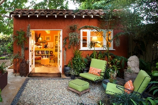
Tired of crowding his landscape architecture practice into a tiny spare bedroom of his bungalow, Joseph Marek renovated a 400-square-foot garage. He quadrupled his work space and created an attractive destination in the garden [William Wright photograph]

Not that I’m competitive or anything, but I did feel a tad victorious when I opened the current (Sept. 08) issue of Martha Stewart Living magazine, seen at right, to discover a feature story about two of my favorite shedistas, Joseph Marek and John Bernatz. Pretty cool to “scoop” MSL on a design story (it isn’t the first time gardens I’ve written about in books have later appeared in this magazine; no, it’s the third time!).

Congratulations to Joseph and John for the much-deserved recognition. And kudos to their friend, writer Susan Heeger, for her story. To be fair, I can’t take any credit for “discovering” Joseph and John. Their garden and several of Joseph’s residential designs for lucky clients have been featured in House Beautiful, Metropolitan Home, Horticulture, the Los Angeles Times, LA Magazine, Pacific Horticulture and Cottage Living, as well.

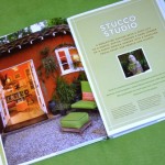
I’m tickled that the dynamic duo’s “Stucco Studio,” a converted 400-square-foot 1930s-era garage in their Santa Monica backyard, is featured as the “opening chapter” of Stylish Sheds and Elegant Hideaways (see the first two pages of their chapter, above left).

Exquisitely photographed for our book by Bill Wright, the studio — a paprika-colored structure once designed to hold a single automobile — has been transformed into a creative and joyous environment for Joseph Marek Landscape Architecture, Joseph’s landscape architecture practice.  The highly functional interiors do double-duty (by day, this is the headquarters for Joseph’s design practice and John’s at-home office for his travel agency; come weekends and evenings, it is often converted into an impromptu party house, where friends and clients may gather for informal cocktails). It is also a vibrant architectural foil for the small but intensely-planted garden.

READ MORE…

Stamps for the gardener

Thursday, August 21st, 2008

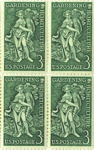
Commemorative “Gardening-Horticulture” stamp, 3-cents, issued in 1958 (from my father’s stamp collection – mint condition)

I know we’re all dependent on the Internet for swift correspondence, but I, for one, am still a huge fan of the hand-written letter. It’s not just the pen- or pencil-inscribed words one writes that matter. Think about other non-verbal cues we convey. Beyond the thoughts communicated by careful penmanship, there is also the selection of paper, note card, or greeting card that implies volumes of meaning. Even the color and type of ink sends a full range of sentiments.

I cherish hand-written notes. I have collected shoeboxes-full of them, saved by year, since the 1970s when my dearest and best childhood friend, Lori, and I started writing to one another after my family moved from New England to Portland, Oregon. I have the cherished love letters, the newsy updates from my mother, the thoughtfully-written narratives from another Lori in my life, who lives in Europe (she is known for excellent choice of paper, as well!). And then there’s Paula, who still jots notes with an old-fashioned ink pen (I just received one as a gift, so perhaps I’ll try to do the same). These “snail mail” versions of human communication trump the Internet on any occasion.

READ MORE…

Gotta love the “Massage Garage”

Tuesday, August 19th, 2008

Kristi Templeton’s “Massage Garage” – a one-car garage transformed into her Seattle massage studio

(all photos, courtesy of Kristi)

I love learning about the many creative ways people are transforming their utilitarian sheds into spaces that have a higher and more noble purpose. Every time I hear from a “shedista” or learn about one of these innovative shelters, I think: Too bad we didn’t get it into the book.

But one can always hope for Stylish Sheds and Elegant Hideaways, Volume II.  No plans yet, but I’ll keep adding these discoveries to my list.

Here’s a little story about Kristi Templeton, Seattle massage therapist, mom, wife, gardener and world traveler. My family and I had to journey all the way from Seattle to Giverny (Yes, Monet’s garden!) in 2002 to meet Kristi and her daughter Katie, then 10, at the time, the same age as our son, Benjamin. It was a chilly, barely-spring day in April and our family of four kept crossing paths with this mother-and-daughter duo, while touring the garden of our dreams. Ahh, Giverny. The inspiring landscape of a Masterful Impressionist. We’d read about it, seen it depicted on canvasses hung in the world’s greatest museums, peered at photographs in the guidebooks. . . .

And here were two fellow travelers from Seattle, visiting Paris on their spring break like us. We managed to caravan by taxi together, back to the return train to Paris. But we missed our connection and ended up at a tavern near the station. Bruce, Kristi and I enjoyed refreshments; the three kids had a plate piled high with pomme frittes and drank sodas. A connection was made and thoroughly enjoyed. Turns out, I, and everyone else in the Pacific Northwest gardening world, knew of Kristi’s husband Timothy Colman, owner of Good Nature Publishing. Tim is famous for his horticultural, botanical art and natural history posters (I have about seven of them hanging in my office and kitchen!).

This was a “petit monde,” n’est ce pas?

READ MORE…

Elegant, Stylish . . . and Prefabricated

Friday, August 15th, 2008

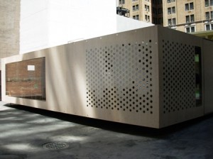
“System 3,” designed by Oskar Leo Kaufmann and Albert Ruf, on display as part of MoMA’s Home Delivery show of prefabricated home design.

The Prefab architecture movement has not been lost on those of us who think we’re hip to design trends. Yet the 21st century prefab building-boom has a centuries-old foundation. Would it surprise you to know that such illustrious inventors, architects and designers as Thomas Alva Edison, R. Buckminster Fuller, Charles and Ray Eames, Jean Prouve and Frank Lloyd Wright dabbled in prefab?

It’s good to look to the context of the past as we study the present and predict for the future. Several years ago, I wrote a newspaper article about the “manufactured home” industry. The house my photographer and I toured and documented was Victorian-style; it was literally factory-built in Canada and shipped, in flat-paneled sections, to Washington state for on-site assembly. There was nothing in its exterior detailing, charming turret and wraparound porch, nor in its gracious interior parlour, dining and living rooms that smacked of a stereotypical “double-wide.” My assumptions about design were turned upside down – and to my and my editor’s surprise, our story was picked up by newspapers around the country. The interest in manufactured homes was due in large part to the affordable and sustainable solutions to costlier custom-built versions.

In recent years, I’ve been exposed to a clever collection of prefab sheds, smaller versions of the manufactured home of the last decade. My shed-seeking journeys have led me to discover innovative shelters with four walls, a floor, a roof and a variety of window-and-door amenities – created by today’s designers. You can read one such review from my visit to the Dwell on Design LA exhibit this past June.

The pages of Stylish Sheds and Elegant Hideaways feature a chapter called “Rec Room,” in which one of Ryan Gray Smith’s sleek Modern Sheds grace a small LA landscape. I really love the way Ryan’s groovy, uncomplicated design solves a space problem for the person who wants to add a studio, atelier, guest room, office, party suite, etc., without building a full-blown addition to the house. And that’s just one architect’s interpretation.

Prefabricated architecture is the subject of “Home Delivery: Fabricating the Modern Dwelling,” a new exhibit at the Museum of Modern Art in Manhattan (on exhibit now through October 26th). If you find yourself in Manhattan, plan to visit it. Lucky for me, I had a last-minute trip to NYC last weekend and was able to spend a few hours at MoMA Saturday morning.

READ MORE…