Stucco Studio in a celebrated garden
August 31st, 2008
Tired of crowding his landscape architecture practice into a tiny spare bedroom of his bungalow, Joseph Marek renovated a 400-square-foot garage. He quadrupled his work space and created an attractive destination in the garden [William Wright photograph]
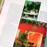
 Not that I’m competitive or anything, but I did feel a tad victorious when I opened the current (Sept. 08) issue of Martha Stewart Living magazine, seen at right, to discover a feature story about two of my favorite shedistas, Joseph Marek and John Bernatz. Pretty cool to “scoop” MSL on a design story (it isn’t the first time gardens I’ve written about in books have later appeared in this magazine; no, it’s the third time!).
Congratulations to Joseph and John for the much-deserved recognition. And kudos to their friend, writer Susan Heeger, for her story. To be fair, I can’t take any credit for “discovering” Joseph and John. Their garden and several of Joseph’s residential designs for lucky clients have been featured in House Beautiful, Metropolitan Home, Horticulture, the Los Angeles Times, LA Magazine, Pacific Horticulture and Cottage Living, as well.
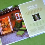
I’m tickled that the dynamic duo’s “Stucco Studio,” a converted 400-square-foot 1930s-era garage in their Santa Monica backyard, is featured as the “opening chapter” of Stylish Sheds and Elegant Hideaways (see the first two pages of their chapter, above left).
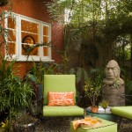 Exquisitely photographed for our book by Bill Wright, the studio — a paprika-colored structure once designed to hold a single automobile — has been transformed into a creative and joyous environment for Joseph Marek Landscape Architecture, Joseph’s landscape architecture practice. The highly functional interiors do double-duty (by day, this is the headquarters for Joseph’s design practice and John’s at-home office for his travel agency; come weekends and evenings, it is often converted into an impromptu party house, where friends and clients may gather for informal cocktails). It is also a vibrant architectural foil for the small but intensely-planted garden.
I first encountered Joseph in November 2006, only a few months after I moved from Seattle to Southern California. He was a featured panelist at the Garden Conservancy’s Fresh Design LA symposium. Listening to him on the subject of “developing a distinct style through creative collaborations,” I was inspired by Joseph’s obvious talent and intelligence; later, during the Q&A period and garden tours, I was impressed by his very approachable personality. He graciously shared his ideas and responded to inquiries with respect and attention.

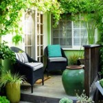 Symposium participants had the fortunate experience of touring one of Joseph’s unforgettable projects, an urban garden in Pacific Palisades, filled with playful jolts of color and avant-garde plantings (seen at right). His clients, a screenwriter and interior designer, wanted to eliminate their lawn and use every inch of the yard for year-round activities. Marek helped the couple create places for grilling/dining, lounging, conversation, soaking in a small pool, and gardening. My friends and I were wowed by the innovative lipstick red twig-teepees (seen at left) that lent a visual “pop” in each of the four raised vegetable beds (a stroke of genius – Marek co-opted an unused driveway section for the veggie garden).
Later that month, Bill and I were in Fallbrook, Calif. (near San Diego) photographing the amazing golden dining pavilion of Patrick Anderson and Les Olson. Patrick told us about seeing and admiring Joseph and John’s garage-turned-studio on a garden tour. He suggested we track it down for possible inclusion in Stylish Sheds.
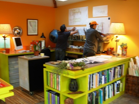
On Location: Joseph (left) and John (right) serving as “stylists” during our April 2007 photo shoot for Stylish Sheds
So I rang up Joseph and he instantly said “yes, come on over!” The minute I drove down the street where he and John live I instantly knew “this is the right house.” In a sea of front lawns (including a faux front lawn – seriously), the Marek-Bernatz property is impossible to ignore. This plant-centric garden starts at the sidewalk and visually lures its guests (and passersby) toward its inner sanctum of small garden rooms: courtyards, fountains, artful displays of pots and plants, varied levels (one sure way to infuse largess into a tiny property), and quirky sculptural finds that lend a not-too-serious tone to the environment.
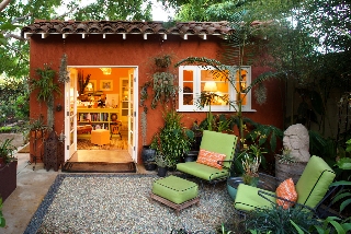
 And where once perhaps a car squeezed down a drive, now there is an alluring gravel terrace where dining and entertaining activities occur. The studio, infused with new life but not structurally altered, features custom cottage-style French doors and windows instead of the old garage door. The windows and doors invite light to fill the interior space, banishing the typical darkness you’d find inside a garage (a skylight in the far corner of the roof aids in this effort).
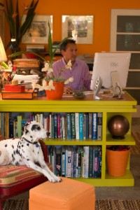
Of course, the melon-and-apricot interior palette (which in my text I describe as “joy-inducing”) nurtures creative ideas and beautiful work. Joseph’s custom designed chartreuse-green work stations give him ample storage (note the built-in bookcases that form the edges of the drawing tables; the interiors are painted a soft lavender hue). The walls are adorned with vintage pieces found by John and Joseph at local flea markets (and each item has a delightful narrative that they willingly share). [Joseph is seen working at his desk, with the late, beloved Pablo lounging nearby.]
Outside, the paprika stucco and red-tile roof lend a rich backdrop to the hanging gallery of Joseph and John’s burgeoning collection of tillandsias and staghorn ferns, silvery-gray plants that look gorgeous against the complementary stucco.
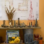 It is no surprise that John and Joseph’s garden, home and studio are often-photographed and lauded by top design magazines. These men have a confidence and boldness when it comes to playing with color, art and plants. They know how to create energy, excitement, and style in their everyday lives.
John and Joseph are generous souls who willingly shared their lives and environment with Bill and me. Joseph summed up the benefits of working at home this way: “When I’m standing at the drafting table drawing, I think how nice it is that I get to see my garden while I’m working, rather than being in an office cubicle or a building with fluorescent lights.”
His sentiments hint at a valuable lesson experienced by one who is fortunate enough to create a shed-like space in the garden. Wishing that opportunity for all who read this. . . .


September 2nd, 2008 at 7:53 am
I am still pouring over my Stylish Sheds and Elegant Hideaways. I’ve taken a great deal of inspiration from the many beautifully written and photographed pages. I’ll link to you soon as I get the project started which should be in the next few weeks. I am forever grateful for the book and my husband says that our little shed became an elegant hideaway after getting your book.
September 2nd, 2008 at 7:55 pm
What a lovely reminder to those of us fortunate enough to “work from home” to embellish and stamp our environment in a way that brings us joy. Color, plants, loved ones and pets…yep we’re pretty lucky. Thank you Debra for another connection!
ox Lorene
September 5th, 2008 at 10:22 am
Congratulations on the scoop! Of course, you’re the real expert on the subject and “Martha” trails far behind. I’ve always dreamed that I would live on a property with a studio/shed/outbuilding like this. (Or that I could afford to build one.) Alas, I’m an urban gardener at the moment, living in an 1800s rowhouse where lot space is measured in square feet. But I’m still dreaming. And your site and book help keep the dream alive.
September 11th, 2008 at 3:32 am
I´m loving the great photographs. Really great inspirations.
March 16th, 2010 at 3:55 pm
This is a great example of the style and feel of a Santa Monica home. Private, but in the middle of the city, unique and comfortable. I wish I could find where it is so I could take a peek! There are many of these beautiful little gems though, might take forever.
August 27th, 2013 at 12:44 pm
I love the red stucco and the lime green chairs. What a great color combination. The setting is beautiful.