Rhythm: a design principle
November 25th, 2007
A pebble pathway at Lotusland creates a pleasing rhythm
Here is the piece I referenced in my last post. I wrote it in early 2002 for Bud Merrill’s Landscape Design II (LHO125) class at South Seattle Community College.
RHYTHM: Creating a Pattern for the Landscape
Webster’s dictionary defines rhythm as “the patterned, recurring alterations of contrasting elements.”
In design, the term relates to time and movement. According to Marjorie Elliot Bevlin, author of Design through Discovery: The Elements of Design (my college design text), rhythm is a principle that works in concert with two other important principles: Balance and Emphasis.
In design, the dynamic of rhythm creates a visual flow. As a beat is to music, as choreography is to a dance, rhythm adds vitality to a garden. In landscape design, rhythm creates physical sensation. It may cause people to move quickly, slow down or even pause before continuing on again. By repetition of like forms or evenly-spaced points of emphasis, a rhythmic design is naturally expressed.
One of the most successful ways to incorporate an instant feeling of rhythm or movement into the garden is with a dry creek-bed. The cascading path of smooth river-rocks mimics the flowing sensation of water, adding energy to the setting. [Photo illustrates a water-pattern created by a narrow rill that disects a stone staircase.]
Using key design elements in various patterns, the garden designer can lead visitors through the landscape, giving the viewer visual cues. As Booth and Hiss (in Residential Landscape Architecture) write: “We tend to view various portions of a composition in sequence, often mentally collecting them to form patterns.”
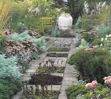
At Ahrends Nursery in Dusseldorf, landscape architect Anja Maubach alternates ordinary paving stones with square plantings of hardy succulents – the resulting pattern is rhythmic and alluring (photo from Country Gardens 2000 by Nicola Browne)
I began looking at the pattern-rhythm concept to see how various designers drew on this principle. Repetition, alteration, inversion and gradation all lend visual rhythm to the landscape. Anja Maubach, a German landscape designer, uses repeating squares of densely-planted sedums interspersed with concrete pavers to jazz up an otherwise generic path. Anja cites Pattern Language, a classic architect’s text, as her influence.
In this 1977 book, the authors Christopher Alexander, Sara Ishikawa, Murray Silverstein (with Max Jacobson, Ingrid Fiksdahl-King and Shlomo Angel) describe more than 250 “patterns” as solutions to design problems. The patterns follow design principles, but are also deeply rooted in nature and human history, which makes them resonate with us. (Perhaps that’s what the term ‘good design’ is all about.)
Pattern No. 247 – Paving with Cracks Between the Stones – talks about the need to “walk from stone to stone and feel the earth directly underfoot.” The authors continue, “As time goes by, the very age and history of all the moments on that path are almost recorded in its slight unevenness.”
Essentially, the spaces make a static path come alive – and have a certain rhythm.
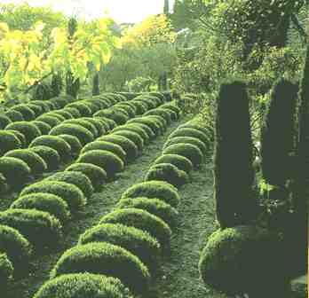
Lines of lavender play on graphic qualities found in commercial herb farms (from Natural Landscapes, 1998)
English garden designer John Brookes incorporated rhythm into a client’s French garden with the use of just one plant: lavender. He drew inspiration from the neatly clipped rows of lavender in nearby farms. “Lines of lavender play on the graphic qualities found in commercial cultivation of the herb,” Brookes explains in his book Natural Landscapes.” And the garden deliberately emphasizes the shapes and textures of this tough region.”
Rhythm is essential as a design principle. It’s the organic motion, the fluid character that every garden needs to come to life for those who enjoy it.


November 25th, 2007 at 5:49 pm
Gardens. Writing. Life. They follow the same rules. Beauty requires rhythm, balance, proper emphasis. Gorgeous piece.
November 25th, 2007 at 7:23 pm
good point, Lydia! love the analogy!
November 26th, 2007 at 6:28 am
[…] Rhythm: a design principle […]
November 26th, 2007 at 8:03 pm
You will not believe this. I have that photo of Ahrends Nursery on the front of my design notebook. I have carried a copy of that around for YEARS. I always wanted to install that garden for a client. Have just decided the client will be none other than, ME!~
November 26th, 2007 at 9:06 pm
MA … You will not believe this, but I am recreating that pathway in my own backyard! I laid the pavers this weekend and now have 4 nifty planting squares, ready for my sedums. Let’s do 2 versions – Idaho and SoCal – like so many other things, we can be 2 peas in a pod! (PS, I did a long-distance email interview with Anja Maubach years ago and she couldn’t have been lovelier) Brilliant woman! DKP
December 11th, 2007 at 9:01 pm
Great review talking about Rhythm: a design principle. Thoroughly love your interesting posts!
December 14th, 2009 at 10:44 am
Wow this was doubtlessly one of the most effective blurbs I have read on the topic so far. I do not understand where you gather up all of your info but up! I am going to send a few individuals over here to check this out. Awesome, just plain amazing. I’m just getting into crafting articles myself, nothing remotely close to your writing potential (doh) but I’d love for you to check out my article sometime! right here